But I Regress…
Do you know that thing that statisticians do called regression analysis? It’s when they look at two (or more) numbers to determine how closely correlated they are. To use a couple of examples I’ve seen recently, education is correlated with health and the presence of a Led Zeppelin bumper sticker is correlated with the likelihood of that vehicle containing a controlled substance like marijuana. I first learned regression analysis back in the days when you had to compute it by hand; now all you need is a computer with Excel. It’s a neat tool, perhaps a bit too easy to use for some.
But something’s always bugged me: why is it called regression analysis? Why isn’t it called correlation analysis? I mean, when you run a regression analysis, the main output is the correlation between the variables, right? So why is it called regression? Huh? Haven’t you wondered the same thing? Even once?
Okay, perhaps you’re not as geeky as I am. But you’ll be happy to know that I think I found the answer while reading a biography of the guy who invented regression analysis, Sir Francis Galton.
Galton was an amazing, quirky guy; one of those classic Victorian gentlemen with lots of time on their hands and lots of things to discover. He traveled the Nile and explored parts of Africa that hadn’t been seen by white men before. He published a book on survival in the wild, parts of which are still included in survival guides. He invented some silly things (one of my favorites: the gumption-reviver machine, which simply dripped water on you until you were thoroughly soaked) and some very important things (weather maps; the system for categorizing fingerprints still used today). Most of all, he counted things.
Galton was an obsessive counter. He determined a precise formula for preparing the perfect cup of tea. He counted beautiful women in different parts of England to deduce his own “beauty map.” And when his cousin, Charles Darwin, invented a little something called evolution, he threw himself into the task of counting hereditary traits.
He was convinced that things like criminal behavior, intelligence and genius were linked to heredity. His beliefs stood in contrast to many of his critics, who also cited environment. In fact, it was Galton who first turned the phrase “nature/nurture” to describe the argument. Along the way, he decided the best thing to do would be to collect statistics on people and measure them. So he set up shop in a Public Health exhibition and asked people if they would like to be measured (height, armspan, breathing capacity, eyesight, etc.). After a year, he had collected measurements on over 10,000 people.
Statistics was still in its infancy, and Galton certainly didn’t have a computer back then. But he decided to analyze these numbers as best he could. He took the heights of 205 sets of adults and their children and (much to my delight) laid them out in a scatterplot graph. He saw that the points moved together: the taller the parents, the taller the children. However, the points didn’t line up perfectly.
So he drew a line that seemed to best fit the relationship between the points, and measured its slope. The result was two-thirds. As Galton thought it through, he realized that children were two-thirds as likely to be as “extreme” as their parents. He called the remaining one-third “regression.” Actually, he called it “regression to mediocrity,” which we have modified to regression to the mean.
This was actually a blow to Galton, who wanted to believe that heredity was absolute. But it was a huge step forward for the field of statistics. Galvin went on to refine his technique, developing correlation coefficients and lots of other things. But the very first thing he noticed, the thing that the graph showed him, was regression. And that’s why we call it regression analysis. I think.
Regression to the mean is everywhere in baseball. Sophomore slump? Regression to the mean. Seattle’s 93-69 record after going 116-46 in 2001? Regression to the mean. Luke Scott’s Slugging Average in 2007? Regression to the mean.
Let me show you another graph. This graph plots batting average in 2005 and 2006. What I’ve done is to split up the 2005 batters into quartiles, and then plotted how those same batters performed in 2006. I used a minimum of 300 at bats in 2005 and included the player in in both years if he played in 2006 at all. This is what regression to the mean looks like:
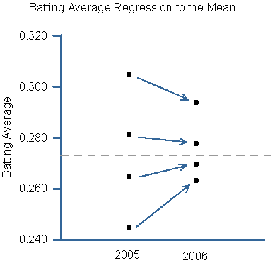
As you can see, each one of the four quartiles moves closer to the average (that gray line) in 2006. The first quartile of batters batted .305 in 2005 and .294 in 2006. The lowest quartile batted .245 in 2005 and .263 in 2006. Each group moved closer to the mean.
There is probably some selection bias in that lower quartile. The worst batters played less in 2006, which skews the overall results higher. So regression to the mean isn’t quite as strong as it appears in that lower quartile, but it’s still pretty strong.
What we’re really after is understanding the difference between a player’s “true talent” and the overall league average. The problem is that one year isn’t enough data to establish a player’s true talent. So let’s see what happens when we include two year’s batting average (2004 and 2005) in the initial quartiles:

If you compare the two graphs, you’ll see that the lines aren’t as steep when you have two years’ worth of data to begin with. In this case, the first quartile moved from .303 in 2004/05 to .295 in 2006, a little less than the one-year sample. The bottom quartile migrated from .252 to .262, a lot less than the one-year sample. If you have more years in your baseline, there is less regression to the mean.
Why do I bring this up now? Because lots of people are producing forecasts for the 2007 season, and one of the first things every decent projection system will do is regress a player’s performance to the mean. In fact, there is one system that does nothing other than regress each player’s performance to the major league average as a basis for its 2007 projection. It’s called Marcel, because it’s so simple that even a monkey can do it. (Marcel, from Friends. Get it?)

You can read more about the Marcel system from its current caretaker, Tangotiger. Tango’s specific calculations are laid out in this thread—he essentially takes each player’s previous major league performance and regresses it to the mean. That’s it; no park adjustments, minor league stats or anything like that. The amount to which he regresses each player depends on how long the player has been in the majors. If he’s only been in the majors a year or two, Tango regresses his performance a lot. He also regresses a pitcher’s performance more strongly than a batter’s, because pitchers are typically more random.
Chone/Sean Smith found that Marcel had a .66 correlation with batters’ actual performance last year. The best correlation he found was PECOTA’s, at .74. Nate Silver of Baseball Prospectus has worked tremendously hard to make PECOTA a cutting-edge system and has succeeded. But even his model only gains a smidgen of accuracy over Marcel. That is the power of simple regression to the mean.
You can download the 2007 Marcel projections from Tango’s site. Just for the heck of it, I downloaded them and compared them to each player’s 2006 performance. Here is a list of the batters who are most likely to see an increase in their batting average, based on Marcel and regression to the mean (minimum at bats in 2006: 300. Minimum batting average in 2006: .240):
Last      First       06BA     mBA    Diff
Gonzalez  Luis A.     .242    .285    .043
Cantu     Jorge       .249    .281    .032
Izturis   Cesar       .245    .276    .031
Ellis     Mark        .249    .278    .029
Mueller   Bill        .252    .279    .027
Duffy     Chris       .255    .281    .026
Kubel     Jason       .241    .266    .026
White     Rondell     .246    .271    .025
Crisp     Coco        .264    .289    .025
Casey     Sean        .272    .296    .024
Lopez     Javy        .251    .276    .024
Peralta   Jhonny      .257    .280    .024
In general, you won’t see many predicted improvements for first- or second-year players, because there’s not enough history to regress to. But Cleveland fans should feel good about seeing Jhonny Peralta on this list.
Here’s a list of players whose batting averages are most likely to decline next year:
Last      First     06BA     mBA    Diff
Redmond   Mike      .341    .291   -.050
Scott     Luke      .336    .292   -.044
Bard      Josh      .333    .293   -.041
Ozuna     Pablo     .328    .290   -.038
Ward      Daryle    .308    .269   -.038
Cirillo   Jeff      .319    .281   -.038
Jones     Chipper   .324    .286   -.037
Helms     Wes       .329    .293   -.036
Coste     Chris     .328    .294   -.034
Jeter     Derek     .343    .311   -.033
You shouldn’t really be surprised by any of the players on this list. Let’s switch to On-Base plus Slugging Average (OPS). Here’s a list of players most likely to improve next year by regressing to the mean:
Last     First      06OPS    mOPS    Diff
Clark    Tony        .643   0.826    .183
Gonzalez Luis A.     .625   0.764    .139
Guillen  Jose        .674   0.800    .126
LaRue    Jason       .663   0.763    .101
Peralta  Jhonny      .708   0.803    .095
Lee      Derrek      .842   0.934    .092
Cantu    Jorge       .699   0.789    .090
Lopez    Javy        .683   0.767    .084
Hermida  Jeremy      .700   0.782    .082
Niekro   Lance       .673   0.754    .082
Crisp    Coco        .702   0.783    .081
Varitek  Jason       .725   0.806    .080
Navarro  Dioner      .687   0.767    .080
Here’s a list of players most likely to decline:
Last       First      06OPS    mOPS    Diff
Scott      Luke       1.047   0.872   -.175
Ward       Daryle      .926   0.782   -.144
Ross       Dave        .932   0.788   -.144
Helms      Wes         .965   0.831   -.134
Dye        Jermaine   1.006   0.879   -.128
Thome      Jim        1.014   0.900   -.114
Beltran    Carlos      .982   0.875   -.107
Anderson   Marlon      .866   0.765   -.102
Bard       Josh        .926   0.826   -.100
Saenz      Olmedo      .927   0.828   -.099
Is Marcel saying that each of these players will regress to the mean? Absolutely not. Some of them won’t. But enough of them will regress to the mean to validate the entire approach. Marcel doesn’t predict breakout seasons; by definition, those are nearly unpredictable. It predicts what you can most likely expect from a player.
Projection systems start with regression to the mean, but they differ significantly in what they regress to. Marcel simply regresses to the overall major league average (with one exception for pitchers in the American League), while PECOTA regresses to the average of similar players (based on height, weight and other things). As another example, this thread includes a fine discussion of how to regress players who have only been in the majors a year or two.
Sir Francis Galton would be proud of the way baseball fans and analysts have incorporated regression to the mean in their thinking. I can also think of a few players who could use that gumption-reviver machine.
References & Resources
The biography of Galton is called Extreme Measures: The Dark Visions and Bright Idesa of Francis Galton by Martin Brookes. The New Yorker reviewed the book a couple of years ago.
Correlation and regression analysis were a tremendous contribution to mankind, but Galton’s other legacy is the field of eugenics. Galton envisioned eugenics as a utopian way to build the best human species. In his conception, eugenics was relatively innocent and naive. Adolf Hitler turned eugenics into a nightmare.
I want to credit John Burnson’s 2006 Graphical Pitcher for the graphical inspiration of regression to the mean. John used it to show the extreme regression to the mean of home runs per fly balls among pitchers.