Team age using aging curves
The Yankees are old. Their lineup features just two starters in their 20s: Brett Gardner, who turns 30 in August, and David Adams, who is filling in for injured thirty-somethings Kevin Youkilis and Alex Rodriguez. Their top three starting pitchers this year are 32, 38, and 41 years old. Their closer is 43, if we want to pretend for a minute that age applies to him.
The Astros are young. Aside from Carlos Pena and Chris Carter, their whole lineup would be the youngest player in the Yankees’ starting nine (and Carter is just a few months older than David Adams). Erik Bedard is currently the team’s only starting pitcher older than 28.
The Yankees’ hitters are, on average (weighted by plate appearances), 32.3 years old. Their pitchers (weighted by batters faced) are 31.8 years old. The Astros’ hitters and pitchers are 27.0 and 28.0, respectively.
What does that mean, exactly? That the Yankees are experienced, or injury-prone, or past their prime? That the Astros are an ideal television demographic? There are countless ways you could spin the age statistics, and several of them probably have merit, but I’d like to focus on one particular meaning.
One reason we care about a team’s age is that age has predictable effects on player talent. Young players are more likely to improve than old players. Old players are more likely to decline. So we can expect that a young team like the Astros is likely getting better (less terrible?) as it ages, whereas an old team like the Yankees is likely getting worse.
When viewed from this perspective, it makes more sense to look not only at each player’s age when we evaluate his team’s age, but also where he is on the aging curve.
There are a few advantages to mapping each player’s age to an aging curve over just averaging the ages themselves. One, we can easily see which ages are “young” (i.e. expected to improve) and which ages are “old” (expected to decline). Additionally, having two players who are 28 may or may not be the same as having one player who is 25 and another who is 31. Averaging the ages will give us the same result for both pairs, but an aging curve will tell us if there are any differences. Furthermore, having a 25-year-old pitcher and a 31-year-old non-pitcher might not be the same as the reverse. Looking at each age’s position on the aging curve lets us make more relevant comparisons than just averaging the ages.
To do this, I ran some simple WAR aging curves similar to what Jeremy Greenhouse did a few years ago. I then fitted a quartic equation to the results to make non-integer ages easier to deal with. (The following graphs set age 20 to 0 WAR, which is not meaningful since we are looking only at the change in WAR):
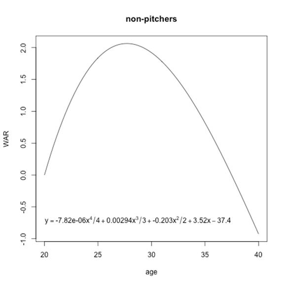

Using these aging curves, non-pitchers peak at around 27.7 years old, while pitchers peak at around 26.3. Note that the peak you get can depend on how exactly you do the aging curve as far as selection criteria, weighting, etc. I’m just using something simple here since the focus isn’t on how to best construct an aging curve but rather a novel use for them. In particular, separating the effects on playing time and on the rate of production would probably get you a better curve if you wanted to put a lot of work into it.
We can now map every player to a current estimate of the direction and magnitude of his talent change based on his age. Jose Altuve is 23.15 years old as of July 1, 2013, so we take the slope of the aging curve at that point and estimate he is currently improving at a rate of .31 WAR/year. Hiroki Kuroda is 38.39 years old, so we map him to that point of the curve and estimate he is getting worse at a rate of .28 WAR/year.
Now, instead of averaging each player’s age for each team, we can average their rates of improvement/decline to see which teams are old or young:
Non-Pitchers:
Team        Age   Change in Talent
NYA        32.3      -0.18
LAN        31.3      -0.15
CHA        30.7      -0.13
DET        30.7      -0.12
PHI        30.9      -0.12
TBA        30.3      -0.11
BOS        30.2      -0.10
TOR        30.1      -0.10
TEX        30.5      -0.10
SLN        29.7      -0.08
SEA        29.9      -0.06
CLE        29.3      -0.06
SFN        29.4      -0.06
CIN        29.0      -0.05
AVG        29.3      -0.05
OAK        28.8      -0.05
NYN        28.9      -0.04
MIL        28.9      -0.04
ANA        28.8      -0.03
ARI        28.8      -0.03
SDN        28.6      -0.03
MIN        29.0      -0.03
MIA        29.3      -0.02
CHN        28.8      -0.02
PIT        28.5      -0.02
WAS        28.4      -0.01
BAL        28.1       0.00
COL        28.2       0.01
ATL        27.5       0.04
KCA        27.3       0.05
HOU        27.0       0.07
The average Yankees hitter is at an age where we’d expect a loss of about .18 WAR per year, while the average Astros hitter is at an age where we’d expect a gain of about .07 WAR per year.
You may notice that by this method, at least using this aging curve, most teams have “old” lineups that are, on average, declining. This makes sense if we consider that the total number of WAR league-wide remains constant year to year and that, going forward, some of those WAR will come from players not yet in the majors. That means that, on average, players currently in the majors will produce fewer WAR going forward than they are now. Hence, most teams’ current rosters are in decline.
The same thing happens with pitchers:
Pitchers:

Team        Age  Change in Talent
TOR        32.0      -0.17
NYA        31.8      -0.16
ANA        30.2      -0.14
BOS        30.4      -0.13
KCA        30.0      -0.12
SDN        30.0      -0.12
CHN        29.3      -0.12
SFN        30.1      -0.11
MIL        29.2      -0.09
PHI        29.8      -0.09
MIN        28.8      -0.09
COL        29.3      -0.08
PIT        29.5      -0.08
DET        28.6      -0.08
AVG        29.0      -0.07
CLE        28.0      -0.07
WAS        28.2      -0.07
SEA        29.0      -0.06
NYN        28.6      -0.05
LAN        28.8      -0.05
BAL        28.3      -0.05
CIN        28.3      -0.04
OAK        28.8      -0.04
HOU        28.0      -0.04
TBA        28.5      -0.04
CHA        27.9      -0.03
ARI        27.7      -0.02
ATL        28.3      -0.01
TEX        27.5       0.00
SLN        27.6       0.03
MIA        27.3       0.03
Still, you may want to know which teams are “young” or “old” compared to an average team, so the league averages have been included in the above charts.
This isn’t meant as a substitution for full projections or to tell you what teams will perform better or worse going forward. It’s just a slightly different look at team age with a more specific purpose in mind—to estimate which direction time is taking a team’s players (in terms of underlying talent, not necessarily performance—you’d want full projections for that), and how quickly it is taking them there.
Question on how to interpret these tables:
If the Yankees are .18 War er year, does that mean I would multiply the 13 position players times .18 War to mean the Yankees are losing about 2.5 wins because they are old? Would I then multiply .16 times 12 pitchers to subtract another 2 wins from their “age-neutral” talent to mean the Yankees lose 4 wins thsi year for being old?
The numbers in the charts are more an estimate of how quickly teams are losing talent than how many wins they have lost from aging (of course the two are related, but the conversion from one to the other can be a bit trickier than it seems). For example, the Yankees roster might be expected to go from a .550 team to a .525 team over the next year, which would be about a 4 win drop in talent level.
That doesn’t drop them from a .550 team to a .525 team for the whole year, though—it’s a gradual drop-off. If they start off the season as a .550 team, then a month later they are probably something like a .548 team, etc. until a year later they are down at .525. Since the drop-off is gradual, going from a .550 team to a .525 team would cost them something like 2 wins off their record over that time instead of 4 wins. And then since the season is only 6 months and not a full year, it’s probably closer to 1 win lost over the course of the season compared to if their players were not aging at all.
A more direct interpretation of the numbers in the charts would be to ask how much more or less likely a team is to win a game because of aging than how many total wins they have lost. If they are losing ~4 wins a year to aging, then we’d expect their roster to play like a team that is 4 wins worse a year from now (i.e. have a 52.5% chance of winning a game instead of a 55% chance), even though they won’t have lost 4 total wins over that time.
As far as I am aware, and based on my own research, there is not much evidence that there is a pitcher aging curve. In fact, there is some evidence that pitchers get worse from the moment they enter the major leagues, because of two reasons: One, loss of velocity, and two, injuries.
So I would not put too much stock in the pitcher charts and curves.
Nice concept, BTW!
In this day and age, protection of one’s home and business is the primary concern for everyone. With the increase in crime rates, there is a growing danger of intruders, resulting in losing valuable belongings and even, at times, resulting in a death. Having a good service provider coming on the premises and install safety locks is more than worth the money shelled out.
Thanks,
Locksmiths Dublin