The Astros’ Rotation Stunk in April 2016. Were Their Starters too Similar?
Plotting the fastball velocities of rotations can be illuminating. (via Ryan Pollack)
Last May, after the Astros had completed a miserable 7-17 April, Ken Rosenthal noted the sorry state of the team’s starting rotation and proposed a reason the team was in this spot. He also hypothesized a cause. I’ll let him speak:
The Astros’ starters ended April ranked last in the AL with a 5.10 ERA — and last in the majors in average fastball velocity at 89.3 mph, according to FanGraphs.
Velocity isn’t everything — the Astros’ starters were 25th last season, yet finished second in the AL in ERA. And the Rangers’ current starters are 29th in average fastball velocity but first in the AL in ERA.
Still, the Astros badly miss hard-throwing right-hander Lance McCullers, who is working his way back from a sore right shoulder.
Too many of their starters are similar.
One of them might turn it around, sure. But both? Seems doubtful.”
The second-to-last line caught my eye: “Too many of their starters are similar.” Because Rosenthal spent the first three paragraphs talking about fastball velocity, I interpreted this statement as: “Too many of the Astros’ starting pitchers throw fastballs at a similar velocity.”
I saw this and I wondered: If a rotation has guys who throw similar heat, will that rotation perform worse than a rotation with a more diverse set of arms? The logic certainly feels right. Hitting is timing. If, in a three-game series, batters see three starters who each average 93.5 mph, hitters should be able to time fastballs from these guys more easily than they could if they were facing an 88-mph thrower, a 93-mph thrower, and a 97-mph thrower. Hitters facing this more diverse set of pitchers should have difficulty adjusting day to day, and therefore will perform more poorly.
It sounds true. It feels true. But is it correct to believe that having a rotation of similar fastball velocities hurts the team? I decided to investigate.
Methodology
I tested the following, more precise, hypothesis: As the similarity of a starting rotation’s fastball velocities increases, the rotation’s average WAR decreases. Specifically:
- In the PITCHf/x era, I searched for pitchers who started at least 25 percent of their games in a season.
- For these pitchers I obtained their average four-seam fastball velocity as well as their FIP- and RA9-based WARs. A few pitchers were excluded because they didn’t record a four-seam fastball velocity in that season.
- I grouped the starters by team and season and computed the median absolute deviation (MAD) of each team-season’s fastball velocities. I accounted for mid-season trades, meaning David Price shows up twice in 2014–once with Tampa Bay and once with Detroit–with his velocities and WAR values allocated to the appropriate teams.
- For Houston in 2016, I looked at only their regular April rotation: Dallas Keuchel, Mike Fiers, Collin McHugh, Doug Fister and Scott Feldman. When Rosenthal made his statement, he’d seen starts by only these guys and Christopher Devenski, whom I didn’t count because he started only one game in April.
- I studied how these MADs related to the WAR of the average pitcher in that rotation. I used average WAR because each rotation has a different number of pitchers.
Examples
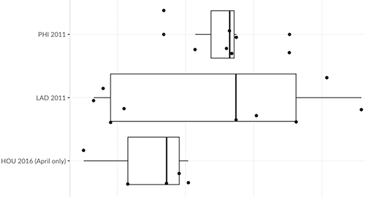
The outliers give you an idea of how the data look. By this method, the 2011 Phillies had the most similar rotation in the dataset (MAD of 0.297 mph); the 2011 Dodgers, the least similar (MAD of 4.862 mph). The Phillies that year ranged from Joe Blanton’s 89.3 mph heater to Kyle Kendrick’s 93 mph fastball. Conversely, the Dodgers featured Ted Lilly, John Ely, Dana Eveland and Jon Garland all throwing 88 mph or slower, while also rostering Rubby de la Rosa and Nathan Eovaldi, who threw 94-95 mph.
Incidentally, Rosenthal was correct in thinking Houston’s April 2016 rotation was similar to itself. This rotation had a MAD of 0.941 mph. That’s much closer to the 2011 Phillies than the 2011 Dodgers. It also ranks as more similar to itself than 92.5 percent of other teams in the data set are to themselves.
The following box plots show these relationships:
So, the Astros’ 2016 rotation was very similar to itself. But is that a bad thing? If so, how bad?

Results
To answer this question, I removed the April 2016 Astros from the data set. Comparing just one month of its rotation to full seasons of other teams doesn’t make sense. I then plotted the remaining rotations:
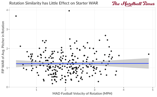
Both the scatter plot and regression line tell us no relationship is present. That’s about a straight a horizontal line as you can get; the correlation of .004 says as much. Rosenthal can claim a minor victory though, because what relationship there is validates his hypothesis. As rotation similarity increases (e.g., as MAD decreases), the average WAR of its starters decreases. But the relationship is so faint as to be almost non-existent.
The same (lack of) relationship holds true for RA9-based WAR:
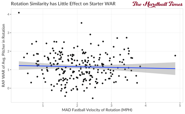
The correlation coefficient of -.039 here not only is weak, but it also opposes Rosenthal’s hypothesis. The negative sign shows that as similarity increases, RA9-WAR increases. But again, the relationship is so weak as to be meaningless.
In case linear regression was playing tricks on me, I turned to Bayesian inference and asked: Given a rotation with very similar fastball velocities (MAD less than 1.0 mph), what is the probability the average starter in that rotation exceeds 1.13 (the median) RA9-WAR? I calculated this probability for all similarity buckets in the data set:
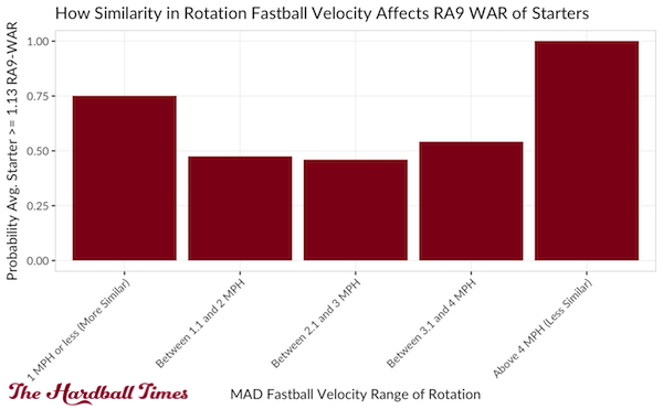
At first glance, the data vindicate Rosenthal’s hypothesis. The least similar rotation in the data set has the highest chance of its members exceeding 1.13 RA9-WAR. (This rotation is the 2011 Dodgers, whose members I described above.)
But consider the 2011 Dodgers are only data point we have of such a diverse rotation. As you can see in the scatterplots above, no other rotation in the dataset has a MAD above 4.0 mph. Are you comfortable making decisions based on one data point?
I’m not. I’d much rather look at multiple data points, meaning the three other bars in the chart. These bars tell me that pitchers in similar rotations have a much better chance of earning at least 1.13 RA9 WAR than pitchers in diverse rotations. This conclusion goes against Rosenthal’s hypothesis.
Conclusion
Rosenthal was certainly right about one thing — the Astros had a very similar rotation last April. But there was probably more to it than velocity — velocity isn’t everything, after all. When it comes to fastballs, pitchers have different rhythms, motions, arm slots and release points that all contribute to upsetting hitters’ timing. Pitch location is also key. Similarly, off-speed and breaking pitches play large roles, as well.
The Astros struggled in April 2016 for several reasons. Their rotation’s ERA was indeed terrible. And the pitchers in that rotation indeed threw fastballs at similar velocities. But in trying to connect these two dots, we find that the data don’t provide any evidence of a relationship.
If there is something to this, maybe it would show up in this way:
Whoever pitches the first game of a series should be fine, but once batters have had a look at him his clones pitching in games 2-3 might show a bit worse performance.
I think the way to look at it is if the team used a pitching machine. Even if you programmed the pitching machine to be the equivalent of Randy Johnson in all his nastiness, if the programming never changed the opposing offense would make the necessary adjustments and hit much better. The pitching machine would be pitching identically but would be less effective.
I think the problem is not as much as if all the starters have the same velocity but if they have similar overall pitching styles. If all the starters had a 91 mph fastball but one relies on pinpoint control, another on a curveball, another on a slider, and another on a split finger, that’s a lot different if they all throw a standard fastball/slider/change-up combination in roughly the same way. The pitchers may be effective pitchers individually, but if they are too similar they get the anti-synergy of familiarity. One pitcher becomes the practice for the next one and will make all them at least somewhat worse.
Whether this applies to the Astros I know not.
If I were a power pitcher I’d want to follow a knuckleballer. Keep ’em guessing.
In April of 2016 the Astros pitchers had a BABIP of .321 and a HR/FB% of 16.5. Thus they had a terrible ERA but a top ten xFIP (4.03). For the rest of the season they had a BABIP of .304 and a HR/FB% of 12.0 a top ten ERA (3.92).
It’s almost like people who are advanced stat illiterate say stupid things about small sample sizes to fit narratives.
Couldnt it maybe more the soft tossing than the similarity? The mets rotation is also similar, they all throw mid to upper 90s and when healthy they have been effective.
Generally throwing harder is more effective. In some years a soft tossing rotation can work but I would see that as a lot of luck accumulated ( 2 or 3 guys having babip luck in the same year).
It must be someone who either knew that they have been in stock and followed the truck or in another way has known what was in the boxes