Update to the Spray Chart Tool (now with Strike Zone plot)
If anyone was lurking on my interactive spray chart tool, they might have seen a new tab: Spray and Strike Zone Plot.
This is a brand new feature officially rolling out today. It takes a spray chart for a given player and places it side-by-side with a plot of the strike zone so that you can see the horizontal and vertical location of each pitch that led to each of the batted balls on the spray chart. Both plots are interactive and can be filtered using the various options, or you can simply click and drag over either plot to highlight certain pitches and hits. The table running below will provide summary information for the data selected or filtered, including average distance and angle of the batted ball, average velocity of the pitches, etc. Remember, this is not perfect data, so there will be some measurement error and some odd data points (e.g. a home run that appears to only travel 200 ft.).
What can you do with this tab? Here are some examples.
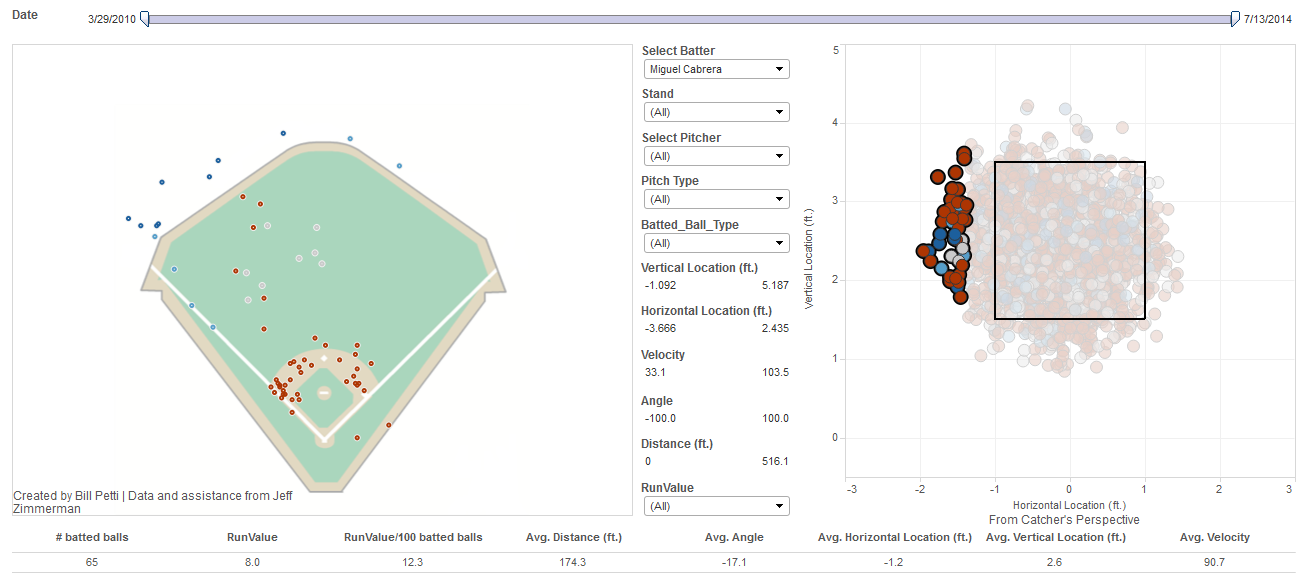
Want to see where in the strike zone all of Migual Cabrera’s home runs this year were thrown? No problem:
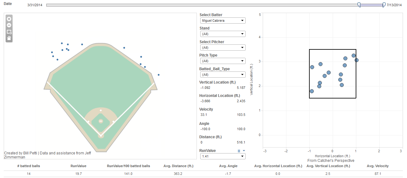
Want to highlight an area of the strike zone and see where those balls are hit by Miggy? Why not:
Want to see the pitch location of all of Joey Votto’s pull-field home runs since 2010? Sure:

Want to see how Mike Trout does when swinging at balls lower than the bottom of the strike zone? Here you go:

Those are just a few examples.
And remember, the tool has four other tabs in addition to this latest one that you can use for different purposes (here’s the original roll-out article for reference):
Park Comparison: Compare batted balls between two or more ballparks
Batter Comparison: Compare batted ball performance between two hitters over the same time period
Pitcher Comparison: Compare batted ball performance between two pitchers over the same time period
Player – Year to Year: Compare batted ball performance for the same hitter across different time periods
As always, all feedback is welcome.
Enjoy!
Fantastic work, as always. For the next iteration of the tool, would it be possible to select pitcher handedness as a button? It would be interesting to see if certain hitters have significantly different spray charts for right vs. left handed pitchers.
Thanks, and yes I am working on pulling pitcher handedness in
This feature is now live on all views.
Great, thanks!
I am very interested in learning how to do this in Tableau. My company wants me to learn Tableau so I’ve been using it as a tool to mess around with baseball stats.
I have a few questions:
1: is the data you use easily available. I haven’t had much getting Pitch/FX data in a way I can use it.
2: How are you plotting these data points in Tableau?
I believe the answer to No. 1 is the proprietary database THT/FanGraphs uses. We present most of the data in less raw formats on FanGraphs, but I think the level of detail required to recreate this kind of Tableau is not available publicly. :/
awesome! is it possible to reduce the pulldown menus so that they only show options that have data points (ie pitch types)
Tremendous work, Bill. My one suggestion would be to add a pitch type legend somewhere for reference. Some of the two-letter abbreviations are simple and common enough to decipher, but others have me scratching my head as I try to figure them out. Thanks for sharing this!
Nice Post, very useful information, not available in Spanish.
Mariah Carey