Visual Baseball: A (New) New Look at MLB Standings
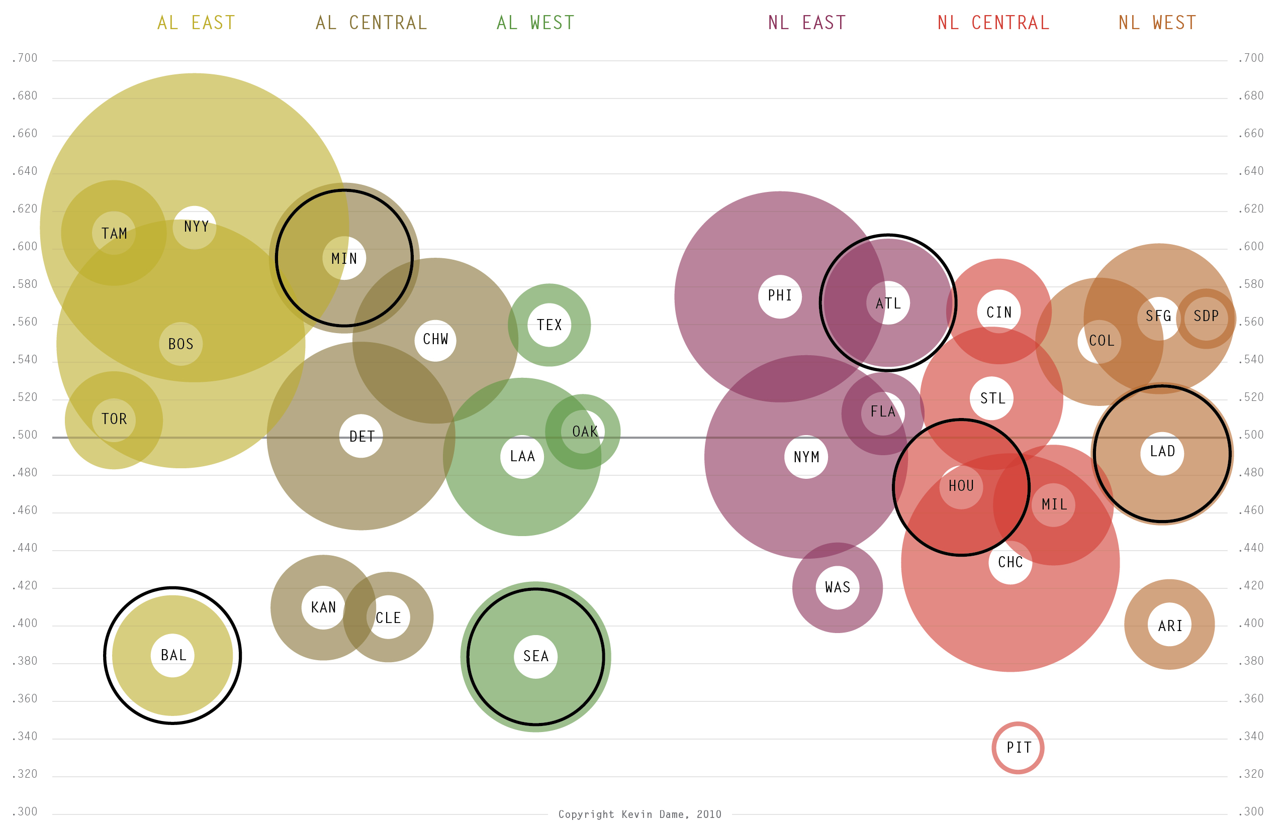
After yesterday’s post I got some neat suggestions to improve the visualized standings, so here are two improved approaches. In this first approach, I used a suggestion to hollow out the colored circles to put more emphasis on each team’s winning percentage. I think it helps a lot. I also tried to cluster the AL and NL a bit more. For your edification, teams are plotted vertically by win percentage (updated today) and team payroll depicted by circle size. Within each division I’ve selected one team whose payroll is closest to league average (depicted with a solid black line).
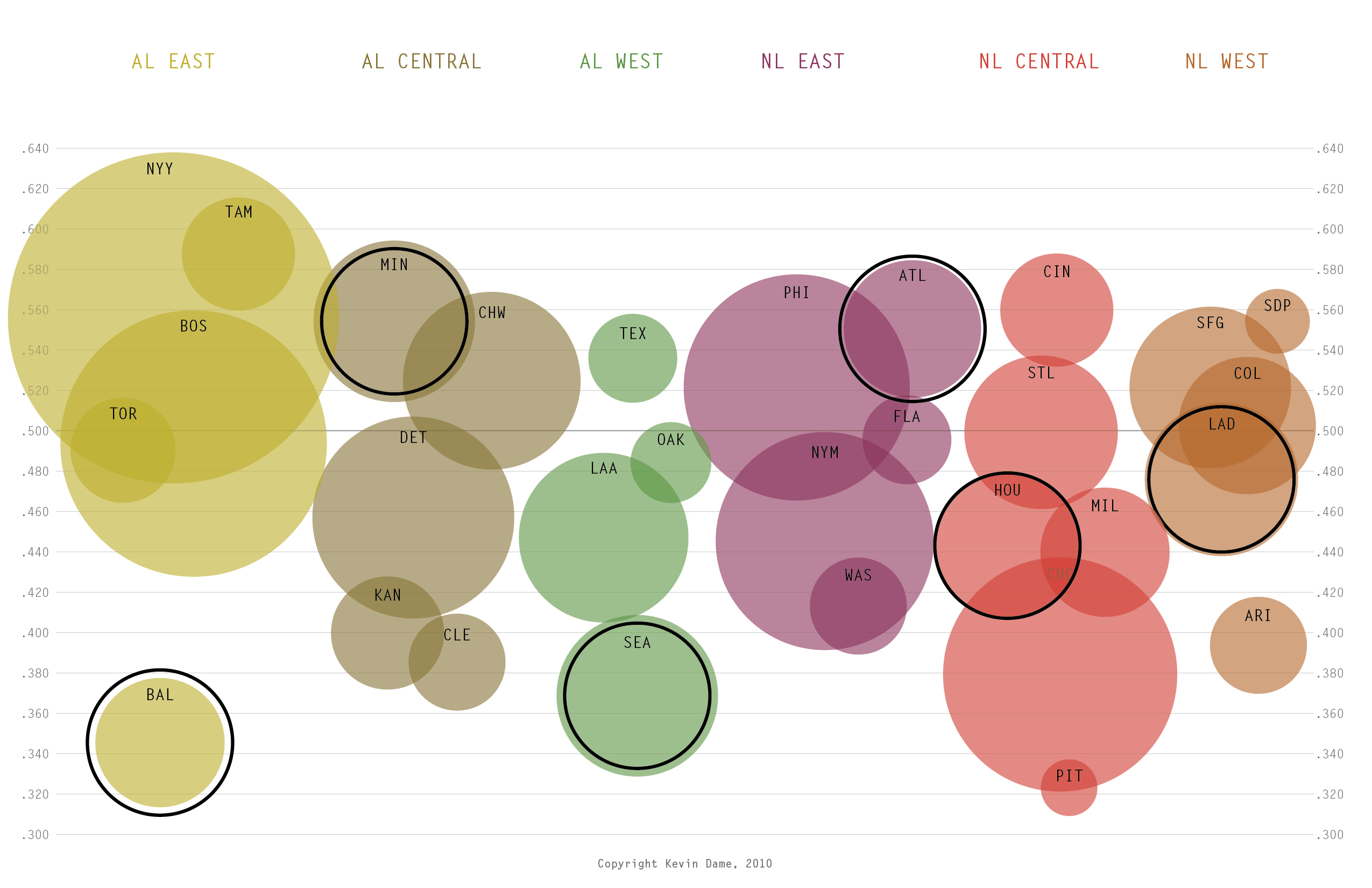
 This second approach aligns the top of the circles with each team’s winning percentages…
Kevin Dame is a writer and visual designer who brings sports information to life in new and meaningful ways. Visit his website and follow him on Twitter @kevintdame.