Visual Baseball: Introducing PayScale
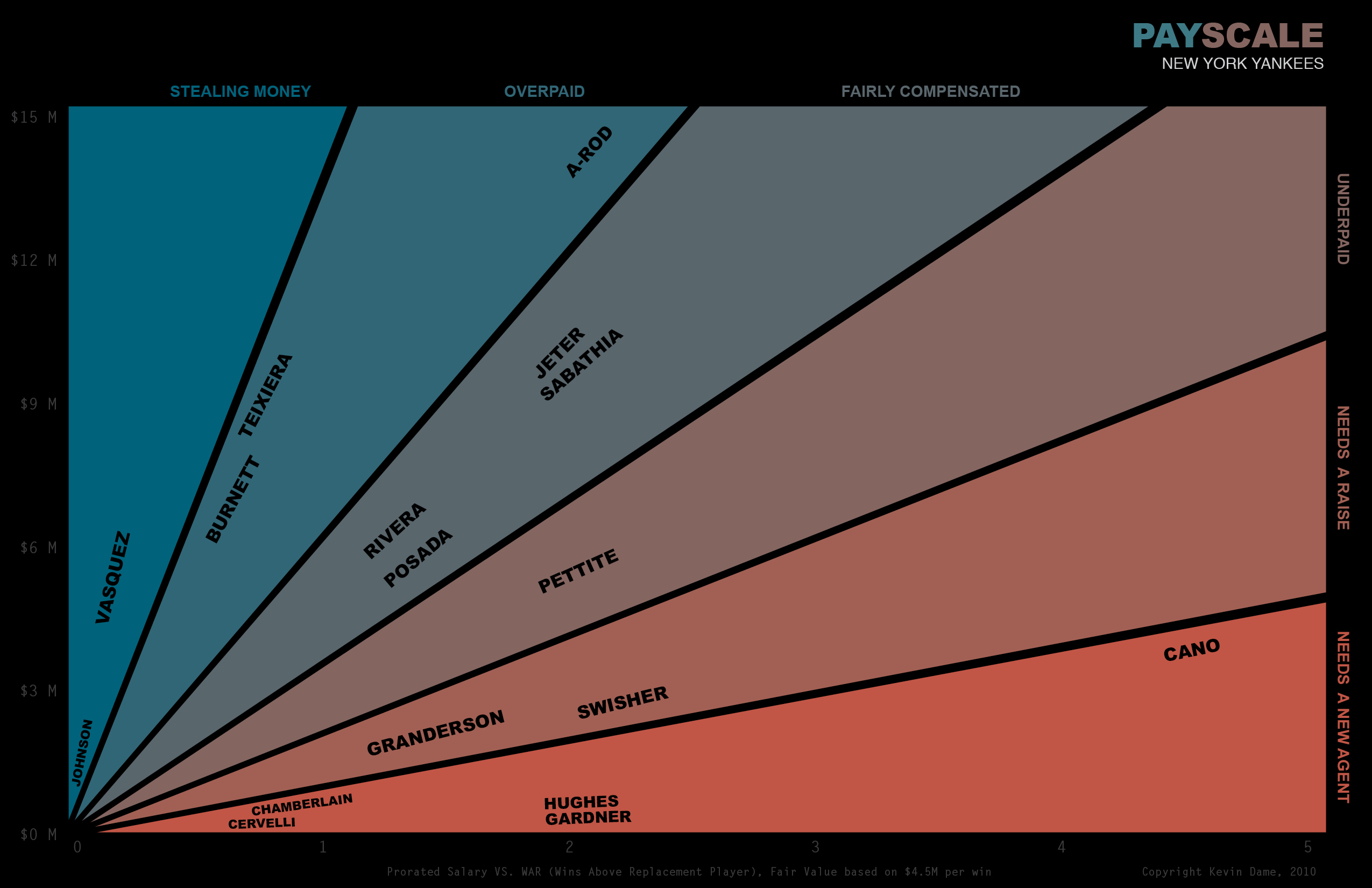
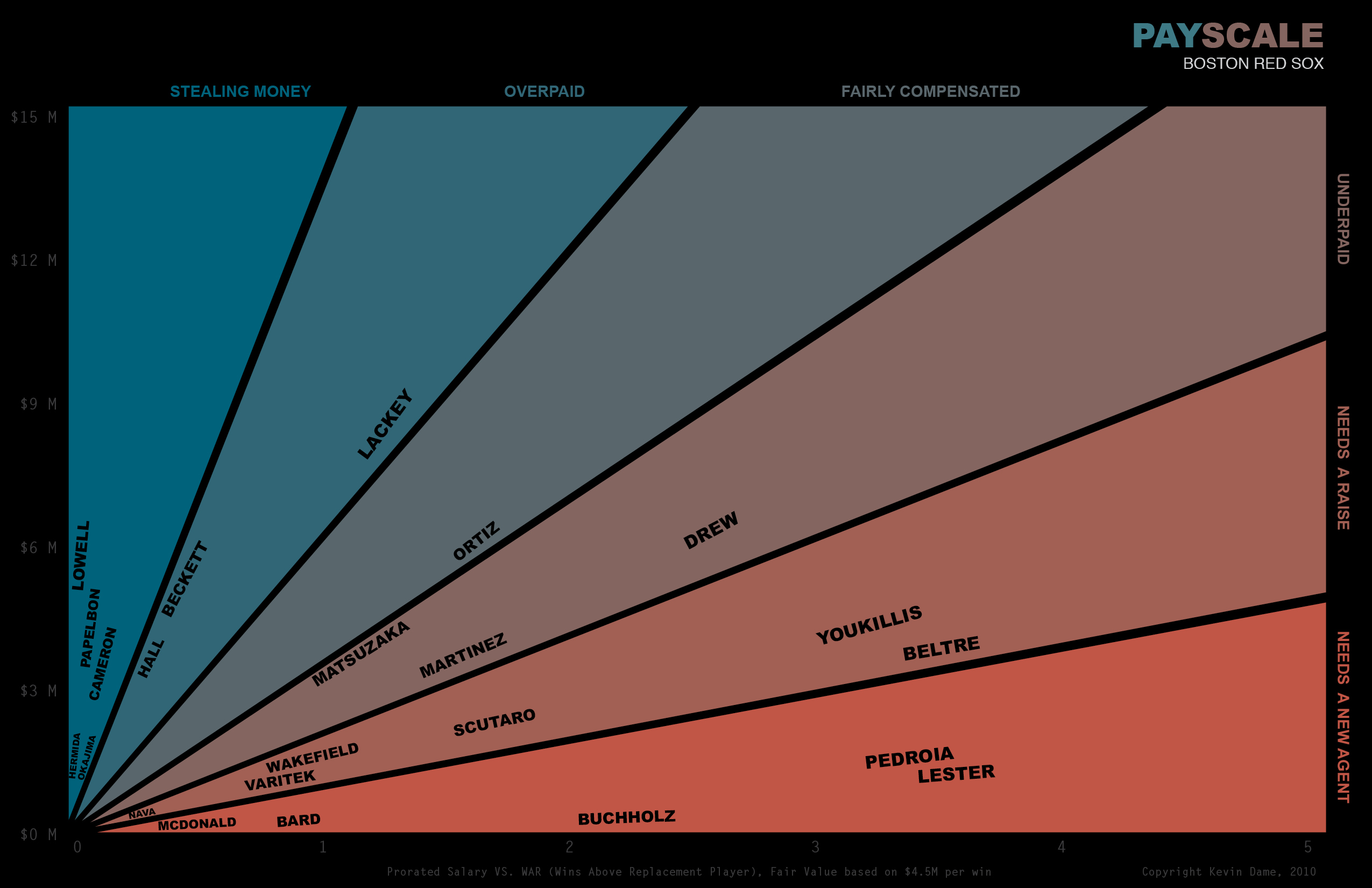
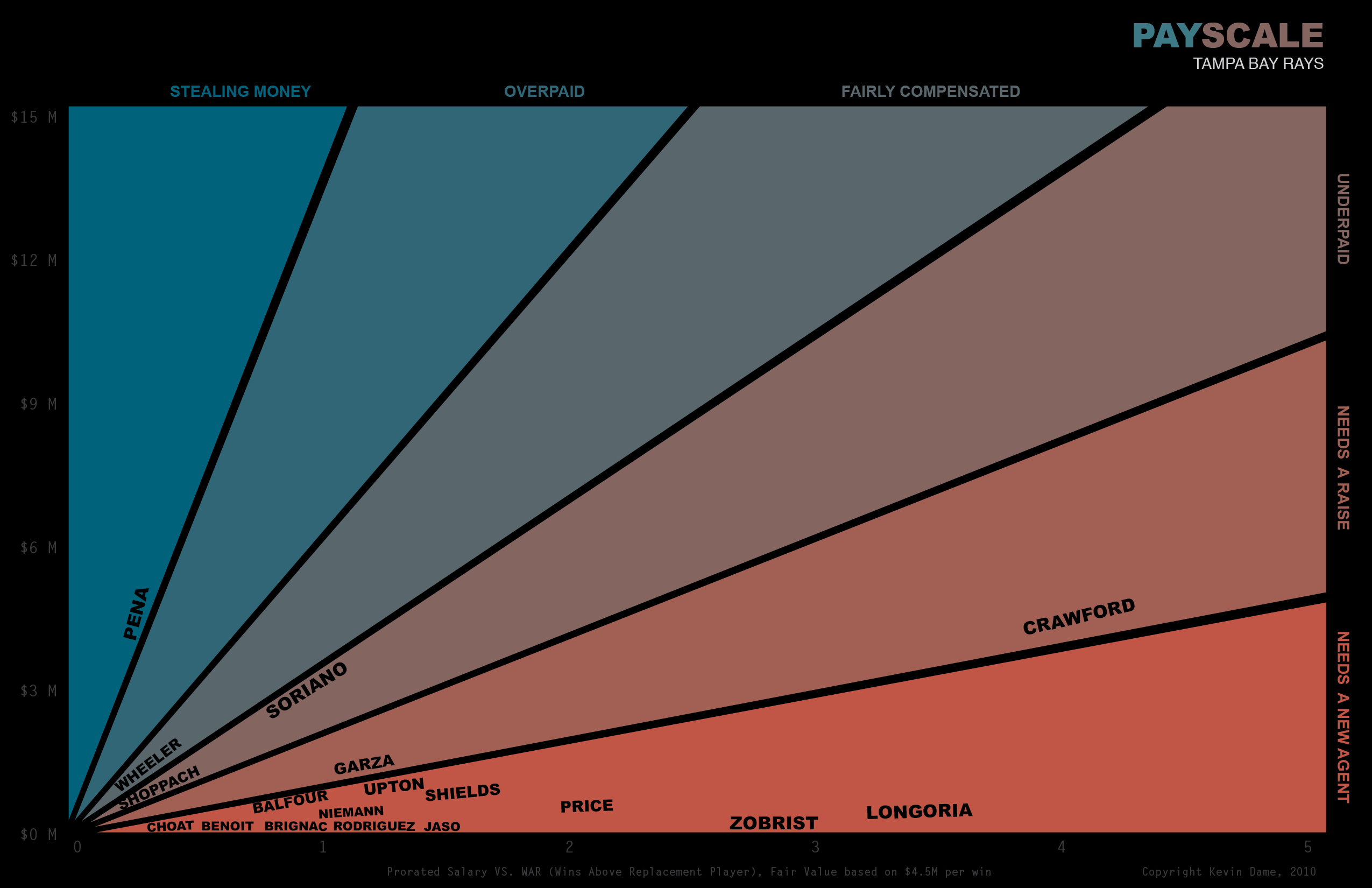
Happy Friday everyone. After a long week and a hard-earned paycheck, let’s take a look at who’s earning their paychecks in MLB. PayScale plots prorated salary (Y axis) against WAR (X axis) and uses a rough baseline of $4.5M per win as “fair compensation.” Players which a higher $/win are classified as overpaid, while players with a lower $/win are classified as bargains.
Here’s a look at two big market teams – the Yankees and Red Sox. Some things that catch my attention: For the Yankees, it’s the rock-solid value (still!) of their old guard of Posada, Jeter, Rivera, and Pettite. For the Red Sox, it’s the tremendous value they’re getting out of Youkilis, Lester, Buchholz, and Pedroia (Boston’s younger version of the Yankees’ old guard).
 Here’s a look at the Rays, who fare much better than their AL East competitors (not surprising since they have similar production with a much lower payroll).
It would be nice if the scales on each axis were brighter.
It’s pretty great for the Rays that Longoria is on the “Needs a new agent” tier. Monster is on the high end of the Underpaid scale, though? I would have never guessed. I’m guessing this doesn’t account for the $50M or whatever that the BoSox had to pay out to talk to him, though
This is a really cool way to view salary data! However, what I’d really like to see is each section of the pie adjusted for it’s density so you could compare teams to each other. For example make the stealing money and overpaid sections of the DRays chart very small/noneistant but have the same section for the Yankees be quite large.
That way we could compare not only within team but use it to compare the teams to each other.