Visual Baseball: Yankees-Twins CASHCLOUD
I know this is the time of year when we put salaries and contracts aside and just play some ball, but I can’t let it rest. Until baseball corrects the vast payroll disparities between teams, I’m going to keep making CASHCLOUDS. And probably for a long time!
Kevin Dame is a writer and visual designer who brings sports information to life in new and meaningful ways. Visit his website and follow him on Twitter @kevintdame.
Yawn. Let’s see the cloud for Twins v. Cubs, Twins v. Mets, Twins v. Red Sox, Tigers…etc. It proves nothing. If you want another way to graphically make excuses why the Twins continually cannot compete with the Yankees, at least jump on the bandwagon of those rehashing Hunter Wendelstedt strike zone from game 2.
Very cool toy. Now how about juxtaposing baseball salaries with other professions?
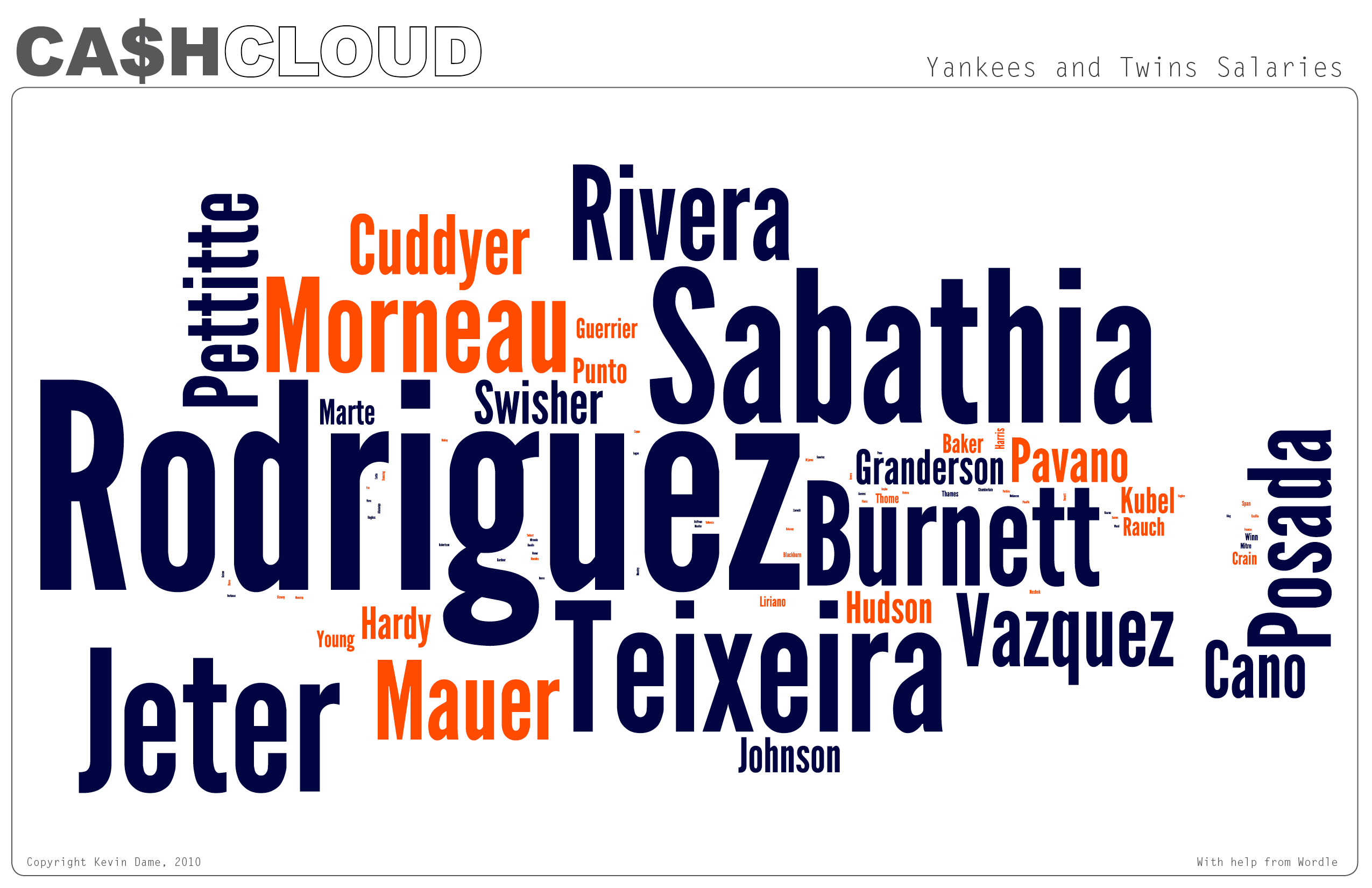
This graph is misleading if the goal is to meaningfully compare salaries. Take A-Rod vs Morneau, for instance. Rodriguez makes roughly twice as much as Morneau; his name in the graph should therefore appear twice as large. However, it is twice as high and twice as wide, so the area is four times the size of Morneau’s name, which is misleading. In other words, the sizes of the names are changing in two dimensions, whereas the salaries are only changing in one dimension; the second dimension is illusory. This graph makes it seem like A-Rod is making more than the entire Twins team, which is certainly not the case. This problem is one that is criticized by Tufte, whom you quote.
That’s what I get for using wordle, which Tufte probably hates. I’ll have to start creating these word clouds myself. For now, lets view them as “gestural.”
No worries, Joe Mauer will look nearly as big as ARod on this chart next year. I’m sure that means my Twins will perform better!!!
🙁
Instead of a cloud, display this as a list in order of size. That’ll really make the juxtaposition show up …