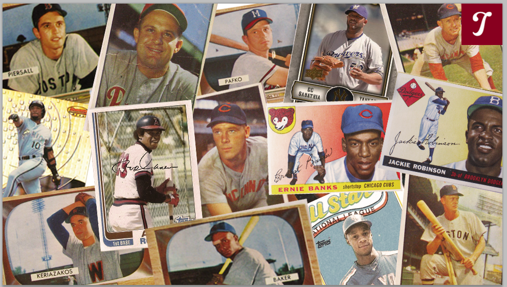
Card Corner Plus: The Simple Style of 1969 Topps
(via Michelle Jay)
If you’re my age, or perhaps older, I’m about to make you even more conscious of the date listed on your birth certificate. As difficult as it is to believe, it was 50 years ago that we lived through the season of 1969, one of the most enduring in the game’s history.
That was the year that Major League Baseball celebrated the 100th anniversary of the professional game, an homage to the Cincinnati Red Stockings of 1869. It was the season in which the entrance of four expansion teams motivated the decision to change the structures of the American and National Leagues and create four divisions, an East and a West for each league. A major rule change lowered the pitcher’s mound from 15 to 10 inches, following the historically low run-scoring environment of 1968.
It was also the year in which MLB adopted its now famous logo: the red, white and blue scheme that featured the silhouette of a batter. (For many years, it was believed that Harmon Killebrew was the model for that silhouette, but that urban legend has since been debunked by the creator of the logo.)
For the first time, pennant races were replaced by divisional races. They now fed into a Championship Series, a best-of-five format that many players felt created even more pressure than the World Series. And it ended with one of the unlikeliest champions in major league history: the “Miracle Mets,” a band of overachieving players led by the inspirational Gil Hodges.
As iconic as that season has become, it is not a time that is particularly well-remembered for its annual release of baseball cards. The 1969 Topps set has drawn its share of criticism, mostly for its re-use of old photographs, some of which were recycled from two or three years earlier. This was forced on Topps by the refusal of the Players’ Association to let its members pose for new photographs during the spring of 1968 and during the ensuing regular season. Led by their association’s executive director, Marvin Miller, the players were unhappy with what Topps was paying them. The strategy would eventually lead to a new deal between the players and the Topps Gum Company.
The use of the old photos is a legitimate criticism of ’69 Topps. But I have a fondness for the set, largely because of its design—or perhaps thereof. There is no clutter of banners or striping; all that exists is the team nickname in plain lettering (without any obscuring background) at the bottom of the card, along with a colored circle featuring the player’s name and position, either in the upper left-hand or right-hand corner of the card. And that’s it. The rest of the card is given completely to the photograph. Although many of the photos are dated, they are usually clear close-ups of the players, giving us a good look at their facial features and mannerisms. With these cards, there is a beautifully minimalist simplicity in which the photos are allowed to breathe—and given every chance to occupy our attention.
As with any set, 1969 Topps has its share of intriguing cards, notable for their color, their mismatching uniforms and team names, and yes, even their mistakes. Included is a famed “backwards card, along with one of the most famous error cards of all-time which has long created debate among collectors and fans.
Let’s take a deeper look at ’69 Topps through this smattering of samples, presented in numerical order.
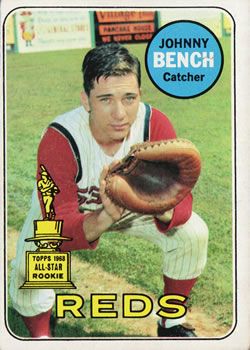
Johnny Bench (No. 95): One of the most desirable cards from the set, this was not Bench’s rookie card—that came in 1968—but it was one of the first two cards in which he did not have to share space with a fellow player. (Bench also appeared on a 1969 All-Star card, sponsored by The Sporting News.) I like this card for so many reasons. First, while we tend to remember Bench for his association with the “Big Red Machine” of the 1970s, this gives us a rare shot of a much younger Bench wearing the sleeveless, pinstriped jersey that the Cincinnati Reds used during the 1960s. With no mask or helmet in evidence, the card also gives us a good look at a Bench as he somewhat glumly eyes the camera, all while squatting in a catching position on the sidelines.
The card has two other attributes worth mentioning. In the background, we see an abundance of advertising signage on the left field fence, something that was prevalent at so many ballparks in the 1960s. (I believe this photograph was taken at the Reds’ spring training site in Tampa, if only because the advertising doesn’t match the outfield signs that Crosley Field sported back then.) And then there’s the presence of that wonderfully colorful Topps All-Rookie trophy, in its glorious and gaudy yellow. All the way around, this is a classic card that is emblematic of its era.
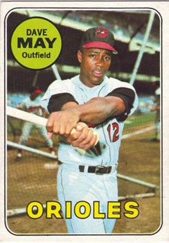
Dave May (No. 113): This is one of my favorite cards in the set, taken during batting practice prior to a game at the old Yankee Stadium. Usually, when players pose with their bats on the sidelines, we see the player holding the bat upright as he pretends to wait for a pitch, or at the finish of a simulated swing. This one is different. Here we see Dave May replicating the middle part of his swing, with a good view of his wrists turning over, to the point that his arms cross over each other. From this angle, we can see the strong muscle development in May’s biceps. This is exactly how I remember May, a brawny player with the build of a fireplug.
The May card does inspire one question: Who is his Baltimore Orioles teammate in the background, the one in the batting cage? It appears to be an African-American player or a player of Latino descent. Given his slender build, I don’t believe it’s Frank Robinson. If the photo is from 1966 or 1967, it could be Paul Blair or backup outfielder Sam Bowens. My guess is Blair, who also appeared on his own card in 1969.
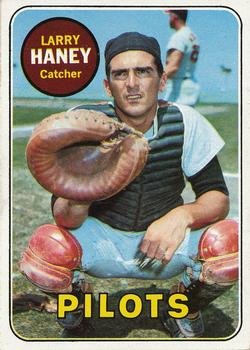
Larry Haney (No. 209) Benny Distefano and Mike Squires are the two most recent left-handed catchers to play in the majors. If you think that Larry Haney joined them in achieving this oddity, I am sorry to disappoint. Haney was a right-handed thrower through and through, and never attempted to catch left-handed in a game.
So why does Haney’s 1969 card show him with his catcher’s mitt on his right hand, instead of his left. A number of years ago, I heard a theory advanced by some collectors that Haney was trying to muster some publicity for himself by posing as a left-handed throwing catcher. After all, he was a backup, one who couldn’t be blamed for seeking a little bit of fame. That seemed plausible to me.

Well, the theory is not true. In 2002, when longtime Topps executive Sy Berger visited the Hall of Fame to participate in a celebration of the card company’s 50th anniversary, I asked him about the Haney card. He said that Haney had nothing to do with the error; it was simply a mistake in the processing of the photo. Somehow the negative became reversed, producing an unusual-looking card. It was reminiscent of what famously happened in 1957, when Topps reversed the negative on Hank Aaron, making him appear to be a left-handed hitter. (Upper Deck would repeat this mistake in producing a reversed Dale Murphy for the company’s inaugural set of 1989.)
For added proof, Haney’s 1968 Topps card has the same photograph, only this time it’s laid out correctly, and not in reverse. By the way, Haney is wearing the uniform of the Baltimore Orioles in both photographs, even though the ’69 card designates him as a member of the expansion Seattle Pilots.
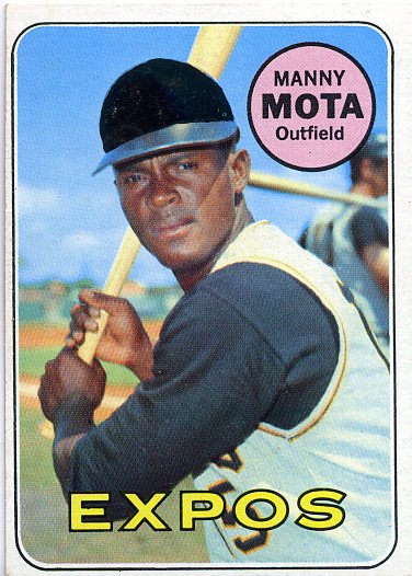
Manny Mota (No. 236): Due to the entrance of four new teams to the league, none of which had even gone to spring training by the time the 1969 Topps cards hit drugstores, it was not possible to photograph players wearing the new uniforms of the Royals, Pilots, Expos and Padres—at least not for the first two series of the ’69 set. Manny Mota’s card illustrates the problem. Mota is clearly wearing the colors of the Pittsburgh Pirates, the team he played with from 1963 to 1968. So Topps blacked out the crown of his cap, obscuring the Pirates’ logo, and used a photograph from a side angle, which hid the team name on the front of the jersey. The photograph is likely one from spring training in 1967, or maybe even 1966, due to the mandate given to players not to pose for new shots in ‘68.
Although Mota started the 1969 season with his new team in Montreal, and thus became an original Expo, he didn’t last long there before moving on. On June 31, after he appeared in only 31 games for the new franchise, the Expos traded him to the Los Angeles Dodgers for Ron Fairly and Paul Popovich; he would remain with the Dodgers for the rest of his long career. As a result, you won’t ever find Mota on a Topps card wearing the colors of the Expos.
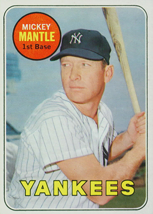
Mickey Mantle (No. 500): It was no accident that Topps’ Sy Berger gave Mantle No. 500 in the ’69 set. Berger liked to assign round numbers to stars, and 500 seems most appropriate for a player who had only recently joined the 500-home run club.
“The Commerce Comet” didn’t actually play in the major leagues in 1969, but Topps assumed that he would after he announced that he intended to report to spring training in Fort Lauderdale. Mantle always claimed that he hadn’t made up his mind about whether to retire at the time of his arrival in Fort Lauderdale. But shortly after he reported to camp, it became obvious to him that his body would not allow him to continue.
On March 1, the Yankees arranged a press conference. “I’m not going to play baseball anymore,” Mantle told the media. “That’s all I know. I can’t play anymore. I don’t hit the ball when I need to, I can’t steal when I need to. I can’t score from second when I need to.”
For collectors of Mantle memorabilia, it’s a bonus to have the extra card, one last chance to see Mantle on Topps cardboard. Even in the latter stages of his career, Mantle looks good, still handsome and in possession of a muscular, toned physique. One feature to the card that seems odd is his listed position of “first base,” which doesn’t seem quite right for a player remembered as one of the greatest center fielders of all time. But the listing was accurate; Mantle appeared in 144 games in 1968, with 131 coming at first base and the rest of the appearances as a pinch-hitter. He didn’t play a single game in the outfield. In fact, Mantle last played a game in the outfield in 1966.
The 1969 Mantle is also a nice collectible because of its relative affordability, at least in lower grade condition. While the ’52 Topps Mantle remains the gold standard in the hobby, a ’69 Mantle can be obtained without having to secure approval for a bank loan.
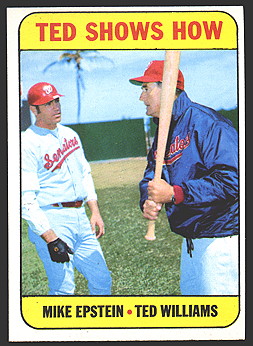
Ted Shows How (No. 539): As it so often did during the 1960s, Topps included a subset of “combination cards” with its 1969 issue. Most of these combo cards featured two or more players, but this one is a little different; it gives us a candid, cross-generational view of Ted Williams as manager of the Washington Senators instructing a young Mike Epstein. In windbreaker mode on a cool day in spring training, Williams seems to have the full attention of Epstein, who would have his best season in 1969 while playing for the Senators.
The card is particularly interesting (and ironic) because Williams and Epstein sometimes butted heads, on both hitting and general baseball philosophy, but Epstein evolved into a strong disciple of Williams and his batting methods. Epstein now operates a hitting school in which he espouses many of the theories Williams once taught him.
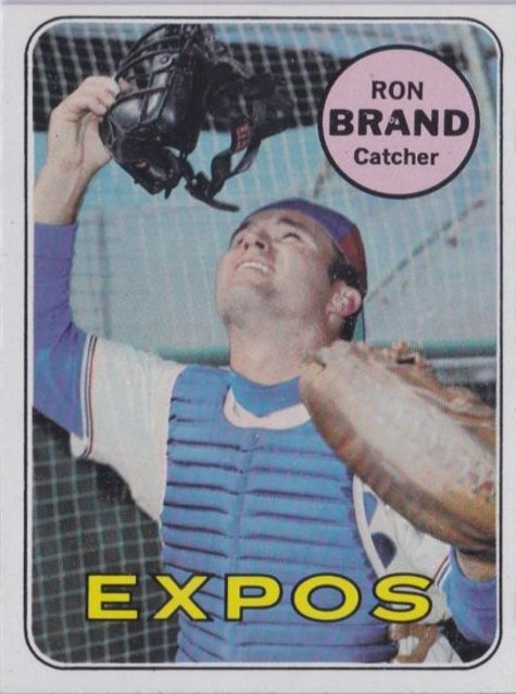
Ron Brand (No. 549): Like the Bench and May cards, this is a personal favorite from 1969 Topps. Taken during the spring of ’69 in Lake Worth, Florida, and in full contrast to the Mota and Haney cards, this is a photo of the Expos’ catcher wearing his new colors—including a bright blue chest protector and the red, white and blue Expos cap. Brand deserves an Academy Award for “best effort on a posed baseball card.” With his mitt stretched to his left, his head turned skyward, and his face mask held carefully in his right hand, Brand is doing his best to convince us that he really is tracking a pop-up behind the plate. Of course, we know that’s not the case, not with the batting cage in close proximity, but Brand’s simulation is about as good as it gets in the history of Topps.
The presence of the cage, along with the blue sky uninterrupted by any kind of grandstand, smacks of spring training in Florida. When you live in the frigid northeast, it’s exactly the kind of card you like to see as you anticipate a new season of baseball.
Brand was a relatively obscure player, a good receiver with no power (only three home runs in 1,500 career plate appearances). Other than 1969 with the Expos and 1965 with the Houston Astros, he spent his career as a backup catcher and utility infielder with non-contending teams. But he’ll always have a special place in Card Corner’s heart, thanks to the effort he put forth in helping create his 1969 Topps card.
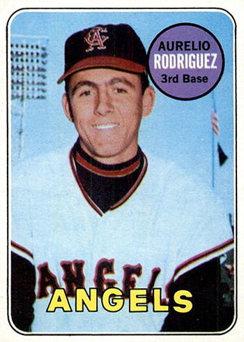
Aurelio Rodriguez (No. 653): Over the years there have been a number of cases of mistaken identity on cards, but none more famous than this one. In 1969, Rodriguez was set to appear on a Topps card for the first time in his career. But when the card came out, it didn’t show Rodriguez, but rather someone who was not even a player with the California Angels.
Few collectors even noticed—at least initially. It was not until a few years later that researchers finally determined that the photograph depicts Leonard Garcia—who was the Angels’ batboy in 1968.
So what happened here? For many years, it was suspected that Rodriguez had pulled a prank on Topps, intentionally having Garcia sit in for his photo opportunity. But here’s what really occurred, as uncovered by noted baseball card historian and collector Keith Olbermann. With the major league players instructed not to pose for new photographs throughout 1968, Topps had to scramble to come up with images for the new set. Topps decided to purchase several photographs of Rodriguez from photographer George Brace. The purchase apparently included a photo of Garcia, which was unknowingly included in the Rodriguez file.
Someone at Topps mistakenly picked the photo of Garcia for the 1969 set. In retrospect, the mistaken identity is more than understandable. Rodriguez, who died in 2000, was a light-skinned Latino, as is Garcia. In 1968, when the photograph was taken, the two men shared some facial resemblance. Rodriguez was not yet a well-known player—he had played only a part-time role for the Angels in ’67 and ’68.
As it turned out, the real Rodriguez would have to wait until 1970 to actually appear on a Topps card for the first time. As for Garcia, he would make his second appearance on a baseball card in the 1980s, when he became a trainer for the Salt Lake Gulls of the Pacific Coast League.
These eight cards give us a small glimpse into the window of 1969 Topps, with all of its airbrushing, its efforts to pass off old photos as newer ones, its mistakes, and its general quirkiness. When discussing the greatest sets produced by Topps, few collectors will put the ’69 edition anywhere near the top of the list. But in my mind, it’s an underrated set of simplistic charm, and one that offers an education into the game’s new expansion class and an early effort by Marvin Miller to gain some credibility for his new union of players.
Great article Bruce, as always. On the Williams/Epstein card, it appears Williams is teaching Epstein how to “choke up” which is odd considering that Epstein was more of a slugger type. As for the historic uniqueness of the ‘69 season, don’t forget that it was the ‘69 Pilots and Jim Bouton that gave us “Ball Four” published one year later and introduced many young fans (myself included) to MLB’s R rated off field antics.
Ted Williams said (at least I read in his books) to choke-up slightly with two strikes and do not pull the ball.
Also, Williams had little confidence in Epstein vs. lefties which put Mike in a first-base platoon with Frank Howard during their Senator years.
Bruce, next time you see Mike Epstein please ask him if Williams held out hope and offered encouragement to Epstein about potential improvement vs. southpaws.
I never knew about the MLBPA boycott of Topps in 1968. Helps to explain a lot of the bad looking cards in 68 and 69. A lot of the pictures were 5 or more years old. Tommie Aaron is the same picture as his 1963 card.
Wonderful, informative article as always Bruce. I like the explanation that the Union had a boycott of Topps which was why this set had so many old photographs. My favorite was the Ernie Banks’ 1969 card was the same as his 1968 card just slightly cropped. I had always thought it was an example of subtle racism, and am glad that there is another explanation.
The only baseball card I ever bought outside of the traditional packs was a ’69 Bob Gibson. I was ten. 30+ years later I still have it.
Another nice article. I’ve taken to collecting the Topps Heritage sets and of course the 2018 season was a 1969 throwback. I agree it wasn’t my favorite series but these Heritage series are a lot of fun for nostalgia. To anyone who has gotten away from collecting the Heritage sets are a great way to go.
Only thing I don’t like about heritage series is that they don’t assign the best numbers to the stars as you describe with Mantle. Topps did a great job in the original series assigning the best numbers to the best players. Is this not allowed anymore in their contract with players association ?