Card Corner Plus: The Vivid Beauty of 1963 Topps

1963 Topps cards have been lauded for the quality of the photos. (via Michelle Jay)
Having been born in 1965, I missed out on Topps’ wonderful 1963 set the first time it made its way into pharmacies and stationery stores. Even today, I have very few of the 1963’s in my collection, mostly due to cost considerations. But that doesn’t lessen my admiration for one of Topps’ most intriguing and vibrant sets of the 1960’s.
Given that 2018 marks the 55th anniversary of 1963 Topps, it seems like an especially appropriate time to take a deeper dive into a set that represented a major step forward for the company, which was still only in its first dozen years of producing baseball cards. While opinions vary, I think the 1963 set is one of the best Topps has ever produced. It was also groundbreaking, signaling a strong decade of cards. While some of Topps’ earlier sets had attractive designs (like the 1962 wood-bordered set), those cards were darker, lacking the vibrant color or the eye-catching nature of the ’63 set.
In 1963, Topps gave us two photographic images on the front of the card, something it would not do again for 20 years. The base photograph, in full glorious color, occupies about 80 per cent of the card. A secondary black-and-white inset photo occupies the lower right-hand corner. The smaller photos often show players holding a bat or a glove, or in some cases, capture them in game action.
Even with the black-and-white images, there is plenty of color to be found in 1963 Topps. The black-and-white shots are framed in a colored circle — blue, orange, red, yellow or green. The player’s name, position and team are near the bottom of the card, set against a wide band that’s colored to contrast with the circle enveloping the smaller photograph.
All this creates a three-pointed, multi-colored card. Combined with the vividness of the photography that Topps produced throughout this set, these design features make the ‘63 cards quite striking. The color and design combine to form a classic set.
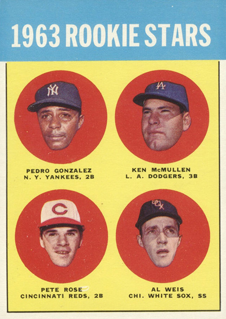
Collectors interested in the bare bones components of 1963 Topps can find two highly desirable rookie cards among the 576 in the set: Willie Stargell and Pete Rose. (Rose appears as a floating head on a card, sharing space with fellow rookies Pedro Gonzalez, Ken McMullen and Al Weis. Stargell shares a card with Brock Davis, Jim Gosger and John Herrnstein.) The high-numbered cards are in particularly high demand; Topps produced the earlier series in large quantities, before severely cutting back the final three series. That can make the high-numbered cards, especially those in the 520-570 range, rather expensive.
Of far more interest to me are the cards that stand out for intriguing qualities, rather than their price tags. Any memorable set of cards needs a complement of quirky cards, and the 1963 set has its full share.
One of my favorites is the card depicting five-time All-Star Ed Bailey, a power-hitting catcher with the San Francisco Giants. With high-speed color photography still a thing of the future, Topps could not yet rely on legitimate action shots. Instead, Topps posed players, sometimes simulating action. While some players simply went through the motions, Bailey gives a sincere effort to try to mimic his throwing motion. With his left arm and mitt extended fully toward the camera, and his right arm cocked behind his right ear, Bailey looks like he’s ready to fire a crossbow.

In recreating his throwing stance, Bailey makes sure to lock his elbow at a 90-degree angle, puts on his best fastball grip, and forms a discernible grimace on his face. It all beautifully completes the picture of a catcher who is trying to throw out a runner at second base. Of course, this is not real game action, just a player posing for the camera, but the passion that Bailey puts into it is worth some praise. That kind of effort can make an ordinary card something memorable.
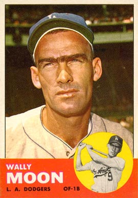
Among other favorite 1963 cards is the Wally Moon entry, which provide us with perhaps the best example of his famous eyebrows appearing on cardboard. Actually, Moon had one long, continuous, unbroken eyebrow, without any separation in the middle. (The man apparently did not believe in using a razor above the nose.) It was quite dark and very full. It was a distinctive look for Moon, one that highlighted many of his cards in the ’50’s and ’60’s, but none more prominently than in the 1963 version. The celebrated eyebrow also obscures the fact that Moon was a very good and underrated player.
Meanwhile, Cookie Rojas’ rookie card gives us an example of early airbrushing from Topps. The photograph was likely taken in 1962, when Rojas was still playing for the Cincinnati Reds. After the season, the Reds traded Rojas to the Philadelphia Phillies, who wore similarly striped uniforms. That meant Topps did not have to do much in altering the color of the pinstripes. The cap, however, did necessitate a change. Clearly, an artist at Topps has superimposed the Phillies’ maroon colors over Cincinnati’s red tones, while also adding a large ‘P’ to the crown of the cap.
The cap looks like it’s about two sizes too large for Rojas’ head. It makes me wonder if someone took a photo of Rojas without a cap, and then created the cap from scratch. It’s hard to say for sure what happened here, but the cap clearly dwarfs his head, making the young Rojas (who was 24 that year) look like he has yet to graduate from high school.


The strangest card from 1963 Topps was the one that featured a young Lew Krausse. This is a case of airbrushing gone mad. It appears that all of Krausse’s Kansas City A’s uniform has been airbrushed; the pinstripes lack the usual definition of a photograph, while the No. 4 on his jersey is a little too vivid and bright to be photographic.
The playing field and the grandstand, presumably the old Municipal Stadium in Kansas City, also look airbrushed. The grass has a bizarre two-tone nature, light green in the foreground near Krausse, but a darker green in the background. The grass doesn’t look much like grass at all. If anything, it looks like artificial turf, which hadn’t been introduced in the major leagues by 1963. We wouldn’t see turf until 1966, when the Houston Astros added the surface as a replacement to their grass field at the newly created Astrodome.

Finally, there is the odd perspective to the card. It’s hard to tell whether Krausse is standing on the grass, or magically floating above it. It’s as if we’re looking at a painting created by a young artist, maybe even a child, still trying to master the technique of perspective. All in all, it just looks odd, like nothing else in the 1963 set.
I wasn’t able to answer the riddle to this card until I stumbled upon the next year’s Krausse card. It looks similar to the 1963 version, but is clearly a photograph, with all evidence of airbrushing having been removed. The result is duller and somewhat faded in appearance, but more realistic. For whatever reason, Topps took this original photograph and added all the airbrushing to create a 1963 card with an abstract subtext.
Another 1963 card is more subtle, but quietly brilliant in its artistry. It’s the card for Tommie Aaron, the relatively little known younger brother of the great Hank Aaron. (Tommie, the first black manager in the history of the Southern League, would become a tragic figure, dying from leukemia at the age of 45.)
The photo is shot from below, rather than straight on, giving us a slightly different perspective than what we’re used to with Topps cards. Here Aaron is displaying picture perfect “catching” form, with both his glove hand and his bare hand extended upward, the fingers on his bare hand touching the edge of his glove. What I particularly like about this card is the unusual color of the sky, almost purplish. Perhaps the photo was taken before an impending storm, or perhaps Topps played some tricks with the color. Whatever the case, it gives the card a slightly surreal but still attractive quality.

In 1963, Topps continued its recent pattern of including “combination cards,” which featured multiple players, sometimes from different teams. on the same card. The “Pride of N.L” give us a rare combination of Willie Mays and Stan Musial, while the oft-used “Power Plus” shows off the duo of Ernie Banks and Hank Aaron. “Bombers Best” showcases the New York Yankees’ Tom Tresh, Mickey Mantle and Bobby Richardson. (This is not meant as an insult to Tresh or Richardson, both fine players, but these are not the first players that come to mind in association with a player like Mantle.)
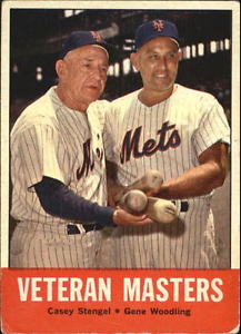
“Veteran Masters” is particularly interesting, giving us a view of two former Yankees, Casey Stengel and Gene Woodling, now employed by the expansion New York Mets. Woodling, who played his final major league season with the Mets in 1962, would not return to the playing field in ‘63.
Of all the combination cards in 1963, my favorite is the one labeled “Buc Blasters.” Rather than showcase the standard two to three players, this card gives us a good view of four standouts with the Pittsburgh Pirates: Smoky Burgess, Dick Stuart, Roberto Clemente and Bob Skinner. Only Clemente was a star, but the other three were capable hitters, albeit near the end of their careers.
The players are well posed, each with his left arm resting on his knee and his hand extended over his midsection. The bats, each pointed in the same direction, are also effective props. The only blemish to the card is Topps’ repeated insistence on referring to Clemente as “Bob,” a bad habit that would finally be laid to rest with the 1970 set.

With its combination cards, brilliant color scheme, and creative photography, the 1963 Topps set has long become a favorite with collectors. The high-numbered cards are pricey, but they are still obtainable, and if you’re willing to settle for lesser condition, they’re a reasonable purchase. Clearly, this is a set that ranks among the top 10 in the history of Topps, and a set that would foreshadow a number of very good offerings from the company in the mid-to-late 1960’s. When it came to producing a set of cards in 1963, Topps knew what it was doing.
An eyeglasses wearer since age eleven, I like the older cards and photos of the players that made the majors without the prejudice of present-day scouts against glasses…Good work Eric Sogard overcoming the poly-carbonate lens haters.
Fantastic article, as always, thoroughly enjoyable. Thanks. One point of correction….the 6th series semi-high numbered cards (447-522) carry a $10-25 low-to-high book value in NM condition, while the high numbers from the 7th series (523-576) go for $6 to $15, significantly lower.
That ‘Pride of the N.L.’ Musial/Mays card is simply amazing. Definitely one of my favorites!
Thanks for a very informative piece Bruce and for mentioning Tommie Aaron. he is the answer to a great trivia question; what brother combination has the most home runs in MLB history? You can stump many a friend (and bartender) who will invariably tell you it was the Dimaggio brothers.