Card Corner Plus: The Hall of Fame’s New Exhibit
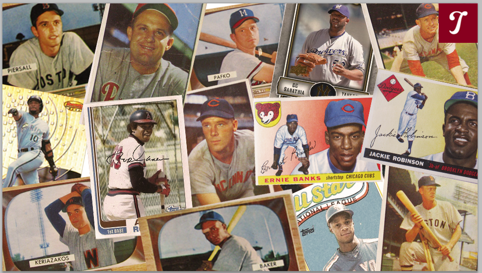
(via Michelle Jay)
It’s funny how certain events can spur interest in cards that I’ve previously treated as mere afterthoughts. Along those lines, a recent development has occurred here in Cooperstown at the Hall of Fame, where our curators unveiled a new baseball card exhibit, known as “Shoebox Treasures.” The exhibit details the history of cards, while exploring a number of themes, including the “holy grails” of collecting, the long tenure of the Topps monopoly, and the various “treats” that have accompanied cards over the years, from tobacco to Cracker Jack to bubble gum.
As fans have become aware of the new exhibit, some have generously donated part—or in some cases, all—of their collections to help the Museum fill in gaps in its own collection. (Prior to the preparation for Shoebox Treasures, the Hall had approximately 135,000 cards. Now that number is up to 200,000. Remarkable.) One particularly generous donor, a fan from Texas, gave the museum his entire collection of cards, which ranged from the late 1960s to the early 1990s. Included in that treasure trove are more than a thousand cards from the 1970 Topps set. Once we sorted through all of the duplicates (or doubles, as we like to say in the collecting universe), we realized that we had every card from the 1970 set, including each of the Hall of Famers.
In looking through those 1970 cards (and yes, it’s been fun doing so), I’ve developed a new appreciation for the set. While it’s true that 1970 Topps has its share of blurry and out-of-focus images, it also has numerous attributes. The subtle gray borders have never received the attention of the black-bordered cards of 1971, but they provide a nice, simple, and breathable framework for the cards. (They also don’t chip as easily as the ’71 black borders.) The player’s name is written in a scripted font at the bottom of the card, a nice change from the block-letter approach of past sets. And then the team name is featured in bold capital letters at the top of the card; the team names, featured in a variety of colors, really jump off the card, emphasizing the team-oriented approach that so many fans brought to the hobby. When I was collecting in the early 1970s, one of my goals was to attempt to find every player on my favorite team (in this case, the New York Yankees); the formatting of the ’70 set lends itself to such a collecting mindset.
And then there is the photography. Putting aside the unclear images, the ’70 set offered a breath of fresh air to collectors after the repeated use of old photographs during the two previous seasons of Topps. In 1968 and ’69, Topps had to rely on so many recycled photos because of the company’s dispute with the Players’ Association, and the union’s subsequent refusal to pose for new photographs. As a result of that stalemate, Topps often used photos from earlier cards, sometimes re-using cards that were two, three, or four years old. Thankfully, all of that came to an end with the ’70 set. By then, Marvin Miller and the players had reached a more equitable agreement with Topps, allowing the company to take new photographs at spring training sites and regular season ballparks.
Topps also found some creativity with the new set. While action cards were still one year away from reality, Topps resorted to something different in 1970. Topps began using more and more “candid” shots, which showed players naturally going through pregame routines while seemingly oblivious to the camera. In some cases, Topps presented us with players signing autographs for fans, or just relaxing by the cage as they observed batting practice. And on a few occasions, Topps gave us “bat rack” shots, or shots of players as they contemplated which bat to choose for batting practice. It didn’t matter that many of these photos were staged, but they still seemed far more natural than the tired photographs of position players awkwardly pretending to swing the bat, or pitchers clumsily feigning their throwing motions.
In examining the large lot of 1970 Topps, I’ve found a few new favorites cards, including one of a player at the batting cage, a couple of side-angle views, and a few cards where the background settings are just as interesting as the players themselves. Let’s take a deeper look at this Big Six from 1970:
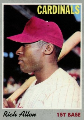
Dick Allen, No. 40: If you feel like you’ve seen this photo in another Topps set, you’re right. It was used two years later in the 1972 set, after Allen had been traded to the Chicago White Sox. But this memorable photo first made its appearance in 1970. While Allen is listed with his new team, the St. Louis Cardinals, the photograph was taken during his days in Philadelphia, with Connie Mack Stadium providing the backdrop. The Phillies’ pinstripes and the maroon-colored cap are in full evidence. What is not evident is a helmet, which would become Allen’s trademark. He started wearing a helmet in the field during his days with the Phillies, in response to having hard objects thrown at him by violent fans.
In past years, Topps tended to show players head-on, but here the photographer has given us something different, a side view of the controversial slugger as he looks away from the camera. The composition to this card is simple but offbeat, another reason to like 1970 Topps. I particularly like the extra touch of having Allen rest a bat on his right shoulder. After all, what we remember about Allen is him swinging the bat, a large 40-ounce bat.
The other point of interest is Allen’s name. He had not yet become known as “Dick Allen;” that request would come when he was traded to the White Sox. In his earliest years, he was known as “Richie,” and that’s how Topps listed him on his cards through the 1969 season. For some reason, Topps decided to switch “Richie” to “Rich” in 1970, and continue using that name for his cards in 1971 and ’72. I’m not sure why Topps did that. Perhaps it came at his request, because he hated being called Richie. Yet in 1970, he was known almost universally as Richie, not Rich.
By the way, Topps would never capture Allen wearing an actual Cardinals uniform. He spent only one season with the Cardinals before being re-routed to Los Angeles. His 1971 Topps card shows him wearing a Los Angeles uniform in a pose at Dodger Stadium, even though he had yet to appear in a game for his new team.
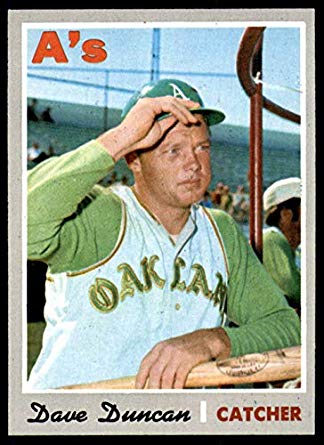
Dave Duncan, No. 678: While Topps produced a number of new photographs for its set in 1970, this spring training photo appears to be at least two years old. Notice that Duncan is wearing the gray, vested Oakland A’s jersey with “Oakland” inscribed on the front. The A’s wore that uniform for just one year, in 1968, their inaugural season in Oakland. So unless the A’s continued to use that uniform during spring training of ’69, the photo would have to be from the ’68 season.
To the right of Duncan is one of the A’s coaches or the manager; we know that because they wore white caps, in contrast to the green ones donned by the players. At first glance, I thought that it might be Alvin Dark, but he was not the manager of the A’s in either 1968 or ’69. It’s certainly not Joe DiMaggio, but it might be John McNamara, who served as Oakland’s third base coach that season and would become the A’s manager in 1970.
Of all the 1970 cards, this is probably my favorite. Observing batting practice while resting his left hand and arm on a bat, Duncan looks relaxed, and that’s emblematic of spring training, the time of year when players are most at ease. Beyond that, Duncan appears to be either tipping his helmet, or giving someone in the distance a friendly salute. How often do you see a player saluting or tipping his cap on a card? Rarely, that I can remember. This was probably staged, likely directed by the cameraman, but it just looks so natural—and cool. I love this pose.
While we tend to remember Duncan for the long hair that he sported from 1972 until the end of his career, his haircut here is so short and close-cropped that you can’t see it under the helmet. Of course, almost every player outside of Joe Pepitone (known for his famed wig) wore his hair in such a style during the late 1960s, an era in which baseball remained a very conservative sport.

Far more importantly, Duncan would eventually earn credit for being one of the great pitching coaches in history. That ability is something that a number of his teammates detected; they rave about the intelligence and knowledge of pitching he showed as a big-league catcher. Over the summer, I talked to Tony La Russa, who played with Duncan in Kansas City. He told me that it was obvious to him just how much Duncan understood the art of catching—and how to work with a pitcher—as far back as 1968, when Duncan was still only 22 years old. That’s why La Russa first hired Duncan as his pitching coach in 1983.
Whenever I see this card, I root for Dave Duncan all the harder.
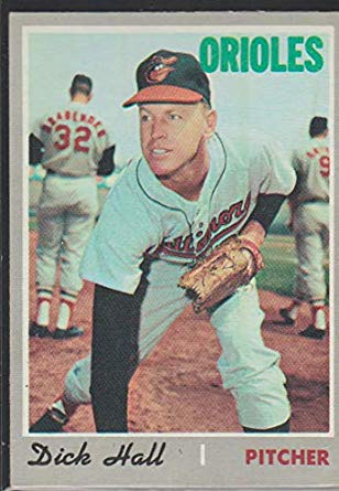
Dick Hall, No. 182: At first glance, there’s nothing out of the ordinary about the card of Hall, who was nicknamed “Turkey Neck” for obvious reasons. The card shows him in a standard sideline pitching pose, one of hundreds that we saw during the 1960s. But a look at the background reveals the rather imposing presence of his teammate, Gene Brabender, an enormous right-hander who was nicknamed “Lurch” because of his 6-foot-5, 230-pound frame. Brabender certainly had broad shoulders, and he needed every inch of them to fit his long last name onto the back of his Baltimore Orioles’ road jersey.
While Hall was nearing the end of a long and underrated career as a pinpoint-control relief pitcher, Brabender had actually reached the finish of his days in Baltimore by the time this card was published. After the 1968 season, Brabender moved onto the Seattle Pilots in the expansion draft and became subject matter for Jim Bouton in Ball Four. So Brabender’s actual 1970 Topps card shows him wearing the colors of the Pilots, the team for which he pitched in 1969. In 1970, Brabender moved with the franchise from Seattle to Milwaukee, where he struggled mightily. An ERA of 6.02 with the Brewers resulted in the end of his major league career.
Sadly, Brabender would endure hard times after his playing days. Plagued by financial troubles, he lost his World Series ring in a bank loan. And then in 1996, he suffered an aneurysm that took his life at the age of 55.
In case you’re wondering about the identity of the other Oriole in the photograph, the one wearing No. 9, that offers us a clue as to when this photograph was taken. In 1968 and ’69, Don Buford wore that number for Baltimore, but that’s clearly not Buford in the picture. No, that’s Russ Snyder, a backup outfielder. Snyder had last played for the Orioles in 1967, so it’s likely that this photograph was taken during spring training of that season. So after spending all of this time extolling the virtues of 1970 Topps and their fresh photographs, I must admit that some older photos were still used in this set, even after the dispute with the union had ended.
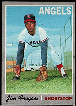
Jim Fregosi, No. 570: At first glance, there’s nothing particularly interesting about Fregosi’s pose. He’s in a full crouch, both arms extended to the ground to field a ball that isn’t there, as he looks rather awkwardly at the camera. But like the Dick Hall card, it’s the background that provides the more intriguing story here. If we look in between Fregosi’s bare hand and glove hand, we can see a white pickup truck, perhaps a Chevy, circa 1969. Automobiles don’t often make it onto baseball cards; I can remember only one other card that features a car: Luis Alvarado’s 1973 Topps card. The presence of a motor vehicle on a card is just weird.
This is obviously a photograph taken during spring training, likely in 1969. At the time, the Angels trained in Palm Springs, California, but what kind of spring training facility is this exactly? Notice the huge wire fence behind Fregosi. It must be at least 20 feet tall and would have been a challenge for Batman and Robin to climb during their prime. To be honest, this looks more like a prison facility. All that’s missing is a watchtower with an armed guard standing in it.
The background of the card is amusing, but Fregosi is also worth exploring. He’ll always be remembered for being on the wrong side of the Nolan Ryan trade, but in his prime he was a star shortstop, a very good fielder and a player who hit like a third baseman in an era when most middle infielders showed little power. Over the span of seven seasons, he made six All-Star teams. During an eight-year run, he received MVP consideration every year.
In this photo, Fregosi still looks lean and well-conditioned, but by 1972, when he joined the New York Mets, he had started to put weight on, and his bat had slowed considerably.
Fregosi had already started to show signs of decline by the late 1960s. From 1967 to 1969, he remained a top-notch defender but had three mediocre offensive seasons, with his power falling off considerably. Now it’s certainly possible that the conditions of the era, which favored pitchers, played a factor. And then in 1970, Fregosi bounced back forcefully, hitting a career-best 22 home runs and posting an OPS of .812. It would turn out to be his last good season. Injuries wrecked his performance in 1971, and then came those disastrous years with the Mets.
The 1970 card serves as the last reminder of what a fine player Fregosi was. For a good while, he was the American League’s best all-around shortstop. At one time, trading him for Nolan Ryan seemed like a good idea. Just not in 1971.
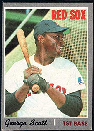
George Scott, No. 385: This is one of my favorite shots from 1970 Topps, and we know that it was taken sometime in 1969, as evidenced by the MLB centennial logo on the left sleeve of the jersey. Instead of giving us a standard straight-on shot of Scott’s upper body, the photographer apparently directed the Boston Red Sox’ first baseman to turn his head to the left, creating a unique angle. Scott is also showing off a smile and a laugh, and that is how I remember this jovial and colorful slugger, known for his sense of humor, for his storytelling ability, and for wearing an unusual necklace full of beads and stones, which he called “second baseman’s teeth.” By this stage of his career, Scott was not yet wearing the necklace; that would appear a few years later, when he started playing for the Brewers.
The 1970 card is also interesting in that it shows Scott wearing a cap, and not a helmet. Early in his career, some fans at a road game began to pelt him with thrown objects; in response, Scott started wearing a helmet in playing his position at first base, as well as during his at-bats. By the middle of his career, photographs of Scott donning a cap would become a rare sight.
Rather famously, Scott battled his weight for much of his career. Although he looks relatively lean on his 1970 Topps card, he would put on considerable weight in later years. With the Brewers, he wore a tight-fitting blue polyester road uniform that seemed like it was on the verge of tearing at the seams. During a second stint with Red Sox, he donned an all-rubber suit prior to each game in an effort to sweat off extra pounds. By the end of each workout, Scott was dripping in perspiration. But he always seemed to put the weight back on, regardless of his efforts.
Much like Dennis Eckersley in later years, Scott had a knack for creating his own terminology. Scott referred to his favorite, game-used bat as “Black Beauty.” He also liked to call home runs “taters,” a practice that later caught on with Reggie Jackson. Few other players sounded like Scott, and almost no one looked like him. He was a one-of-a-kind gem.
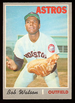
Bob Watson, No. 407: Like the Fregosi card, Bob Watson’s photograph includes a rather sterile-looking building in the background. Could it be a laboratory? Likely not, but it is a rather stale and unappealing structure to find at a spring training site.
Of more interest is the juxtaposition between Watson’s listed position and the kind of glove he is wearing. Topps indicates his position as “outfield,” but the picture clearly shows him wearing a catcher’s mitt. Awkwardly, Watson has turned the mitt so that is facing up, as if he is ready to make a basket catch. It isn’t often that catchers make basket catches, but then again, this is all just a simulation that Watson is putting on for the photographer.
So why did Topps photograph Watson wearing a catcher’s mitt during this spring training shot from 1969? After all, he played a grand total of one game as a catcher that season, instead spending most of his time as a left fielder. It’s possible that the Houston Astros planned on him doing more catching in 1969, and then reverted to a more conservative plan once the season began.
Ironically, Watson rarely played as either a catcher or outfielder in 1970, the year this card appeared. He caught six games and played one game in the outfield. Topps should have listed him as a first baseman; he made 87 appearances at first base that spring and summer. After the ’70 season, he would never catch again, instead splitting time between first base and the outfield for the next several seasons before becoming a full-time first baseman in 1976.
Watson has become one of my favorite people in the game. Only the second African-American general manager in history (after Atlanta’s Bill Lucas), he oversaw the New York Yankees during their world championship of 1996. Yet, he rarely seems to receive credit for that. He was one of two people, along with Gene Michael, who recommended to George Steinbrenner that he hire Joe Torre as Yankees manager. Yes, that worked out quite nicely for the franchise.
Last we heard, Watson was struggling with kidney disease. To give you an idea of the man’s character, he turned down a donation of kidneys from two of his children, explaining to ESPN, “I’ve had a good life and I don’t want to take a kidney from young people who really need them and still have their whole lives ahead of them.’ That would be very selfish on my part.”
In giving a closer look at these cards from 1970, I’m struck by how many of my favorite players show up in attractive photographs. There’s not only Watson, Scott, and Duncan, but people like Norm Cash, Willie Stargell, and Joe Torre, and characters like Pedro Borbon and Coco Laboy. I’m also fascinated by all of the background intrigue, from the weird buildings and dirt fields to the teammates who just so happen to show up.
Clearly, there’s a lot more to 1970 Topps than I was led to believe.
This is fantastic. I love the cards and, especially, the “forensic” work you do in identifying the time and location of the shots, as well as the other players in them. Great job!
Thank you, Marc. Much appreciated. I enjoy putting these “collage” pieces together.
It seems that throwing objects at players must’ve been a widespread problem back then.