Estimating Pitcher Release Point Distance with PITCHf/x: Home and Away Splits

Stephen Strasburg’s release point dropped at home during the 2014 season. (via Cathy Taylor)
Two years ago in a FanGraphs article, we outlined several versions of an algorithm for estimating a pitcher’s release point distance using PITCHf/x data. The goal was to use PITCHf/x to estimate the average distance from home plate each pitcher releases his pitches, conceding that each pitch is going to be released from a slightly different distance. We’d do this by finding the distance from home plate where his pitches were most tightly clustered and label that as the “release point.” This would add a variable third dimension to current analysis of release points, since most is done at 55 feet from home plate, and help identify changes in release point that may not be evident to the eye. We considered the case of home and away separately to see if and how PITCHf/x data from various ballparks affects the estimates.
In this update, we combine the previous versions of the algorithm into a single multistage one and apply it to Stephen Strasburg as a test case, and to the 10 pitchers who threw the most pitches in 2014 (and did not change teams from 2013). The former serves as the easiest way to explain the new algorithm, as Strasburg’s data present a challenge due to their spatial distribution and also highlight some capabilities of the algorithm itself.
Test Case: Stephen Strasburg
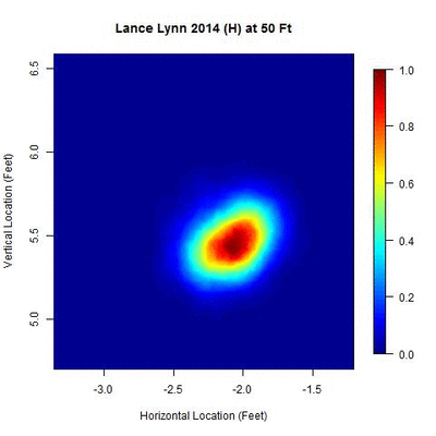
We begin with a heat map of Strasburg’s pitch locations from his 2014 home data between 50 and 60 feet, normalized by the most dense location over this interval, to get an idea of its distribution:
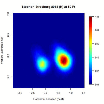
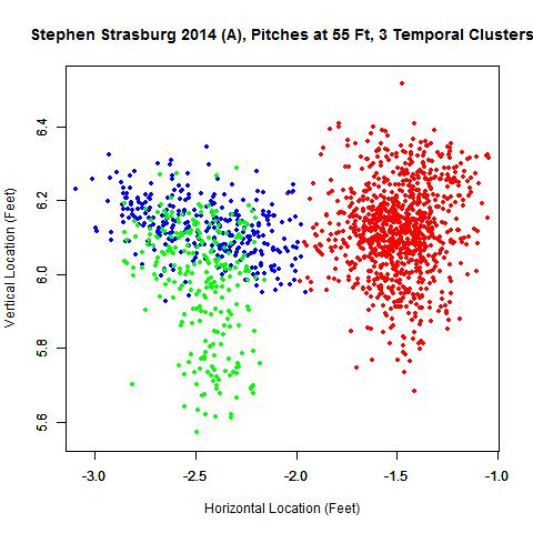
There appear to be two disjointed clusters, roughly a foot apart from center to center, indicating that either Strasburg switched the horizontal location (i.e., the x-variable in PITCHf/x) of his release point once in 2014 or used two different horizontal locations for his release point over the year. The clusters appear approximately equidistant across this 10-foot interval, with the one on the right being more densely populated. The goal is to split these two clusters into separate data sets and then find where each is most compact, which will be taken to be the point of origin for the pitches. Since there are two clusters, this also provides a means of direct comparison between the two y-values, or estimated distances from home, of the release point.
The algorithm begins with a simple temporal splitting method, similar to signal processing, to sort the data in the order they were generated. This method works with small groups of consecutive pitches, finds their average location, and looks for when consecutive disjointed groups are more than some prescribed distance apart. If this occurs, the data set is separated at the point where the average locations are farthest apart and the pitches on either side are each considered a separate data set in the next stage of the algorithm.
We consider the PITCHf/x data at 55 feet (the default starting point since it is expensive computationally to run this entire process over each y-location considered) and, using 75-pitch groupings, look to see if successive groupings of this size differ by more than 0.75 feet. This is accomplished using a rolling average: find the average location in x (horizontal location) and z (vertical location) of pitches 1-75, 2-76, …, and then compare the locations of pitches 1-75 and 76-150, 2-76 and 77-151, … to see if they identify as disjointed clusters. The choices of 75 pitches and 0.75 feet of separation were chosen as a reasonable lower bound for the number of pitches a starter may throw in a game and a distance that would generally lead to clusters with little to no intersection (taking it much smaller than 0.75 feet, say around 0.4 feet, works well in some cases but will generally produce several clusters with large areas of overlap, which serves to reduce the size of each data set). However, these numbers can be changed depending on the specific pitcher to improve the results, as will be seen later. As expected, this produces two clusters:
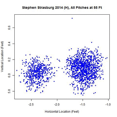
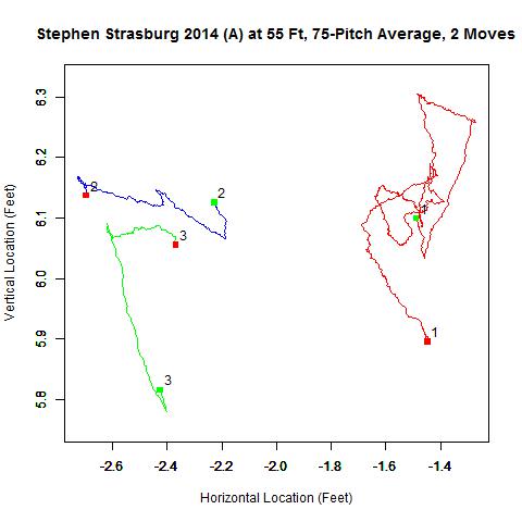
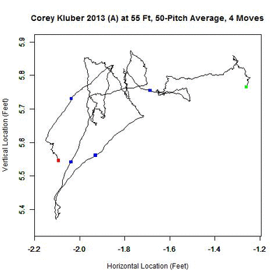
The above GIF shows all pitches (all blue data) at 55 feet followed by the data split into two sets: the red data representing the first cluster and blue the second. This confirms that Strasburg did shift his release point only once in 2014. We can also plot the aforementioned rolling averages to get an idea of the evolution of his pitches at 55 feet from home:
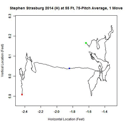
The first image is the rolling average of all home pitches (continuous black line) with the green square located at the average location of the first 75 pitches and the red the last 75. The presence of a change in release point is typically associated with sections of the rolling average being very linear, whereas when the release point is stationary, it appears more random. The blue square indicates the location of the change in release point location. The second image shows the rolling average over each separate cluster, with the same color scheme as the previous GIF and numbers indicating the order of the clusters in time.
Even though we have not yet found the y-coordinate of the release point, we can still surmise that Strasburg’s release point at home started high, compared to the rest of the season, and dropped over time. Then at home-pitch 1,221 out of 1,770, the estimated pitch where the change occurred, Strasburg moved about a foot to the left and again, over time, his release point fell. While video evidence makes it hard to validate the vertical shift in these observations, we can substantiate the horizontal shift. First, here is GIF from a home start against Atlanta on April 5, 2014:
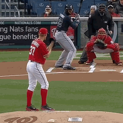
Note that Strasburg’s right heel is positioned on the left edge of the pitching rubber on the pitch to Jason Heyward. Now, moving to one of his last home starts, also against Atlanta and Heyward, on Sept. 10, 2014:

In this start, Strasburg’s right foot is closer to centered on the rubber, accounting for the horizontal shift to the left in the data (which is from the opposite perspective).
With these two clusters of pitches now separated, a spatial clustering algorithm is run to remove outliers and additional small clusters not identified by the previous phase, and fit the remaining values to a bivariate normal distribution. We choose this distribution under the assumption that the pitcher, within each cluster with respect to time, has a single theoretical release point and every pitch is some slight variation of this point. This would account for the dense population of data in the center that becomes more sparse moving outward. The spatial clustering is also performed at 55 feet, as performing it at all reasonable distances becomes prohibitive in terms of run time and consistency in the data at each distance considered.
The algorithm is incremental in terms of finding clusters and, starting with the most dense area of the data, labels that as the center of the first bivariate cluster. It then goes through and looks for a second center that is separate from the first cluster, and continues until no new independent clusters can be found. This is adapted from an incremental k-means clustering algorithm for n-dimensional data and is optimized here to run for the 2D case. Working only with the largest cluster, the pitches kept are those that have a 0.05 probability or better of belonging to this cluster. In practice, this usually maintains at least 90 percent of the data from the original set.
From this subset of pitches, the sample mean vector and sample covariance matrix for the data are found at distances ranging, inch by inch, from 45 to 65 feet, an extremely wide range of values to ensure that we are finding the global minimum. From the mean vector and covariance matrix, the area that accounts for two standard deviations away from the center of the cluster at that distance is found, which forms an ellipse. This is the metric used for measuring the size of each cluster. The two standard deviations here (as opposed to one or three) have no effect on the location of the minimum but work well to give a general size of the cluster. We then find the distance from home plate at which this area is minimum and label this distance, as well as its associated mean x– and z-values, as the “release point.”

For Strasburg’s home 2014 data, these clusters appear as:
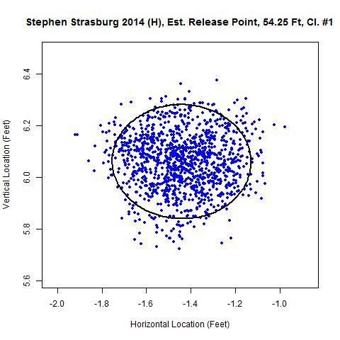
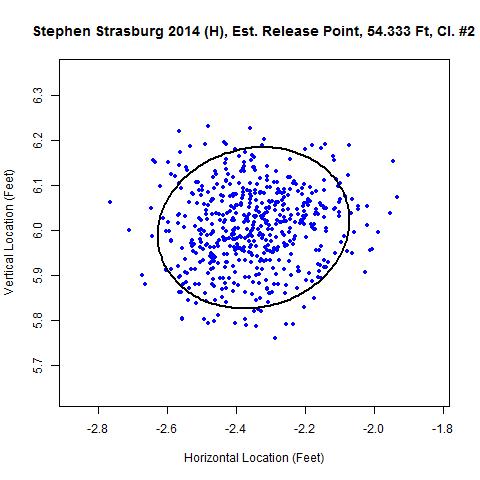
Both give very similar distances from home plate: 54 feet three inches and 54 feet four inches. Away from Nationals Park, three clusters are found for Strasburg in 2014. Also, for his data from home and away in 2013, a single cluster each is identified:
| Stephen Strasburg, 2013-2014 |
|---|
| Year | H/A | x | y | z | Size | Sample | Percent | Area |
| 2014 | Home #1 | -1.442 | 54.25 | 6.061 | 1220 | 1219 | 99.9 | 0.215 |
| 2014 | Home #2 | -2.35 | 54.333 | 6.005 | 550 | 549 | 99.8 | 0.155 |
| 2014 | Away #1 | -1.47 | 54.417 | 6.1 | 946 | 937 | 99 | 0.246 |
| 2014 | Away #2 | -2.467 | 54 | 6.11 | 305 | 253 | 83 | 0.182 |
| 2014 | Away #3 | -2.355 | 53.167 | 5.924 | 262 | 217 | 82.8 | 0.196 |
| 2013 | Home | -1.326 | 54.417 | 6.218 | 1497 | 1373 | 91.7 | 0.178 |
| 2013 | Away | -1.338 | 54.333 | 6.137 | 1347 | 1347 | 100 | 0.242 |
The values in the table are the x-, y-, and z-estimates of the release point, the size of the data set after temporal splitting, the sample size of the data after spatial clustering, the percent of the data used after spatial clustering, and the area of the two-standard deviation ellipse, in square feet. Most the of samples use over 90 percent of the data and place the estimate of the distance from home plate of release in the range of 54 feet four inches. The exceptions are two clusters away from home in 2014, which each use only about 80 percent of the pitches. The problem here is that the two clusters were separated in time by shrinking the distance between clusters from 0.75 to 0.4, which was necessary since the data, upon inspection, did not appear to be a single cluster. Also, both have strongly linear rolling averages, so that there really is not a centralized point from which the data is generated, compared to the case for the first cluster, which is more dense around a central location.
Based on experience with the algorithm, when the data do not closely resemble a bivariate normal distribution, more data are discarded, in this case around 20 percent, and the release point estimates get pushed toward home plate. However, since these typically go hand-in-hand, it is easy to discern when the estimate is likely to be poor.
Estimates for Top 10 Pitchers in Pitches Thrown in 2014
To further examine this algorithm, we will run it for the top 10 pitchers in terms of number of pitches thrown in 2014, using only pitchers who did not change teams from 2013, to ensure the home data is standardized to a single ballpark for comparisons with 2013. No adjustments are made to the parameters here from the 75 pitches and 0.75 feet between clusters, such as was done with Strasburg’s 2014 away data, but some cases will be similarly explored later on.
| 2013-2014 Estimates for Select 2014 Pitches Thrown Leaders |
|---|
| First | Last | Year | H/A | x | y | z | Size | Sample | Percent | Area |
| Johnny | Cueto | 2013 | Home | -2.499 | 54.75 | 5.781 | 501 | 495 | 98.8 | 0.296 |
| Johnny | Cueto | 2013 | Away | -2.353 | 53.75 | 5.702 | 447 | 438 | 98 | 0.339 |
| Johnny | Cueto | 2014 | Home | -2.282 | 55 | 5.893 | 1904 | 1856 | 97.5 | 0.327 |
| Johnny | Cueto | 2014 | Away | -2.155 | 54.25 | 5.779 | 1724 | 1715 | 99.5 | 0.439 |
| Max | Scherzer | 2013 | Home | -3.456 | 54.917 | 5.351 | 1647 | 1619 | 98.3 | 0.412 |
| Max | Scherzer | 2013 | Away | -3.359 | 54.083 | 5.316 | 1741 | 1569 | 90.1 | 0.386 |
| Max | Scherzer | 2014 | Home | -3.575 | 54.583 | 5.375 | 1543 | 1540 | 99.8 | 0.299 |
| Max | Scherzer | 2014 | Away | -3.509 | 54.25 | 5.337 | 2092 | 2090 | 99.9 | 0.361 |
| James | Shields | 2013 | Home | -1.102 | 54.5 | 6.088 | 1700 | 1691 | 99.5 | 0.43 |
| James | Shields | 2013 | Away | -1.251 | 54.417 | 6.019 | 1957 | 1855 | 94.8 | 0.399 |
| James | Shields | 2014 | Home | -1.441 | 54 | 5.803 | 1614 | 1604 | 99.4 | 0.419 |
| James | Shields | 2014 | Away | -1.508 | 54.083 | 5.892 | 2016 | 2013 | 99.9 | 0.6 |
| R.A. | Dickey | 2013 | Home | -0.718 | 53.5 | 5.929 | 1833 | 1754 | 95.7 | 0.337 |
| R.A. | Dickey | 2013 | Away | -0.741 | 52.5 | 5.962 | 1670 | 1664 | 99.6 | 0.449 |
| R.A. | Dickey | 2014 | Home | -0.618 | 53.083 | 5.88 | 1750 | 1686 | 96.3 | 0.246 |
| R.A. | Dickey | 2014 | Away | -0.724 | 52.75 | 5.95 | 1754 | 1744 | 99.4 | 0.376 |
| Corey | Kluber | 2013 | Home | -1.763 | 54.75 | 5.681 | 1115 | 1000 | 89.7 | 0.145 |
| Corey | Kluber | 2013 | Away | -1.771 | 54.333 | 5.736 | 1172 | 860 | 73.4 | 0.171 |
| Corey | Kluber | 2014 | Home | -2.097 | 54.583 | 5.896 | 1736 | 1727 | 99.5 | 0.284 |
| Corey | Kluber | 2014 | Away | -1.952 | 53.917 | 5.774 | 1752 | 1469 | 83.8 | 0.3 |
| A.J. | Burnett | 2013 | Home | -1.782 | 54.417 | 5.797 | 1432 | 1432 | 100 | 0.256 |
| A.J. | Burnett | 2013 | Away | -1.74 | 53.833 | 5.864 | 1577 | 1571 | 99.6 | 0.336 |
| A.J. | Burnett | 2014 | Home | -1.903 | 54.5 | 6.029 | 1734 | 1701 | 98.1 | 0.259 |
| A.J. | Burnett | 2014 | Away | -1.857 | 53.5 | 5.9 | 1727 | 1684 | 97.5 | 0.346 |
| Lance | Lynn | 2013 | Home | -2.165 | 54.5 | 5.53 | 1655 | 1639 | 99 | 0.27 |
| Lance | Lynn | 2013 | Away | -2.167 | 53.667 | 5.501 | 1696 | 1669 | 98.4 | 0.353 |
| Lance | Lynn | 2014 | Home | -2.318 | 54.25 | 5.558 | 1894 | 1894 | 100 | 0.239 |
| Lance | Lynn | 2014 | Away | -2.153 | 53.5 | 5.555 | 1551 | 1551 | 100 | 0.312 |
| Felix | Hernandez | 2013 | Home | -2.024 | 53.083 | 6.005 | 1564 | 1564 | 100 | 0.397 |
| Felix | Hernandez | 2013 | Away | -2.106 | 54.917 | 6.198 | 1599 | 1598 | 99.9 | 0.317 |
| Felix | Hernandez | 2014 | Home | -2.145 | 52.917 | 5.967 | 1712 | 1602 | 93.6 | 0.329 |
| Felix | Hernandez | 2014 | Away | -2.149 | 54.333 | 6.16 | 1717 | 1716 | 99.9 | 0.244 |
| Chris | Tillman | 2013 | Home | -2.219 | 53.917 | 7.046 | 1859 | 1817 | 97.7 | 0.277 |
| Chris | Tillman | 2013 | Away | -2.098 | 54.083 | 6.86 | 1611 | 1549 | 96.2 | 0.36 |
| Chris | Tillman | 2014 | Home | -2.05 | 54.083 | 6.964 | 1822 | 1773 | 97.3 | 0.321 |
| Chris | Tillman | 2014 | Away | -2.032 | 53.197 | 6.858 | 1584 | 1427 | 90.1 | 0.356 |
| Justin | Verlander | 2013 | Home | -1.99 | 53.5 | 6.705 | 1877 | 1873 | 99.8 | 0.27 |
| Justin | Verlander | 2013 | Away | -1.887 | 53.25 | 6.717 | 1804 | 1799 | 99.7 | 0.426 |
| Justin | Verlander | 2014 | Home | -1.959 | 53.75 | 6.661 | 1504 | 1490 | 99.1 | 0.233 |
| Justin | Verlander | 2014 | Away | -1.857 | 53.083 | 6.597 | 1901 | 1883 | 99.1 | 0.338 |
Example Case: Lance Lynn
Consider Lance Lynn’s 2014 home data. No additional clusters in time are identified and 100 percent of the data are used after the spatial clustering phase of the algorithm. The area of the ellipse related to two standard deviations ranks among the smallest of the 10 pitchers in the study.
Note that there is a small centralized area where the pitch locations are most dense and as the distance changes, the cluster contracts to the theoretical point of release and then expands.

The data points themselves mirror the shape of the ellipse shown.
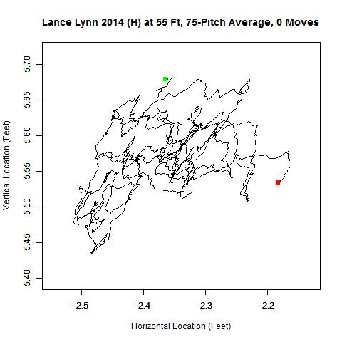
The rolling averages stay horizontally within four inches of each other and vary in height by slightly less (around three inches). However, for data that perform well, the release distance estimate can still vary slightly from year-to-year, with the estimate going from 54.5 feet in 2013 (a similarly good data set) to 54.25 in 2014.
Comparison of Release Point Distance Estimates
With these estimates in hand, we will focus on the y-values, or estimated release point distances, and make three comparisons to check consistency of the estimates: 2013 Home vs. 2014 Home, 2013 Home vs. 2013 Away, and 2014 Home vs. 2014 Away. As a metric, we will use the minimal distance that the ordered pair of the two estimates is from matching exactly.
The two sets of home data generate fairly consistent estimate for the 10 pitchers, with an average minimal distance for each point to the blue line, where the estimate would match, of 0.183 feet, or about two inches.
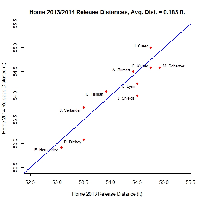
Most of the estimates fall within a reasonable range of 54 to 55 feet. However two outliers appear in R.A. Dickey and Felix Hernandez. After modifying the parameters in the algorithm, we were unable to find a better estimate for the release point for Dickey, so the problem does not appear to be with the parameters. Speculating a bit, that may be due to Dickey throwing a knuckleball. With those pitches being fitted to the very smooth trajectory of the quadratic functions used in the nine-parameter PITCHf/x model, the extension of the data to the release point distance is not as accurate as that of other pitches. As for Hernandez, upon changes to the parameters (shrinking the distance of separation, in feet, from 0.75 to 0.4 in 2013 and 0.3 in 2013), the estimates move slightly farther from home:
| Felix Hernandez, 2013-2014 |
|---|
| Year | H/A | x | y | z | Size | Sample | Percent | Area |
| 2013 | Home #1 | -2.045 | 53.75 | 5.986 | 1169 | 1132 | 96.8 | 0.308 |
| 2013 | Home #2 | -2.133 | 53.833 | 6.339 | 111 | 108 | 97.3 | 0.194 |
| 2013 | Home #3 | -2.068 | 55 | 6.012 | 284 | 257 | 90.5 | 0.199 |
| 2014 | Home #1 | -2.317 | 53.417 | 6.2 | 319 | 318 | 99.7 | 0.209 |
| 2014 | Home #2 | -2.162 | 54.083 | 5.936 | 1393 | 1379 | 99 | 0.243 |
A more in-depth analysis of this, since the same trend does not show up in Hernandez’s away data, would likely require a study on the release point distances of pitchers at Safeco Field to see if the discrepancy is endemic to the park or relegated to Hernandez himself.
The comparison of the 2013 Home and Away data demonstrates an interesting consequence of the algorithm.
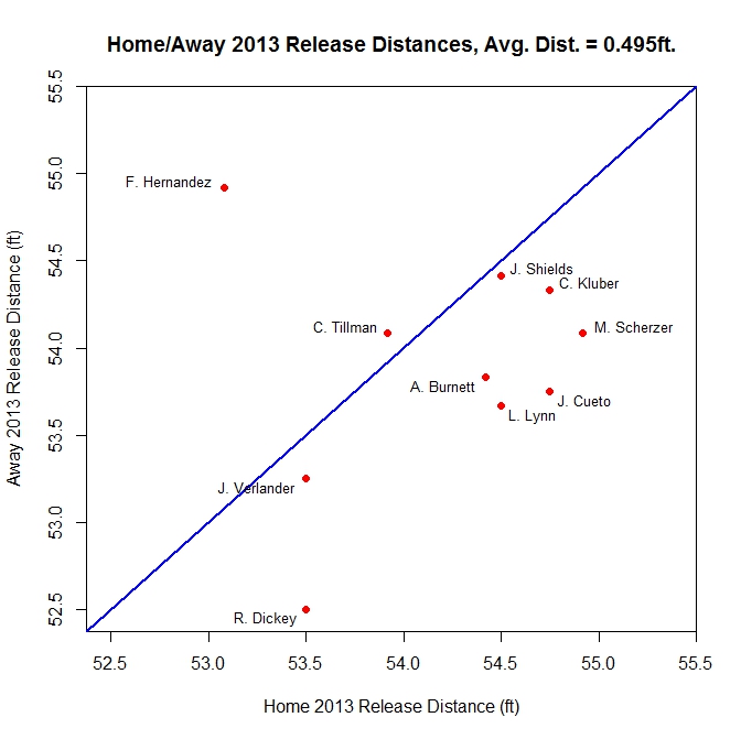
For eight out of the 10 pitchers, the away estimate of the release distance comes closer to home plate than the home estimates, some by as much as a foot. As noted earlier, the algorithm tends to push the release distance closer to home when the data do not appear to be close to a bivariate normal cluster, which is more prevalent with the away data. Possible indicators of this include a low percentage, below 90 percent or so, of the data used after spatial clustering or a large value for the area of the ellipse. If we focus on the Area value to get an idea of how spread out the data are for these two cases, the home clusters average an area of 0.309 square feet and the away 0.354 square feet, so the latter case is more spread out. This is possibly due to variations in the acquisition of PITCHf/x data from different stadiums or minor adjustments made by pitchers from park to park.
This trend holds up when for the 2014 data as well:
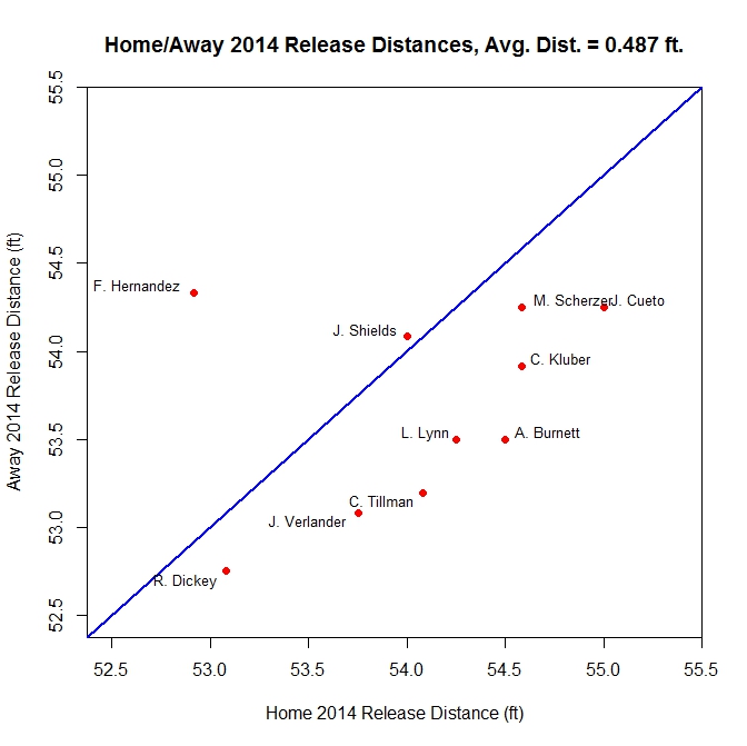
Again, eight of 10 away estimates come in below their home counterparts. Both home/away splits have average minimal distances from a perfect match just under half a foot.
Based on the results for this small sample, we can say that it is probably better to work with only the home data when dealing with release points. For the 10 pitchers considered, and for Strasburg, the algorithm appears to work well in most cases to produce consistent estimates between the two years, with even the two outlying estimates being consistent between 2013 and 2014. However, in some instances, adjusting the parameters in the algorithm can serve as a way to better sort the data and find changes in release point when the clusters overlap. This is hard to do with any fixed set of parameters, but working with a single pitcher, the values can usually be fine-tuned to work well.
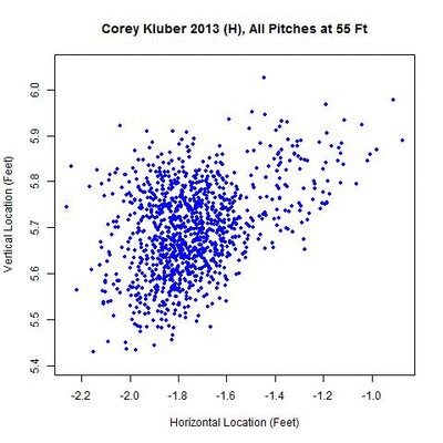
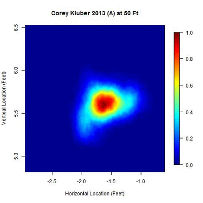
To demonstrate this, we will focus on a particular case where the data appear to be multiple overlapping clusters and try to adjust the parameters to see if wee can get better results. It will also illustrate some of the difficulties that show up in the data, especially from multiple parks for the away data of a single pitcher. For this extended analysis, we will focus on Corey Kluber in 2013, since both of his percentages of data used are on the low end, at 89.7 percent at home and 73.4 percent away from Progressive Field. Percentages in this range indicate that it is likely that, in time, more clusters can be identified and, in turn, better estimates can be found based on each.
Multiple Clusters: Corey Kluber in 2013
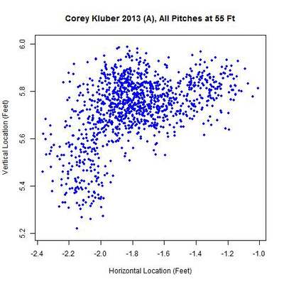
As with Strasburg, we will start with Kluber’s Home 2013 heat map:

Notice that right around 53-55 feet, there’s a small cluster to the right of the main one. This was not picked up in the original algorithm since the required distance for separation was 0.75 feet, but shrinking this to 0.35, we can separate the two.
For the data at 55 feet, a small cluster is present early in the season (red) followed by a larger cluster to the left (blue).

The rolling averages show that Kluber’s release point, examined at 55 feet, dropped early on and then shifted to the left, where it remained for the rest of the season.
| Corey Kluber, 2013 Home Results |
|---|
| Year | H/A | x | y | z | Size | Sample | Percent | Area |
| 2013 | Home #1 | -1.312 | 54.917 | 5.8 | 105 | 96 | 91.4 | 0.098 |
| 2013 | Home #2 | -1.774 | 54.75 | 5.677 | 1010 | 975 | 96.5 | 0.136 |
The 105 pitches in the first cluster account for, almost exactly, the 106 pitches thrown in two home starts against Boston and Minnesota in 2013 (since there is some overlap between the clusters, it is reasonable for this to be off by a pitch or two). After that, his release point moved horizontally by about 5.5 inches and dropped 1.5 inches. The larger cluster places his release point distance at home for 2013 at 54 feet nine inches.
The away data present a larger challenge as several more clusters appear, many overlapping.
There appears to be one dominant cluster with two lesser clusters appearing to its right and lower left. To capture all of the clusters, the parameters are modified to identify overlapping clusters (looking for clusters whose 50-pitch rolling averages are 0.3 feet apart or less). With this choice of parameters, five temporal clusters are found (ordered sequentially in time as red, blue, green, orange, and black).
As with the 2013 home results, Kluber’s pitches at 55 feet slid to the left, from the catcher’s perspective, but then made a jump down and left, then back up, and finally back down. Continuing to the spatial clustering phase, the five clusters each produce an estimate of the release point.
| Corey Kluber, 2013 Away Results |
|---|
| Year | H/A | x | y | z | Size | Sample | Percent | Area |
| 2013 | Away #1 | -1.454 | 54.5 | 5.768 | 329 | 328 | 99.7 | 0.155 |
| 2013 | Away #2 | -1.813 | 54.75 | 5.762 | 493 | 461 | 93.5 | 0.127 |
| 2013 | Away #3 | -2.088 | 54.5 | 5.389 | 93 | 74 | 79.6 | 0.054 |
| 2013 | Away #4 | -1.878 | 54.667 | 5.746 | 166 | 166 | 100 | 0.101 |
| 2013 | Away #5 | -2.088 | 54 | 5.564 | 91 | 86 | 94.5 | 0.076 |
The first cluster in time of 329 pitches differs by only one pitch from the 330 pitches thrown in four road starts from April 20 to May 15 (based on the data, this and the next cluster appear to be missing a pitch in PITCHf/x, which accounts for the difference). This is followed by 493 pitches which match up approximately with the 494 pitches made in five road starts from May 26 to July 2. The next cluster of 93 pitches aligns with a start at Minnesota on July 20, where Kluber’s release point shifts left and downward. The next two starts of 166 pitches at the White Sox and Royals move back to the area of the second release point, and his season concludes with the release point modifying again for a 91-pitch effort at Minnesota. If we ignore, for the moment, the two starts at Minnesota, Kluber’s release point on the road shows the same pattern as home with a single shift early in the season, which combining the home/away analysis, occurred May 21 versus Detroit.
Why the change exists for the two starts are Minnesota is unclear, as it does not carry over to the home data or any other starts on the road. It may be a related to the PITCHf/x data from Minnesota or solely to Kluber. Much as with Felix Hernandez, finding the cause of this would require further investigation.
Much of the away data for pitchers have similar characteristics with multiple, slightly displaced clusters, as was seen with Strasburg, and so this is the likely cause for the disparity between the y-values of the release point distance between the home and away data for the pitchers considered earlier. However, it is difficult to attribute this to the data being from multiple ballparks or to a pitcher’s release point in fact varying more on the road. Presumably, finding the right mix of parameters would generate consistent estimates for home and away data and alleviate this difficulty.
Discussion
This choice for the algorithm is just one of many possible configurations relative to each stage. The parameters left to the user are, with the values used here in brackets, (i) the number of pitches in the rolling average [75 pitches], (ii) the distance between separate clusters in time [0.75 feet], (iii) the cutoff for including data in the cluster after spatial clustering [0.05 probability of belonging to the largest cluster], and (iv) the initial distance to perform the temporal and spatial clustering [55 feet]. The goal of this is to form a single algorithm that performs well given any data set from PITCHf/x. However, this proves difficult due to the variability in the data from pitcher to pitcher, especially in the away data. As it stands now, the algorithm appears to work well provided the user takes the time to examine the results and reconfigure the parameters as needed, as with the above discussion of Kluber. When such care is taken, the results can become more consistent, with both of Kluber’s largest clusters in 2013 estimating a release distance of 54 feet none inches.
Another difficulty that arises from the data sometimes straying too far from the bivariate normal assumption is that the algorithm finds nearly one-dimensional clusters, which causes problems since the covariance matrix of such a cluster is ill-conditioned. To curtail this, the maximum number of allowable spatial clusters occasionally has to be restricted to stop the algorithm before it reaches this point.
Future work on this may include analysis of the aforementioned Dickey and Hernandez PITCHf/x data sets, as well as new versions of the algorithm that are less hands-on. Also, the y-location of the release point can be compared to pitcher height to get another measure of consistency, operating under the assumption that height correlates with a release point closer to home plate. As a preview, we can test this for the 2014 home data of the 10 pitchers previously analyzed:
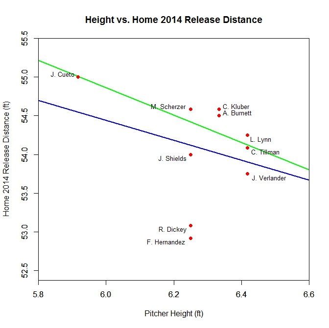
The blue line is the best fit line through the data for all 10 pitchers, and the green corresponds to the case where Dickey and Hernandez are omitted. The Pearson correlation coefficients for these cases are -0.286 for the former and -0.738 for the latter, which appears promising provided the estimates of the two outliers can be improved.
Posted below are links to several Pastebin pages which contain the code used for the release point, 2D clustering, and heat map algorithms. All are written in R and use calls to a MySQL database to get the PITCHf/x data. Parts may need to be adapted to match with another database, but feel free to use or modify any of the files posted.
Great work Matthew. I remember discussing this with you when I was taking a shot at estimating release points a while back now. I believe I also decided to focus on home games for the sake of consistency and simplicity, but it’s certainly a challenging problem.
Thanks for sharing your ideas, results and code here.
No problem. The hardest part appears to be the consistency as, from pitcher to pitcher, the data can either be very consistent or very erratic, so coming up with a one-size-fits-all algorithm is difficult. If I can pin down a single way to extract a good subset of the data from each pitcher, that simplifies the process and makes it so that the parameters wouldn’t have to be tuned to each specific case. The other difficulty, that I was able to fix, was the runtime. The old version took about 45 minutes to run, and so I went through the code to rewrite parts of it, and sped it up to about 2 minutes.
The other ideas I had for the article were comparing pitchers of varying heights, to see how that correlated with the estimates (which is touched on here), and also looking at home data from pitchers at different ballparks. I was going to compare the estimates across seasons for, for example. Jason Vargas, Ervin Santana, and Dan Haren since all three spent a full season with three different teams in 2012-2014. However, I opted for this since I thought it would be a good starting point to build from.
As for the code, I’m always happy to post/share anything I’ve written. I think it also helps in that for those interested, they can see exactly what’s happening in the algorithm without me having to explain all the finer points. In addition, if someone else can take something I did and improve it or re-purpose it, that’s great.
Love to see what the numbers come out to be for the Marlins Capp. Maybe 50 ft?
I thought about trying this on Capps, but I think the lack of a large amount of data makes it hard to get a reliable estimate. I can give it a try on his 2013 data, which has 59 IP, when I get a chance in the next day or so and I’ll post the result here in the comments.
I ran the algorithm for Capps in 2013, which is the year he has the most data. For the home data, there are two separate clusters in time over foot apart: one with 52.417 ft (264 out 324 home pitches used) and another with 53.333 ft (216 out of 236 home pitches used). Provided he ends up with a decent number of pitches thrown in the majors this year, I can run it for the 2015 data for a future article and hopefully get a more consistent result.
Matthew – with different release points, doesn’t it imply that pitch speed at the batters box would be different as well? A few years back Fox was showing batters box vs. pitcher release velocity and I still wonder why we don’t see that any more. Also, in addition to release point, couldn’t certain other pitching factors affect velocity at the point of the batters box , e.g. how much ball rotation ?
I guess my point/question is, shouldn’t we ignore pitching velocity as currently measured at the point of release and only look at the ball speed a the batters’ box which would be affected by the distance of the ball thrown as shown in your article and other factors?
Excellent information Matthew – thanks.
In the PITCHf/x data, the actual velocity can be found at any point by adjusting the time to match a particular location of the pitch, so the comparison of release point vs. batter’s box velocity could be done with the 3-dimensional release points in hand. I believe there are some studies out there on this general topic that fall under the heading of “effective velocity”. One thing I always heard was that tall pitchers (for example, Randy Johnson) had an advantage because they release the ball closer to home plate, cutting down a batter’s reaction time. So if I could get a good estimate for each pitcher’s release point, I could find, for example, the average reaction time for certain pitches and look into how that affects batters.
For the other articles I’ve written, here and on Fangraphs Community, I was looking at projecting pitches to the plate at various distances to see how pitch movement might affect perception. As a future addition to that, I was going to try to factor pitch rotation into the algorithm but I just haven’t got a chance to figure out the logistics of it and build it into the code. Most of my codes, in total, are 1000 or so lines, so it can take me a bit of time to write and to get them up and running properly.
So to answer your question, I would say “yes” but the hurdle is putting all of these pieces (release distance, rotation, velocity, etc.) together to model a batter’s perception, which will vary player-to-player.