Expanding the Edges of the Strike Zone

Matt Harvey threw to the upper vertical edge far more than most last season (via slgckgc).
Introduction
It has been quite a while since Jeff Zimmerman or I wrote anything about our Edge% metric. For those that haven’t seen it, we attempted to quantify pitcher control by bucketing pitches into various zones based on Mike Fast’s work on the called strike zone during the PITCHf/x era. Specifcally, we were interested in how well a pitcher works the black–the horizontal edges of the strike zone–relative to the heart of the plate.
After a few iterations, the result was Edge%, a metric that encompasses the horizontal edges of the called strike zone based on batter handedness and height. For size, we determined that the inside edge was roughly .6 of a foot in width and the outside edge was .3 of a foot, with specific location dependent on batter handedness. For a sense of proportion, the width of a baseball is roughly .3 of a foot.
In the past year or so since we published our research we have heard numerous questions about the vertical edge of the strike zone. How would we define those edges? What difference–if any–does throwing to those locations make? Fair questions, and today is our first attempt at tackling the issue of the vertical edges of the zone. I say first attempt as I won’t claim that these new metrics should represent the finished product. In fact, trying to determine the optimal vertical edges of the strike zone has proven much harder than our initial work on the horizontal edges.
Comparing the Old and New Edge(s)
First, let’s compare the old and new metrics.
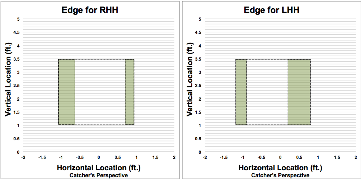
The table below compares the vertical coordinates of the original horizontal edges as well as the heart of the strike zone, by batter handedness:
| Horizontal Coordinates of Original Edge and Heart Metrics | ||||||||||
|---|---|---|---|---|---|---|---|---|---|---|
| Batter Handedness | Edge | px> | px< | Width of Edge (ft.) | ||||||
| RHH | Inside | -1.03 | -0.43 | 0.60 | ||||||
| RHH | Outside | 0.70 | 1.00 | 0.30 | ||||||
| RHH | Heart | -0.43 | 0.70 | 1.13 | ||||||
| LHH | Inside | 0.81 | 0.21 | 0.60 | ||||||
| LHH | Outside | -1.20 | -0.90 | 0.30 | ||||||
| LHH | Heart | -0.90 | 0.21 | 1.11 | ||||||
As you can see, we determined the inside edge was .6 of a foot wide while the outside edge was .3 of a foot wide. The heart of the zone was 1.13 feet for right-handed hitters and 1.11 for left-handed hitters. We derived these coordinates through a combination of logic, observation and empirical analysis.
Based on data from 2011-2013, the expected run value per pitch for pitches thrown to the horizontal edges of the strike zone was -.034 compared to -.036 for pitches in the heart of the plate–a 7 percent difference. That may not seem like much, but the difference really popped when we looked at batted balls. On contact, pitches on the edge produced .028 expected runs compared to .062 for pitches in the heart of the plate–a 121 percent difference.
This makes sense when you think about the tradeoffs between the edge and the heart–pitches in the core of the zone are much more likely to be called a strike (roughly 97 percent vs. 72 percent), however they are also easier to hit well.
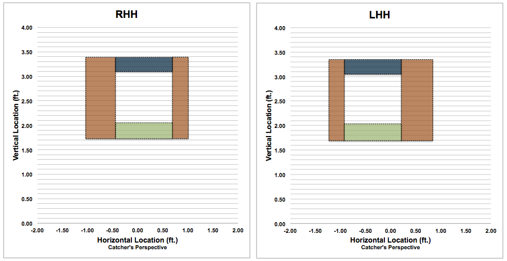
Besides altering the Edge metric, defining vertical coordinates for the outermost part of the strike zone also meant we needed to change the definition of the heart of the zone.
After a lot of trial and error we’ve settled on .3 of a foot from the top and bottom of the called strike zone for the vertical edges. This was essentially the result of seeing how much we could push the edge while maintaining a heart of the zone that seemed distinct. It wasn’t easy, and I am not completely sure we’ve hit on the best formula, but it appears to be a reasonable place to start given that it is consistent with how we’ve approached the edge in the past. It also allows us to explore locations similar to some of the most recent work on effectiveness and pitch location, such as Jon Roegele’s amazing dissection of the strike zone since 2008.
Here are the specific formulas for each location of the strike zone according to our new definitions:
Heart
RHH: (px >= -.43 and px <= .7) and (pz >= (1.22 + Batter Height/12 *.136) and pz <= (2.30 + Batter Height/12 *.136))
LHH: (px >= -.9 and px <= .21) and (pz >= (.65 + Batter Height/12 *.229) and pz <= (1.7 + Batter Height/12 *.229))
Horizontal Edge (old Edge)

RHH: (px > -1.03 and px < -.43 ) or (px > .7 and px < 1.00 ) and (pz > (.92 + Batter Height/12 *.136)) and pz < (2.60 + Batter Height/12 *.136))
LHH: (px > -1.20 and px < -.9) or (px > .21 and px < .81) and (pz > (.35 + Batter Height/12 *.229) and pz < (2.0 + Batter Height/12 *.229))
Top Edge
RHH: (px >= -.43 and px <= .7) and (pz > (2.3 + Batter Height/12 *.136) and pz < (2.6 + Batter Height/12 *.136))
LHH: (px >= -.9 and px <=.21) and (pz > (1.7 + Batter Height/12 *.229) and pz < (2.0 + Batter Height/12 *.229))
Bottom Edge
RHH: (px >= -.43 and px <= .7) and (pz > (.92 + Batter Height/12 *.136) and pz < (1.22 + Batter Height/12 *.136))
LHH: (px >=-.9 and px <= .21) and (pz > (.35 + Batter Height/12 *.229) and pz < (.65 + Batter Height/12 *.229))
Out of Zone (OOZ)
RHH: ((px <= -1.03 ) or (px >= 1.00 )) or ((px > -1.03 ) or (px < 1.00 )) and (pz <= (.92 + Batter Height/12 *.136) or pz >= (2.60 + Batter Height/12 *.136))
LHH: ((px <= -1.20) or (px >= .81)) or ((px > -1.20 ) or (px < .81 )) and (pz <= (.35 + Batter Height/12 *.229) or pz >= (2.0 + Batter Height/12 *.229))
The formulas for out of zone and the horizontal edges are the same as before. Here are the various pitch locations rates for the league:
| Pitch Location Rates | ||||||||||
|---|---|---|---|---|---|---|---|---|---|---|
| Year | Hor. Edge% | Top Edge% | Bottom Edge% | Heart% | OOZ% | All Edge% | ||||
| 2011 | 17.3% | 3.8% | 5.9% | 22.8% | 50.2% | 27.0% | ||||
| 2012 | 17.1% | 3.5% | 6.2% | 22.4% | 50.8% | 26.8% | ||||
| 2013 | 16.9% | 3.4% | 6.3% | 22.3% | 51.1% | 26.6% | ||||
| 2014 | 16.9% | 3.5% | 6.2% | 22.0% | 51.5% | 26.5% | ||||
| Overall | 17.1% | 3.6% | 6.1% | 22.5% | 50.7% | 26.8% | ||||
The biggest change for the existing metrics is that the heart has lost about .6 of a foot in total between the top and bottom of the zone. If we look at these zones visually it is easier to see the difference the new metrics make (graphics assume batter is 74 inches tall):
Yet another way to look at the difference between the metrics is to compare the area of each zone:
| Zone Areas | ||||||||||
|---|---|---|---|---|---|---|---|---|---|---|
| Zone | Area (sq. ft.) | % of Strike Zone | ||||||||
| Old Edge | 1.51 | 44% | ||||||||
| Old Heart | 1.90 | 56% | ||||||||
| Top Edge | 0.34 | 10% | ||||||||
| Bottom Edge | 0.34 | 10% | ||||||||
| New Heart | 1.22 | 36% | ||||||||
| New Combined Edge | 2.19 | 64% | ||||||||
At any given time, the entire strike zone is about 3.41 square feet. Using the old metrics, the Heart comprised 56 percent of the strike zone and was 26 percent larger than the Edge. Now, the Heart comprises only 36 percent of the zone, while the entire Edge makes up the remaining 64 percent.
Essentially, adding vertical edges to our exiting metric flipped the distribution of the strike zone. After digging in, this is why we decided to list both the new combined Edge metric and its components. You’ll see why this makes a difference below.
Called Strikes
By now it is common knowledge that a strike is not always a strike. PITCHf/x has afforded us an unprecedented opportunity to quantify and verify the biases umpires display when pitches are taken by the batter. Besides Jon’s work referenced above, a number of additional analyses have explored these biases, such as recent work by Brayden King and Jerry Kim.
Given what we know about umpire bias, it should come as no surprise that not only do called strike rates differ by pitch location (a topic I examined with reference to Edge% here, and expanded on here), but the rates also vary depending on the count.
My original research looking at counts did find significant differences for called strike rates for pitches on the edges of the strike zone. Consistent with what we’ve come to expect, pitchers are more likely to get calls on the edges when the count favors the batter. When the count was in the pitcher’s favor, however, called strike rates dropped considerably. For example, any two-strike count resulted in a called strike on the edge only 57 percent of the time compared to the overall Edge strike rate of 69 percent.
The analysis was re-run based on data from 2011-2013 and included breakouts for each new Edge area. Here are the results:
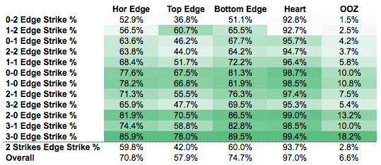
The heat mapping runs vertically within each column, so the darkest green indicates the highest called strike rate for each zone relative to each type of count. Overall, the pattern is similar to what we’ve seen time and again–umpires are giving pitchers more called strikes when they are behind in the count. The one real exception here are 3-2 counts, where called strike rates appear lower than we would expect relative to the general pattern.
What is more interesting, however, is the difference between the different edge locations. The horizontal edges have an overall called strike rate of 71 percent. Pitches to the bottom edge are slightly better at 75 percent, while pitches to the upper edge of the strike zone manage a measly 58 percent called strike rate. Not only are umpires more gun shy when it comes to calling the high strike, but they are even less enthusiastic about punching a batter out on these pitches.
If we compare the difference between the overall called strike rate and the rate when a pitcher has two strikes, we find that the percent difference is more drastic for pitches to the top edge of the strike zone (-27 percent, versus the bottom (-20 percent) and horizontal edges (15 percent).
This drastic difference between called strikes and the two vertical edges got me thinking how player height might play a role. I ran called strike rates for pitches in the top and bottom edge zones by both batter and pitcher height and then compared them to the average called strike rates for those zones (simply, called strike rate_height/league called strike rate). The results are interesting:
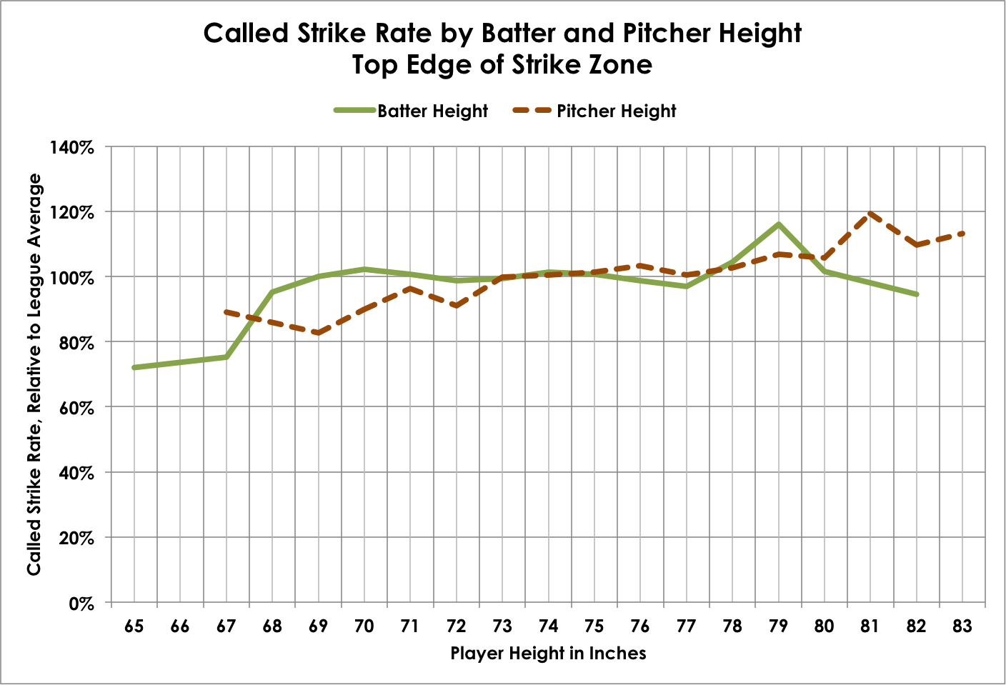
For pitches thrown to the top of the strike zone we see the called strike rate increasing with pitcher height. Pitches thrown by hurlers less than 6-foot-1 (73 inches) tend to be called strikes at a lower rate than average, while taller pitchers manage average to above average called strike rates. For batters, the pattern is less obvious but there appears to be some marginal differences at extreme heights, at least for hitters on the left tail of the distribution (think Jose Altuve).
What about the bottom edge?
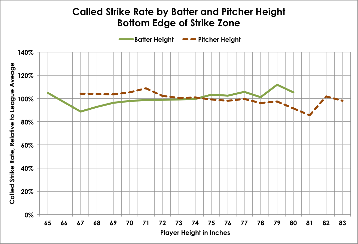
The results here are not as drastic. Pitchers shorter than 6-foot-1 appear to get these calls more than average, while taller pitchers have more trouble getting umpires to give them the low strike. The pattern appears to reverse itself with batter height, consistent with what we see with top edge pitches.
Why would there be a difference by batter height? Off the top of my head, there could be two drivers.
First, umpires may adjust their personal strike zone much less than the rule book says they should. Technically, the horizontal edges of the strike zone are standard wherever you play (although we know that isn’t the case in practice). But the vertical edges of the strike zone are also supposed to fluctuate based on batter height. While this could account for the pattern we see with hitters (i.e., umpires generally have a “higher” vertical strike zone), it doesn’t account for variation in pitcher height.
Which leads me to my second thought, that the differences are less about an umpire’s personal vertical zone and more about perception. With a taller pitcher, my guess is a pitch up in the strike zone will appear to have less vertical movement given the release point and trajectory to home plate. A pitch down in the zone, however, will appear to have greater vertical movement and therefore umpires may be tricked into thinking the pitch was thrown out of the strike zone. The same thing could be at play for shorter pitches. Pitching up in the zone might appear to be the result of greater vertical movement relative to the release, tricking the umpire into believing the pitch was high. Contrast that to pitches to the bottom of the zone, which might appear to move less drastically out of the hand of a shorter pitcher. This would also account for why the effect seems more pronounced for top of the zone pitches–pitches thrown to the bottom of the zone are going to appear to be moving more vertically regardless of pitcher height, at least relative to pitches up in the zone.
Those smarter than me in this area (e.g., Harry Pavlidis, Dan Brooks, Alan Nathan, etc.) will surely have better explanations.
Location, Pitch Type and Performance
Something that has puzzled me since the first iteration of Edge% were some of the outliers I found–specifically, Matt Harvey and Max Scherzer. In general, a higher Edge% is associated with better overall performance. However, Harvey and Scherzer put up remarkably similar seasons in 2013 in terms of both their performance and their distribution of pitches–and where they threw the ball didn’t necessarily align with the findings regarding Edge% and performance.
Now, of course Edge% isn’t perfectly correlated with performance–there is more nuance than just “throw the ball to the edges” to be successful. But it spurred the question whether there are general relationships between pitch types and strike zone location that we might incorporate into our use of Edge%.
Scherzer and Harvey both threw to the heart of the zone more than the average pitcher in 2013 (114 percent of league average), but both had extremely effective fastballs and swing-and-miss secondary stuff. And while both threw to the edges about the same as the league average, they used the edges in different ways.
Harvey threw six percent of his pitches to the upper edge, which was actually 161 percent of the league average for that location. Scherzer generally avoided the upper edge, but threw to the bottom edge at an above average rate.
| Matt Harvey vs. Max Scherzer | ||||||||||
|---|---|---|---|---|---|---|---|---|---|---|
| Stat/Rate | Harvey | Scherzer | ||||||||
| Hor. Edge% | 15% | 16% | ||||||||
| Top Edge% | 6% | 3% | ||||||||
| Bottom Edge% | 6% | 7% | ||||||||
| Heart% | 25% | 25% | ||||||||
| OOZ% | 48% | 48% | ||||||||
| All Edge% | 26% | 27% | ||||||||
| Hor. Edge+ | 89 | 97 | ||||||||
| Top Edge+ | 161 | 82 | ||||||||
| Bottom Edge+ | 93 | 118 | ||||||||
| Heart+ | 114 | 114 | ||||||||
| OOZ+ | 94 | 94 | ||||||||
| All Edge+ | 99 | 100 | ||||||||
| K% | 27.7% | 28.7% | ||||||||
| BB% | 4.5% | 6.7% | ||||||||
| K%-BB% | 23.2% | 22.0% | ||||||||
| BABIP | 0.280 | 0.259 | ||||||||
| LOB% | 77.4% | 74.4% | ||||||||
| ERA- | 63 | 71 | ||||||||
| FIP- | 55 | 68 | ||||||||
To further dig into this, I calculated expected run values for different buckets of pitches when thrown to different parts of the strike zone, and further cut the data by how hard the pitches were thrown. I based the bucketing of pitches loosely on the three classifications used at Brooks Baseball (i.e., hard stuff–all types of fastballs, except splitters; breaking stuff–curveballs, sliders and knuckle curves; off speed–change-ups, splitters and screwballs). It’s a little rough, but we can always refine the classifications later.
Here are the results for hard stuff:
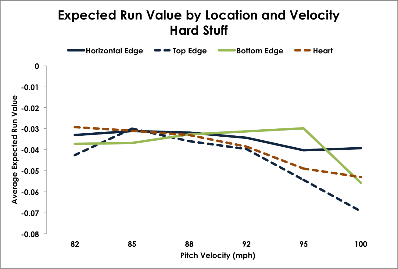
Generally, throwing to the heart of the zone results in less expected runs. This makes intuitive sense when we look back out our called strike rates; if a batter takes these pitches it will result in a strike 97 percent of the time on average. Between 82 and 85 mph, however, the other areas of the strike zone do appear to produce better results. This is likely due to batters taking fewer of these pitches, which negates the called strike advantage of the heart pitches and amplifies the contact advantages of the edges. As velocity increases, however, the heart generally produces better outcomes, save for pitches at the top of the strike zone.
The takeaway for me–and, it’s not surprising–is that the harder you throw your fastball, the less the advantage you gain from avoiding the heart of the zone.
Here are the results for breaking pitches:
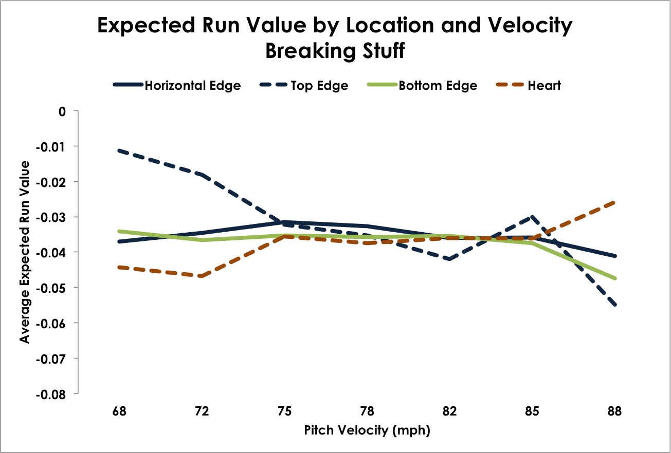
Breaking pitches display a similar pattern, with higher velocity pitches producing fewer expected runs. However, the difference are minimal for pitches on the horizontal edges. The difference between the highest and lowest velocity buckets is only 10 percent for those pitches. The biggest difference we find is with breaking balls in the upper edge, with a difference of 382 percent between the slowest and hardest pitches. The only area that gets worse as velocity increases appears to be pitches in the heart of the zone. It could be that if a breaking pitch ends up in the heart of the zone it likely doesn’t have as much bite or movement, so without the advantage of the speed differential it has the same impact as a below average fastball.
Finally, off speed pitches:
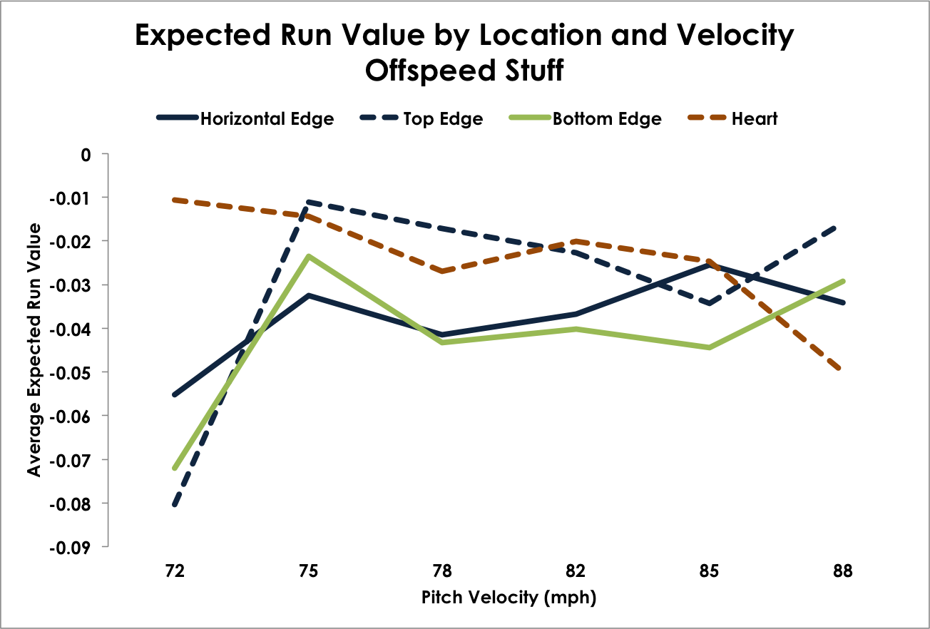
Pitches on all edges here appear to be most effective when they are thrown between 72-75 mph. After that, bottom edge and horizontal edge pitches generally decrease in effectiveness with greater velocity. Expected runs for heart and top edge pitches shoot up between 75-78 mph, but then both steadily decline as they are thrown harder.
If you’ve stuck with me so far, I’d like to thank you and also suggest that you seek professional help.
One last thing I wanted to look at was whether the count had an impact on the overall effectiveness of throwing to each of the different zones.
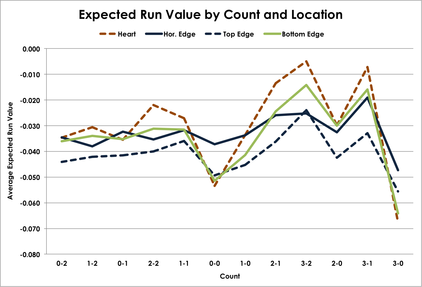
I know, I know, it’s a line graph with data points that are not related to each other temporally. Normally I try to avoid this, but I found this was the easiest way to look at data at one time. Turning to the actual data, we find that while the expected run values for each location vary from each other, they generally vary in similar ways by count. Despite the fact that strikes are called more often when the pitcher is behind in the count, run values generally increase as the count moves toward the batter’s favor. The two general exceptions are 0-0 and 3-0 counts. Looking back at our called strike chart above, you can see that 0-0 counts generate better than average called strikes for each location, and 3-0 pitches are number one across the board. Combine that with the fact that swing rates are the lowest on 3-0 counts and second-lowest for 0-0 counts and the numbers make a lot of sense.
Wrapping Up
So I dumped a lot of information on you all. And, to be honest, that is the result of where we are with the research. Determining the contours of these new Edge metrics is a lot more complicated than at least I initially thought. Working through the data led to a host of additional questions, which led to most of the analysis above. Some of it is relevant, some of it is more “nice to know.” But even with everything above there are still questions to answer and analyses to run.
So where do we go from here?
First, the called strike work can be further expanded upon by adding in pitch type, outs in the inning, handedness of pitchers and batters, and a host of other variables similar to what I ran using the old Edge metrics.
Second, it would be interesting to see whether the difference in pitch velocity from one pitch to another has any impact on the effectiveness of throwing to various parts of the strike zone. The question of velocity differential is a research topic in and of itself, but it would be interesting to see how it impacts pitch effectiveness in different locations and how that might also mediate the general patterns we saw above with pitch types. I think that would likely show that it’s less about absolute velocity and pitch types and more about velocity differential for each pitcher.
Third, just like we did with the original metric there needs to be an analysis that links pitch location distribution to pitcher outcomes. Do pitchers with above or below average edge rates perform better or worse? What about top and bottom edge-heavy pitchers? Are there general advantages to throwing to these zones or do the advantages differ by pitcher based on their pitch types, velocities, and where the pitchers are located?
A lot to tackle, hopefully soon.
References and Resources
- Strike zone dimensions courtesy of Mike Fast’s work.
- PITCHf/x data from MLB’s Gameday application, via FanGraphs.
Called strike rate by pitcher height sparked a curious thought for me… What if the umpire actually calls the strike zone not based on where the ball crosses the plate, but where the catcher catches the pitch? There’s obviously some trajectory between the ball crossing the plate and it reaching the catcher, and taller pitchers will have a steeper trajectory. The catcher would catch the low strike from them at a lower position than from a shorter pitcher. The catcher would catch the high strike from them at a lower position as well. If the umpire was watching the glove, he’d tend to give the tall pitcher the higher strike but not the lower strike.
When you consider that these umpires are generally older than the players, likely with slower reflexes for catching these subtle differences in pitch location, it is at least conceivable that they determine which pitch is being thrown and subconsciously determine whether the pitch was a ball or strike based on where it was caught an what their expected strike zone for that pitch is (based on where the catcher catches that type of pitch). If this were the case, it would explain why pitch framing appears to have so much value.
When I saw the title, I thought this post would be about how the strike zone changes as the game progresses, with pitcher’s ability (or inability) to hit the edge in early innings resulting in a larger (or smaller) edge in later innings. Has anyone done any work like that?