Explaining the 2019 MLB Home Run Record with Quality of Pitch

Pitching: one of our world’s most mysterious art forms. (via Doug Shaw)
Most media explain the 2019 home run “explosion” with ball manufacturing changes, and some with batter technique. Baseball is not just bats and balls, but also the art of pitching. As in the art of painting, where a small change in brush or stroke can make an entirely different result, a pitching technique’s location and pitch type can greatly affect batted ball results. Indeed, Jim Albert, the lead statistician on the MLB Commissioner’s scientific panel that studied the home run surge of 2019, recently blogged, “[D]on’t get so preoccupied with tearing up or measuring baseballs without looking at the whole story.”
In this article, we will discuss the role of pitching in the home run record of 2019. In particular, we will focus on the following three questions: (1) How do pitching changes relate to home runs? (2) Has pitching changed in 2019? (3) How has pitching changed in 2019?
I. How do pitching changes relate to home runs?
Let’s begin with the first question, How are changes in pitching related to home runs? To answer this, we will use our quality of pitch statistic, or QOP. An individual QOP value (QOPV) is calculated from the following pitch components: rise, breaking point, vertical break, horizontal break, location, and speed of a single pitch. The scale is roughly 0 to 10 where the larger the value, the better the pitch. The major league QOP average (QOPA) is around 4.5 with a median of around 5.0. (For details, see www.qopbaseball.com, which includes a tool to obtain QOP averages for any player and date.)
The data used throughout this article is the PITCHf/x data from 2008 to 2019. The results presented here are a summary of our detailed study, which will be referred to as our technical report.
There is a moderate correlation between QOPTM and home runs. The correlation is invisible, however, when looking at the QOPA for a season versus the total home runs (Table 1a). In many cases, home runs increase in years where QOPA increases.
| Year | 2008 | 2009 | 2010 | 2011 | 2012 | 2013 | 2014 | 2015 | 2016 | 2017 | 2018 | 2019 |
|---|---|---|---|---|---|---|---|---|---|---|---|---|
| HR | 4878 | 5042 | 4613 | 4552 | 4934 | 4661 | 4186 | 4909 | 5610 | 6105 | 5585 | 6776 |
| % inc | 0.98 | 1.03 | 0.92 | 0.99 | 1.08 | 0.95 | 0.90 | 1.17 | 1.14 | 1.09 | 0.91 | 1.21 |
| QOPA | 4.47 | 4.51 | 4.46 | 4.47 | 4.57 | 4.57 | 4.57 | 4.58 | 4.59 | 4.49 | 4.48 | 4.39 |
The correlation is masked because some underlying variables are blended together such that, when identified and separated, the correlation is revealed. Now, our primary explanatory variable is the range of QOPV as shown in Figure 1a below.

Figure 1a. Plot points were obtained by taking all pitches within 0.5 of QOPV 0, 1, 2,…,9 and finding the proportion of home runs for those pitches, e.g. if there were 1,000 pitches in the QOPV range of 1.5 to 2.5 with 6 home runs the proportion would be 0.006. The middle QOPV value is 2, which is plotted against 0.006.
It turns out that for pitches with QOPV below 3 — the poorest quality pitches, mostly outside the strike zone — home runs increase as QOPA increases. This is because these tend to be the outside, teaser, ball in dirt, etc. pitches. For the pitches of interest — QOPV around 3 and up — there is a clear decrease in home runs as QOPV increases. This holds for all pitches (red curve) as well as pitches swung at (blue curve). Now, plotting the home run proportion by QOPA in two groups, above 3 and below 3, reveals the correlation. (See Figure 1b below.)
There is a positive correlation between QOPV and home runs for low-quality pitches (QOPV<=3) and a negative correlation for mid- to high-quality pitches (QOPV>3). Thus, there are two different categories of QOPVs that relate to home runs, but in opposite ways. As the QOP decreases under 3, these out-of-strike-zone pitches become so bad that they are unhittable, whereas when QOP increases over 3 these pitches become more difficult to hit because they are increasingly well thrown. This observation will be important later.

Figure 1b. Plots of home runs (HR) by QOPA, split according to pitches with QOPV <=3 versus QOPV >3
The correlations in Figure 1b imply the variation in the proportion of home runs that can be explained by QOPA is over 100(-0.68)^2 = 46.2%. This means that QOPA can account for around 46% of the variation in home run proportions over the years. Separating the pitches by pitch type yields a 26% variation.
To further characterize the relationship between QOP and home runs, we explored a more sophisticated statistical technique called a generalized linear logistic regression model. We were able to successfully construct a model that explains around 40% of the variation in the proportion of home runs using the six pitch components that make up QOPTM (see technical report). Even without an exact proportion of variation, our range of 26% to 46% shows strong evidence that the quality of pitching is one factor, among others, that explains annual home runs. The other 54% to 74% is due to other factors, which likely include changes to the ball and batting technique.
Having established that there is a relationship between the quality of pitch as measured with QOPVs and home runs, we turn to the main question.
II. Has Pitching Changed in 2019?
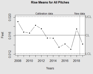
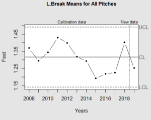
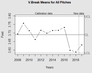
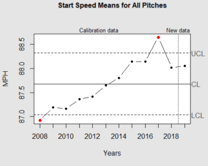
Our first look at whether pitching has changed is to examine the control charts for each pitching component as seen in Figure 2a below.
The graphs in Figure 2a are called Control Charts and are routinely used in manufacturing quality control to detect when a process is within historic limits, and when it is extreme. In particular, the middle lines are the mean of the component, and the upper and lower limits (UCL and LCL) are the mean +/- three standard deviations. By viewing the graphs we can see the change in the component’s behavior over the years, and identify when the change is particularly extreme (i.e. above the upper limit or below the lower limit). We discussed the extreme changes of 2017 in a previous article. For our current year, 2019, two changes stand out: horizontal break and location. The pattern is very similar for control charts of home runs only (see technical report).
Horizontal break is the horizontal distance in feet that a pitch breaks from a projected straight line pitch, or how far away a pitch goes after leaving its originally straight path. Our location scale is more complicated. It is the only QOP pitch component not directly measured on a physical scale. Our location is a non-linear function of the vertical and horizontal coordinates of the ball’s location in the strike zone plane. The scale starts with zero at the corners of the strike zone, and points accrue as the ball moves out from the corners, both into the center of the strike zone as well as out of zone (see www.qopbaseball.com.) Medians are plotted, instead of means as with the other components, because the location distribution is skewed. The mean horizontal break spiked to a record high in 2017, dropped to a record low in 2018, and dropped further in 2019. Median location has been relatively flat in recent years, but has spiked dramatically this year. What is happening?
 |
 |
 |
 |
 |
 |
III. How has pitching changed in 2019?
The primary change is that pitchers are pitching less in the middle of the strike zone and shifting to more pitches low and inside. To see this, we use the PITCHf/x / Statcast location model, shown in Figure 3a.
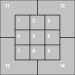
Figure 3a. Strike zone location model.
Zones 1-9 are inside the strike zone and zones 11-14 are outside. See our technical report for how we resolved the discrepancy between the PITCHf/x and Statcast zones. Figure 3b shows the proportion of pitches thrown into each zone.
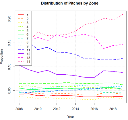
Figure 3b. Distribution of all pitches by zone. For a given year, the sum of the proportions for zones 1-9, 11-14 is 1.00. In this way, looking vertically at the graph, one can see the distribution of pitches within a given year. Looking horizontally at the graph, one can see the change in the proportion of pitches, by zone, across years.
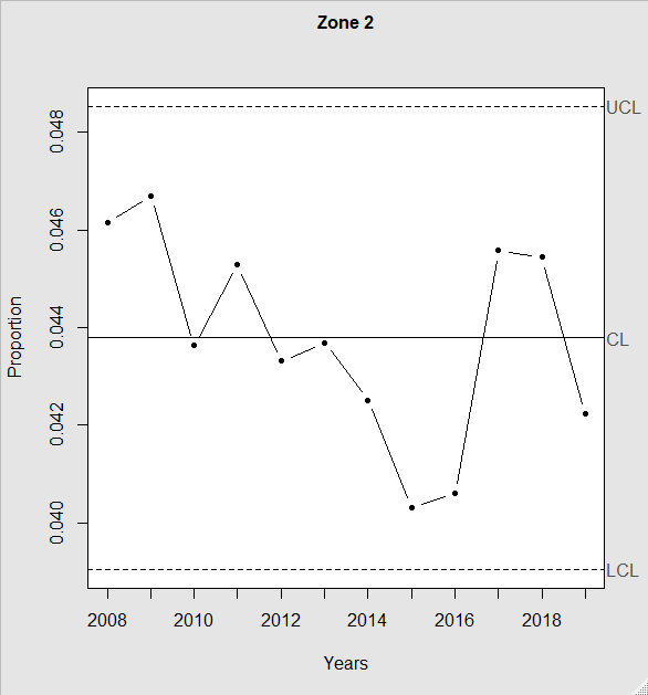
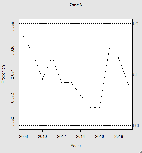
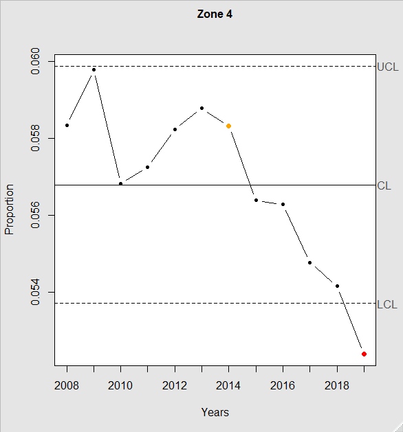
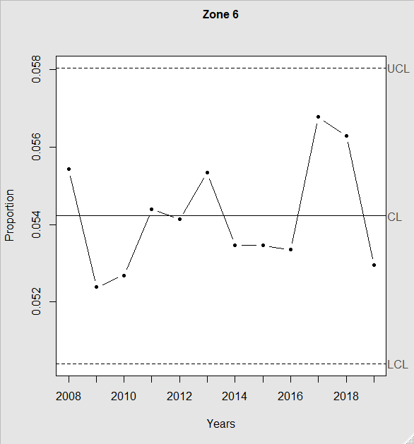
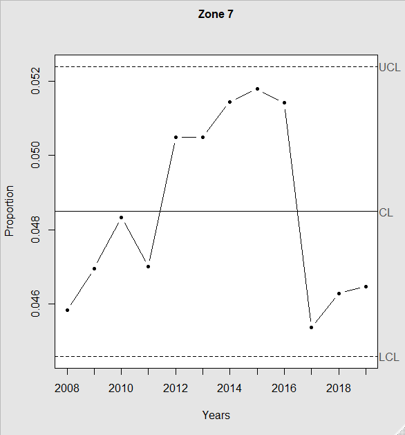
This graph shows a noticeable increase in the proportion of zone 13 and 14 pitches — low and outside of the strike zone — in 2019. Slight declines in some of the inside-strike-zone pitches can be seen, particularly zone 5. However, the scale of the graph does not give a sense of whether such changes are significant until the zones are examined individually. We do this with control charts in Figure 3c.
 |
 |
 |
 |
 |
 |
 |
 |
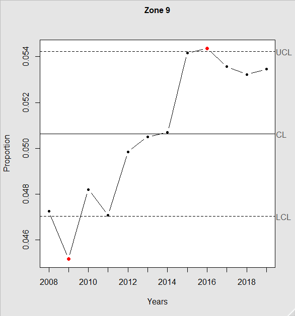 |
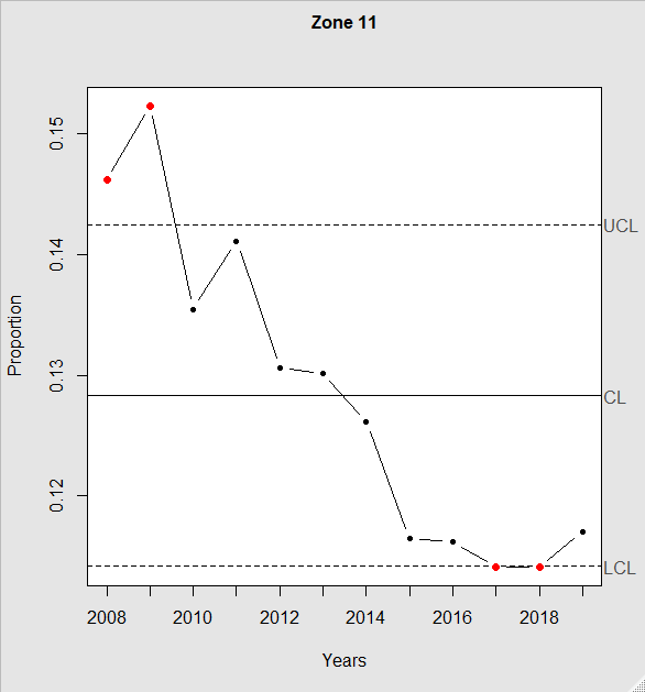
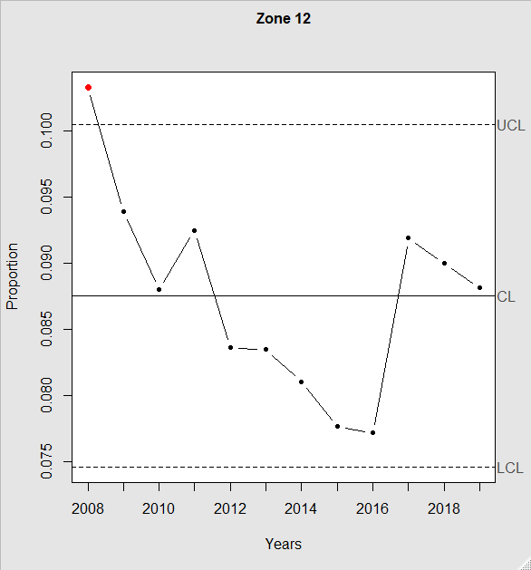
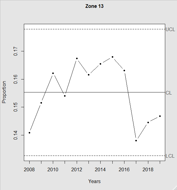
This clearly shows that a proportion of pitches have been moving out of the top and middle of the strike zone (zones 1-6). There is little change at the bottom of the strike zone in 2019 – the significant changes there occurred in 2015 and 2017. Next, let’s inspect outside the strike zone in zones 11-14 (Figure 3d).
 |
 |
 |
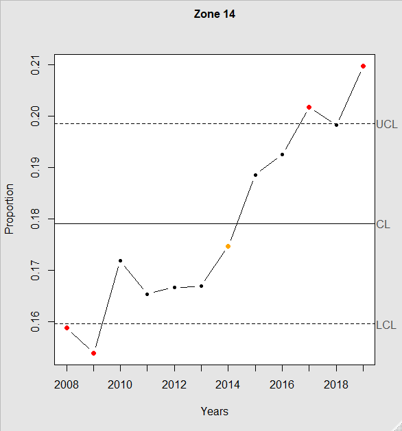 |
There is a jump in zone 14 from about 20% to 21%. Despite one percentage point perhaps seeming insignificant, zone 5 in Figure 3c shows it to be nontrivial. Zone 5’s visibly large decline in proportion is only 0.066 to 0.062, which is 0.4%! Thus, the decline in zone 5 is less than half of the increase in zone 14. Similar observations can be made about the other zone proportions, which means that the pitches moving out of zones 1-6 are mainly showing up in zone 14. See our technical report for tables of the exact numbers.
This could naturally lead one to inquire about the splits by pitcher-batter handedness matchups. For example, how might the graphs above change if a right-handed pitcher is matched with a right-handed batter (R-R for short), or a right-handed pitcher vs. a left-handed batter (R-L for short)? This quadruples the number of graphs and complicates the analysis.
As explained above, we observed more pitches low and close to the batter, which is zone 14 for R-R matchups and zone 13 for L-L matchups. Nevertheless, we were intrigued to see how pitchers locate pitches differently for batters with opposite handedness. Specifically, pitchers throw more high and close to the batter or low and away from the batter. Figure 3a shows the totals and the split graphs may be viewed in the technical report. This relates to horizontal break, in that all of the pitching changes of closer-to-the-batter have reduced horizontal break.
Having considered the changes in the pitching by zone, let us consider the proportion of home runs by zone, shown in Figure 3e.
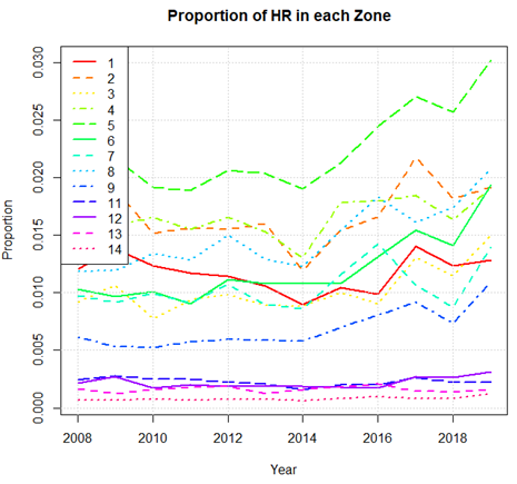
Figure 3e. Proportion of home runs in each zone. For example, of the pitches to zone 5 in 2019, about 0.030, or 3%, were hit for home runs. Unlike Figure 3b, the sum of the proportions vertically, for a single year, is NOT 1.00.
The proportion of home runs has increased in 2019 for all zones! Considering all zones when split for pitcher-batter handedness matchups, 83% show an increase in home runs (see technical report). To consider the effects of these results, let us consider zone 14 as an example. In Figure 3e it appears essentially flat, except with a slight uptick in 2019. Looking at its control chart in Figure 3f, however, reveals a different story.
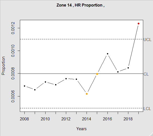
Figure 3f. Control chart for the proportion of home runs hit from zone 14. For example, in 2016 around 0.0010, or 0.10% of the pitches to zone 14 resulted in home runs
The proportion of home runs increased from 0.00085 in 2018 to 0.00131 in 2019. This is an increase of 0.00046 home runs per pitch. Using this proportion for the 2019 regular season, and the 737,297 pitches in our database, with 0.2088 (20.88%) of the pitches in zone 14, this would result in an increase of 0.00046*737297*0.2088= 70.8 additional home runs. Similar calculations for each zone gives us these results:
| Zone | 1 | 2 | 3 | 4 | 5 | 6 | 7 | 8 | 9 | 11 | 12 | 13 | 14 |
|---|---|---|---|---|---|---|---|---|---|---|---|---|---|
| +HRs | 21.3 | 41.8 | 77.0 | 116.5 | 214.5 | 175.8 | 169.4 | 166.7 | 157.7 | 24.3 | 13.3 | 43.1 | 70.8 |
Summing the increased home runs for each zone is 1,292. The actual difference between 2019 (6,676) and 2018 (5,585) is 1,191, which is 101 more home runs than expected from zone percentage increases. In principle, the variation in home runs could be partitioned into sources due to material changes (i.e. the ball) and human changes (i.e. pitching and batting). The uniform increase across all zones implies that some of the variation is due to material changes, although it is not possible to identify how much due to the lack of per-pitch ball data. The additional 101 home runs imply human variation.
IV. Conclusions
After establishing correlation between quality of pitch and home runs, we determined that quality of pitch accounts for a meaningful amount of the variation in the proportion of home runs in the major leagues. Two components substantially changed in 2019 from historic levels: horizontal break and location. Location had the proportionally largest change, and appears to be the primary factor. Location significantly changed from the middle of the strike zone (zones 4-6) to low and closer to the batter (zones 13 and 14, depending on batter handedness). This accounts for the decrease in horizontal break. At the same time, 83% of pitch zones experienced an increase in the proportion of home runs from 2018 to 2019 (counting differences in pitcher-batter handedness match-ups).
These results are consistent with either a passive or an active pitcher, i.e. an unconscious reaction or conscious decision. The passive pitchers would be reacting to a perceived threat of batters hitting more home runs. The active pitchers would be attempting to control the game by altering their strategy, albeit unsuccessfully. Furthermore, balls with less drag may result in pitchers achieving less command and horizontal break: inadvertently pitching straighter. This may allow batters to better read the pitch trajectory and result in better contact.
Regardless of whether the change in pitching is unconscious or not, we see that the quality of pitch in 2019 finished at a record low with home runs at a record high. Pitchers are moving their stuff from locations that yield more home runs (middle of the strike zone) to locations that yield fewer home runs for batters (low and close to the batter). In the aggregate, this change is yielding the opposite of what may be expected (a decrease instead of an increase in home runs), in part due to lower overall quality pitches.
It must be kept in mind that the pitch quality variation accounts for around 26% to 46% of the variation in home run proportion, leaving 54% to 74% of the variation to other factors. These other factors likely include changes in the ball, increased uppercut swinging by batters, and perhaps lesser factors as well. Pitch quality has thus been shown to be one of the factors in the home run surge of 2019, although not the majority factor.