Groundballs, Flyballs and Line Drives
Our friends at Baseball Info Solutions track every single batted ball in every game. If a batted ball results in an official plate appearance (that is, a hit or an out), they place the batted ball in one of three buckets: groundballs, flyballs and line drives. Actually, they also track bunted balls, but we’re not too concerned with those — the first three types make up about 99% of all batted balls. So let’s talk about those.
Here’s a little table, based on games played through May 4th, of the number of each type of batted ball, and what percent of each type was turned into an out:
                NUMBER     OUTS    OUT%
Groundballs       9952     7208     72%
Flyballs          7845     6179     79%
Line Drives       4082     1050     26%
Total            21879    14437     66%
45% of batted balls were groundballs, 36% were flyballs and 19% were line drives. But line drives were much more likely to become hits than groundballs and flyballs, while flyballs were most likely to be turned into an out. Overall, 66% of all batted balls were turned into outs by the fielders.
Actually, this data is a little bit misleading because it includes home runs (which are mostly flyballs). There were about 880 home runs hit during this period. When you take them out of the data, you find that 69% of all fieldable balls were converted into outs by fielders — which is consistent with the DER (Defense Efficiency Ratio) that is listed in our stats section. Data consistency always makes me feel good.
There’s gold in them thar data — so much that I hardly know where to start. For instance, your first inclination might be to say that flyball pitchers are better than groundball pitchers (more outs per batted ball) but then you’d realize that flyballs are most likely to turn into home runs. We need to dive a little deeper into the data.
For this article, I’m going to take a closer look at team data only and leave player data for later. To start, here is a graph of batted ball type distribution by each team’s pitching staffs (the solid gray box) and each team’s batters (the lined box). All 30 major league teams are included.
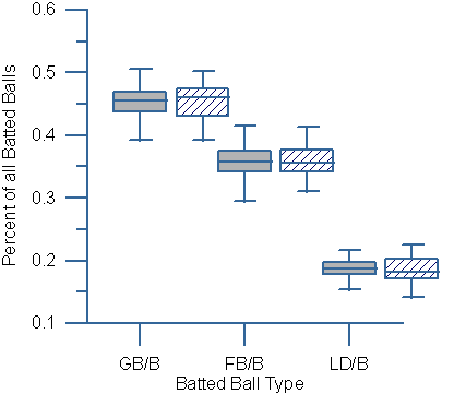
This is called a “box whisker graph.” The median of each batted ball type is represented by the horizontal line in the middle of each box. The boxes represent the 25th and 75th percent quartiles, and the extended vertical lines include the rest of the teams.
This graph will be a lot more revealing with individual player data, but even at the team level, you can see one important point: batters, more than pitchers, determine if a batted ball is a line drive. Look at the pitching and batting boxes for line drives, and you’ll see that the variance is greater for batters than pitchers. The difference from the top to the bottom is greater, for both the boxes and the extended lines.
By the way, it may look like the variance for flyballs is wider for pitchers, but that is primarily driven by one outlier (the Braves, who have a very low FB%), so we can’t call it conclusive. But the implication of the line drive data is pretty clear: major league pitchers don’t vary a lot in their ability to cause or prevent line drives, but major league batters do vary in their ability to hit them.
As you can imagine, batters who hit line drives are more likely to see them fall in for hits. Here’s a graph of each team’s LD% (percent of batted balls that are line drives) and its BABIP (Batting Average on Balls in Play).
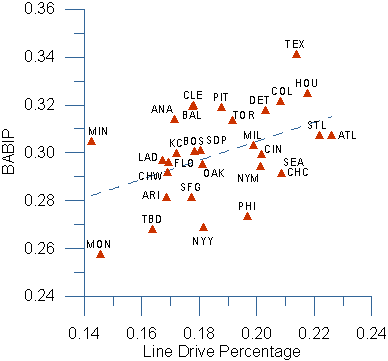
You can see that BABIP generally increases as line drives increase. Of course the correlation isn’t perfect (R squared of .20), but the trend is unmistakable. Certain ballparks can also have a big impact on BABIP, so let’s adjust this data by ballpark, using some figures provided by the generous Tangotiger.
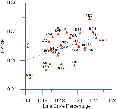
It may be hard to see, but this adjustment helped the “fit” a little (R squared of .22). In fact, it’s probably safe to say that the Rangers and Orioles have been lucky so far (BABIP is higher than LD% would predict), and the Yankees, Expos, Devil Rays and Phillies have been unlucky (vice versa). Time will tell; we’ll keep an eye on this graph as the season progresses.
By the way, the ability to hit line drives is also correlated with overall batting effectiveness (GPA) and Isolated Power (ISO, which is SLG minus BA) but not home runs. Home runs are more closely tied to hitting flyballs.
What about groundballs, you ask? Don’t hit them, unless you’re Juan Pierre or Scott Podsednik. Here is a graph of groundball frequency against GPA:
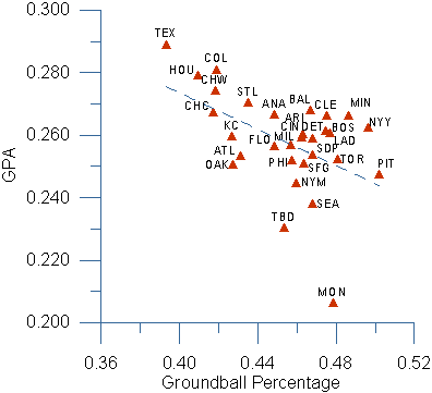
In general, the more that teams hit the ball on the ground, the less runs they score. The R squared for this data is .25.
There are a lot of variables that need to be considered when analyzing offense. These graphs have only looked at batted balls, but obviously the ability to hit a ball in the first place helps, too. So does the ability to draw a walk. So to try and pull things together, I ran a multiple regression model based on a number of factors.
Here’s what I did: I regressed five different rates per plate appearance — strikeouts, walks, line drives, groundballs and flyballs — against the number of runs that each team scored (per plate appearance), to see which factor had the most impact.
In a multiple regression, the best measure of impact is something called the “t-stat” (if I remember my statistics class correctly). Here’s a list of each of the five factors, along with its t-stat:
– Line Drives: 3.29
– Flyballs: 2.89
– Walks/HBP: 1.79
– Groundballs: -0.99
– Strikeouts: -1.76
The R Squared of this model is .39. I won’t go into the technical interpretation of these results, other than to say that line drives and flyballs are the most important factors in the ability to generate runs. Taking a walk is good, too. Strikeouts and groundballs are not good for scoring runs, though strikeouts are worse. Maybe you knew that already…
Okay, this is a very general model — a rough cut at the data. If you have suggestions for improving the model, please let me know.
But before you go, let me try one more graph — let’s look at the offense of the six teams in the very competitive National League Central. I’ll call this the “Three Good Outcomes” graph, because it includes the rate at which each team hit line drives, flyballs or drew a walk (or HBP). The number at the top is the total number of runs each team scored:
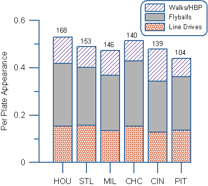
Not a perfect match, but not bad either. Remember, there are a lot of things that impact run scoring. For instance, the Astros play in a batter’s park, and they’ve batted .322 with runners in scoring position. The Cubs, on the other hand, have batted .232 with RISP. The Brewers don’t look very impressive, but their offense features one of the few guys who can turn groundballs into a good thing (the aforementioned Mr. Podsednik). The Reds don’t hit enough line drives (and don’t connect often enough) and the Pirates could use a few more walks and a lot less groundballs.
This is not a definitive graph, but it’s a fun graph, providing a different look at things. Hopefully, you’ve enjoyed it. I plan to turn my “graphical eye for the line drive and fly” to pitching next, as well as individual players, eventually. I’ve already started wondering what the “three good outcomes” looks like for Barry Bonds.
References & Resources
Update:
I just received a great e-mail from JC, who told me that the coefficient of each regressed factor, rather than its t-stat, is more indicative of the factor’s impact. Both are important, but I should have listed the coefficient of each factor for you. So here they are:
Line drives: .464
Walks/HBP: .356
Flyballs: .212
Groundballs: -.069
Strikeouts: -.264
What this means is that walks actually have a bigger impact on scoring than flyballs do. Line drives and flyballs are not as similar in impact as their t-stats would indicate. And that’s as technical as I’m going to get.
By the way, I want to express my thanks to a number of baseball writers and commentators who have stimulated my thinking in this area. They include Mike Emeigh, Chris Dial, Vinay Kumar, Bryan Smith, Tangotiger and the boys at Baseball Prospectus.

I have a question, in 2014 what percentage of fly balls were dropped when 1 player attempted the catch vs. 2 players attempting and 3 players?