How fast should a fastball be?
“As fast as possible,” of course. Many, if not most, of the great pitchers in
the history of the game have thrown the ball hard. Sure, there are
exceptions, but I would guess, without having studied the thing, that
for every Greg Maddux, you’ll find two or three guys like Randy
Johnson, Roger Clemens and Pedro Martinez. And what’s the first thing you want to know about a pitching prospect? Yes, how hard he throws—”Live arm.” “Power fastball.” “Electric
stuff.” They say that scouts aren’t very fond of numbers, but I can
think of several numbers scouts love: 95, 96 and 99, as in
miles-per-hour. Obviously, being able to throw the ball hard is
better than throwing it soft. A fast pitch is just more difficult to
hit than a slow one, right?
Sure, but how much more difficult? And if you have to sacrifice
something to throw harder, like control, do you make that trade? Is it
better to throw 96 down the middle or 88 on the black? These are the
kinds of questions that I’d like to look at today.
What makes a pitch effective?
This issue of the value of speed is part of a broader line of inquiry:
what makes a pitch effective? If you think about it for half a minute, you realize that there are
many things that might affect the quality of a pitch: speed and
location, of course, as I’ve mentioned. Movement, too—an 85-mph slider is going to be more effective than an 85-mph fastball, all
other things being equal.
What else? Well, batter- and pitcher-handedness come into play, since
some pitches are relatively more effective in righty-lefty matchups
than others. What about pitch sequence? If I threw you a changeup
after having already thrown three straight off-speed pitches you might handle
it better than if it had been preceded by a slider and two fastballs,
say. Similarly, the ball-strike count is important: A breaking-ball
thrown on 3-1 might be more effective than one thrown on 1-2, simply
because the batter wasn’t expecting it. There are other things, too,
like deception, which are not even easily defined.
Wow, that’s a lot of things to take into consideration. One way to
approach the problem is to throw all the variables into a regression
analysis, turn the crank, and see what comes out. Don’t worry, I’m
not going to do that. I’m going to take the Thoreauvian approach I
used when look at infield defense last year. The idea is to keep things
as simple as possible, see if you can isolate what’s going on by looking at one piece
of the puzzle at a time.
Just a corner of the puzzle

Since I want to investigate the importance of speed, I need to
compare the effectiveness of pitches of different speed, while trying
to keep “all other things being equal”. Let’s start with location: I’m
going to consider all pitches in a rather small part of the strike
zone, illustrated in the graphic on the right. I’m also confining
myself to right-handed pitchers against right-handed batters, so these
pitches are “low and away”, although they are within the strike zone,
according to PITCHf/x.
What about movement? To get pitches with essentially the same type of
movement, I’m going to only consider fastballs. Most fastballs (from
RHP) tend to have significant tailing action in towards a right-handed
batter, and most have a positive spin-induced vertical movement, i.e. the fall
less than they otherwise would due to gravity. Of course, not all
fastballs will have the same movement, but in general terms they will
be similar.
As for the other effects, like pitch sequence, count and the like:
from necessity, I’m going to assume that this stuff averages out. I’m
forced to do this because if I divide the data up too much, I won’t
have enough pitches in any sub-group to analyze. As it is, I’ve got
about 4000 pitches to work with, which amounts to a little more than
one percent of the total number of pitches recorded by PITCHf/x in 2007.
Ok, so I’m going to initially focus on the 4,000 down-and-away fastballs
from right-handed pitchers to right-handed batters. Now all I need to
do is see how the effectiveness of each pitch depends on its speed and
voila!, we should learn something. But just what is
“effectiveness”, how do we measure that at the pitch level? Well,
luckily, I’ve already figured out how to assign a run value (above or
below average) to any given pitch. I described that methodology in a
previous article, so you can go and read up on the
details, if you like.
Pitch effectiveness vs. speed

So, here are the results in graphical form. Here, let’s go through
this plot one step at a time. Each colored dot represents a group of
pitches that fall within a particular speed range. The ranges for the
different colors are shown in the legend on the right and the points
are plotted such that speed increases as you move to the right across
the plot.
The vertical axis shows pitch effectiveness, measured in runs above
average per 100 pitches. Negative run values mean the pitch is more
effective than average, the more negative, the more effective the
pitch. So, we can see right off the bat that all of these fastballs on
the outside corner are quite effective—a hundred of these
pitches would save about 2.5 to three runs.
OK, now that we are familiar with how to read the graph, let’s
focus on how pitch effectiveness varies with speed. First of all, we
notice that, except for the red point on the far right, there doesn’t
seem to be any dependence on speed. Let me say that in plain English:
An 87-mph fastball in this part of the strike zone is every bit
as effective as a 96-mph heater.
This brings to mind a few questions, for example, How many tumblers of Chianti did you consume while doing this analysis? I’ll try to answer that in a minute. In the meantime, what about that point on the far
right? These 97+-mph pitches appear to be very effective. I
should tell you, though, that there are only 126 pitches in this speed
range, so we may have a sample size issue. The blue point,
corresponding to the slowest pitches, represents only 73 pitches,
while all the other points have 500-700 pitches each.
So what is going on here? Well, frankly, I don’t know, so let’s dig a little deeper. First, let’s expand our zone, as it were. I’m going
to show you the same kind of plot, but now you’ll see what
happens in each of the nine parts of the strike zone. Ready? Here it
is:

You should think of the whole plot as the full strike zone and the different
panels as sub-zones within the strike zone. We’re looking from the
pitcher’s viewpoint, so the lower left panel
shows the low-and-away pitches—the same results as the plot I showed you before. Oh, I also
switched to four groupings of pitch speed instead of eight, to try to
increase the sample size of the slowest and fastest pitches. With me?
Good.
Check out the middle-right panel—these are thigh-high pitches on the
inside third of the plate. Here we see a
nice progression of increasing effectiveness with increasing speed which is perhaps more in line with our expectations. In
this part of the strike zone, speed really helps. This, of course,
confirms the notion that to work inside you really have to bring the heat. Soft tossers best stay outside.

Note that all three of the inside zones show this same speed behavior to some degree,
while all three outside zones show little
dependence on speed. The middle-of-plate zones seem to be somewhere,
well, in the middle.
There’s all kinds of interesting stuff in this plot. For example, let
your eyes focus on all the dots of a single color and see how pitch effectiveness changes in the different zones.
The blue dots (slow fastballs)
clearly do much better on the outer third, while the red dots (94+-mph) can work effectively all over the strike zone, everywhere except
maybe down and in. Actually, down and in is tough on everybody and
should really be avoided if possible (remember, I’m only looking at
fastballs to righties from righties).
Digging deeper
 |
 |
 |
Let’s go back to our low-and-away pitches and see if we can understand
why slow pitches are apparently as effective as fast pitches in that
zone. Let’s dig deeper than just overall runs and look at three
additional measures: percentage of pitches missed, percentage of
pitches that are called balls and runs on balls in play. You see the
graphs for these quantities over on the right. On the left of each
graph we have the low-and-away pitches and on the right, for
comparison, the middle-in pitches, where, as we saw above, speed does
have a big effect.
The first plot shows the percentage of swing-and-misses relative to
the number of swings. We expect a greater percentage of misses as
speed increases and we see that for both the low-and-away and the
middle-in pitches. The trends aren’t that startling, although it appears
that throwing above 94-mph really helps, especially on the inside
pitches. Naturally, pitches on the outside portion of the plate are harder to hit than inside pitches.
In any case, there is nothing in this plot that explains why
speed doesn’t matter low-and-away.
Next, we have the percentage of called balls, relative to the number
of taken pitches. I found this plot fascinating, mostly because it
came as a surprise. Around 30 percent of all taken pitches in the
low-and-away zone are called balls and the faster the pitch, the higher chance it has
of being called a ball. Remember, essentially all these pitches are
actually in the strike zone and should have been called strikes. So,
here we see a definite disadvantage to throwing hard—you have a greater chance of a bad call from the
umpire. That sucks doesn’t it? Ninety-eight mph heater at the knees on the outside black: BALL! calls the ump. Same exact location, but
now it’s thrown at 86 mph: STRIKE! Maybe this is the reason that guys like Tom Glavine,
who work the outside corner with soft stuff, seem to get more than their share of close calls.
The last plot on the right, though, really shows what’s happening. It
appears that when a low-and-away pitch is put into play (I’m including home runs here), the speed of
the pitch doesn’t matter much—all speeds lead to an average
run value of around zero. For the middle-in pitches the situation is
much different and we see a sharp dependence on speed—batters
really cream the slower offerings in this part of the strike zone,
while they generally don’t do as much with harder pitches.
This result on balls in play begs the question whether more hits drop in on slower pitches (higher BABIP) or if the difference comes from
home runs. The next graphic shows the home run dependence on speed, and let’s go back to the full strike zone:

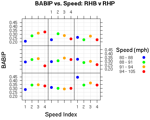
This is the percentage of balls in play resulting in home runs. Keeping in mind that we’re looking at small sample sizes here, we see that a large part of the dependence on speed for inside pitches comes from the ability of hitters to drive the slower pitches out of the park. Outside pitches seem more difficult to hit for homers, no matter what the speed. I am reluctant to also show the BABIP plot lest you see dancing colored dots in your head as you vainly try to fall asleep tonight, but the plot is available for the brave souls that are still interested: BABIP plot.
Looking forward
The PITCHf/x data is so exciting to me because it gives us a chance to investigate some fundamental aspects of the game, things like what makes a pitch effective. Sometimes (most of the time probably), the investigation will confirm conventional wisdom—I don’t know how many times I’ve seen comments on my articles that go like this: “Well, duh! You needed to do all that to tell me Francoeur has a cannon?!? What a *&%^#!” Still, confirming conventional wisdom is almost as valuable as refuting it (although not nearly as much fun, of course). And sometimes you do turn up something interesting or new or just weird and it makes the whole exercise worth doing.
So, what did I turn up with this analysis? Well, keeping in mind the sample size and other caveats previous mentioned, I think I’ve learned that
- fastballs outside don’t depend much (if at all) on speed for their
effectiveness; - conversely, inside fastballs are more effective the harder they are thrown (this one I already knew);
- most of the observed effect appears to come from home runs: outside pitches are rarely hit for homers and when they are, a fast pitch is as likely to be hit out of the park as a slow one;
- a pitch thrown hard is more susceptible to the ump’s bad call than a soft toss.
That’s not too bad a haul, considering we’ve really just started. Stay tuned for more.
The last Metiers d’Art spectacle was staged in the ruins of Lithlingow Palace in Edinburgh, Scotland (see PurseBop’s extensive review here). Since 2003, the show has been an opportunity for Chanel to showcase the craftsmanship of its talented small ateliers