Investigating the Importance of Pitch Selection with Clustering

Pitch selection is obviously important, but it’s even more important when viewed through the lens of clustering. (via Arturo Pardavila III)
The perception of many catchers’ defensive value received major boosts earlier this year when FanGraphs integrated pitch framing into its Wins Above Replacement (WAR) calculations. Whether catcher is the most important defensive position in team-building has more to do with the distribution of talent at the position. Independent of this, though, the catcher position is now recognized as more valuable than previously thought, thanks to the quantification of a skill previously thought to be unquantifiable.
Expanding on the idea that we’re missing parts of a catcher’s value, a logical next step is to try to quantify the value and effects of pitch calling. (The second-order question of how much a catcher controls pitch calling, as opposed to the manager or other members of the coaching staff, is difficult to answer and surely depends on the team and catcher at hand.) Quantifying pitch selection is a fascinating exercise that requires many variables to be considered.
To quantify pitch calling, we have to investigate the counterfactual. We must look at what pitch was called, then determine how much better or worse it performed than any other pitch selection would have done. Counterfactuals are inherently unknowable, leaving the path of investigation relatively open for different approaches.
Intuitively, analyzing which pitches a pitcher has thrown successfully against a batter in the past seems like a good basis for quantification. One quickly realizes, however, that sample sizes in most cases are going to be much too small to derive any predictive value. In light of this, I decided to make groups of pitchers and groups of batters to increase the sample sizes. To group the pitchers I used data on which pitches pitchers throw and how they throw them. Similarly, I grouped batters based on how they hit all the different pitches they faced.
Another consideration is how pitch sequencing affects a plate appearance. Presumably, if a pitcher throws the same pitch over and over, the batters will catch on. This consideration can be addressed in many ways. As a first stab at the problem, I looked at how effective a pitch was when thrown after another pitch (i.e. not the first pitch) in the same plate appearance, based on pitch type and location.
The data used for this analysis is pulled from Baseball Savant. It is a complete collection of every pitch in the 2018 major league baseball season, measured across 90 dimensions listed and described here. Determining what it means to throw the ball or hit the ball like another player becomes a lot easier with these data at one’s disposal. There is pitcher information on release velocity, the spin rate of the ball, and extension of the pitcher’s hand from the rubber. There is information on where the ball is released in three dimensions, how it accelerates in three dimensions, where it crosses the plate in two dimensions, and how much it moves in two dimensions. This is an almost comprehensive recreation of every pitch.
We have similar information on how the ball is hit, but not on how the bat is swung. The relevant batter information for us is launch speed, launch angle, the direction of the hit in two dimensions if the hit was a barrel, and how far it traveled. Since not every pitch is hit by a batter, I also accounted for the percentage of pitches taken, what type of pitches are thrown and where they’re thrown and finally the percentage of whiffs a batter has to create a more complete picture of a batter.
To be able to make sense of these data, they is grouped by player and pitch type, and the mean and variance are taken. This creates 299 variables for each of the 838 batters and 480 variables for the 799 pitchers. Large dimensional data are hard to do statistical inference on because of the Curse of Dimensionality. This phenomenon comes from the fact that adding a dimension increases space so much that it requires observations to be increased exponentially to maintain the same level of density.
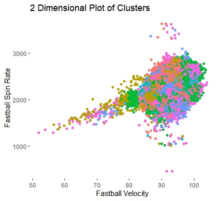
Below is an image of over half a million pitches placed on the two-dimensional axis, followed by a GIF demonstrating how much more space simply adding one dimension provides.
Now imagine having hundreds more of those transformations. The data get very spread out, very quickly. Dimension reduction must take place, and Roger Cheng does a great job here explaining how Principal Component Analysis (PCA) can do just that. While keeping 95% of the variation in the data, PCA reduces the pitching and batting datasets down to 72 and 80 dimensions respectively.
These data now put us in a position to use an unsupervised machine learning technique called clustering to group the players into clusters, which are homogeneous within and heterogeneous between. There are many different clustering methods, like hierarchical or expectation maximization, but I’ve decided to use k-means. k-means requires the number of groups (k) to be predetermined. k “centers” are randomly placed in the data. Each data point is then assigned to the closest center and the k groups are considered. Each group is then given a new center based on some distance measure. The exercise of finding the closest center is repeated and the new k groups are established. This is repeated until all the centers stop moving by some arbitrary amount. Below is an example in 2 dimensions with k=3.

Since k is predetermined, I tested how well each number of center performed at creating groups which are homogeneous within and heterogeneous between. The Davies-Bouldin Index (DBI) is used here to score the clusters on this basis. Its plot for pitchers is below, where a lower score indicates tighter clusters.
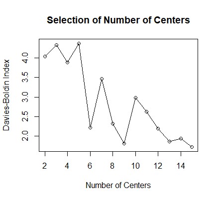
There is a significant drop between 5 and 6 centers. Because of the random nature of the starting points, the exercise is run many times and this plot is indeed representative. It may be tempting to merely choose the number of the centers with the smallest DBI, but this number would be equal to the number of observations in the dataset, which entirely defeats the purpose of clustering in the first place. We are attempting to increase the sample sizes, so we must balance the DBI on one hand and the size of the samples on the other. In this case of the pitchers, six groups seems to be appropriate. The same number appears to be optimal for the batters as well. The number of players in the batting groups ranges from 31 to 330, while the numbers in the pitching groups range from 59 to 250, giving us an ability to decide which pitches to throw to which batters.
Merely looking at the performance of each pitching group against each batting group is interesting, but first, we have to test whether the results are actually predictive. Using the data from the first half of the 2019 season as the test data, the table below shows the Weighted On-Base Average (wOBA), the number of plate appearances, and the rank of the batting group in terms of the pitching group for both the 2018 training data and the 2019 test data. The full data set can be found at https://github.com/peterloiseau/MLB_Pitch_Selection
| Batting
Cluster |
Pitch
Name |
Pitching
Cluster |
Train
wOBA |
Train
n |
Test
wOBA |
Test
n |
Error | Train
Rank |
Test
Rank |
Rank
Error |
|---|---|---|---|---|---|---|---|---|---|---|
| 1 | 2-Seam Fastball | 6 | 0.373 | 2499 | 0.332 | 1006 | 0.041 | 3 | 1 | 2 |
| 1 | 0.322 | 1057 | 0.337 | 371 | -0.016 | 2 | 2 | 0 | ||
| 4 | 0.311 | 475 | 0.413 | 192 | -0.102 | 1 | 3 | 2 | ||
| 2 | 0.396 | 176 | 0.438 | 37 | -0.042 | 4 | 4 | 0 | ||
| 4-Seam
Fastball |
4 | 0.348 | 1436 | 0.327 | 760 | 0.021 | 4 | 1 | 3 | |
| 1 | 0.340 | 2277 | 0.345 | 1085 | -0.006 | 3 | 2 | 1 | ||
| 6 | 0.333 | 4738 | 0.348 | 1992 | -0.015 | 2 | 3 | 1 | ||
| 5 | 0.351 | 1367 | 0.350 | 698 | 0.001 | 5 | 4 | 1 | ||
| 3 | 0.357 | 1871 | 0.362 | 796 | -0.005 | 6 | 5 | 1 | ||
| 2 | 0.332 | 756 | 0.371 | 388 | -0.039 | 1 | 6 | 5 | ||
| Changeup | 5 | 0.291 | 381 | 0.260 | 223 | 0.031 | 5 | 1 | 4 | |
| 1 | 0.274 | 964 | 0.262 | 469 | 0.012 | 4 | 2 | 2 | ||
| 3 | 0.271 | 819 | 0.264 | 321 | 0.007 | 2 | 3 | 1 | ||
| 2 | 0.271 | 375 | 0.291 | 160 | -0.02 | 3 | 4 | 1 | ||
| 4 | 0.238 | 481 | 0.307 | 220 | -0.068 | 1 | 5 | 4 | ||
| 6 | 0.295 | 1185 | 0.321 | 602 | -0.026 | 6 | 6 | 0 |
The rightmost columns show how much the rank changed for the batting group between the test and train data. If the clusters were perfectly predictive, the average change would be 0; if the ranks were assigned at random, the expected average change for the pitchers would be 1.14 and 1.41 for the batters. In the case of the table above, where pitching groups are held constant, the average change is 0.58. When the batting group is held constant, the average change moves to 1.26.
This implies the clustering method does have some predictive value about how a batter will perform against a pitcher based on his batted ball/contact profile and the pitcher’s throwing profile. This method, however, predicts pitcher performance better based on those same variables. In accordance with this finding, there is much less variance in the batting groups ranks likely because these metrics have much more to say about overall performance for batters than they do for pitchers. The crucial insight should be that there is some predictive value about a batter’s performance based on the way a pitcher throws the ball for different groups of batters.
Pulling back out to the question of pitch calling, we can conclude that different batters are more susceptible to certain pitches being thrown in certain ways. With this information in hand, we can analyze which group any individual batter falls into and which pitches he performs the worst against. From there, a pitcher can choose to throw those pitches more often. Increasing our sample sizes with predictive groupings ought to give us higher confidence than what can be mined from individual pitcher-batter matchups.
This still leaves the question of pitch sequencing. While now we have information about which pitches work based on the individuals on the mound and in the box, it still seems unwise to continuously repeat the same pitch over and over. Approaching it naively, we can analyze how much better or worse a pitch is when thrown after all possible other pitches. There were 720,660 pitches thrown across the 2018 major league season. After eliminating all first pitches of plate appearances, we are left with 535,969 pitches that were preceded by another pitch in the plate appearance.
How to group the pitches into adequately-sized buckets is an interesting question and should be done in multiple ways to find interesting insights. The way I decided to proceed was by grouping the pitches into fastballs, breaking balls and offspeed pitches, as per Baseball Savant’s classifications, and then inside (1), middle (2) and outside (3) regions for both same and opposite-handed pitchers. Lastly, I quantified how valuable a pitch was based on the expected wOBA of the count and how it was changed by the result of the pitch (ball, strike or ball in play).
| Balls | Strikes | wOBA |
|---|---|---|
| 0 | 0 | 0.392 |
| 0 | 1 | 0.364 |
| 0 | 2 | 0.172 |
| 1 | 0 | 0.395 |
| 1 | 1 | 0.380 |
| 1 | 2 | 0.184 |
| 2 | 0 | 0.429 |
| 2 | 1 | 0.397 |
| 2 | 2 | 0.212 |
| 3 | 0 | 0.675 |
| 3 | 1 | 0.583 |
| 3 | 2 | 0.383 |
| 4 | 2 | 0.625 |
Now you make ask: How was the wOBA in 2018 0.625 on 4-2 counts? Would the batter not already have walked? But a 4-2 count actually happened twice in 2018. The first instance was in a White Sox vs Blue Jays game in August that resulted in a Lourdes Gurriel Jr. double. For an account of the second instance, I will direct you to a Ben Lindbergh article. Our experience of reality is a bunch of hallucinations we collectively agree on.
With this methodology, below is a heat map for both same-handed and opposite-handed pitchers, where smaller score (darker blue) are a reduction in wOBA, relative to the row–a good result for a pitcher.
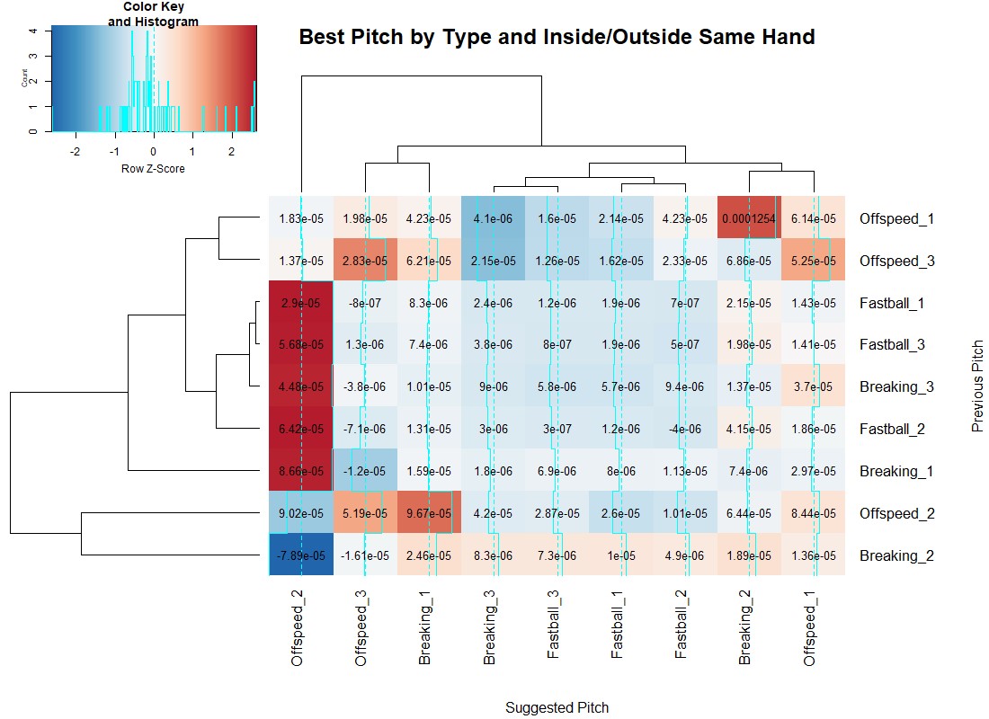
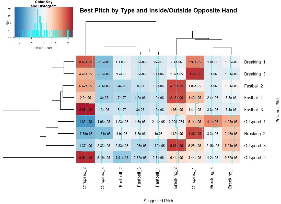
Using the blue lines up the columns, we see when a given pitch is more or less effective when preceded by any other pitch. Interestingly, offspeed and breaking pitches over the middle of the plate have extremely high or low values. They do have sample sizes over 100 pitches in all cases, but they are the rarest events. By definition, they are pitches in the strike zone, so I’d suppose the deep blue cases are where most of the pitches are taken, and given a larger sample they would also become deeply red.
Independent of pitch sequences, inside offspeed pitches to opposite-handed batters are always a bad idea, while moving the same pitch to the outer third becomes very effective. However, when the batter is same-handed, outside offspeed pitches are really only effective when preceded by a non-off speed pitch. Inside breaking balls to same-handed batters follow the same pattern: Preceding offspeed pitches–in this case, breaking pitches in the middle of the plate as well–reduce the effectiveness of the pitch. There are many more interesting takeaways from these maps, and the GitHub page has an analogous heat map where the grouping is done by high (1), middle (2) and low (3) pitches.
These maps tend to show that most bad pitches are bad pitches no matter what happened prior. However, there are findings that align with traditional baseball orthodoxy about changing speeds and locations being valuable. This means we ought to have memory when calling pitches, and not merely throw the same “best” pitch given the batter and pitcher.
Fully integrating this knowledge into a system that captures the value of a catcher would be no small feat. Even without completing that exercise, though, we’ve validated some interesting hypotheses about how pitch sequencing ought to work. We have also leveraged the power of machine learning to conclude that pitchers’ delivery, release, velocity and movement on a given pitch is more effective on some batters based on their batted ball/contact profile. With these insights, we can be sure pitch calling is a significant frontier to study and, with future advancements in research, will once again shift how much value we attribute to the person on the field who’s calling the shots.
This is very cool! Would you be open to posting your code on github as well? Interested in breaking it down further, by count for instance.
Thank you! I’ll clean up the code and post it to the github account linked in the article.
Thanks so much!
Sorry for the wait, but it is posted now.
Very nice, indeed.
Impressive analysis… TAMMY!