Is there a better way of comparing players between historical eras?
How do we compare players from different eras of baseball to each other? We can’t just compare raw numbers, since baseball today is a wildly different game than baseball was in 1920. Was Barry Bonds’ best season stronger than Babe Ruth’s best? Who was more dominant in his time?
One of the best tools we have for these types of comparisons is the “plus” stat, like OPS+ or ERA+. But as useful as plus stats are, it seems to me that they’re missing a small, but important point: Plus stats don’t consider the width of the talent distribution in baseball, which has changed over time.
As a quick refresher, plus stats are calculated very simply—it’s just the percentage points above or below the average, with the average set at 100. And while this works quite well, simple percentage points don’t give the full picture. An OPS+ of 150 is 50 percent better than the league average, but what does that mean? Is 50 percent historically great? Is it fairly commonplace? We can’t tell from the number alone.
When I talk about the width of the talent distribution, I’m talking about the size of the spread of talent in baseball. To use an example, someone who grows to a height twice that of the national average will be studied by doctors for years, but someone who has an annual salary that’s twice the average is very easy to find. Both examples are twice their respective averages (the equivalent of 200 in plus stat form), and yet they have completely different meanings. The spread of human height is relatively narrow, whereas the spread of income is far greater. Baseball’s talent distribution has had different widths throughout history, so if you’re going to adjust a player’s statline to reflect the average of his time, why not adjust for the width as well? Adjusting for both brings us closer to the whole point of adjusting in the first place—we’re attempting to compare two players based on how dominating they were in their era.
A little math background: standard deviation is a statistical measurement of the width of a sample of data, in terms of “distance” from the average. To use my example from above, the standard deviation of human height is much smaller than the standard deviation of annual salaries. Simply, a larger standard deviation means that data points are more likely to be found further away from the average. A general rule of thumb is that you can expect around two-thirds of a sample to exist somewhere between one standard deviation above and below the average. Two standard deviations above and below encompass 95 percent of the sample, and that percentage sharply rises more and more the further you move from the average. For example, the scores on an IQ test are usually scaled so that the average is 100 and the standard deviation is 15. In other words, two-thirds of people have IQs between 85 and 115, and 95 percent of people fall in the range between 70 and 130. To bring this back to baseball, qualified batters in 2011 had an average wOBA of 0.342, with a standard deviation of 0.037. That means that we can expect two-thirds of qualified batters to have a wOBA between 0.305 and 0.379.
For batters, wOBA gives us a total picture of a player’s offensive output, and as you’d expect, the average wOBA for each year has changed fairly dramatically, especially with all of the rule changes in the early portion of baseball history. I plotted the average wOBA along with one standard deviation above and below the average for each year, to give a visual look at how the run environment of baseball has changed over time. Click to enlarge.
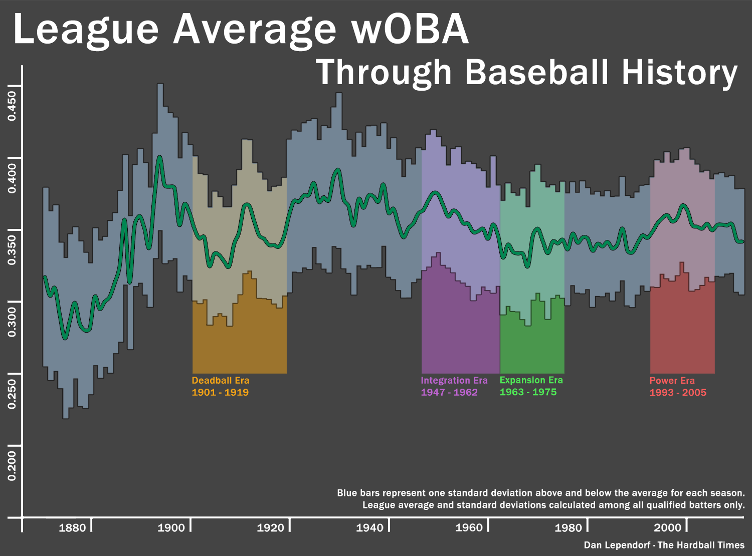
As you might expect, the width of talent in baseball has reduced over the years. In the 1870s, one standard deviation comes out to roughly 20 percent of the average wOBA, and it’s been a gradual decline to the 9 or 10 percent we see today. This means that regular plus stats undervalue modern players, since being 50 percent better than the average in 2011 means you’re ranked quite high. Being 50 percent better than the average in 1885 doesn’t put you ahead of as many players. Interestingly, there’s a spike in the standard deviation up to 12 percent in the late 1990s and the early 2000s. Barry Bonds is probably singlehandedly responsible for a good chunk of that. More on that in a bit.
Once we have the average and standard deviations for each year, it’s easy to see which single seasons were the most dominant of their time in terms of z-score, which is the number of standard deviations above or below the average. Compared to plus stats, this ranking gives a more accurate representation of how dominating a player was, compared to his peers. An plus stat of 150 could be historically excellent or simply merely good, depending on the stat in question and the era. But a z-score is always consistent—a z-score of 3 is always fantastic, no matter the context. Here’s the top 10 in baseball history.
| Player | Season | wOBA | Z-Score |
|---|---|---|---|
| Barry Bonds | 2004 | 0.538 | 4.996 |
| Babe Ruth | 1920 | 0.600 | 4.536 |
| Barry Bonds | 2002 | 0.546 | 4.495 |
| Babe Ruth | 1921 | 0.578 | 4.257 |
| Babe Ruth | 1926 | 0.547 | 4.158 |
| Ted Williams | 1941 | 0.565 | 4.102 |
| Barry Bonds | 2001 | 0.539 | 4.089 |
| Barry Bonds | 2003 | 0.506 | 3.972 |
| Babe Ruth | 1923 | 0.566 | 3.844 |
| George Brett | 1980 | 0.479 | 3.860 |
Seem a little repetitive? That’s right, eight of the best nine offensive seasons in baseball history came from the bats of either Babe Ruth or Barry Bonds. That 2004 season from Bonds is something we won’t see again for a long long time, if ever again.
I’ve put together a full leaderboard of all qualified batters below. For my next article, I’ll do the same for pitchers.
References & Resources
Full sortable leaderboard of all qualified seasons from 1871-2011 here. Be warned, it’s on the larger side. You should be able to sort it if you go to list view. If someone wants to confirm this in the comments, that’d be great.
Some notes:
- This would technically only apply if baseball talent followed a normal distribution, which it doesn’t. But if we restrict the sample only to qualified batters, a normal distribution becomes a decent approximation.
- On the other side of that leaderboard, we’ve got White Sox shortstop Mike Caruso. With a z-score of a ridiculous -2.9 in 1999, he’s the proud owner of the worst qualifying season in baseball history, aside from a handful of guys in the 1800s.
- All data from Fangraphs. Sincerest apologies, Dave Appelman, for asking your servers for every season by every batter in the history of baseball as a CSV file.
Pretty, pretty…
“Power Era” huh?
That’s a nice euphemism.
Come on, Dan. Power era? Why not call it what it was; what everyone else calls it-the era of the ‘Roid Ragin’ era! (Insert smiley face here)
Yes, sortable in list view. Nice work.
I did something similar for my own use a couple years back, just BA for semi-qualifiers (I think I used a cutoff of 140 PA) for 1890 to (I think) 1981. I don’t have it in front of me, but, not too surprisingly, only Cobb and Williams flirted with z-scores around 2.55 for their careers. (I think Cobb wound up with an adjusted BA of .360 lifetime, and Williams .355; Mantle, I recall, jumped up to .317 lifetime, Ruth fell to .323, something like that.)
Wow, this is awesome. Can’t wait for the pitchers.
This is wonderful.
Is there any easy way for you to revise so a span of years can be shown (i.e. 1969-1979)?
Same question for sorting players by last name?
Also, when sorting by player name, any way to within each player have it sorted by ascending year, rather than descending wOBA?
Not nitpicking—great stuff!
Excellent. I think this is probably the best way to do cross era comparisions. The only improvement might be instead of having a qualifier cutoff, to weight wOBA by PAs while including ALL batters, but not sure if it would change the results enough to be worth doing.
@John
I’m not quite sure what Google Docs will allow me to do as far as letting viewers sort and filter a read-only file. But if not, downloading the whole thing and opening it up in Excel would work. I’ll add another sheet to the leaderboard tonight with yearly averages and standard deviations.
@KJOK
I actually started with that (again, apologies to Appelman for the 60,000 row CSV), but the distribution of all players, qualified or not, isn’t a normal one. It’s right-tailed, which makes the standard deviation z-score treatment not applicable. That said, that sample just had larger stdevs across the board, and it seemed pretty consistent.
Bonds was on juice.
Ruth was on beer.
I wonder how Bonds was able to excel if, as we seem to believe, so many other players were also juicing at the same time? How come none of them made the list?
Is it possible he really was pretty good aside from that?
Yes, Bonds was “pretty good” aside from steroids. Nevertheless, the top ten list includes only his steroid years. So did the roids matter? Yup.
Steroid use taints Bond’s records. His best years were when he was on steroids. He should be disqualified from the list.
Bonds was a natural Hall of Famer. It took steroids to turn him into Babe Ruth. Without them he was Frank Robinson – still great, but not the greatest. In 1919, Ruth set the record for homers in a season with 29. He then proceeded to hit 54 and 59 the following two years. The Babe could pitch a little bit, too. For Bonds to have that same shock and awe value, he would have had to hit about 135 and 150 homers in the two seasons following his 73 homer season. Imagine how big his head would have been if he had taken enough juice to do that!
So, I’ve updated the leaderboard Google Doc spreadsheet with a second sheet. This sheet has the average and standard deviation (both weighted by plate appearances, of course) for each year. Qualified batters only, just like before.
How does this chart take into account players who traveled by train vs by air; time zone travel vs basically east coast play; players who hit the dead ball vs players who get a new ball everytime it hits the dirt; players who hit when the mound was 6 inches higher vs now; players who hit with a piece basically a piece of wood vs today computer designed bats; players who wear body armor vs those who didn’t; players who hit against starters left 150 pitches into a game vs todays relief specialists; players who hit pitching in a league with 16 teams vs 30; players who toiled in the NL during the 50-60’s against arguably the greatest pitching ever;
Using z-scores is a basic and obvious step in normalizing across eras, but it does make two important assumptions: 1) that the statistic in question is normally distributed and 2) that a player of a certain z-score in one era is equal to a player of that same z-score in a different era.
The first assumption is easy enough to check. Standard deviations are misleading if the data isn’t normal.
The second assumption is arguable. A wide spread in the talent pool will result in a large variance and as a result large standard deviations. If you suddenly included all minor league players in the majors, variance will increase. It’s pretty safe to assume that the variance in the talent pool is not equivalent across all eras.
The presence of high performers is just as much a function of an increase in the variance of the talent pool as it is the ability of the performer.
another way of distinguishing really great performances by year, is by looking at a player’s numbers, as a standard deviation from the top quartile in that year.
don’t sweat the utility infielders/managers’s sons in the league’s total at bats.
if you can run with the big dogs…ruth, williams, bonds, out ran them
kevin