It makes sense to me, I must regress
Regression to the mean is all about reliability and sample sizes. And variability. And some other stuff. When you look at the reliablity of statistic, you can see why you need to regress. If you’re a visual thinker, hopefully some of the charts illustrate the importance of reliability and how it varies from stat to stat.
In a simple way of looking at it, the more noise there is in a statistic, the more you have to regress a player’s performance. You want to regress each player’s performance to the mean of some population, which is something we’ll grapple with at a later date and give only brief attention today. But how much to regress?
Objective
Identify reliability levels of batter-pitcher outcomes from the pitcher’s perspective. Alternatively, develop the framework for calculating reliability levels.
Methodology
Order all plate appearances chronologically from 2007-2010. Mark the 51st plate appearance and every 50th thereafter, up to 4001. Progressing through each marker, split the plate appearances in half and calculate park adjusted rate stats for each pitcher. Calculate interclass correlation (agreement) as a measure of reliability at each marker.
Plate appearances that ended with a strikeout, non-intentional walk, hit batter or batted ball were included. Batted balls were split into ground balls, line drives, fly balls and pop ups (or infield flies). All outcomes are park-adjusted. Calculating park factors is another can of worms which I’ll keep mostly closed today. The methodology employed there deserves its own space, at some point.
Batted balls were broken down by outcome, and the process was repeated on a per ball-in-play basis. Reliability for outs, errors, home runs, singles, doubles and triples were calculated when possible. Results for outs and home runs (on line drives and fly balls) are shown below, as the number of batted balls for each outcome time could be small, or non-existent for some batted ball types. For singles, doubles and triples the results were all “less reliable” than the out rate, which itself is sufficient to illustrate the control pitchers have over batted-ball outcomes. Again, all results were adjusted by a park-specific factor.
Sample size
Sample sizes start at nearly 1000 pitchers at 50 batters faced, dropping to 13 pitchers at 4000, as shown below. Marker-to-marker attrition rates (with a five period moving average in red) are also shown.

Results
Simply put—and of no surprise—pitchers have some control over the types of batted balls they allow but virtually none over what happens to the ball once it is in play. This over-simplifies things. Dealing with major league pitchers is one big whack of selection bias, compounded by the shrinking sample sizes as the number of batters faced increases. It doesn’t address reliability by age level, for example, which may be easier to tease out with Minor League Gameday data. Of course, there are much larger sets of baseball data to work with. The unstated goal of all this is to get down to pitch-by-pitch metrics, so I’m hoping to stay within the Gameday universe as much as possible.
Click the 3-panel graph below for a larger version in a pop-up window.
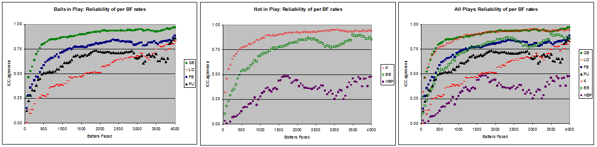
On the left, we have each type of batted ball. The vertical axis shows the ICC agreement, the horizontal axis the number of batters faced. Each point is an increment of 50 batters faced. The middle pane shows reliability trends for balls not in play (walks, strikeouts and hit batters). The third image combines the first two sets of lines into a single graph.
Russell Carlton has used .7 as the threshold of reliability (see References and Resources below) while statistics with .4 to .6 ICC agreements are generally considered reliable in social sciences. For the purposes of regression, it isn’t about thresholds so much as “how much”. If a statistic is “only” .5 reliable, to calculate “true performance” you mix one part the player and one part the population (league, cohort or whatever). If it is .8 reliable, it’s four parts player, one part population.
In a nutshell, strikeout and ground ball rates get reliable quickly and will require the least amount of regression. Walk rates and fly ball rates follow a similar trend toward pretty quick reliability, while pop-up rates stick around until it reaches it’s apparent limit of reliability. Line drives take their own path, but the sample sizes are so small when line drive rate becomes clearly reliable, it may be safer to assume it reaches a limit more akin to that of pop-ups, but at a slower pace. Hit batters are a 50/50 proposition at best.
So, what happens to balls put in play? Here are the reliability trends for outs (per each batted ball type) and home runs (per fly ball and line drive). Click the image to open a larger version in the pop-up window.
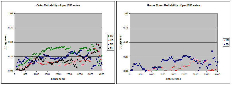
Woah. The right panel tells me that home runs per fly ball need to be blended one part player to three parts population, even after hundreds and hundreds of batters faced. Thousands, even. Pitchers may have a reasonable amount of influence over ground ball outs, but I really get the feeling that the left pane is more a measure of defensive efficiency’s reliability than anything else.
What to do next
A lot. Batter’s perspective, pitch-by-pitch rate stats (whiffs and called-strikes) and age- or level-adjusted regression targets. Sit back, wait for readers to pick apart and improve my technique.
References & Resources
Batted ball data from MLBAM; R and the psy package used for ICC calculations; Russell Carlton’s methodology was the foundation for this entire exercise and lives forever on Web Archive; Eli Witus has an excellent summary of approaches to regression and reliability estimation in sports; Graham MacAree’s tRA takes a very similar approach, which was invaluable in shaping my own; Graphs created in Excel; Article title inspired by/stolen from a Widespread Panic lyric

Harry, this is fantastic stuff. I’m a little slow, however, so I have a question:
I don’t quite understand how you separated out pitchers. Did you include them all until they weren’t in the sample anymore? So, the sample size (in terms of number of pitchers) decreases with the total number of PA? How does this approach impact the findings?
A nicely written and illustrated article on an important subject. Congratulations Harry.
BTW, re-running based on two changes
1) discovered some pre-2007 snuck in … this will reduce sample sizes (we won’t get to 4000 at all) but will get rid of some yuk
2) randomized the plate appearance sequencing
so far, it looks like reliability is being dampened but it’s only run thru the 100 BF group level (long way to go)
Very good stuff. I love this idea of “reliability”. Questions about how it is measured, the accuracy of those measures and their relationship with signal are all vital.
In fact, a few colleagues and I tried to approach these issues in the most recent issue of JQAS (http://www.bepress.com/jqas/vol6/iss3/8/) using a Bayesian mixture random effects model. We got some very similar results with regard to controlling a pitcher’s batted ball distribution. I don’t mean to plug our stuff; I am just really interested in getting someone’s opinion on it who has a good idea of what these issues are.
Dave, you are correct. It creates a few interesting effects. Sample size doesn’t just dwindle, but you (a) lose scrubs who barely pitched (b) eventually start shedding relievers and (c) end up with a very small group of starters (n=13 at 4000 BF !).
It creates a bunch of problems. Ordering pitches sequentially is another problem.
What’s interesting is how well these results are consistent with Tango’s approach to finding regression factors.
Here’s his run of my data:
http://www.insidethebook.com/ee/index.php/site/article/regression_equations_for_pitcher_events/
In short, the data is consistent, with some noise, but can be improved (perhaps) by randomizing the ordering.