Money and wins
Okay, we all know that teams with bigger payrolls tend to win more games. We know it so well, in fact, that many people consider it the scourge of baseball, the evil lurking in our fanatical hearts, the dark side of the force out. Call it the Alpha Team theory of major league ball. If you’re a fan of an Alpha Team, life is good. If you’re a Pirates fan, well, you’ll always have Willie Stargell and Rennie Stennett.
I’m not out to debunk the Alpha Team theory; far from it. I would just like to give it some historical perspective. This is possible thanks to some terrific data collection by THT co-founder Matthew Namee. Matthew recently compiled the payrolls of all major league teams from 1976 through 2011, the Free Agent Years. Matthew has been using the data to analyze the effectiveness of general managers, which is a really cool idea. Consider this article a background piece to his more detailed analyses.
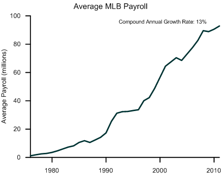
Let’s start at the very beginning. In 1976, the average team payroll was about $1 million; in 2011, it was $93 million. That’s a 13 percent compound growth rate over 35 years. During the same time period, inflation has grown 4.5 percent a year. The S&P 500 index has grown 7.6 percent a year. If you could have invested in baseball players in 1976, you’d be buying lots of THT Forecast subscriptions right now.
Plus, there were just 24 teams in 1976; now there are 30. More teams. More payroll. A boatload of money is now paid to major league ballplayers. It wasn’t always thus.
If you were around at the time, you remember 1976. The month before the New Year, December, 1975, was the month that Peter Seitz changed the economics of baseball by declaring Andy Messersmith and Dave McNally free agents. This ruling basically undermined the reserve clause. Chaos ensued. The owners postponed spring training in 1976, though Bowie Kuhn finally forced them to open their gates. The Twins traded Bert Blyleven. Charlie Finley sold his best talent, though Kuhn overruled that, too. 24 players refused to sign contracts during the 1976 season and were declared free agents at the end of the year. Reggie Jackson, Joe Rudi, and Bobby Grich were among the players who subsequently signed multi-year deals for over a million dollars each. Mike Schmidt didn’t go the free agent route, but the Phillies signed him to the richest contract (at the time) in baseball history ($3.4 million for four years) just to cover themselves.
And on and on. Bottom line: the average team payroll leaped nearly 90 percent from 1976 to 1977.
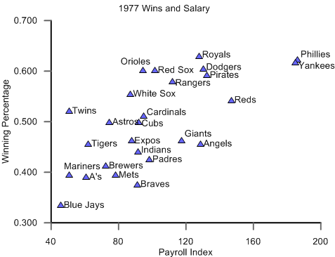
And wins followed suit. The relationship between payroll and team performance had already been strong—in 1976, the correlation (otherwise known as “R”) between payroll and winning percentage was 0.55—but that correlation jumped to 0.7 in 1977.
The graph on the right shows how much each team spent and won in 1977. It’s pretty easy to draw a line through the data points, isn’t it?
The Phillies, with their veteran lineup featuring Schmidt, Greg Luzinski and Steve Carlton, won 101 games but lost the NL Championship series to the Dodgers. The Yankees, who had been wandering the desert without a world championship for over a decade, took it all with Jackson, Don Gullett and Catfish Hunter leading the payroll. It seemed as though money truly was becoming destiny.
Okay, enough with the ancient history. Let’s step back, take in the big picture and ask: how have payroll and wins correlated since the free agency explosion? Has the relationship between the two stayed as strong? The answer is, “it’s complicated.”
Below is a graph of the year-by-year correlation (R, not R-squared) between the payroll and wins. A high R means that wins closely followed payroll; a low R means that results on the field were more random than payroll would imply. Take a note of the ups and downs during these years.
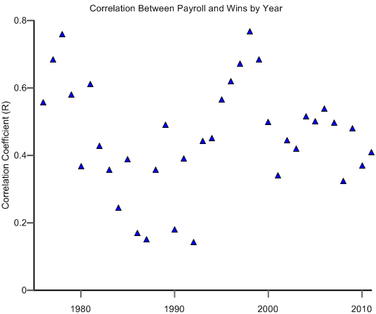
As you can see, there have been two periods in which money and performance were closely tied: the last half of the 1970s and the last half of the 1990s. The last half of the 1980s, however, was a period of relative equal measure, when both rich and “poor” teams had relatively even chances of winning. Some historical review is in order (the following are my thoughts. Be sure to leave your own observations below).
In the first few years of free agency—the latter half of the 1970s—teams did take advantage of new opportunities by signing top talent to big bucks. It’s no coincidence that this period coincided with the Steinbrenner Yankees’ return to glory and the introduction of two bottom-dwelling, low-pay expansion teams (the Mariners and Blue Jays). These developments exacerbated the differences between the have’s and have-not’s.
Beginning around 1980, however, the picture changed as young, lower-paid talent began to make an impact on the pennant races. Players such as Eddie Murray and Cal Ripken in Baltimore, Rickey Henderson in Oakland and George Brett in Kansas City changed their team’s fortunes before changing their payrolls. The Mets developed a gaggle of phenomenal, “cheap” young talent. This influx of top young talent helped change the picture in the early part of the decade. At the same time, bad contracts started appearing. The Angels became the first team known for its bloated, underperforming contracts.
Something else happened in the 1980s: collusion. In 1985, 1986 and 1987, free agents such as Andre Dawson, Tim Raines, Jack Morris and many others found no market for their services. It turns out that commissioner Peter Ueberroth had convinced major league owners that they should work together to refuse expensive, long-term contracts. The owners reportedly established standards of no more than three years for position players and two years for pitchers. As a result, average payroll actually declined in 1987.
The impact on the the economics of winning was stark, and the correlation between wins and payroll reached two of their lowest points in 1986 and 1987 (0.17 and 0.15, respectively). Money was losing its power and competitive balance seemed possible. Trouble was, this was illegal. In three different cases, arbitrators ruled that the owners had colluded and eventually ordered them to pay damages.

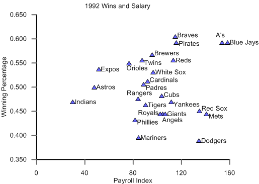
1992 was the nadir of money’s influence, when wins and payroll had a correlation of just 0.14. On the left, the graph for 1992 looks like a random scatterplot. The Dodgers, notably, won only 63 games despite paying Daryl Strawberry over $4 million. And I don’t mean to pick on Strawberry. The Dodgers paid a lot of guys a lot of money. Obviously, this was a team effort in economic futility—one of the ten worst in our database.
In 1993, the Rockies and Marlins joined the National League and the era of relative economic equality ended in the major leagues. After the labor strife of 1994 and 1995, high-spending teams started winning strong once again. By 1998, the correlation between salary and wins was 0.77, the highest correlation in the history of our little bit of data. The Yankees and Braves were at the top of the charts, the Expos and Marlins at the bottom, and the Alpha Team worriers seemed to have reason to worry once again.
In fact, a 2000 “blue ribbon panel” (where did that term come from, anyway?) recommended that Major League Baseball institute a system of revenue sharing, essentially taxing the rich teams and giving to the poor ones. Then, in 2001 and 2002, Moneyball was played in Oakland and Billy Beane’s A’s mounted two of the three best win/salary performances of all the teams and years in our database. (Said differently, the A’s won many more games than their payrolls would have predicted, based on the overall major league patterns.)
Certainly we can argue whether teams really did learn how to better spend their payroll dollars. What’s less arguable is that the commissioner did indeed start to share revenue between teams according to payroll, and a formal revenue-sharing scheme was codified in the 2006 Collective Bargaining Agreement.
Has this worked? Go back up to the graph and take a look. For the past decade, the average correlation between wins and salary has settled into a “natural” space between 0.3 and 0.5. There are still big payrolls, to be sure, and those teams are more likely to win games. But we haven’t seen the extreme correlations between payroll and wins that we witnessed in the past.
For a little more insight, here’s one last graph. It’s called a “box-whisker” graph because it shows boxes and, um, whiskers around the median payroll each year. In this case, I’ve calculated the 2011 equivalent of each team’s salary and plotted each year on the graph. The boxes above and below the median represent the first two quartiles; that is, half the teams fall within those two boxes. The whiskers show the outside 25th percentile, but I’ve put an arbitrary limit on those outer quartiles so you can spot the outliers. Those are the triangles that fall outside the whiskers.
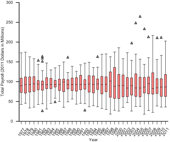
See all those outlier triangles starting around 2000 and lasting all decade? Those are the Yankees. Even in the years in which the Yanks don’t technically break out as outliers, they stretch the lines to their fullest height. On a inflation-adjusted basis, the Yankees of the 2000’s have nine of the top ten spending teams of all time. The only team to break up that run is the Yankees of 1999. So, it’s all Yankees.
Check out the other trends. See how narrow the quartiles were in the collusion years? Notice that, indeed, teams became more spread out in the late 1990s. When the Yankees fall into outlier territory in the 2000s, the quartiles look about as wide as previous years. If you graph the Yankees as outliers, the spread between teams in the 2000’s is roughly the same as it was in the 1970’s and late 1990’s, perhaps a bit larger.
So here’s the point: Wins and salaries are closely tied, but the relationship between the two has changed over time. There is no doubt that some of the change has been random, or the simple result of individual team successes and failures, but some of it also seems to be related to structural changes in the game. The current state of the game? Despite the outrageous spending ways of the Yankees, it’s settled into a pattern that is more competitive than any previous time period, other than the years of collusion.
One other point: We’re measuring payroll against regular-season wins here, so the extra randomness added by expanding the playoffs to include wildcard teams isn’t accounted for. This is another factor that has given “poor” teams a reason for hope.
So, hey Pittsburgh fans, maybe there is some hope. Hang in there.
References & Resources
You can find payroll information at Baseball Chronology.
It’s a little dated, but this is a nice history of baseball economics.
This is a research article on the impact of revenue sharing in the 2000’s.
Dave:
If we could have had an ETF or mutual fund tied to baseball player salaries, we’d all be retired by now. But if we invested our $$$ and tied it to an index that mirrored medical costs or college tuition we would have retired 15 years ago…
“Blue ribbon panel”? All the red ribbons were taken.
Great research on a great subject. I can still remember Ruly Carpenter selling the Phillies around 1981 and running for the hills because of the irresponsible nature of the Ted Turner-Claudell Washington contract
Dave,
Did you ever live on Grand View Ave?
Not if Pedro Alvarez doesn’t rake, and soon.
Great stuff! How about if you track just one team year-to-year? Then you can see a cycle of young team/mature team/fire sale. I’m thinking like the Marlins’ two runs, etc.
Interesting stuff alright. I have taught math for over ten years and this is the first box and whisker plot I have seen outside of a text, ever.
The A’s of the early 2000s relied on essentially the same core players, give or take a Giambi and Tejada. If the team construction is similar, is it fair to say that each season is an example of a low-revenue team making it? In reality, the A’s lived on Mulder, Hudson, and Zito during their playoff runs and it was the other players who were complementary to them.
Quick question… what did you use to calculate the 2011 equivalent for each team for past years?
Great and interesting information, Thanks!
More like a Pabst Blue Ribbon panel…
Thanks for the comments. Andres, I created a payroll index based on past actual payroll inflation rates to calculate the 2011 equivalent payrolls.
Alan, I’m not sure what you’re asking. In our data, the 2001 and 2002 A’s were the teams that had extraordinary variances vs. predicted wins.
David, yes it’s fun to track individual teams. I may write about that later, or Matthew may.
squires8, yes I did live on Grand View Avenue a long, long time ago.
The problem with this study is that it’s incomplete, and doesn’t ask the appropriate questions. When you have teams that habitually are in the top or bottom 10% in payroll, you are following how well-managed they are, as much as what impact salary-differences have on wins.
A more interesting study would be to look only at the middle 50% of payrolls and see if payroll differences that are NOT at the extremes actually result in wins.
An even better study would be to look at relative increase/decrease in payroll by team year-by-year, and any accompanying change in wins or losses. In any study like this, the goal should be to eliminate confounding variables, not to introduce them.
Jeff, for teams in the 50% range, the correlation is somewhat lower (.30 vs. .46) and the equation is slightly steeper.
Seems like there are four distinct factors that affect this correlation:
(i) The range of payrolls (=the spread of data on the x-axis). As you say, the smaller the spread, the weaker the correlation, all else being equal.
(ii) How wisely teams spend their money on average. The smarter teams are on average, the stronger the correlation should be, all else being equal.
(iii) Any correlation (positive or negative) between how wisely teams spend their money and how much they spend. Teams that are both wise and poor, like the Moneyball A’s, weaken the correlation, while teams that are both wise and rich strengthen the correlation.
(iv) Random (unpredictable) variation in player performance. The correlation’s never going to be 1.0, if only because of things like random injuries.
The data certainly seem to show some of these effects, particularly the first one. Is there any way to quantify all four effects and tease apart their contributions to strengthening or weakening the correlation? I’m especially wondering how strong the correlation would be if every team spent money as wisely as possible, so that the only source of noise around a perfect correlation was (iv).
Thanks for the great write-up Dave. This is fascinating stuff.
It would be interesting to know what the correlation looks like for teams with a winner percentage over 50%.
I know we want to know how much payroll helps a team get to the playoffs, but, we know that it’s the marginal wins after you get to 80 that start to get really expensive. It seems plausible that this is where payroll really starts to make a difference. (of course this artificially eliminates those teams with high payrolls that collapse)
Jeremy, I’m no expert at this sort of thing, but it seems to me you can get at (iv) relatively easily by approaching it backwards. For instance, we can quantify the standard variance in expected performance by a player, and we can express that in wins. Multiply it by average payroll, and I think you can have the impact of (iv).
From the French, originally, Cordon Bleu.
So, Dave, in your estimation, if the point of revenue sharing was to even the playing field, and make winning attainable to any and all teams, it’s worked? To another point, to fix the perpetual outlier called the Yanks, would you overhaul the luxury tax policy?
I see you reached the conclusion that baseball is the most competitive it’s ever been—are they doing too little/too much? Curious to hear your thoughts about all of this, and I like the findings here…
Hey Nick, the intent of my article wasn’t to pass judgment on the current give and take of revenue sharing or decide what’s right or wrong about the system. It was just to put the current situation in some historical context. I gave the opinion that revenue sharing has had something to do with the current balance, but I’m not positive it has. I don’t know what the optimal tax policy would be because I don’t fully understand the current system and its impact.
I see people out there using this article to support their point of view about the issues you raise, but I don’t think there’s enough here to support opinions on either side. We clearly don’t have parity today, but the last decade has seen more competitive balance than we had in most previous years. Is that good or bad in the grand scheme of things? No clue.
How do you get a salary CAGR Of 13%? My calculations put it at 17.1%.
Good catch, William. The original payroll level wasn’t $365 thousand, that was the standard deviation. It was actually $1,171,000. I’ll change that in the text.
Hey Dave, I’d be interested to hear whether or not you think the real long contracts today have any bearing on the lower correlation between wins and payroll. 10 years basically guarantees a players finances for the rest of their life and would eliminate the financial incentive to play well. I’m not saying that all players would see a drop in performance as a result of this, but certinally some would.
Thanks, good article
There’s no doubt that players perform better in the beginning of long-term contracts than at the end of old ones, due to aging if nothing else. So, yes, to the extent that teams don’t add deals with more efficient contracts/young players in the latter years, it will impact the effectiveness of payroll.
By the way, trivia question: Who got the first 10-year deal in free agency? Wayne Garland/Cleveland Indians. Back in 1976.
Interesting findings. I don’t think you’re necessarily approaching this question the right way. A team that spent the league minimum (all replaecment-level players) would still win about 50+ games but its value on the “payroll index” would likely be quite different in 1976 from today, so I don’t know that it should be approached parametrically.
I would be interested to know if your results change if you run non-parametric tests for correlation instead of parametric ones.
Either way, quite interesting!
David,
I have enjoyed your posts over the years…. I lived across the street from your family in Elkins. You turned me on to baseball cards then and baseball has been a huge part of my life ever since…..keep up the writing………Scott Oldenburg
wow, Scott! How great to hear from you. Drop me an email if you’d like:
jessef, why do you feel that a replacement-level team would have a different place on the payroll index than it used to?
Hi Dave—
I’d think that a replacement-level team would have a different place because I’d imagine that the variance in MLB payroll league-wide has changed over the past 30 years.
Depending on what kind of regression you did, this might not be a problem. I assumed it was a linear regression but if you’re looking at correlation coefficients of nonlinear best-fits (we’d almost certainly see diminishing returns at the highest payrolls), I think your results may be better than the nonparametric tests I had suggested before.
One other quick question: did the magnitude of the correlation (not its fit) change much?
Once again, really interesting work and thanks for responding
-jessef