My WAR Graph
Let’s take a retrospective look at four intriguing third/first basemen from the 1960s through the 1980s. Harmon Killebrew, Graig Nettles, Dick Allen and Darrell Evans were very different types of players, but all four played at similar positions at a high level for a long time. Only one of them (Killebrew) is in the Hall of Fame, however. Should he be?
This isn’t going to one of those classic Hall of Fame articles, not quite. I’m using the Hall of Fame argument to discuss the ways we present data, particularly visual displays of data. But this is an interesting group of players. Let’s start by comparing their standing in a couple of Bill James stats. I’ll use the Hall of Fame Monitor score (from Baseball Reference—100 is someone likely to be voted into the Hall, based on MVP voting, basic batting stats, etc. etc.) and Win Shares Above Bench (WSAB—my own slight modification to Bill’s Win Shares system, a measure of the contribution by each player to his team’s wins).
Player      HOF    WSAB
Killebrew    178    190
Allen        99     207
Nettles      63     131
Evans        42     164
The HOF Monitor score is supposed to “predict” whether a player qualifies for the Hall. As you can see, it does pretty well in this case; Killebrew is far ahead of everyone else.
WSAB is a measure of how many wins each player contributed to this team, relative to a bench player. It doesn’t care about things like winning MVP or batting titles. Plus, it includes the impact of fielding. While Killebrew has the highest HOF score, Allen outranks him in WSAB. Nettles and Evans appear to be far behind in both categories.
But there are other advanced win-based stats. One is WPA, though it doesn’t yet include fielding. Using Jeff Sagarin’s WPA calculations and adding my own WPA above bench calculation (using a .350 winning percentage for the bench level), I get the following totals for each player:
             WPA    WPAB
Killebrew     61      80
Allen         50      65
Evans         40      60
Nettles       16      35
Killebrew is still at the head of the class but Evans has crept up on Allen. (Sidenote: Evans had an .854 OPS in high-leverage situations vs. .786 in low-leverage situations. Allen did best in medium-leverage situations.)
When comparing these figures, remember that Win Shares are equal to three times wins. Comparing the numbers for Killebrew, for instance, he’s 190 Win Shares Above Bench, or about 63 wins above bench, but he’s 80 wins above bench on offensive WPA alone. Part of the difference may be that Killebrew hit better in high leverage situations, and he also wasn’t a very good fielder.
Ah, fielding. The critical difference between WPAB and WSAB should be related to each player’s glovework, but the difference doesn’t appear to play out here. Graig Nettles was undeniably a great fielder, but WSAB doesn’t give him the boost over WPAB that you’d expect (at least, not relative to the others on our list). Not a surprise—Win Shares is known for its conservative approach to giving players credit for their fielding contributions.
Enter Wins Above Replacement (WAR). WAR is very similar to WSAB, though it differs in two key ways:
{exp:list_maker}The goal of WSAB and Win Shares is to measure each player’s contributions to his team’s win. The goal of WAR is to measure the value of each player in terms of wins. The difference is subtle but important.
WAR is denominated in wins instead of wins times three. {/exp:list_maker}Actually, the math behind the two systems is very different, but I don’t want to get into that here (particularly since I’m no expert on the subject).
WAR has been made possible by the tremendous work by the folks at Retrosheet and their detailed play-by-play database. Tangotiger and a lot of other people have worked out a system that includes not only the impact of batting, but fielding, baserunning and whatnot. The big difference between WAR and other systems, however, is the emphasis it puts on fielding. Witness the WAR numbers of our four players (a big thanks to Sean Smith for the data):
             WAR
Nettles     61.6
Allen       61.2
Killebrew   61.1
Evans       57.3
It’s a virtual dead heat, with Evans a bit behind Nettles, Allen and Killebrew.
Think about this for a second. We’ve moved from the Hall of Fame Monitor (a pretty good system that represents how Hall of Famers are selected today) to some better win-based systems to one that fully incorporates the hardest critical skill to measure, fielding. And we’ve totally upset the order of things.
WAR does differ from the other systems in other respects, and those choices are certainly debatable. But it is fielding that really separates WAR from the other systems. It makes a huge difference. Graig Nettles is 140 runs above average in Total Zone, Sean’s fielding evaluation system. That makes him one of the best fielding third basemen of the past 50 years. At the other extreme, Dick Allen was 97 runs worse than average in the field. That’s a difference of almost 240 runs, or approximately 24 wins.
For the record, Evans was 39 runs better than average in the field and Killebrew was 63 runs below average.
We can all quibble about WAR and some of the details behind it. But I don’t doubt that we’re much closer to measuring a player’s true value to his team than we have ever been before.
Whew. That was a long introduction. Let’s take this examination of WAR a little further. Total WAR figures are good and all, but there’s also the question of how much each player contributed in individual years. Arguably, huge, MVP-type years are worth more than the WAR scale would indicate. We can add some fancy math to calculate the difference, but this is one of those things that might be best served by a visual graphic. Enter the WAR graph.

I believe WAR graphs were first created by Sky Kalkman, who has made them a regular feature at Beyond the Boxscore, along with the other excellent BtB writers. This is what they look like:
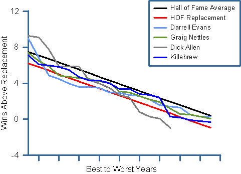
This is my own recreation of a WAR graph, not one that was posted at Beyond the Boxscore. The idea is that you line up each player’s seasons ranked by WAR, from their best to their worst year. I think that the graphs originally just had a few players in the graph, but extra context was added by including lines representing an average Hall of Famer and a replacement-level Hall of Famer. (I just eyeballed those lines myself and added them to my graph.)
It’s easy to see why these graphs are so popular. They give you more information beyond just listing each player’s total career WAR. In particular, they allow you to see how consistent each player was, and whether he had some outstanding peak seasons. They pass the critical test of any graph: they communicate key information more easily than a table of the same data would.
Unfortunately, this graphic doesn’t really help that much, at least in my opinion (of course, I have no one to blame but myself). The lines cross over so much that the entire thing looks like a “spaghetti chart” in which it’s hard to untangle the facts. You know how they say that statistics lie? Well, graphics can lie even more easily unless the graphic designer is very careful about the layout of the graph and the way its constructed.
I’m going to try to improve my first attempt at a WAR graph. The most important step in untangling that mess of spaghetti is to figure out which strands are different than the others and can be treated with a different visual style. Said differently, can we throw away some of the strands?
The obvious candidates are the Hall of Fame lines. In fact, the two Hall of Fame lines provide the really important context for the graph (more important than either the “X” of “Y” axis) and we can really make them stand out by graying in the area between them and getting rid of the lines altogether. Here’s the result:
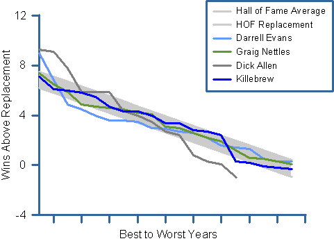
Okay, I think that’s a big step in the right direction. However, it’s still difficult to make out the strands and really understand what the graph is saying. That’s because the differences between the lines aren’t very stark, and the gray background has made it a little more difficult to pick out some of them.
There are several things you can do to untangle the lines of a spaghetti chart. One of the biggest mistakes I see in graphs is that people often only use color to distinguish between lines, and the colors are often hard to pick out (particularly for the 10 percent of men who are partially color blind, like me). I would encourage folks to change the line styles (dashes often work well) or add symbols to one or two of the lines. You don’t want the graph to be too busy, but you want to make sure the lines are distinguishable.
I played around with my WAR graph and decided that symbols and such didn’t work in this case because the lines are all so tight. But I created starker color differences between the lines and moved the most distinguishable one (the black line, Nettles, which is also the least critical because it follows a “normal” downward slope) behind the others. I think that makes these lines a little easier to pick out.
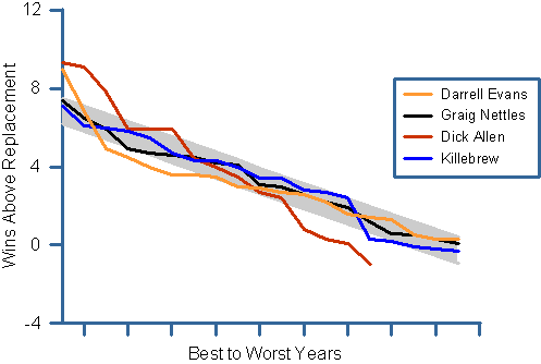
You’ll notice that I also took the Hall of Fame references out of the legend cause they weren’t really needed. Which leads me to another important point. Too often, I see people use legends that are far away from the actual visual data. That doesn’t help the reader much, because it’s hard to associate the two. So I was sure to keep the legend close to the actual data, and I also added names next to the end of each line to further help the reader label each line. Like so:
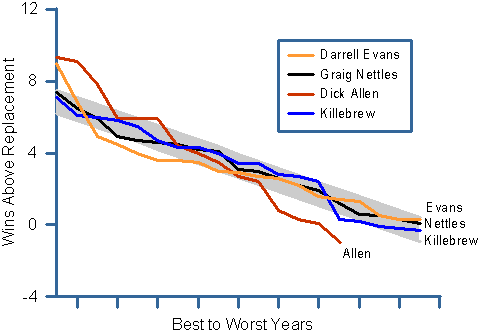
This is looking pretty good, I think. You can see that Allen had a couple of MVP years (1964 and 1972) and Evans also had one (1973, when he was second in the league in WAR but 18th in MVP voting). But Evans’ third- through sixth-best seasons were below HOF replacement level. Allen had a short career, while Nettles and Killebrew were in that “Hall of Fame lower half” on a consistent basis.
That is one interesting graph. We’ve learned a lot from it. But I would like to do one more thing. The graph maven Edward Tufte talks about a graph’s “data-ink ratio.” The idea is that you don’t want to waste ink in a graphic (gridlines and the like are usually useless) because it detracts from the data itself. We have an opportunity to really improve the data-ink ratio in the WAR graph, because the Hall of Fame band makes the “X” and “Y” axes pretty much irrelevant. In fact, let’s get rid of them altogether, as well as the border around the legend.
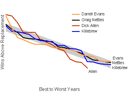
That’s my idea of a really good WAR graph.
References & Resources
Many of these breakouts were made possible by Baseball Reference. Many thanks to Retrosheet, Tangotiger, Sean Smith, Sky Kalkman and all the other BtB writers.
You seem to be dancing around the real potential improvement here. You’ve already noted the X and Y axes don’t add a lot of info and that the defining feature of the graph are the HOF models. Shouldn’t you just plot WAR above RHOF? That is, make the Replacement HOF line the y=0 point. That would probably allow the axes to be rescaled enough so that the lines separate a little.
I like the graphs, Dave (and the analysis, of course). One other thing that I prefer with my graphs is to also change the font of the legend keys to match the lines themselves. In your case, that would mean bolding/blueing Killebrew, bolding/blacking Nettles, etc. It’s one less visual translation that readers need to make.
Thanks for the constructive comments, studes.
I like a lot of the improvements. The color-blind issue is a hard one to anticipate for those of us who have both green and red cones, but really we just needed to be shown some colors that will work for everyone (as you’ve done here).
I have to say, I really prefer seeing the axes, as it allows me to get at some quantitative data—how high was that great season, for example, or how many seasons, specifically, was that peak.
Aside from that, I like the suggestions. A key for me is that they be automate-able, but I (and I’m sure others) will fiddle around and see what I can do. The names at the end of the lines are a nice addition, as long as I can make one of my various graphing programs do it.
-j
I would advise anyone worried about color blind viewers to check out something like Vischeck, which will simulate what your image looks like for a color-blind viewer.
Also, Dave, what program are you using to make those graphs? It doesn’t look especially familiar to me.
Thanks for the comments. Some replies:
– I’m not a fan of reducing all the lines to the difference between it and RHOF. That may be the most reductive approach mathematically, but I don’t find it to be very useful visually. I like the gray background adding context for both average HOF and replacement HOF. Tells a fuller story.
– Ed, interesting idea about changing the coloring of the legend. My problem with that is that it would make some of the legends hard to read. Evans’ name in orange, for instance, is harder to read on the white background than it is on the gray background of the graph. To overcome that, I guess I’d change the background of the legend.
– J, I understand about the y axis. FWIW, I think Tufte would agree with you.
– Colin, I use an old version of Grapher Pro.
Dave, I agree that some of the lighter colors can be hard to read, but I find that bolded/colored keys instantly map the legend to the rest of the graph in viewer’s minds. I have used such keys to positive effect in my articles at BaseballHQ (I’d like but they’re all hidden behind the firewall). The best examples that I’ve seen are those by Dave Allen at either FanGraphs or Baseball Analysts.
I put together R code that would produce a WAR graph similar to Dave’s. The code is here. And the image result is here. If you have any questions about getting it to work you can shot me an email to my baseball analysts email address.
Thanks, Dave (Allen). I saw that in the Book Blog thread as well. I know that I keep dwelling on the legend, but to me having the names in color as you have done is hugely beneficial. It’s the difference between mentally saying “Darrell Evans is represented by the orange line” vs. “Darrell Evans IS ORANGE”.