Offensive Batted Ball Statistics and Their Optimal Uses

Giancarlo Stanton is all by himself when it comes to batted-ball data. (via Arturo Pardavila III)
So far, 2015 has been a good year for batted ball statistics. FanGraphs unveiled Baseball Info Solution’s (BIS) contact strength ratings data, baseballsavant.com began sharing batted ball velocities, and Statcast data has begun to populate national broadcasts—bringing the average fan into greater familiarity with these kinds of stats.
Just as when line drive percentage (LD%) and ground ball percentage (GB%) appeared on FanGraphs thereabouts of 2010, we might have a tendency to look at a player’s shiny new stats and declare big and bold things. But let’s pause a moment and find a good home and role for each of these batted ball stats:
- the Soft, Med, Hard% data from BIS
- the hit velo data from baseballsavant.com
- line drive, ground ball, fly ball, and infield fly rates
Each of these babies gives us a special and specific insight into a hitter’s ability, tendencies and performance. But sussing out those specifics can be tricky. So let’s get tricky.
Contact Strength Data from BIS: The shiny new toy
How they are recorded: A dude or dudette working for BIS watches the game and decides if the ball is hard hit.
UPDATE: Neil Weinberg points out in the comments that BIS changed their methodology in 2010. They now record certain hard data (duration of hang time and landing location) with the observed hit type — liner, grounder, etc. — and then an algorithm decides if the ball is a hard hit.
Correlations:
R2 with ISO: 0.70
R2 with SLG: 0.63
R2 with wRC+: 0.57
R2 with BABIP: 0.06
These correlations suggest there is a strong relationship between a player’s BIS hit data and his ISO and SLG. But this is among qualified hitters from 2002 through half of 2015. These are big samples.
On the season level, the connection is much weaker. Looking at just the 2014 season, Soft%, Med%, and Hard% regress against ISO with a 0.56 R2—, and in all cases our P-values are less than great (if that’s a thing you care about), suggesting these aren’t the variables we’re looking for. (I, for one, don’t care much for P-values and definitely don’t pay much mind to arbitrary levels of statistical significance.)
Looking even more granularly, in the month of June 2014, the R-squared with ISO was just 0.34—meaning just 34 percent of the variations in players’ ISO performance could be attributed to their eye-test contact strength.
When we put the data altogether, though, we can see how it gets its 0.57 R2 with wRC+:
Double click to zoom in.
Players near the top left—maximum hard contact, minimum soft contact—are almost exclusively red (i.e. good hitters). Fellas on the right and below the trend line—lots of soft contact, minimal hard contact—tend to be blue or bad hitters. And, naturally, the red dot way out in Hard Contact Town is Giancarlo Stanton. But these data have some interesting exceptions. Guys like Justin Smoak—who wades fairly deep into red dot territory, but himself is a bluey:
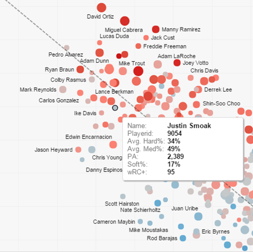

Smoak typifies the exceptions to the BIS data and wRC+ relationship.
Smoak typifies the exceptions to the BIS data and wRC+ relationship. But what do we have in Smoak? A hard-hitting under-performer? A streaky hitter? A guy who hits loud outs? It’s hard to say, exactly. He is still unknown—especially given his strong year in Toronto thus far. Maybe there is a connecting thread among the 43 percent of unexplained variation here, but the thread isn’t in the BIS contact data.
What it tells us: I admit to being the most susceptible when the blight of Shiny New Toy Syndrome sweeps through the countryside. When SIERA first came out, all I ever wrote about was SIERA. It was the world-changing stat. Now—while I still love SIERA—I turn to strikeout and walk percentages when looking for a read on a pitcher. The two most basic stats are essentially my go-to metrics for understanding a pitcher.
So it takes every fiber of my being to not just make chart after chart of Hard% and Soft% data (although, I couldn’t resist entirely). But the truth is these stats really only help on a macro level—and even then, if you’re looking at multiple years of data, why not just look at ISO? Maybe these numbers offer a predictive value?
Well, the 2002 through half-of-2015 data set does give us a few fairly strong formulas—one for finding SLG and one for finding ISO. Let’s use the ISO one for hitters from June 2014 and see if their BIS data better predicts their July 2014 ISO than just the plain ol’ June ISO predicts their July ISO.
Here’s the formula:
xISO = 1.03 - 1.17 * (Soft%) - 1.07 * (Medium%) - 0.34 * (Hard%)
This formula actually does a slightly better job of predicting next month’s ISO given this month’s contact data—that is, the xISO (or expected ISO) the formula creates has a slightly R2. That’s kind of cool. But also probably just noise.
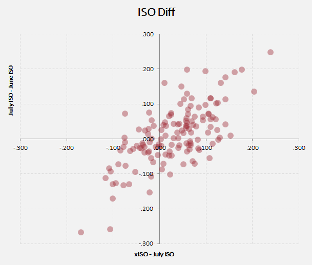
Batted ball data from BIS does a not-terrible job of predicting next month’s ISO, but if it did a truly great job, these data would have a more vertical appearance. Instead, it looks pretty dang close to a tie.
So how can we use the BIS contact data?
- Not for BABIP. This is seriously the wrong data to use if so-and-so has a low BABIP. Don’t say, “But he’s making hard contact (Hard%).” These stats do so very little to predict BABIP—in part because “hard contact” can be deep fly balls, and fly balls have the worst BABIP of all non-infield-pop-ups. And typically, weak or medium contact results in ground balls, and those have a higher BABIP. But ground balls can be hit hard too. Just stay away from BABIP with these stats.
- For ISO and SLG variations. Is your team’s prized slugger no longer lashing doubles and homers? Check the BIS data. Major fluctuations there might indicate he’s declining. Otherwise, give it some time.
- And to a degree, wRC+ variations. But a lot goes into a total-offense metric like wRC+. I’d be more inclined to look at a contact rate than a contact strength measurement. Contact is a clearly delineated event. Contact strength has a lot of noise. But in bigger samples, it can be useful. For instance: Nobody has even hit below 100 wRC+ when his Hard% is 35.5 percent or higher. In fact, very few hitters over 33 percent have been bad hitters—as a group, they average a 121 wRC+. Look at this:
| wRC+ By Hard-Hit Rate Quartile |
|---|
| Quartile | wRC+ |
| Max (43.2%) | 118 |
| Q3 (31.4%) | 102 |
| Q2 (27.8%) | 94 |
| Q1 (24%) | 82 |
- So fellas hitting under 24 percent Hard-rate are probably not doing well. But remember: there’s a lot of volatility here. The standard deviation in that bottom quartile is 13.6—meaning about 68 percent of the data lies between 68 wRC+ and 96 wRC+. It’s a wide swath.
Batted Ball Velo Data
How they are recorded:
The MLB Gameday feed supplies this data. That makes me think it is probably one of these three options: PITCHf/x, HITf/x or Statcast. Either way, it’s not a human with a stopwatch; it’s probably cameras and computers.
Correlations:
R2 with ISO: 0.39
R2 with HR%: 0.39
R2 with SLG: 0.32
R2 with wRC+: 0.24
R2 with BABIP: 0.01
It’s important to remember—unlike the BIS numbers—we only have a single season of data here. That said, Hard% has a 0.50 R2 with HR% and a 0.35 R2 with wRC+ over that same sample as above.
Does this make the Baseball Savant data inferior? Eh, I’m not willing to go that far. It’s only a partial season of data here. This could easily be a case of random variation getting the best of the exit velocity data. Or it could be a trick of the average function, which inadequately presents all by the most normally distributed (and tightly distributed) data sets.
One of the great things about the exit speed data from baseballsavant.com is that it actually matches up pretty well with the contact strength data from BIS. Among 2015 hitters with at least 100 recorded at-bats of Baseball Savant data, we see about a 61″ correlation with Hard%:

All things considered, there’s decent overlap between the BIS numbers and Baseball Savant numbers.
This bodes well for the BIS data, which purports to show the same data, albeit collected by hand. When we regress all three BIS numbers against the average velos from Baseball Savant, we get similar correlations. And I think that’s kind of special because — remember — the BIS numbers are effectively 0 and 1 dummy variables (Is the hit hard? Yes, then 1. No, then 0. Etc.) whereas the exit velos are an average. It’s like comparing a histogram to an average. Getting decent correlations means there’s pretty good connectivity underneath it.
What it tells us:
Unfortunately, as much as I love this dataset, it does not seem to have clear and superior relationships to data elsewhere. But it’s still young. I would not be surprised to find, say, average groundball mph become a key component in predicting or regressing BABIP. But for now, with only a partial season of data, we can’t use it for much on its own.
- Average Exit Velo doesn’t correlate well (or better than the BIS numbers) with OBP, SLG, ISO, wRC+, BABIP, or even home run percentage.
- Neither does Average flyball/line drive mph or Max Exit Velo or any of the other stats at Baseball Savant’s batted ball leader board. They simply don’t have meaningful partial-season relationships to the stats we know and love.
- Possible uses in the future may include folding groundball mph and flyball/line drive mph into an xBABIP model, but alone they do not offer enough information.
I’ll be honest: I’m bummed this data wasn’t more meaningful (or at least, isn’t more meaningful yet). Baseball Savant produces a lot of good stuff, but for now, the exit velo data does not improve our understanding of in-game effects. The data might be useful for narrative purposes, but not for hard research. Perhaps a full set of data—not just averages—could provide more useful information.
LD%, GB%, FB%, and IFFB%
How they are recorded: Someone working for BIS watches the ball and decides if it’s a liner, a grounder, a fly, or an infield fly. A stopwatch may or may not be used to assist those ends.
Correlations:
| Batted Ball Correlations |
|---|
| Statistic | LD% | GB% | FB% | IFFB% | IFFB/PA |
| BABIP | 0.15 | 0.11 | 0.20 | 0.36 | 0.43 |
| wRC+ | 0.01 | 0.08 | 0.07 | 0.07 | 0.02 |
| OBP | 0.06 | 0.01 | 0.00 | 0.11 | 0.08 |
| SLG | 0.00 | 0.18 | 0.19 | 0.01 | 0.00 |
| HR% | 0.07 | 0.32 | 0.40 | 0.01 | 0.05 |
| ISO | 0.04 | 0.32 | 0.39 | 0.00 | 0.03 |
| BA | 0.11 | 0.04 | 0.09 | 0.11 | 0.07 |
Looking at these R2 numbers, we can see no one batted ball stat is a great measure for any other number. The IFFB% (which is infield flies divided by fly balls) and IFFB/PA—which doesn’t appear in the FanGraphs database, but is rather something you have to calculate by hand—have decently strong connections to BABIP. This makes sense because infield pop-ups are an out 99 percent of the time. Almost equivalent to a strikeout.
But if we push these data together, sprinkle in some other BABIP-related events (like K%, BB% and HR%), we can produce a fairly strong (multiple R2 of 0.90) model for predicting BABIP:
xBABIP = 1.69 + 0.95(HR%) + 0.66(BB%) - 0.25(K%) - 1.2(LD%) - 1.39(GB%) - 1.46(FB%) - 0.53(IFFB/PA)
Is this the best possible xBABIP model? No. It lacks age and speed information and is based on large swathes of time. It may have little effectiveness over shorter samples. But it is illustrative of how the ball-in-play classifications from BIS can help complete the picture of a batter’s profile.
Groundball rates and fly ball rates have strong connections to ISO and HR%. This should be fairly obvious, but a high groundball percentage strongly connects to low homer and ISO numbers. Conversely, more fly balls means more ISO.
The same cannot be said for line drive rate. It may be the go-to metric for blog comment writers defending or critiquing a player, but LD percentage is just too all over the place to be singularly useful.

What it tells us:
Taken together, these stats can give us a good feel for a hitter’s style—especially when it comes to groundball or flyball tendencies. Andrew Koo found a few years ago that the Oakland Athletics were leaning heavily on flyball hitters—and doing so to great effect at the time. A hitter’s GB/FB ratio might very well inform us how a hitter will perform in given stadiums or against given pitchers. The problem with these data, though, is that we are far to quick to look at line drive percentage and make bigger conclusions.
- We can’t use LD% to rationalize a BABIP. You know, good for Dee Gordon that he is setting a career high in LD% during the 2015 season. That’s no reason to think he can keep his BABIP above .400 or above his career norms. Change “Dee Gordon” to “Starlin Castro” and “2015” to “2014” and we will see why LD% is a fickle master.
- We can’t use LD% to rationalize a wRC+. Yes DJ LeMahieu has an enormous LD%, but he had an even higher rate in 2013—back when he also had a 68 wRC+.
- We can build some strong xBABIP tools. These contact data fill out a lot of the gray area of “in play.” It helps differentiate duck snort doubles from scorched, near-homers. And so, unsurprisingly, it can pair nicely with other PA outcomes—walks, strikeouts and homers—to make a decent model for predicting BABIP.
The tools we have for evaluating and predicting hitter performance are—despite my expectations—still growing. And in that process, we have to be careful to be sure our intuition aligns with the statistics. When we’re tempted to cite batted ball data, we need to be even more careful.
References & Resources
- “More Moneyball: Oakland’s Other Platoon Advantage” by Andrew Koo. Baseball Prospectus.
Bradley,
Thanks for the article. I’ve been playing with the Baseball Savant batted-ball data myself, more from the standpoint of looking at pitchers and the quality of contact allowed.
For this analysis I’ve spent the most time looking at fly balls and line drives, trying to see the relationships between exit velocity and home-run rate for these balls. For the first half of 2015 data, I’ve divided these balls into “soft”, “donut hole”, “hard”, and “crushed” categories based upon the batted-ball velocity from Baseball Savant:
Group PA Avg. Dist. HR% BABIP rvBIP rvXB rvHR rvTOT
S (<80 mph) 2,489 241.6 0.1% 0.467 0.06 0.01 0.00 0.07
D (80-89 mph) 5,479 280.7 0.2% 0.248 (0.09) 0.02 0.00 (0.07)
H (90-99 mph) 8,581 318.3 4.7% 0.327 (0.04) 0.05 0.06 0.07
C (100+ mph) 5,765 340.9 25.9% 0.657 0.14 0.08 0.36 0.58
Total w/Data 22,314 306.4 8.6% 0.392 0.01 0.04 0.12 0.17
Missing Data 7,763 7.4% 0.385 0.00 0.04 0.10 0.15
Total 30,077 8.2% 0.390 0.01 0.04 0.11 0.16
(Apologies if formatting looks bad – cutting and pasting back into Excel should make this tidier)
The last 4 columns are:
rvBIP: linear-weights run value for non-HR balls in play, excluding the run value of extra bases (i.e. just crediting the batter with a single), per plate appearance resulting in a FB or LD
rvXB: run value for the extra bases for non-HR balls in play (per FB/LD).
rvHR: run value for home runs per FB/LD
rvTOT: total run value per FB/LD
You can clearly see the "donut hole" (term borrowed from Tony Blengino) for balls hit between 80-89 mph, where the average distance traveled (~280 feet) corresponds nicely with the typical positioning of outfielders. Of course the exit velocity doesn't capture all the other important factors such as the vertical angle, backspin, wind, etc. that affect the flight of the ball, but I think there's the makings of a good narrative on batted-ball velocity if we use these buckets:
<80mph: likely to be a bloop hit, with BABIP having a negative correlation to exit velocity in this range.
80-89mph: likely to be caught, with little correlation between BABIP and exit velocity in this range
90-99mph: in this range we begin to see three things – first, a positive correlation between BABIP and exit velocity; second, an increase in the probability of extra bases on balls hit in play; third, a realistic probability of hitting a home run
100mph+: in this range the probability of hitting a home run soars, and the run value for non-HR balls also increases strongly.
Now this is all based on one-half season of data from Baseball Savant, and assumes its accuracy. In particular, I had concerns about the high % of batted balls where there was no exit velocity data recorded, but other than having a slightly lower HR% than the overall group there was no substantial difference in the results for these balls vs. the ones with exit velocity recorded.
So having said all this, what I would love to see is the same kind of correlation analysis you did above being applied to bucketed velocity data. I wouldn’t be surprised to see something emerge that shows some real explanatory or predictive value.
Why does the formula for xBABIP have a negative coefficient for LD%? I think that starting your formula at zero would yield something more understandable, though I’m sure the R2 would be lower.
FYI, both THT and Fangraphs had LD% data much earlier. I think we had it around 2005.
Nice article, btw. Like you, I find myself relying on the basic stats and using the more detailed stats when I’m curious about something.
It was 2004. Here’s what I wrote about infield flies at the time.
http://www.hardballtimes.com/never-swat-an-infield-fly/
When you have 10 different interns that rotate every year using a subjective arbitrary definition, the data is bound to have errors. I would rather stick to exit velocity as a measure of “hard hit ball”
There’s a huge problem with exit velocity data right now, though, and it’s that a significant proportion of batted balls have no exit velocity data. And it seems to be the softest-hit balls that are most susceptible to this. Until that’s fixed, I wouldn’t look at a player’s average hit velocity as anything more than a curiosity.
Great point, and I agree about the use of exit velocity.
Right now, I’m finding it helpful for balls hit in the air to the outfield, and only at a fairly aggregated level. For anything granular, or for softly hit balls, grounders etc., it’s difficult to trust.
When I see stronger correlations with ISO, SLG, etc. to hard hit%, the first question that pops into my head is how much scoring bias is here. If you’re trying to decide whether a borderline hit was hard or medium, I’d guess that the one that falls for a double is more likely to be scored hard hit than the same ball caught by an outfielder.
My thoughts as well. I also wonder if the hard hit% is biased by how hard balls are hit relative to the batter’s perceived batted-ball authority. In other words, would an opposite-field liner by Ben Revere be classified as “hard” while the exact same ball from Bryce Harper gets classified as “medium”.
I wonder if it would make a difference if the individual batted ball data was directly coupled with the contact strength data? Does anyone know if FanGraphs receives this type of information together from BIS or simply the raw totals for individual players?
ex: Soft-GB, Hard-GB, Med-FB, etc.
The BIS coding is a bit more rigorous than the text specifies. Here is the FG Library description of the process, based on information from BIS:
“For the early years of quality of contact stats, the BIS video scouts had to make judgments, but since 2010, the video scouts recorded the amount of time the ball was in the air, the landing spot, and the type of batted ball (fly ball, ground ball, liner, etc) and the BIS algorithm determines if the ball was soft, medium, or hard hit.”
The most recent years are based on imperfect data, for sure, but it’s not simply the opinion of the stringer.
http://www.fangraphs.com/library/offense/quality-of-contact-stats/
Weird. Don’t know how I missed that change! Thanks for sharing this!
Interesting. If they have measured hang time and landing point, I’d have thought they could compute a pretty good vertical angle and GB/LD/FB/PU bucketing.
Not knowing wind and spin will bring some error, but human classification brings bias, too. They must have considered this; I’d love to see their internal report on it.
Can customers buy the underlying location and time data?
If hang time, landing point, and exit velocity are all known, that places pretty tight constraints on the vertical launch angle, despite the fact that spin and wind are unknown.
Great article. It’s also useful to note that FB%, GB%, etc are reported per batted ball in play whereas K and BB% are reported per PA. This is another reason why LeMahieu can have a high LD rate but a low offensive output; I bet he was striking out a lot, even though when he did hit the ball it was getting hit hard.
Well never mind on that, haha. Looks like his K rate was actually lower in 2013 😉
It’s really odd to me that the BIS data is better than baseball savant exit velocity, especially when you only consider fb/ld numbers. Do you think it would make a difference to include gb/fb ratio? I think one of the issues with looking at just FB/LD exit velocity is you get a lot of guys in there who swing hard but get bad contact most of the time.
It could be because of the recording problems with the data that it could be better to look at Max velocity since it should be correlated with average velocity, but won’t have as much problematic data. Just a few ideas.
Should exit velocity theoretically be highly correlated with bat speed?
Probably not anymore than it is correlated with pitch velocity.
I’ve been wondering whether the MLB proprietary system tracks foul balls as well as fair. There are so many fouls hit relative to each fair ball that there must be a much larger dataset available than just using fair balls/true outcomes alone. Foul tips are probably going to be difficult to measure (if not impossible), but it seems reasonable that a system that’s capable of differentiating between just-foul screamers down the line vs soft pop-ups over the dugout might be better at predicting outcomes on fair balls.