Run Estimation for the Masses
“Please, fill the internet will all your inanities and swap algorythms [sic] with your buddies until the cows come home…but DO NOT confuse yourself with a baseball fan. It is an insult to both the true fan and to the game. A baseball fan does not dishonor the game, or those who actually play it, by attempting to reduce them to silly equations.—”A “fan” of one of my recent articles
Well. At the risk of further reducing baseball to a bunch of silly equations, I was recently privy to some discussion among SABR members as to the merits of On-Base Plus Slugging (OPS) as a tool for evaluating a player’s offensive contribution. The discussion was wide ranging and as always insightful, but from my perspective the most interesting aspect delved into answering the question of why OPS turns out to be useful as a proxy for offensive production.
In order to share that insight, this week I’ll take a closer look at OPS, how it stacks up against other measures used to gauge offensive performance and do a little algebra to get to the root of the question.
OPS 101
For those, like my new fan quoted above, who are new to performance analysis, OPS is simply calculated by adding slugging percentage to on-base percentage which can be represented as:
where total bases divided by at-bats represents slugging percentage, and hits plus walks divided by plate appearances is on-base percentage, albeit in a simplified form.
OPS can actually be thought of as a linear approximation or simplification of a statistic called “Batter Run Average” or BRA that was developed by Pete Palmer and Dick Cramer and published in the 1974 issue of SABR’s Baseball Research Journal where they introduce their new statistic in the following paragraph:
“The batter’s run average, or B.R.A., is a new statistic that we have devised independently of one another and now propose as a solution to this problem. A player’s B.R.A. is found by multiplying his on-base average (his run-scoring ability) by his slugging percentage (his run-driving-in ability).”
Over the years OPS came to supplant BRA for two reasons: OPS is simpler to calculate since it uses addition instead of multiplication, and it turns out that OPS is nearly as accurate in its ability to correlate with offensive production. In fact, we’ll see shortly that the difference between the two is miniscule.
Obviously, in the past five years raw OPS has gained wider acceptance as mainstream newspapers and industry pundits such as Peter Gammons (although not Harold Reynolds, he of the famous “What the heck is O-P-S?” quote) have started using it.
Critics of OPS generally concede that while OPS is simple, it adds two values with different denominators and therefore is mixing apples and oranges. It turns out that this mixing is what allows OPS to correlate so well with run production. Some also argue that OPS, being a sum of two values, actually conceals information. I would counter that while I can learn more about a player from his batting line in the form .280/.305/.425 than I can from the number 730, our classifying and pattern-seeking species loves to reduce what we analyze to solitary numbers, and OPS does a wonderful job of representing a player’s offensive contribution while remaining simple to calculate.
Analysts have also taken OPS a couple of steps further and normalized it for league and year so that players from low offensive eras (the 1960s for example) can be compared to those who played in higher run environments (the 1990s). For example, Babe Ruth’s 1379 OPS (the decimal point is often dropped for simplicity) in 1921 and 1309 total from 1923 are essentially equivalent when normalized at 179 and 178 respectively, since 1921 was a banner offensive year when 5.12 runs per game were scored in the American League, while in 1923 the rate was 4.78.
Finally, both raw OPS and the normalized version can be adjusted for the park in which the batter plays by dividing it by the square root of batter park factor or BPF. When that is done, for example, Barry Bonds’s 2001 normalized OPS of 182 becomes 191 in SBC Park, while Ruth’s higher 1920 normalized OPS of 189 becomes 185 in Yankee Stadium. The top seasons since 1900 in park-adjusted normalized OPS are shown below (400 or more plate appearances).
Year  Name         Team        OPS    NOPS NOPS/PF
2002  Barry Bonds   SFN       1381     186     195
2001  Barry Bonds   SFN       1379     182     191
2004  Barry Bonds   SFN       1422     188     185
1920  Babe Ruth     NYA       1382     189     185
1921  Babe Ruth     NYA       1359     179     177
1923  Babe Ruth     NYA       1309     178     176
1941  Ted Williams  BOS       1287     177     175
1957  Ted Williams  BOS       1257     178     173
1926  Babe Ruth     NYA       1253     170     172
2003  Barry Bonds   SFN       1278     171     172
And those for 2005:
Name              Team        OPS    NOPS NOPS/PF
Derrek Lee         CHN       1080     145     144
Albert Pujols      SLN       1039     140     139
Travis Hafner      CLE       1003     133     137
Carlos Delgado     FLO        981     132     136
Alex Rodriguez     NYA       1031     137     135
David Ortiz        BOS       1001     133     132
Miguel Cabrera     FLO        947     127     131
Vladimir Guerrero  LAA        959     127     130
Brian Giles        SDN        905     122     129
Manny Ramirez      BOS        982     130     129
Those who are familiar with Baseball-Reference.com will note that Adjusted OPS or OPS+ is calculated a bit differently.
Correlating with Offensive Production
I’ve mentioned that OPS does an admirable job of correlating with run production, but how does it stack up against other sabermetric measures? To find out I took a look at aggregate team statistics for the period 2000-2004 encapsulating 150 teams and calculated 13 different common sabermetric measures for each team listed below.

I then performed a simple linear regression with each of these measures to calculate the correlation coefficients, which is a measure of the strength of the linear relationship between runs scored and each of the measures.
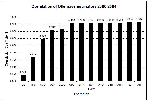
What this shows is that while walks, home runs, batting average, on-base percentage and slugging percentage all correlate fairly strongly with run production, they are in a different category than the other eight measures. Among the other eight measures the difference ranges from .955 for OPS to .9641 for XR (Runs Created came in at .9638).
Squaring the correlation coefficient gives us the R-square which represents the fraction of the variation in runs scored that can be explained by each of the measures. When doing so OPS comes in at .913 while XR is at .929. In other words, 91.3% of the variation in runs scored can be explained in terms in OPS, while 92.9% can be explained in terms of XR. That’s not bad when you consider that OPS is the sum of two widely available numbers, while XR uses 15 separate counting stats and Runs Created uses 12 in a much more complex relationship.
To get a feel for how closely OPS and XR correlate to run scoring, consider the following two graphs that plot runs scored against each measure and show the best fit linear regression line and corresponding equation for the line.

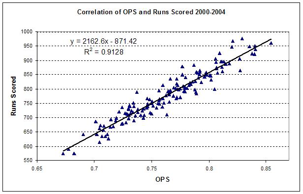
Here you can indeed detect that OPS doesn’t do quite as good a job of predicting runs scored since the points on its graph are generally not as close to the best fit line. When you use the equation to actually predict the runs scored from each measure, OPS does so with a standard deviation of 25 runs while XR has a standard deviation of almost 23 runs. In other words, OPS can predict runs scored within about .155 runs per game while XR can do so within .141 runs per game. This confirms the findings related to OPS included in Jay Bennet and Jim Albert’s book Curve Ball.
Now of course the bigger question, which I won’t tackle here, is whether run estimators like XR and Runs Created and consequently regression equations used with OPS can really be applied to individual players rather than only the team statistics from which they are produced.
Why Does it Work?
Finally, we can now address the question with which I began this article. Namely, why does OPS correlate so well with run production?
A little bit of high school algebra lies in front of us, and some help from a fellow SABR member is all we need to get that answer.
First, it’s apparent that OPS is the sum of two addends (OBP and SLUG) with different denominators. As a result, a common denominator can be created and the two addends brought together in this equation.
Plate appearances can then be rewritten as at-bats plus walks and each multiplied by total bases to get the following:

Now, at-bats can be factored out of the numerator, which then cancels out at-bats in the denominator. The result can then be split into two different addends.
Now it gets interesting. Both hits and total bases can be expanded into their component parts in the numerator of the first addend which yields the equation:

Next, if we factor four divided by plate appearances out of the first addend, it will result in the following:

Now you’re probably starting to see the light at the end of the tunnel. Let’s compare the expanded first addend above with a subset of the XRR equation using the same offensive elements.
Obviously, the implicit weightings in OPS are remarkably close to those found in other formulas like XRR and Pete Palmer’s linear weights formula. The difference is that the first addend, since in its denominator is plate appearances, is really a kind of estimate of runs contributed per plate appearance. In fact, if you take only the first addend and perform a linear regression, you get a correlation coefficient of .949.
Of course we haven’t dealt with the second addend, but it turns out that the second also correlates with run scoring about as well as home runs do (.705), although not as strongly as the first addend. It does so because the ratio includes run scoring events (total bases and walks) in the numerator and opportunities (at bats and plate appearances) in the denominator. Adding these two together therefore strengthens the correlation.
It’s also important to note that OPS is heavily weighted towards the first addend, as it supplies between 92 and 96% of the total value for OPS where high-scoring teams like the 2000 Seattle Mariners are in the 92% range and low-scoring ones like the 2002 Detroit Tigers are down around 96%.
So that gets us about as far as we want to go. OPS works because it happens to be a kind of linear approximation of more complex run estimation formulas. And of course it’s so simple that even my new biggest fan can use it.
References & Resources
The graph, “Correlation of Offensive Estimators 200-2004”, uses the correlation coefficient on the y axis. But two paragraph discusses R^2 using identical numbers. So perhaps the graph is mislabeled?
Good post.
It doesn’t look like that’s the case. Reread the 2 paragraphs below. The first is discussing coefficient of correlation (R) and the second gives the coefficient of determination (R^2). .955^2 = .913 and .9641^2 = .929. The bar graph is labeled correctly.
What this shows is that while walks, home runs, batting average, on-base percentage and slugging percentage all correlate fairly strongly with run production, they are in a different category than the other eight measures. Among the other eight measures the difference ranges from .955 for OPS to .9641 for XR (Runs Created came in at .9638).
Squaring the correlation coefficient gives us the R-square which represents the fraction of the variation in runs scored that can be explained by each of the measures. When doing so OPS comes in at .913 while XR is at .929. In other words, 91.3% of the variation in runs scored can be explained in terms in OPS, while 92.9% can be explained in terms of XR. That’s not bad when you consider that OPS is the sum of two widely available numbers, while XR uses 15 separate counting stats and Runs Created uses 12 in a much more complex relationship.