Research Notebook: Slopegraphs and Mike Trout

Fist bump — Mike Trout is not only great, but consistently great. (via Keith Allison)
Welcome to the first in what will be the “Research Notebook” series. These posts will be part analysis, part tutorial, where I share approaches and R code from things I am working on or just have been playing around with. They won’t always be the most analytically intense posts, but hopefully still interesting and mostly helpful as people think about how to tackle different types of baseball analysis. My full code will always be made available on GitHub.
Introduction
It’s hard to argue against the greatness of Mike Trout, but putting that greatness in perspective gives one even more of an appreciation for just how consistently dominant has been since becoming a full-time player in 2012.
I wanted to see just how great he’s been while taking into account how other players have fared over the past five seasons and thought there might be a few good ways to do this graphically.
I landed on three statistics to use for the comparison:
- Wins Above Replacement (WAR): Everyone by now should be familiar with WAR. WAR is an attempt to take the overall performance of a player (offense, defense, positional scarcity) and represent that value in single number that can be used to compare that player’s overall value to others. WAR is a counting stat, so it also takes into account that a player with more playing time will provide more value than a similar player with less playing time.
- Weighted Runs Created Plus (wRC+): wRC+ is arguably the single best, context-free rate statistic for hitters. It takes the runs created by a batter and corrects for the hitter’s home park and league, making it easy to compare hitters across leagues, parks, and eras. The average is set to 100, meaning a hitter performed at the league average. Higher values represent hitters performing above league average.
- Run Expectancy based on the 24 base-out states (RE24): If context is your thing, RE24 is a helpful statistic that measures the change in run expectancy between the beginning of a player’s plate appearances and their end. Essentially, it’s trying to measure how a player’s performance in a given base-out state changes their team’s odds of scoring. RE24 is also a counting stat.
Acquiring and Transforming Data
First, we need to load the necessary R packages:
# load required packages

if(!require(baseballr)) {
  install_github("BillPetti/baseballr")
  require(baseballr)
} # functions for baseball analysis

require(tidyverse) # for data manipulation
require(rvest) # for data scraping
require(ggrepel) # for plot labeling
require(dplyr) # for data manipulation
require(magrittr) # for data manipulation

# load my custom ggplot theme and mlb team color palette

source("https://raw.githubusercontent.com/BillPetti/R-Plotting-Resources/master/theme_bp_grey")

source("https://gist.githubusercontent.com/BillPetti/b8fd46e24163fbd63e678a7b5689202f/raw/59f84aeceb51272105b6e59f512f0d4c020db654/mlb_team_colors.R")
Next, we need data that includes all qualified hitters and their aggregated performance since 2012. I decided to use data from across both leagues for this exercise. You can pull the data from the FanGraphs leaderboards and export as a CSV, or use the fg_bat_leaders function from my baseballr package. Once the data is pulled, we want to reduce the data to only those variables we really need to create our graphics:
## cummulative performance since 2012

trout_cum_last5yrs <- fg_bat_leaders(2012, 2016, qual = "y", ind = 0, league = "all")

# reduce the variables we are working with

trout_cum_red <- trout_cum_last5yrs %>%
  select(Name, Team, wRC_plus, RE24, WAR)
Here’s a sample of what our data currently looks like:
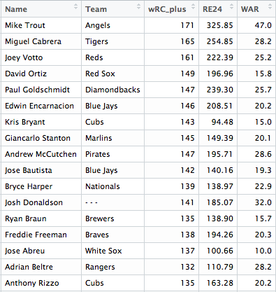
Our data is currently in wide format, but for the graphs we want to produce we’ll need to the data in long format. We can use the tidyr package to transform the data. While we are at it, we can also rank each hitter based on how they performed in each of the metrics over the past five years.
# melt the data, so every row is a player, team, and individual variable, and that variable's value

trout_cum_red_melt <- trout_cum_red %>%
  gather(variable, value, -Name, - Team)

# rename wRC_plus variable

trout_cum_red_melt$variable <- with(trout_cum_red_melt, ifelse(variable == "wRC_plus", "wRC+", variable))

# rank hitters based on each metric

trout_cum_red_melt <- trout_cum_red_melt %>%
  group_by(variable) %>%
  arrange(variable, desc(value)) %>%
  mutate(rank = row_number(variable)) %>%
  ungroup()
And here is what we are now working with:

Now, we don’t want to plot every qualified hitter, so we need some way to narrow down the list. I decided on a golf score approach–so, take each player’s rank across the three metrics and add them together. We can then use that golf score to filter the list, plotting on those players with the 10 lowest scores.
To calculate this we can shape the data back to wide format and sum across the rows of the metrics, find the top 10 players, and then use that list to filter our master data set:
# filter by top 10 players based on golf score

trout_golfscore <- trout_cum_red_melt %>%
  select(-value) %>%
  spread(key = variable, value = rank) %>%
  mutate(golf_score = rowSums(.[, c(3:5)], na.rm = TRUE)) %>%
  arrange(golf_score) %>%
  slice(1:10) %>%
  mutate(rank = seq(1:10))

# choose a team for players with multiple teams over the span

trout_cum_red_melt_2 <- trout_cum_red_melt %>%
  filter(Name %in% trout_golfscore$Name)

plyrs_multiple_tms <- filter(trout_cum_red_melt_2, Name %in% c("Josh Donaldson", "Robinson Cano"))

# code Donaldson as a Blue Jay and Cano as a Mariner

plyrs_multiple_tms$Team <- c("Blue Jays", "Mariners")

plyrs_multiple <- trout_cum_red_melt_2 %>%
  filter(!Name %in% plyrs_multiple_tms$Name)

# merge the Donaldson and Cano cases back into the melted dataset

trout_cum_red_melt_2 <- rbind(plyrs_multiple, plyrs_multiple_tms) %>%
  mutate(rank = factor(rank, levels = rev(seq(1:30))))
Now we get to the fun part: plotting.
Plotting the Data
We will go with a slopegraph here. This will allow us to see how each player performs across all three metrics in one graphic. When this is done, it’s pretty easy to see whether players were balanced in how well they performed across all three metrics, or if they were really high in one or two, but far lower in others. We will use the ggplot2 package to build the plots.
I’ve adapted some code from the incredibly helpful Bob Rudis. Essentially, you need to layer point and line plots together where the values for each metric make up our x-axis. We then only label the first and last values along the x-axis with the player’s names. You’ll notice in the earlier section we created a factor rank variable where the levels were the reverse rank. This was done to ensure that the highest rank was listed at the top of the graph.

# plot the data as a slope graph

ggplot(trout_cum_red_melt_2, aes(factor(variable), rank,
                            group = Name,
                            label = Name,
                            color = Team)) +
  geom_line(size = .75) +
  geom_point(size = 4) +
  geom_text(data = subset(trout_cum_red_melt_2, variable == "wRC+"), aes(label = paste0("    ", Name)), fontface = "bold", hjust = 0) +
  geom_text(data = subset(trout_cum_red_melt_2, variable == "RE24"), aes(label = paste0(Name, "    ")), fontface = "bold", hjust = 1) +
  ggtitle("\n   Comparing the Rank of MLB Players on Key Metrics: 2012-16\n") +
  labs(subtitle = "    Ordered Highest to Lowest\n", caption = "\n\nCreated by @BillPetti\nData acquired using the baseballr package\nData courtesy of FanGraphs.com") +
  scale_colour_manual(values = mlb_team_colors) +
  theme_bp_grey() +
  theme(legend.position = "none",
        axis.text.y=element_blank(),
        axis.title.y=element_blank(),
        axis.title.x=element_blank(),
        axis.ticks=element_blank(),
        axis.line=element_blank(),
        panel.grid.major = element_blank(),
        panel.grid.major = element_blank(),
        panel.grid.major.y = element_blank(),
        panel.grid.minor.y = element_blank(),
        panel.background = element_blank())
We color-coded the graphic based on a player’s team, which makes it easier to track the lines across the variables:

Not a lot to say–Trout has lead the league in each of the three metrics over the past five years. Miguel Cabrera was second to Trout in RE24 and wRC+, as well as fourth in WAR. Outside of Trout and Cabrera, players take on one of two types–those high in batting value, but lower in WAR, and those lower in batting value, but high in WAR.
There is, of course, another way to look at this–looking at how well a player performs across all three within each season.
For that we need each individual player season from 2012-2016. We can pull that data simply by changing the ‘ind’ argument in the fg_bat_leaders function. As before, we will want to melt the data into long form and rank each hitter by each metric in each year:
### Comparing players across the three metrics, by season

# pull data from FanGraphs for individual seasons for qualified hitters for 2012-2016

trout_last5yrs <- fg_bat_leaders(2012, 2016, league = "all", ind = 1)

# reduce the variables we are working with

trout_red <- trout_last5yrs %>%
  select(Season, Name, Team, wRC_plus, RE24, WAR)

# melt the data, so every row is a player, season, individual variable, and that variable's value

trout_red_melt <- trout_red %>%
  gather(variable, value, -Season, -Name, -Team)

# rename variables

trout_red_melt$variable <- with(trout_red_melt, ifelse(variable == "wRC_plus", "wRC+", variable))

# rank hitters based on year and metric

trout_red_melt <- trout_red_melt %>%
  group_by(Season, variable) %>%
  arrange(Season, variable, desc(value)) %>%
  mutate(rank = row_number(variable)) %>%
  ungroup()
We will also want to limit to those players with top “golf scores” as before, to make the plotting easier:
## slopegraph faceted by metric

trout_golfscore_year <- trout_red_melt %>% select(-value) %>% spread(key = variable, value = rank)

trout_golfscore_year$golf_score <- rowSums(trout_golfscore_year[, c(4:6)], na.rm = TRUE)

trout_golfscore_year <- trout_golfscore_year %>% group_by(Season) %>% arrange(golf_score) %>% mutate(golf_score_rank = row_number())

trout_slope <- trout_golfscore_year %>% filter(golf_score_rank <= 10)

trout_slope_melt <- trout_slope %>% gather(variable, value, -Season, -Name, -Team) %>% filter(variable != "golf_score_rank") %>% filter(variable != "golf_score")

trout_slope_top10 <- trout_slope_melt %>% ungroup()

trout_slope_top10$value <- factor(trout_slope_top10$value, levels = rev(seq(1:34)))

trout_slope_years_alone <- trout_slope_top10 %>% filter(Name == "Mike Trout")
trout_slope_top10_noTrout <- trout_slope_top10 %>% filter(Name != "Mike Trout")
And here’s the plot:
ggplot(trout_slope_top10_noTrout, aes(factor(variable), value,
                                        group = Name,
                                        color = Team,
                                        label = Name)) +
  geom_point(size = 3, alpha = .75) +
  geom_point(data = trout_slope_years_alone, aes(factor(variable), value), size = 3) +
  geom_line(size = .5, alpha = .25) +
  geom_line(data = trout_slope_years_alone, aes(factor(variable), value), linetype = "dashed", size = .5) +
  geom_text(data = subset(trout_slope_top10_noTrout, variable == "wRC+"), aes(label = paste0("    ", Name)), fontface = "bold", hjust = 0, size = 3.5) +
  geom_text(data = subset(trout_slope_years_alone, variable == "wRC+"), aes(label = paste0("    ", Name)), fontface = "bold", hjust = 0, size = 3.5) +
  geom_text(data = subset(trout_slope_top10_noTrout, variable == "RE24"), aes(label = paste0("    ", Name)), fontface = "bold", hjust = 1.1, size = 3.5) +
  geom_text(data = subset(trout_slope_years_alone, variable == "RE24"), aes(label = paste0("    ", Name)), fontface = "bold", hjust = 1.1, size = 3.5) +
  ggtitle("\n   Comparing the Rank of MLB Players Across Key Metrics: 2012-16\n") +
  labs(subtitle = "Ordered Highest to Lowest\n", caption = "Created by @BillPetti\nData acquired using the baseballr package\nData courtesy of FanGraphs.com") +
  scale_colour_manual(values = mlb_team_colors) +
  facet_wrap(~Season, nrow = 2) +
  ylab("\nRank\n") +
  theme_bp_grey() +
  scale_x_discrete(expand = c(1.2, 1.2)) +
  theme(legend.position = "none",
        strip.text.x = element_text(face = "bold", size = 14),
        axis.title.x=element_blank(),
        axis.title.y=element_blank(),
        axis.text.y=element_blank(),
        axis.ticks=element_blank(),
        axis.line=element_blank(),
        panel.grid.major = element_blank(),
        panel.grid.major = element_blank(),
        panel.grid.major.y = element_blank(),
        panel.grid.minor.y = element_blank(),
        panel.background = element_blank(),
        plot.subtitle = element_text(face = "bold", size = 12, hjust = .02))
Notice that we are faceting by season. This allows us to see how players compared in their performance across these three metrics in each season since 2012:
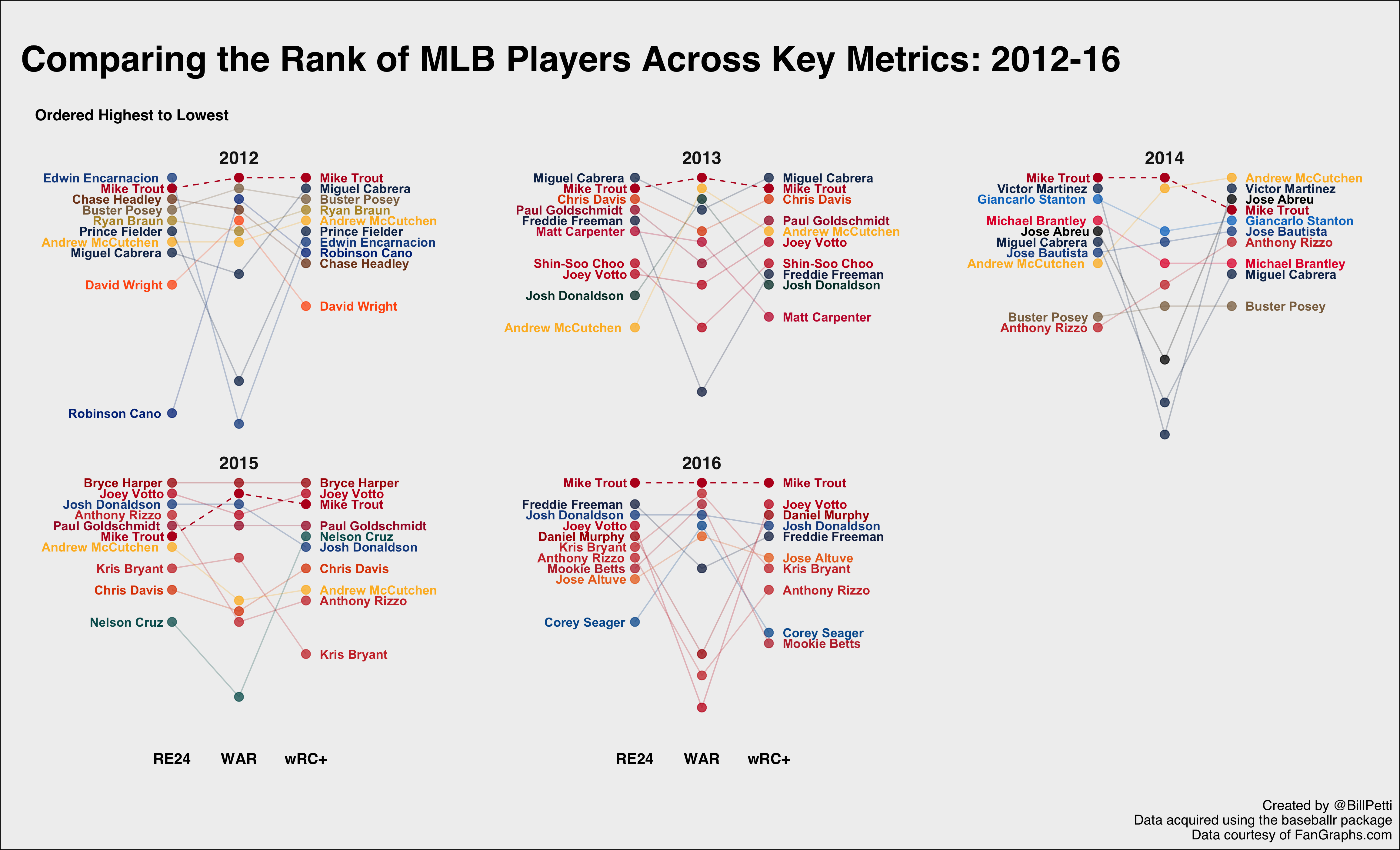
It’s pretty remarkable that Trout is really the only player to consistently perform so well across all three metrics every year. 2015 is arguably his weakest based on this criteria, but that was by far and away the year of Bryce Harper. Outside of 2015, Trout ranked fourth or higher in all three metrics every year.
If you want to see this broken out by metric instead we can do that, we just need to swap the x-axis value and facet values (note that the labels also need to be switched, since the x-axis now consists of Seasons instead of metrics):
ggplot(trout_slope_top10_noTrout, aes(factor(Season), value,
                                      group = Name,
                                      color = Team,
                                      label = Name)) +
  geom_point(size = 3, alpha = .75) +
  geom_point(data = trout_slope_years_alone, aes(factor(Season), value), size = 3) +
  geom_line(size = .5, alpha = .25) +
  geom_line(data = trout_slope_years_alone, aes(factor(Season), value), linetype = "dashed", size = .5) +
  geom_text(data = subset(trout_slope_top10_noTrout, Season == 2016), aes(label = paste0("    ", Name)), fontface = "bold", hjust = 0, size = 3.5) +
  geom_text(data = subset(trout_slope_years_alone, Season == 2016), aes(label = paste0("    ", Name)), fontface = "bold", hjust = 0, size = 3.5) +
  geom_text(data = subset(trout_slope_top10_noTrout, Season == 2012), aes(label = paste0(Name, "    ")), fontface = "bold", hjust = 1, size = 3.5) +
  geom_text(data = subset(trout_slope_years_alone, Season == 2012), aes(label = paste0(Name, "    ")), fontface = "bold", hjust = 1, size = 3.5) +
  ggtitle("\n   Comparing the Rank of MLB Players Across Key Metrics: 2012-16\n") +
  labs(subtitle = "Ordered Highest to Lowest\n", caption = "Created by @BillPetti\nData acquired using the baseballr package\nData courtesy of FanGraphs.com") +
  scale_colour_manual(values = mlb_team_colors) +
  facet_wrap(~variable) +
  ylab("\nRank\n") +
  theme_bp_grey() +
  scale_x_discrete(expand = c(1.2, 1.2)) +
  theme(legend.position = "none",
        strip.text.x = element_text(face = "bold", size = 14),
        axis.title.x=element_blank(),
        axis.title.y=element_blank(),
        axis.text.y=element_blank(),
        axis.text.x=element_text(size = 9.5),
        axis.ticks=element_blank(),
        axis.line=element_blank(),
        panel.grid.major = element_blank(),
        panel.grid.major = element_blank(),
        panel.grid.major.y = element_blank(),
        panel.grid.minor.y = element_blank(),
        panel.background = element_blank(),
        plot.subtitle = element_text(face = "bold", size = 12, hjust = .02))
And here’s the resulting plot:
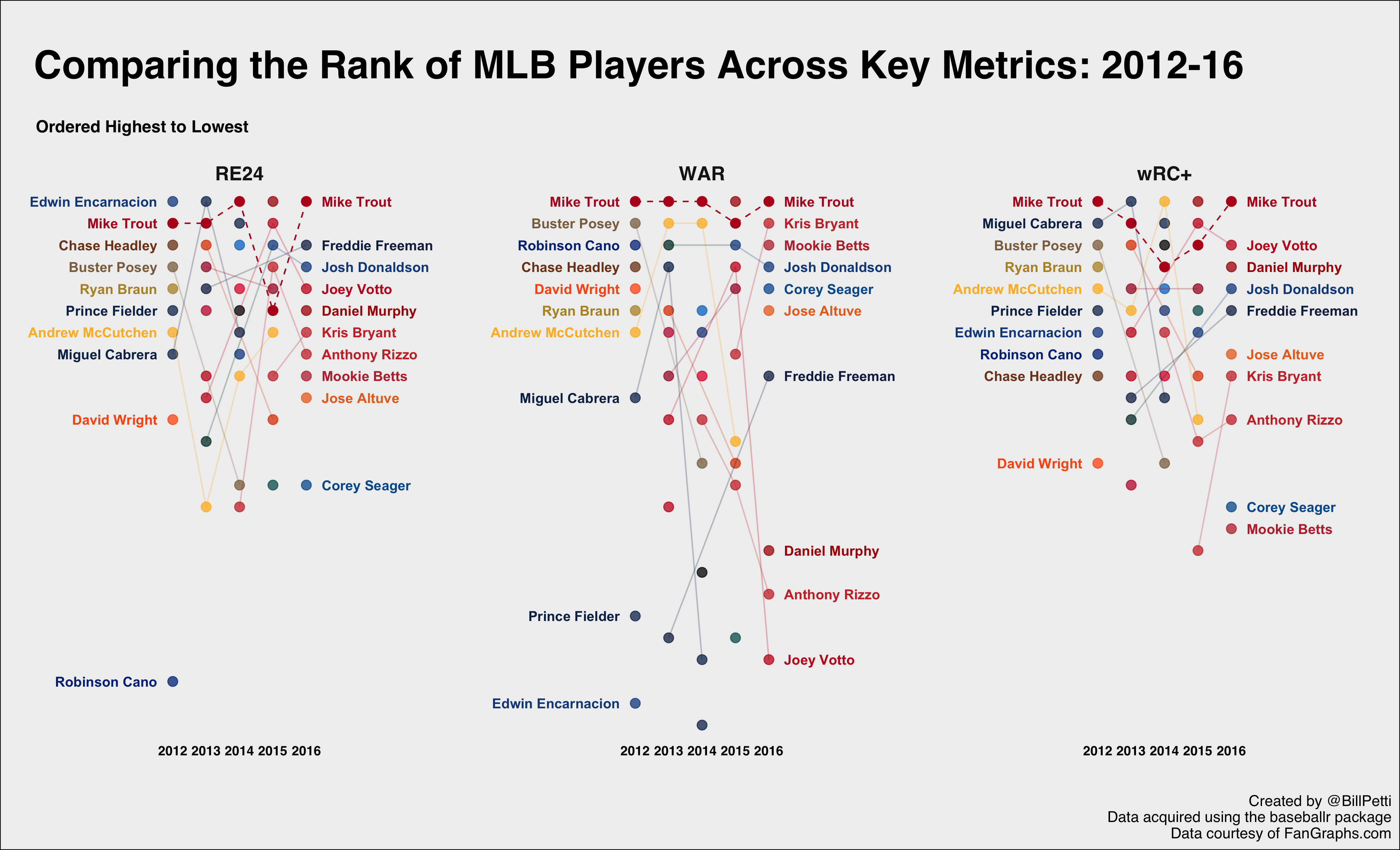
Trout’s dominance in terms of WAR certainly jumps out. He finished second to Harper in 2015–the only year he didn’t lead the majors–and only two players manage to make more than one appearance in the top-5: Andrew McCutchen and Josh Donaldson. Remember, some players are disappearing because their golf scores across the three variables weren’t high enough in each year. That highlights Trouts consistency–both across time, but also across multiple measures of performance.
Summing Up
As I said at the top, this is the first in what will be an ongoing series where I share stuff I am working on, along with code and a bit more of a how-to. They won’t all be this long, but hopefully this gives you a taste for what these posts will be like. And, more importantly, hopefully you will find them useful.
References & Resources
- Code available in my GitHub repo
- Charlie Park, “Edward Tufte’s ‘Slopegraphs'”
- Bob Rudis, “Slopegraphs in R“
Hey Bill, awesome stuff. If you would share the data set in an Excel sheet (I do not have the coding skills to extract my own data for these variables), I would like to carve the data up using a different scoring methodology which takes into account not just the nominal domination of rank, but also the level of relative domination. I will in turn supply you with the results. It’s not complicated, but is a nice and accurate way to show relative player performance.
My contact details for the data are below (I don’t see them above).
Well intended but made my head explode. Sorry.
Thanks for posting this. If I could make a request for a future post, I have been trying to use the baseballr package to look at pitching stats, but have been stuck trying to assign pitchers to event level stats. A tutorial would be most helpful.
Can you be more specific about what exactly you are trying to do?
This is awesome!!! Can you share this on R-Bloggers.com?
I ran the numbers for WAR for the first five seasons of full-time play for position players – and Mike Trout (47.8) is second alltime.
60.1 Babe Ruth (depending on where you start him full-time as position player)
45.7 Willie Mays
45.4 Mickey Mantle
45.2 Lou Gehrig
45.1 Ted Williams
Even at OPS+ he is tied for seventh with Musial
231 Ruth
190 Williams
184 Thomas
179 Gehrig
176 Jackson
175 Cobb
173 Musial
171 Mantle
171 Foxx
170 Speaker