Salary inflations and market behavior
In order to understand the economics of baseball, it’s important to see how much teams are spending per year on player salaries. Inflation is a tool that can help us understand the proportionate increase or decrease from year to year of payrolls. While others have looked more closely at the inflation rates of Win Shares or WAR, I wanted to take a look simply at how much the average player salary went up or down each year.
Don’t get me wrong here, inflation rates of a marginal win are very important when analyzing contracts post-signing, and quite interesting. But I think if we are to analyze a front office’s off-season decisions, we should do so without any hindsight bias. We can always analyze a player’s worth to a team after or during the span of the contract, but only forecasts of a player’s value are available to the front office pre-signing. So all I am analyzing here today is how much average salary has increased over the years and whether the change in the payroll of a team is associated with the forthcoming year’s change in winning percentage.
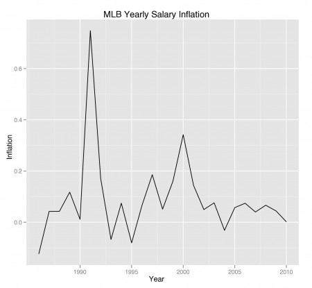
I was able to get my hands on a salary data set that comes from Baseball Databank. The population consists of 21,457 players from 1985 to 2010 and their salaries for the season. Using simple inflation equations, I was able to find the average salary of players for each year, and calculate the change in salaries per year to find an inflation rate. The graph below shows the results; the year corresponding to each inflation rate shows how much the average salary increased or decreased from the previous year.

As you can see, the zig-zag pattern tells us inflation does vary plenty from year to year (although the past few years look more stable). The graph shows two major peaks, each occurring at the beginning of each decade (1991 and 2000). I personally can’t think of a good enough reason for these increases in salaries; maybe a more informed historian can submit his input on the matter.
Inflation of salaries split by teams
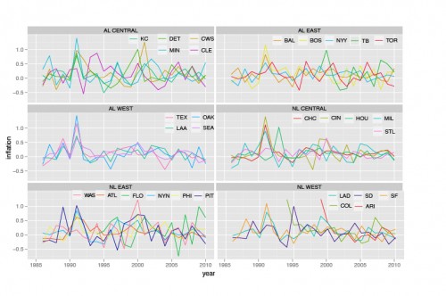
I then looked at the inflation of an average salary for each team over the years. This is a bit hard to show graphically (presenting 32 line plots is not easy!), but bear with me. I faceted the teams into their respective divisions in order to compare inflation rates. I know the leagues were different pre-1994, but this is the best solution I could come up with so that the lines were not all crisscrossing one another and becoming a big jumble of nothing.

Many of the divisions don’t show much movement altogether. The AL West teams, however, look as if they follow one another in off-season acquisitions (to buy or not to buy) in order to compete within the division. I also see some similarities between Boston and New York’s spending habits, whether it be willingly or sparingly.
In fact, I think you will notice plenty of other instances where teams closely follow each other’s purchasing trends. I found instances where a team plays ‘catch up’ by spending a year or two after a competitor within the division has already done so. It’s not for certain these graphs tell the entire story on why or when teams are willing to spend, but it does support some of the stories we see in the off season (like Boston and New York always outbidding one another).
This arms race (literally, if we’re talking pitchers) to acquire the best on the free agent market shows no differences in the economics of other businesses. If a competitor increases its supply of resources, it’s your turn to beef up as well.
Fruition from increased payrolls?

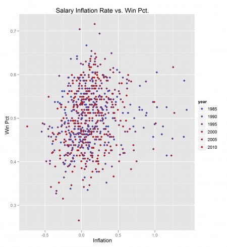
I looked to see if there is any evidence for an association between the team inflation rates found in the above section and the team’s winning percentage for the season. I also color-coded the points by year to see if that has any lurking effect. To my disappointment, there is not much graphical evidence to suggest any strong linearity between the two in the plot above.
I tried looking at the variables from several angles: looking at winning percentage or the change in winning percentage from one year to the next. I thought maybe there was lag time for an increase in payroll (possibly a season or two) to have a real effect on winning percentages. None of the plots looked very convincing. Yet I still tried out a linear model that regressed a team’s past three inflation rates (so for 2008, I used the 2006-2008 inflation rates) on its winning percentage to see how the cards fell. Below is a summary of the model.
Coefficients:
            Estimate Std. Error t value Pr(>|t|)
(Intercept) 0.489469   0.003355 145.905  < 2e-16
inf0        0.041858   0.008881   4.713 2.99e-06
inf1        0.029386   0.008827   3.329  0.00092
inf2        0.017221   0.008623   1.997  0.04623
Residual standard error: 0.06756 on 644 degrees of freedom
While my model tests to be statistically significant, there are some flaws I should point out. The first cause of speculation came from a very low R-squared. Also the residual standard error came out to be approximately .067.
Since this is in context of winning percentage, a 6.7 percent error is pretty large: about a 10-win error when considering a full 162 game season. Meaning a 95 percent confidence interval of a team's winning percentage would be in the realm of around 40 wins. This interval is way too big to even begin thinking that this model shows any meaningful evidence of association between the variables.
Final tidbits and tangents
While I can't say that my research on this topic was very fruitful, I found some interesting points worth noting. The reason why I decided to see if years had a lurking effect on the data is because I wanted to see whether or not the market is becoming more efficient. What I mean is, over the course of the past 20 years, have front offices managed to become more successful in winning more games when adding payroll? Looking back at the last graph, the answer is essentially, 'not really', as the points look randomly distributed when comparing the blue points against the red ones. The process is still very hit or miss.
In the end, it seems likely someone will try to make a huge splash, but ultimately fail to improve the team. The efficiency of the market has not weeded out signings like Barry Zito or Alfonso Soriano, despite plenty of warning signs.
Efficiency also ties in with the discussion about teams having similar spending trends over the years. Maybe the anxiety to add payroll in order to keep up with other teams causes front offices to continually take risks by overpaying for mediocre talent. Still very hit or miss.
References & Resources
The dataset used for this article comes from the Baseball Databank.

Kevin—Interesting article, but I am confused about your inflation charts. In the first chart, the y-axis gives inflation points of 0.0, 0.1, 0.2, etc., all the way up to 0.8. Does this mean that the increase in the average salary for 1991 was approximately 75% over 1990’s average—or 7.5%, or some other figure? I’m assuming it must be 75%, but can you clarify?
Now that I think about it, it is a bit confusing. I probably should have switched the axis to read as percentages. But yes you are correct, it reads as an inflation rate of 75% (pretty freaking high right?). So in the plots, multiply the y-axis by 100 and you’ll get the rate in terms of a percentage. Thanks for catching that Bill.
Thanks, Kevin. This really is interesting stuff that I haven’t seen elsewhere. That was indeed quite a leap in 1991 and 2000!
Interesting, but the only way that avg salaries could increase by 75% in one year is if the league did something like double the minimum salary. Otherwise, there must be a mistake…
I double checked my work, and the average salary increase from 1990 to 1991 was about $511K to $894K, which is close to a 75% markup. For your minimum salary argument, I thought that might be plausible but I googled the info and found that from 1990 to 1995, the minimum salary only increased from $100K to $109K.
Link from baseball-reference: http://www.baseball-reference.com/bullpen/Minimum_Salary