The 2015 Season Preview in Data Visualization

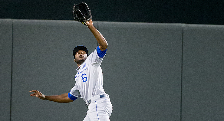
Lorenzo Cain and the KC outfield are projected to be the best in the game defensively. (via Keith Allison)
Editor’s Note: With the season finally just a week away, it’s time to preview the season. Welcome to Season Preview Week!
If you’ve been following my work at FanGraphs, you know that I’ve been slowly ramping up for the season with some funky data visualizations. Most recently, I’ve produced interactive graphs of the new Forbes team values and of 2015 OPS projections. Today, we’re going to go a little deeper, looking at various ways to preview the 2015 season with visuals.
Over at FanGraphs, we’ve been taking a look at things on a more granular level with our Positional Power Rankings series, so the hope here is to pull back for more of an overview. Hopefully, the sum of these graphics is a holistic picture of the season to come. Let’s get to it! All of the data in these graphics are current as of Sunday.
Travel Time
Each team’s schedule can get a little clunky to add up. So we thought we’d simplify it a little. What follows is an interactive bar chart with each team’s schedule broken out solely by homestands and road trips. This is useful because we can see the swings that teams go through.
Some teams have their longest homestands of the season followed by their longest road trips of the season. Looking team by team, the Dodgers have a particularly brutal stretch in June and July, with a 10-game homestand sandwiched between two 10-game road trips. On the other end of the spectrum, if the Yankees can hang in the race until mid-August, they’ll get a chance to do some real damage, when they have a stretch with 20 of 26 games at home.
Offensive Metrics by Month
Speaking of August, everyone is used to poor offense in April and lots of home runs in August. As you can see in the below graphic, that intuition is correct. Offense rate metrics peak in August, and then trend back down in September as expanded rosters and the beginning of cooler weather drag things back down.

A Season For All Ages
Let’s get back to looking at this season specifically. Here, we see the ages of players projected to see playing time this season, according to the FanGraphs depth charts. The depth charts cover more or less all players on a team’s 40-man roster who have progressed to Double-A or above. The population starts thinning out after the age of 29, but there are still plenty of players hanging around into their late 30s and early 40s.

Position Player WAR Components Heatmap
This heat map gives you a good picture of the components of the position players’ WAR. Batting is most valuable and extreme component with teams wide on both ends of the spectrum. The Angels lead with 73.0 batting runs while the Phillies are really far behind with -55.2. Following them closely are the Braves with -49.0. Relative to batting and fielding, Base Running doesn’t have the same influence, and the teams are certainly bunched closer together.

Defense Heat Maps
Referencing our Projected WAR Batter Components above, we know that fielding does not influence the team’s success quite as much as batting, but it is still an important component to a team’s success throughout the season. Below, I’ve laid out two defensive heat maps — one for each league, with divisions listed vertically in alphabetical order by team nickname. Green is best, followed by yellow, then orange, then red is very bad. You probably didn’t need me to tell you that, but just in case, there you are.
These heat maps provide a quick-glance analysis of total defensive position projections. They do not represent just one player, but instead, they show the entire season for that position. However, elite players do tend to monopolize playing time at a given position. For reference in the context of WAR, 9.117 runs equals one win (for 2014), so you can divide these figures by nine to get an estimate of that position’s fielding contribution to the team’s WAR. For example, Andrelton Simmons and the Braves’ shortstop position contributes a little over two WAR defensively.
American League
The Royals most have the best defensive team in baseball. Alex Gordon, Jarrod Dyson and Lorenzo Cain provide the majority of the Royals’ 28.6 outfield fielding runs. The Twins are on the opposite end of the defensive spectrum having just one position — first base thanks to Joe Mauer — that contributes positively to fielding runs.

National League
The Senior Circuit does not have any standout defensive squads like the AL does, but the Cardinals lead the NL in fielding runs. Offseason acquisition Jason Heyward provides more than half of the Cardinals’ 31 defensive runs, while his former team in Atlanta might be in trouble now that the Braves don’t have him to cover for them in the green pastures. But they’re not projected to be as bad as the Padres, with Wil Myers and Matt Kemp being the most egregious. They’re projected to lose over two WAR in outfield fielding runs.

Projected WAR Bar Chart
Here, we summarize FanGraphs’ depth charts. Each team’s total projected WAR is broken out by position. Pitchers are in red and batters are represented in blue. Starting rotations represent the single largest chunk of a team’s WAR total. Designated hitters mostly reflect a small contribution since they don’t add any value fielding, but the Red Sox, Blue Jays, Tigers and White Sox all get rather good production from their DH.
Note: Negative WAR values are represented as zeros. There were three instances of this and the values were very close to zero.

Projected Standings Changes, 2014-2015
Every year there are four basic types of teams: teams that beat expectations (2014 Orioles), teams that underperform (2014 Red Sox), teams that are in decline (Rangers) and teams that are rising (Cubs). One way to visualize the change and variance is through the arrow chart below. Here we compare 2014 wins with the FanGraphs projected wins for the 2015 season. Both data points are displayed along with the direction (arrow) and magnitude (color) of the change. This one is interactive, so you can play around with the filters at the top.
The Red Sox, Diamondbacks and Cubs are the teams projected to improve the most. The Sox both underperformed last season and added some talented players last season. The Diamondbacks may still be curious, but they’re not forecasted to be as bad as they were last season. The Cubs have been improving their roster with free agents like Jon Lester and with a seemingly endless barrage of prospects. At the other end of the spectrum, the Royals, Angels and Orioles are all regression candidates for 2015.
BaseRuns Win Percentage Projection
Here is one final look at the standings, through the prism of BaseRuns projected runs scored and allowed, which you can find on the FanGraphs Projected Standings page.
Note: The x-axis is reversed, because it would look weird if it wasn’t.

A couple things stick out right away. Teams are not as bunched as tightly as you might expect. Second, it’s going to be a looooooong season for the Braves and Phillies.

This was really nice! The fielding charts in particular are a great way to represent a team’s fielding strength. I think I would’ve liked an “Overall” number, so I can quickly tell what the upshot is without having to add together 9 positions, but that’s a minor quibble.
I think your 3B for Dodgers is colored incorrectly. The number shows +8.7 ( for Juan Uribe… a plus plus defender) but it is orange. Based on similar numbers on the other heatmaps I think that color should be green.
Fixed! Thank you for the catch, Daniel.
Love it.
The Projected Standings Changes have the divisions all out of whack. Boston and L.A. are switched and Tampa is missing.
“The Sox underperformed last season”
which sox players underperformed, exactly?
What depth chart variant did you use for the Astros defensive graph? LF figures to be manned by Carter/Gattis, two lumbering DH’s, CF by Rasmus/Marisnick, two plus center fielders, and RF by CF-by-trade Springer. But LF is shown as a positive and CF and RF as negatives. That seems backwards to me.
Strike that, with Jon Singleton probably going to the minors, LF will almost certainly be manned by CF’s Grossman and/or Marisnick. That’s why I was curious what you used for the depth chart. The Astros OF should be a plus defensively this year across the board.
The first thing i looked for was if any team was all green up the middle. reds closest to that, except at catcher, but at least still positive there. Doesnt seem like a lot of teams executing towards conventional wisdom .
So how exactly is it that your total War for each team doesn’t line up with projected standings? Do some teams just have way better benches?
Nice stats, but I wouldn’t call it Data Visualization. It’s just basic static 90’s charts.