The eye of the umpire
How accurate are umpires in calling the strike zone? How well can
they locate a ball flashing towards them at 95 mph? Or unexpectedly
swooping down and, perhaps, nicking the lower outside extremity of
the strike zone? Two inches? One? One-tenth of an inch? Here’s what
Ted Williams wrote about his ability to judge where a pitched ball
actually goes, from his book The Science of Hitting:
It’s very likely that once you’ve made yourself sensitive to the
strike zone, you’ll be a little more conscious of what you think are
bad calls by the umpire … I would say umpires are capable of calling
a ball within an inch of where it is. As a hitter, I felt I could
tell within a half-inch.
Well, I’m skeptical by nature, and those estimates seem a trifle too
good to me. But Williams was a very smart guy and he wasn’t one to
throw a lot of bullshit around, so I wouldn’t dismiss his claims
outright. And it turns out that we can shed some light on the subject
by looking at MLB’s fabulous pitch data, the so-called pitch-f/x
data.
Today I’m going to build on some work I did last time (Strike zone: fact vs. fiction)
on determining
the size of the strike zone using pitch data. As we’ll see in a
few moments, we can infer from that data how well an umpire can
locate the incoming pitch. First, though, I want to go back
and make some small improvements to the measurements of the strike
zone that I did last time.
That was a ball?!?
One of the loose ends of that analysis was some question about the
quality of the data. Here’s a snippet from that article:
I’ve already mentioned the fact that the ball fraction for pitches
right down the middle of the plate is not zero, in fact it’s about
5-6%. Can umpires be missing these easy calls so frequently? It seems
hard to believe. The alternative explanation is that there is some
problem with the data.
I also mentioned that one of the pitches that supposedly was right
down the middle of the strike zone was actually an intentional ball,
thrown two feet off the plate, as verified by checking the pitch on
video.
After viewing some other pitches on video, it became clear that the
MLB system for tracking pitches was just getting some pitches
wrong. Of course, this shouldn’t be surprising. This is a very complex
system that is still in the course of being rolled out in all major
league parks, we should not expect the data to be perfect. But, we do need
to understand its limitations and see how it affects what we are
trying to do with the data.
So, I have tried to determine how often the system mis-tracks a
pitch. First, let’s recall the ball
fraction graphic I produced last time. This graph shows the fraction
of balls called by the umpire as you move across the strike zone.

The edges of the strike zone are defined as the position the ball
fraction (blue curve) crosses the one-half mark (horizontal green
line). Whereas last time I focused on measuring the width of the
zone, I now want to understand the features of this plot more
generally. As already noted, the ball fraction does not go to zero at
the center, as one would expect it should. Also, the transition from
zero to one at the edges of the strike zone is not perfectly sharp,
which is what you’d expect for a perfect pitch-tracking system and
infallible umpires.
In fact, the sharpness of the ball-strike transition is a direct
measure of the accuracy of the system, although it should be kept in
mind that I’m referring to the pitch-tracking system and umpire
pitch-locating ability combined. The graphic below shows how the ball
fraction curve is modified for different accuracies. I generated these
curves analytically using a simple model (see the Resource section for details).

As you can see, the
less accurate the system, the more the curves get “smeared” out. Note
how the edges of the strike zone are the same for all values of
accuracy. In other words, the measured width is independent of
accuracy.
Do any of these colored curves look like the real data shown above?
Not really: the green or cyan curves seem to have the right shape in the
transition region, but they do not show the non-zero ball
fraction at the center. It turns out that no value of the accuracy
number can reproduce what we see in the data. However, if I modify my
model a bit, I can get this plot:

Here I show the same data I showed above (dark blue curve), but now
I’ve superimposed the curve I get from my calculation (in cyan). As
you can see, the match to the data, while not perfect, is actually
pretty good: the transition sharpness looks about right and we see a
ball fraction of around 7-8% right in the middle of the plate. To get
this shape, I had to assume about 5% of pitches are completely
mis-tracked by the system, i.e. for those 5% of pitches the
location as determined by the system was wildly off. Note that the
measured width of the strike zone is not affected significantly. (I
have assumed a strike zone that goes from -1 to one foot, to match the
observed data.)
A big word of caution: I am not claiming that 5% of the
pitches gathered thus far are mis-measured. Mine is just one
hypothesis that happens to qualitatively describe the data, but it
doesn’t mean it’s correct. My little model does not rule out
other possibilities, it simply shows how one hypothesis is indeed
plausible.
The main point here is that, while there is some small level of noise in the data, its presence doesn’t affect our ability
to measure the strike zone.

Calling the high strike, or not
After my previous article appeared there were lively discussions on
the results both on Ballhype and over at The Book Blog. Sabermetrician
Mitchel Lichtman was fairly (OK, very)
certain that there was something wrong with my estimation of the
vertical strike zone for right-handed batters. I had found the the
umps were calling the high strike correctly, as shown in this plot (taken directly from my previous article):

Here’s what Mitchel
thought about that:
In any case, there is NO WAY IN HECK that the average umpire calls a
rule book strike at the top of the zone for RHB!!!!!!!!!!…Something is wrong. I have watched 300 games a year for 20 years.
The average top of the strike zone is well below the rule book.
This is almost unequivocable.
Hey, when Mitchel speaks, especially this forcefully, well, I
listen. The guy knows his stuff. And indeed, I found two problems, one
was a trivial mistake on my part, the other was another data quality
issue.
My mistake was in reporting the size of the rulebook strike zone. I
did not add in the radius of the ball to either end of the vertical strike zone
as I had for the horizontal dimension. OK, that’s easy to fix, but the
second problem was more difficult to solve. It has to do with the
MLB-supplied limits of the vertical strike zone.
The height of Jeter’s knee
While the horizontal size of the strike zone is defined by the width
of the plate and is the same for everybody, the vertical dimension of
the zone is tied to each individual batter. A nice feature of the
MLB pitch data, is that they include, for each pitch, their estimate of
the lower and upper limits of the strike zone, based on the batter’s
stance. The operator of the pitch-f/x system sets those limits on a
video screen as the batter assumes the hitting position.
This data, then, allows us to know if a pitch was actually in the strike zone. However,
I have found some problems with these strike zone limits that come
with the pitch data, namely, they seem to vary a quite a bit, even for
the same batter on different days. As an example, here are the lower
and upper limits of the strike zone for Derek Jeter on three different
occasions:
Limits of Jeter's strike zone (inches)
Game         Low    High    Diff
Tex, 5/3    23.6    53.0    29.4
Sea, 5/12   23.3    46.4    23.0
Chi, 5/16   20.4    40.5    20.1
Diff: High minus Low; the vertical size of the strike zone
Now, I suppose a batter can tweak his stance a little from one game to
the next, but I seriously
doubt that Jeter’s vertical strike zone is changing by nine inches
from game to game. I did not single Jeter out as a particularly bad
case; just about all batters in the sample have this problem.
Let me say that I don’t think this is particularly surprising. As I
mentioned above, this is a complicated system that has just begun
operating. There is surely a learning curve for the system’s operators
and I’m confident that the strike zone data will improve as time goes
on.
But in the meantime, what shall we do? Do we abandon our idea of
measuring the vertical strike zone using the pitch data? Actually, I
don’t think we have to do that. What we can do is assume that on
average the system’s operators are getting it right. So, for each
batter, I calculate his average strike zone lower and upper limits,
based on the pitch data. Then I apply each batter’s average strike
zone for all pitches thrown to him, instead of the pitch-by-pitch
values that come with the data. Make sense?
The results for both right-handed and left-handed batters, is shown in
the graph below:

These definitely look better than the
previous plot: the bottom is flatter and the ball-strike transition is
sharper. In fact, these plots now resemble the plots for the
horizontal dimension, where the strike zone limits are not
batter-dependent, so that’s good. Note that in these plots, I’ve also
corrected my error on the rulebook strike zone—it’s been
widened compared to the plot above.
From these plots, it now appears that umpires are not really calling
the vertical strike zone as they should, although they are doing just
as poorly on the low strike as they are on the high strike. Here are
updated versions of a plot and table I ran last time:
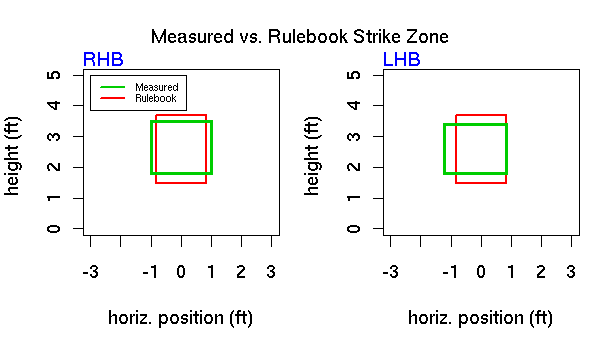
Actual vs. Rulebook Strike Zone Dimensions (inches)
            Left  Right   Lower*  Upper  Total Area+
RHB        -12.0   12.1    21.6    42.0      492
LHB        -14.6    9.9    21.5    40.8      475
Rulebook    -9.9    9.9    17.7    44.2      527
* vertical strike zone mapped to average
+ total area in square inches
So, our conclusions from last time change a bit. Right-handed batters
still have to defend a slightly larger strike zone than lefties, but
in both cases the total area of the measured zone is less than the
rulebook strike zone. The difference between the measured upper limit
and the rulebook strike zone is only 2.2 inches for right-handed
batters, which doesn’t seem like much, certainly not as much as what
we see on TV, where pitches that are just a shade above the belt are
routinely called balls.
It’s hard to judge the height of a pitch on TV
But are we seeing what we think we’re seeing? I’m not sure we
are. When we watch a pitch on television, we generally see if from the
center field camera, so we have no depth perception along a line from
the pitcher’s mound to home plate. We necessarily judge the location of a pitch
from where it hits the catcher’s glove. However, since the pitch is
moving at a downward angle and the catcher is positioned well back of
home plate, the pitch drops significantly from the point it passes
through the strike zone to the point where the catcher receives it.
The amount of drop will depend on the speed and the type of pitch, it
can be a foot or more for a slow curve, but even hard fastballs will
drop 3-4 inches between home plate and catcher’s glove. As I
mentioned, watching on TV we cannot discern this drop, we can’t tell
how high the pitch was when it crossed the plate.
Note that this same illusion is present even when viewing a pitch from
the side, which is the view on some replays. In that case, we tend to
judge the pitch as it passes the batter, but almost all batters take
their stance well back in the batter’s box and the distance from the
front of home plate to the batter (middle of chest, let’s say) can
easily be two feet. Again, many pitches will drop several inches over that
distance, and we will think the pitch is lower than it actually was.
In other words, it is virtually impossible to judge the vertical position of where a pitch crosses the strike zone
by watching on TV.
Final thoughts
So what about Ted Williams and his claim that umpires can call pitches
to an accuracy of one inch, what does my study say about that? Well,
the nice curve I calculated for the third graphic in this article
assumed an accuracy of 2.5 inches. Now that number represents a
combination of the average accuracy of the umpires and the accuracy of
the pitch-f/x system. The latter is reported to have an accuracy of
one inch, but keeping with my skeptical nature, I will assume that this is the best-case scenario.
This would imply that the contribution of the umps to the
overall accuracy is, at most, a little over two inches (see the Resources section
if you’re curious about how I get this number). Two inches is not as
good as Williams’ estimate, but I think it’s pretty darn good.
References & Resources
For those few that want the gory details:
- Analytical ball fraction curves—I used a simple simulation to generate these curves. The first step is to choose a random number between -2 and two feet. This is the true position of a pitch. To that I add a small number, the uncertainty, the result being the apparent position of the pitch. The uncertainty is normally distributed with mean zero and sigma set to one, two or three inches, etc. The pitch is a strike if its apparent position is within the strike zone. I generate thousands of pitches this way, and the ball fraction as a function of the true position gives the curves shown above.
To reproduce the actual data, I had to add about 5% of pitches where the uncertainty is very large (around two feet) instead of two or three inches.
- Accuracy of umpire’s eye — Our measured accuracy is a combination of the accuracy of the pitch-tracking system and umpire accuracy. When there are multiple contributions to an uncertainty, the total uncertainty is not the sum of the individual contributions, but rather the square of the total is the sum of the squares. Thus, given total uncertainty (s_tot) and pitch-tracking uncertainty (s_track), the umpire uncertainty (s_ump) can be estimated as s_ump = sqrt(s_tot^2 – s_track^2).