The sum of their parts: a deeper look at pitchers’ peripheral data
Disclaimer: I am no stats-creation expert (I consider myself more of a reader/applier), but with the help of some of the THT staff (special shout out to Jonathan Halket, Derek Carty and Dave Studenmund) I have created/compiled the data below. You can access comparative peripheral data by clicking here and the three year pitching data by clicking here. Let me know if you notice an error.
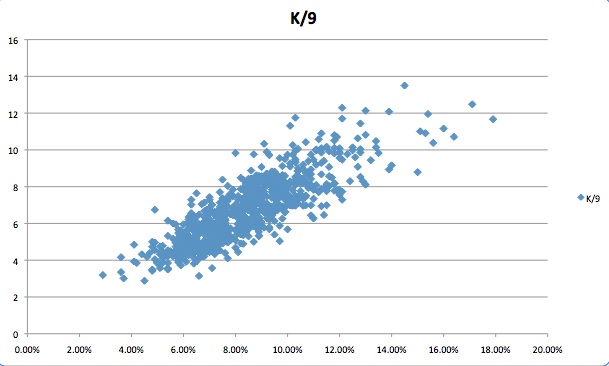
Since Fangraphs made its swinging strike percentage data publicly sortable a few weeks ago, I have pondered how changes in swinging strikes (SwStr%) affect changes in strikeouts per nine innings (K/9). Similarly, I pondered the correlation between getting ahead of batters (F-Strike%) and walks issued (bases on balls per nine). Logically, it would seem that an uptick in SwStr% and F-Strike% should result in some respective increase in K/9 and BB/9. To confirm this suspicion, I took a sample of all major league pitchers who tossed 70-plus innings in a single season from 2007-2010 and graphed both their SwStr% to K/9 and F-Strike% to BB/9. The resulting data are pictured below (click to enlarge):
SwStr% to K/9:
F-Strike% to BB/9:
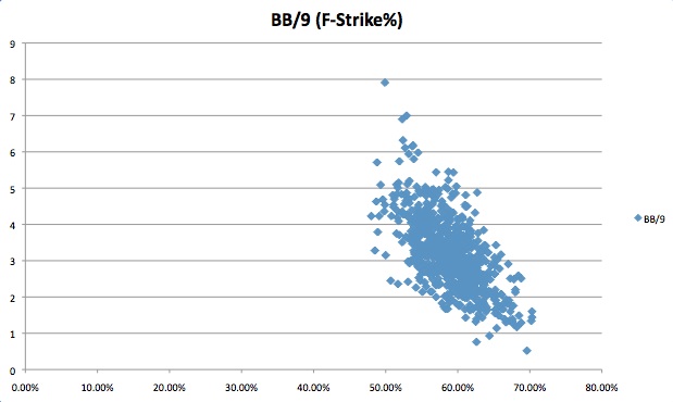
As the graphs indicate, the two data sets seem correlated and a deeper look into the numbers reveals that there may be some causal effect. The SwStr% to K/9 data set has a coefficient of determination (R-Squared) of ~.700, while the F-Strike% to BB/9 data has an R-Squared of ~.409. Absolute relation, however, is not what intrigues me most. What I am more curious about is how changes in one component stat might affect the other—the elasticity of the data. In other words, if Pitcher X is garnering more swinging strikes and getting ahead of batters, by how much could one expect his K/9 and BB/9 to change? To answer this question, I determined the correlation coefficient of the logarithms of each data set. Here is how the elasticity, when graphed, looks (click to enlarge):
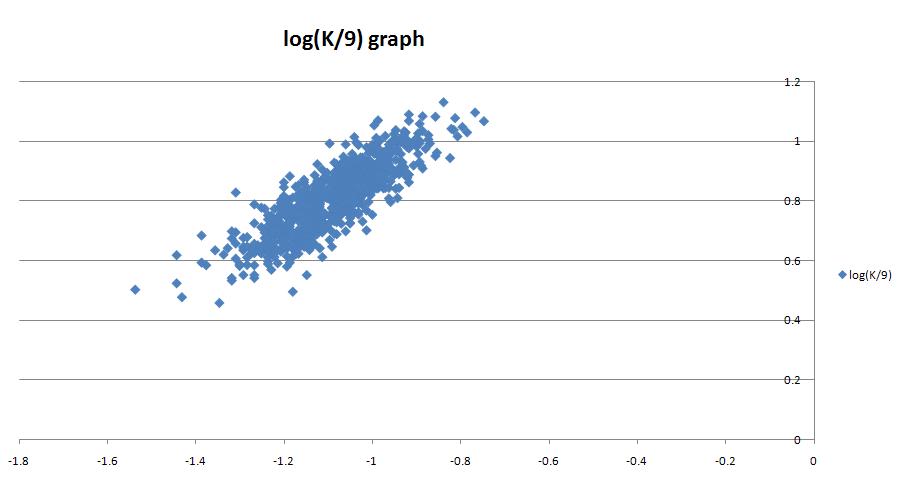
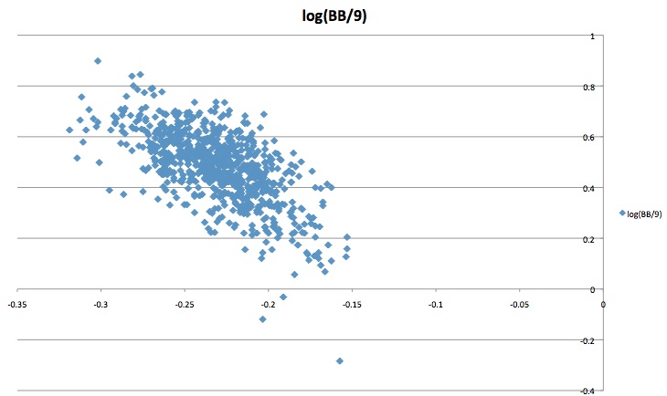
The elasticity correlation between SwStr% and K/9 is 0.838436 and the elasticity correlation between F-Strike% and BB/9 is -0.64652. In other words, a +1.19 percent change in a pitcher’s swinging strike rate generally sees a corollary +1.0 percent increase in K/9. Likewise, a +1.55 percent increase in a pitcher’s F-Strike percentage generally sees a corollary -1.00 percent change in BB/9. I also did the diligence on BB/9’s relationship to Zone%, but there turned out to be no significant statistical correlation relationship between the two, oddly enough.
Yet, plenty of major leaguers are showing polar tendencies in 2010 compared to 2009. On one hand, Cole Hamels’ SwStr% is at a career low and down from last season, and yet his K/9 is at a three-season high. On the other side of the spectrum, Tim Lincecum is garnering more swinging strikes than last season (on par with 2008) and yet his K/9 is down for the second straight season.
Perhaps this observation is merely a correction from a “lucky” BB/9 in 2009 or an “unlucky” K/9 in 2009. To verify the validity of expected changes matching up with actual changes, it is important to double-check a player’s absolute SwStr% and F-Strike% on the season. If he’s got a 10+ SwStr% and he’s striking out eight-plus guys per nine, but last year struck out only six guys per nine with a slightly higher swinging strike rate, it is entirely plausible to conclude that 2009 (not 2010) is the fluke and thus the expected change rate might be misleading. This is just an extra step one will have to take with my data for the time being (absolute rates are provided in my data sheet under “raw data”).
Using the above information, I have created an Excel spreadsheet of all pitchers in 2010 who pitched at least 70 innings in 2009 and 70 innings through June 26 this season and mapped out their changes in K/9, BB/9, Zone%, F-Strike% and SwStr%. In my spreadsheet, I have not only mapped out the changes in these stats this season compared to last year, but I have also created a column for expected changes in K/9 and BB/9 based on changes in the component stats (SwStr% and F-Strike%).
There is also a column which compares expected changes in K/9 and BB/9 to the player’s actual changes. A negative number in the difference columns indicates a player’s actual change is below his expected change and a positive number in the difference column indicates that a player’s actual change is above his expected change.
The purpose of the data is to help fantasy owners mine for second half gold. The information is far from perfect, but it should give fantasy player some sense of which guys should see regression/improvement in their WHIP and strikeouts in the second half and aid in smart trading. An informed decision is a smart decision and the key to winning a fantasy league is economizing resources and mining for value.
Now that I’ve explained what I’ve done and what my data mean, let me present the sortable and usable data. You can download my Excel sheet by clicking here.
For those who just want a quick look at the top/bottom 35 pitchers, you can check out the sorted screen shots below:
Top 35 starting pitchers who are “underperforming” in K/9:

Bottom 35 starting pitchers who are “overpeforming” in K/9:

Top 35 starting pitchers who are “underpeforming” in BB/9:


Bottom 35 starting pitchers who are “overpeforming” in BB/9:

Enjoy. Post your love/hate in comments.
Good stuff, but I would use K/PA and BB/PA instead of K/9 and BB/9. The latter ratios are affected by BABIP, as an inflated mark would allow a pitcher to face more batters in an inning and therefore provide him with additional chances to strike out or walk a batter.
Fantastic. Thanks for this.
Mike, I agree, and have been an advocate for using the “PA” denominator for a while now, but for some reason that data still isn’t as readily available as it should be. At least that’s what I’ve seen.
I’m not quite sure what you’ve done here. You say you looked at “changes” in rates, but I believe what you really did is apply logarithms to the data, correct? It’s not clear to me that changes in a dataset are the same thing as changes made by a specific pitcher.
More relevant would have been an analysis of specific pitchers’ changes in rates from year-to-year, and the correlation between those and changes in their K and BB rates.
Good point about K/PA and BB/PA. That’s what we use in the THT Annual (cheap advertisement).
Like the direction you are heading, and I think directionally it is the right way to go, but wondering if a better first step to this analysis is determining if there is a formula to calculate xK/PA based on Swinging Strikes and Strike Percentage? Then make the jump to lucky/unlucky.
This is probably a stupid question, but what the heck is “SwStr%”????
This has probably been done before, and you seem to have danced around it, but how about seeing if the error term (K/9 -xK/9) in 2009 is predictive of the change in K/9 in 2010 vs 2009?
I used your spreadsheet to run the simple correlation, and get a 0.5 correl (25%) R^2 – not bad and certainly helpful for predicting future changes in K/9, no?
Diff Count K Err dK/9 yoy
-3.0 1 -0.03 -0.15
-2.0 12 -0.19 -0.22
-1.0 31 -0.17 -0.16
0.0 34 0.18 0.14
1.0 15 0.21 0.16
@Jake Pinato:
So even though I did “per 9” rather than “per PA”, there is some statistical significance to my results and to these relationships, correct? Is the “K Err” the RMS?
@All:
I like the idea of “per PA” rather than “per 9” and I will look into an end of season update to this all using K/PA and BB/PA. Unfortunately, I’m moving to Madison and transferring law programs in the upcoming month, so I have little time to devote to tinkering around and doing it “per PA” at the moment.
Wow. I wonder why my own name popped up asking “what the heck is “SwStr%”????”
Someone’s attempt at irony?
To explain to “Jeffrey”,
Every pitch has one of five outcomes:
1) Ball
2) Called Strike
3) Put In Play
4) Foul
5) Swinging Strike
SwStr% represents the percentage of all pitches which result in the fifth of these outcomes
K Err is actually just the difference between expected K/9 in 2009 (using SS% regression) and actual K/9 in 2009. dK/9 is the change in K/9 2010 vs 2009.
Sorry, the correlation # is correct (0.5), but the chart got messed up. Please ignore that one … see below:
K Error Count Avg K Err dK/9
-2.0 12 -1.49 -1.67
-1.0 31 -0.52 -0.35
0.0 34 0.48 0.05
1.0 15 1.33 0.47
As you can see, bucketing pitchers by their K/9 error in 2009 shows a predictive relationship with their change in K/9 yoy.
For example, there are 15 pitchers who had a K/9 – xK/9 (using 2009 SS%) of between 1 and 2 (bottom line). Of these pitchers, the average change in K/9 yoy was +0.47 K/9.
Yes, seems to be a predictive relationship by bucketing … although this is very rudimentary. Using a regression, 25% R^2 isn’t amazing, but it’s certainly something.
Actually 1 of 6 outcomes, HBP is another outcome.