Heatmaps: for comparison’s sake
Visualizers are always helpful when trying to grasp a general idea. There’s so much information out there that it’s easy for anyone to get lost. That’s why it’s important to have visually appealing graphs, tables or even interactive pieces that help tell a story.
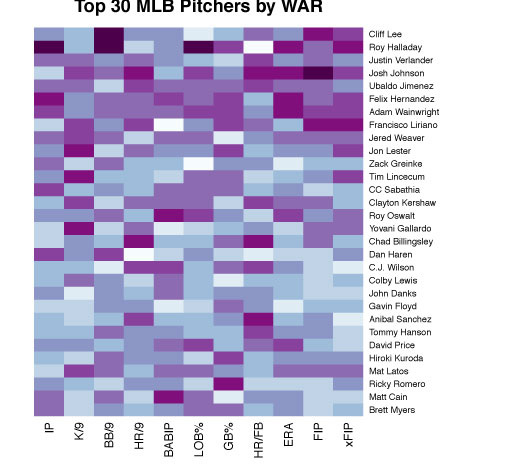
When I think about data visualization, I think of colors—easy to read and aesthetically appealing graphics. With that in mind, I wanted to make some heatmaps for the 2010 season, based on metrics that we like to look upon when comparing players. I’m not saying heatmaps are all of the above, but they’re pretty cool to look at.
This concept of heatmaps isn’t so you can reference Josh Hamilton’s actual strikeout rate, but more for comparing it to Jason Heyward’s, or something on those lines. Keep that in mind in these next few plots. They’re more for a casual fan to see that Jose Bautista’s ISO was pretty ridiculous compared to others. The data I used comes from Fangraphs, and I sorted the top 30 hitters and pitchers by WAR.

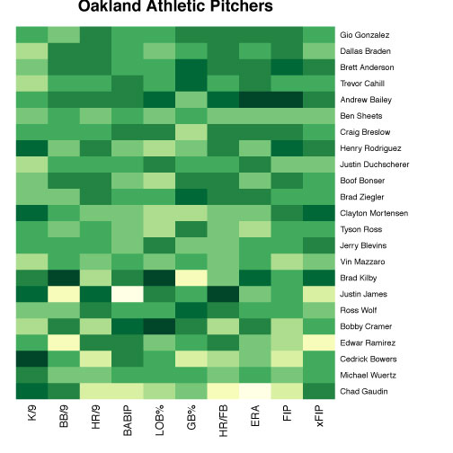
If you want to give heatmaps a shot, they’re really easy to make on R. A really good tutorial can be found here. Go crazy. Be creative. Do one maybe for your favorite team.
I also attached PDFs of the graphs, in case the JPEGs were too small.
Matt Cain has an awfully dark BABIP brick…
These are so cool.
Also cool in that it helps illustrate the importance of position when determining WAR. For example Ryan Zimmerman’s (4th overall) color blocks are nearly all lighter than that of Miguel Cabrera (12th overall), who is only 3 spots ahead of the illustrious Kelly Johnson!