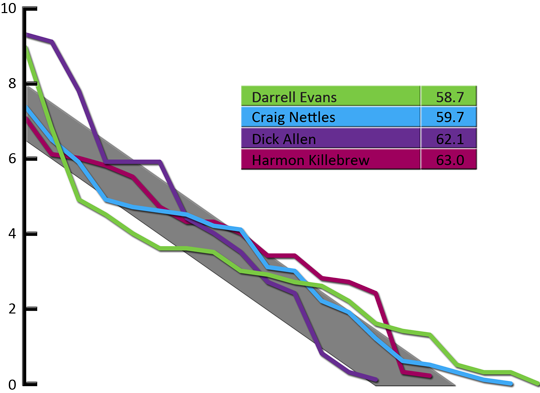
Illustrator WAR graphs, take two
This is a follow-up to yesterday’s post about making WAR graphs.
There were several requests for plot lines and the legend to be larger, and I’ve done that.
Also, at Tango’s blog, there was some discussion about including the total WAR in the legend, and how to make that line up properly. It occured to me that the best way to do that would be as a table. (Longtime readers will note that I don’t need a lot of prompting to make a table.)
And for the convenience of our color-blind readers, I ran the color scheme through VizCheck to make sure there was at least some contrast between the colors for those with color-blindness.
Here are the results:

You can click on the image to see a larger version (about three times the size, actually).
I’ll take any other suggestions you have, dear reader. I’ll also take suggestions on another graph to try out.
It’s Graig Nettles, although I shouldn’t complain since I’ve made the same typo in the past.
You should probably state what the gray bar is, for people who haven’t seen these before.
For some reason this graph made me think of Don Johnson.
But I like the bigger text and lines.
I had no idea what I was starting. Nice job with the legend, Colin, though it seems odd to list players in ascending order.
This is an aesthetic comment, but your graph is pretty “heavy.” Personally, I would make the line of the Y axis skinnier, and I wouldn’t use such dark colors. In the legend, for instance, it’s hard to read Dick Allen’s name.
Some of the lines don’t show up well against the gray background, so at the least I’d make the gray lighter.