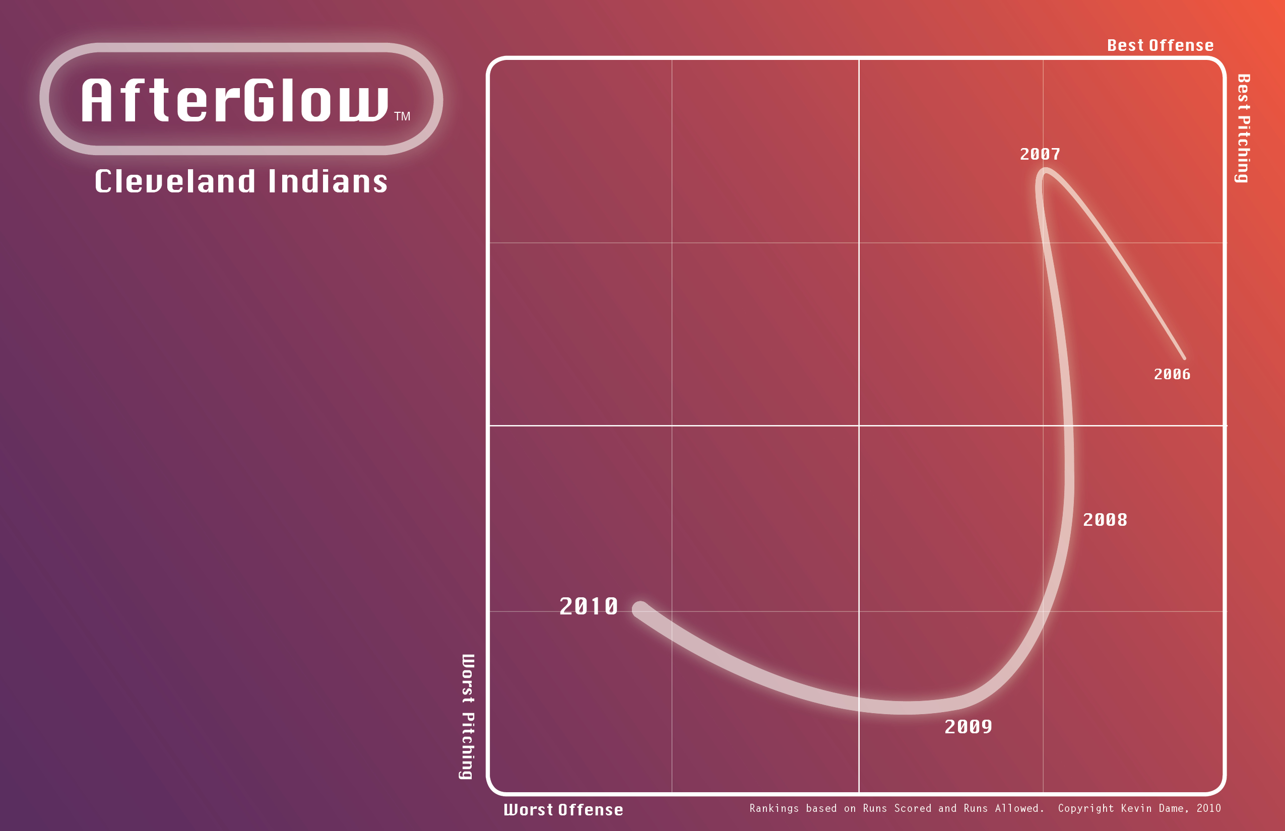
Visual Baseball: Introducing AfterGlow
Happy Friday. Here’s a new visual that I’d like to take for a spin today. It’s pretty simple, plotting a team’s trajectory over the last five seasons in terms of runs scored and run allowed. Here’s a sneak peek at a team that has been heading in the wrong direction for several years. During the next week I can share more AfterGlow visuals as a way of previewing MLB’s eight playoff teams. A simple “more” will do…
Kevin Dame is a writer and visual designer who brings sports information to life in new and meaningful ways. Visit his website and follow him on Twitter @kevintdame.
Anything combining baseball and Tufte is a good thing. More!
More, please.
Does it adjust for the league wide decrease in offense?
More.
Love it. Think it should cover more years, though.
@Detroit Michael: I would assume the stats are adjusted for league and park, so yes (even though the decline in offense from 2009-2010 isn’t really out of the ordinary).
Also, Kevin’s chart reminds me of the map Tufte always holds up as an example of excellent graphical presentation, the one that depicts Napoleon’s invasion and retreat from Russia: http://mappery.com/maps/Napoleon’s-Invasion-of-Russia-Map.mediumthumb.png
Oh wow this is cool! I was going to do a 10-year team WAR splits chart during the winter, but I’ll defer to this!
Great work
Big fan of this—can’t wait to see it for other teams.
Also, didn’t know anyone was still using Chicago as a typeface anymore.
Cool. Basically a time series of the runs scored/allowed graphic I use in the Graphical Report and THT Annual. (Buy yours now!)