Visual Baseball: A new look at the standings
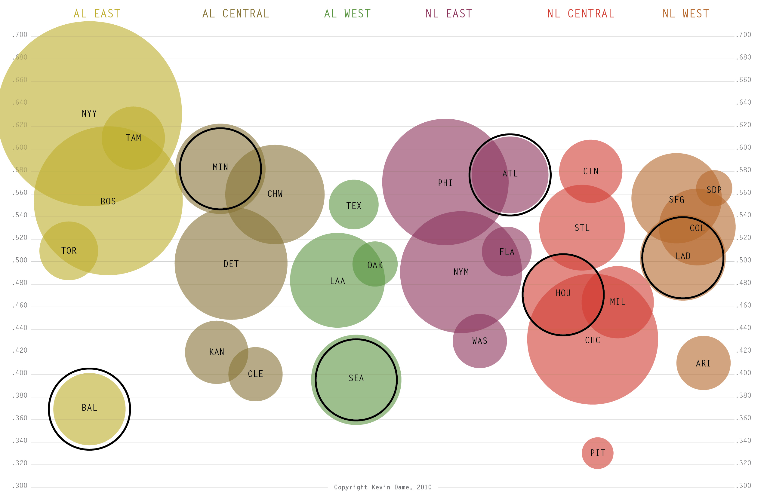
Happy Friday. Here’s an attempt to look at the major league standings in a different way. Features include teams plotted vertically by win percentage and team payroll depicted by circle size. Within each division I’ve selected one team whose payroll is closest to league average (depicted with a solid black line).
Kevin Dame is a writer and visual designer who brings sports information to life in new and meaningful ways. Visit his website and follow him on Twitter @kevintdame.
Houston is stil closest to league-average payroll even after their salary dump, and shedding Oswalt, Berkman, and Feliz? Yikes.
I like this a lot…other than the lowly Pirates, payroll is really not a great indicator of success or failure (at least this year).
Every time I think no better way to visually analyze the baseball world can be published, something like this comes up. This is amazing, and now one of my all time favorites. So much of this 2010 year in baseball makes sense right here in your post.
Wow. this is really neat, concise, informative, and pleasing.
I believe a clearer picture would emerge if the circles were displayed such that their top boundary (rather than their center) aligned with the winning percentage. It would more clearly show, for instance, how close the Yankees and Rays are.
That is really cool.
I agree with jeff, that either placing a clear point within the circle that corresponds with winning percentage or having the top of the circle aligned with winning percentage could show this a bit better. Great idea though.