What do stats tell us?
Statistics basically tell us what happened. If a pitcher gives up 20 earned runs in 50 innings, his ERA is 3.60. Given a league average of around 4.40 for starters, a 3.60 ERA means that the pitcher did a good job when he was on the mound—in terms of results.
But those results don’t necessarily tell us how well that pitcher actually pitched. He could have had a team behind him with an infield of Albert Pujols, Chase Utley, Brendan Ryan (or Elvis Andrus, depending on your taste) and Evan Longoria, and an outfield with three Franklin Gutierrezes. In that case, it’s likely that he didn’t pitch as well as his ERA suggested, and his stats would suffer in front of a less awesome defensive team.
With the advent of fielding independent pitching statistics, we can start to get a better feel of how well a pitcher actually pitched, by looking only at things a pitcher has a reasonable amount of control over (namely walks, strikeouts, home runs and batted ball types). However, even those pitching independent stats measure only the results of what happened. A pitcher could throw a 12-6 curveball down and away, and Alfonso Soriano could shoelace it into the stands. Or a pitcher could throw a fastball in the strike zone on a 3-2 count and have it be called a ball.
The point of this long-winded introduction is that even the best stats tell us the results of what happened, not the process. Over a large sample size, the results start to conform to how well a pitcher actually pitched. However, when you look at the highs and lows that all pitchers experience, it’s likely that the results of each start don’t actually tell you much about how a pitcher pitched that day.
In fact, I believe that they tell you almost nothing at all!
Okay, hotshot, prove it
I can’t do that. I can, however, look at a example to see if my theory holds water. I’ve chosen A.J. Burnett as my case study for today. Why Burnett? Well, over the years, despite being a very effective pitcher, he has developed the reputation of being quite streaky. In 2009, that reputation was justified – at least by looking at his monthly splits. Since I am expressly trying to look at the highs and lows of a pitcher’s season, it makes sense to pick one who had a lot of highs and lows.
I took a gander at Burnett’s game logs this year and sorted them by Game Score—a metric devised by Bill James to rate the effectiveness of a pitcher in a single start. I then chose his 10 best and 10 worst starts of the season to make my comparison.
In his 10 best starts, he averaged a Game Score of 70.9. In his 10 worst starts, he averaged a Game Score of 31.9. More intuitively, his ERA was 1.06 in his good starts compared to 9.13 in his bad starts… quite the difference.
I then grabbed all of the PITCHf/x information on those two groups of starts. In case you are unfamiliar with it, PITCHf/x is a ball- tracking technology powered by SportVision, which measures certain key characteristics of each pitched ball, including speed, spin deflection (movement) and location. After manually classifying Burnett’s pitches game-by-game (yes this was a pain), I was ready to look at the data.
My agenda was simple. I wanted to see, using the intrinsic qualities of each pitch, exactly how differently he pitched in his best and worst starts of the season. I looked at three variables: stuff, location and approach.
Stuff
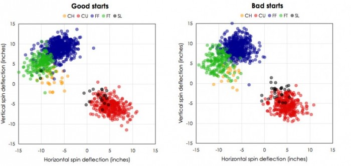
For stuff, I looked at the three main aspects of a pitch: horizontal and vertical spin deflection, and velocity. Spin deflection is the technical term for movement that you may often hear with regard to PITCHf/x studies. The numbers indicate how many inches the ball moved compared to a theoretical pitch thrown without spin. They are from the catcher’s point of view, so negative means that the pitch moves toward the third base side and positive means it moves toward the first base side.
| Good | ||||
| Type | Percent | Velocity | H-Spin | V-Spin |
| FF | 49.4% | 93.9 | -6.0 | 8.9 |
| FT | 16.5% | 93.7 | -10.0 | 5.1 |
| CH | 3.2% | 88.1 | -7.7 | 1.7 |
| CU | 29.3% | 82.0 | 5.2 | -5.6 |
| SL | 1.6% | 84.4 | 2.7 | -3.3 |
| Bad | ||||
| Type | Percent | Velocity | H-Spin | V-Spin |
| FF | 48.3% | 94.4 | -5.9 | 8.9 |
| FT | 17.0% | 94.4 | -10.0 | 5.4 |
| CH | 2.3% | 87.6 | -7.7 | 2.5 |
| CU | 29.3% | 82.0 | 4.9 | -5.5 |
| SL | 2.8% | 83.4 | 3.0 | -2.2 |
First, some notes on his pitch classifications. Burnett is an interesting pitcher, in terms of stuff. His two-seam fastball (FT) is the exact same speed as his fastball, but it has a lot more horizontal movement and more drop. Since 2007, there have been only 5,001 pitches thrown at least 94 mph with less than 10 inches of horizontal spin deflection and less than six inches of vertical spin deflection. Of those, 216 belong to Burnett. His change-up is also in the mid to high 80s, which is awesome.
I couldn’t tell his slider and curveball apart, even at the game-by-game level. I identified a few pitches that I thought were in fact sliders (they were about 5 mph faster than his curves that day, with a little bit less drop), but there were so few pitches that actually looked like sliders that you probably could just lump them with the curveballs.
Anyway, back the table above. Look real hard at it and tell me if you can see a meaningful difference in the two groups of starts. His fastball velocity was actually better in his bad starts, and the average spin deflection and velocity on the rest of his pitches were nearly identical. If you want to see the spin deflection charts for each of the two groups, look here.
Location
So I think we can say, for all intents and purposes, that there was no practical difference in the quality of Burnett’s stuff in his best and worst starts of season. That’s not too surprising as stuff is primarily a matter of mechanics. Location, on the other hand, also includes release timing and intent, two things that you would expect to add a lot more variance from start to start.
First, let’s check out some basic location stats. “Outside” is the percentage of pitches thrown greater than .5 feet off of the strike zone in either direction, “Border out” is pitches within .5 feet of the strike zone, but not actually in the zone, “Border in” is pitches within .5 feet in the strike zone and “Middle” is pitches in the middle square foot of the zone. Given that left-handed hitters and right-handed hitters have different strike zones, I calculated each of the stats separately, then summed the results.
| Good | |||
| Outside | Border out | Border in | Middle |
| 18.7% | 31.6% | 21.4% | 17.4% |
| Bad | |||
| Outside | Border out | Border in | Middle |
| 15.4% | 32.0% | 20.9% | 19.2% |
In his good starts, he threw more pitches on the inner borders of the strike zone and fewer pitches down the middle. Those are good things. He also threw fewer pitches in the strike zone overall, and more pitches well outside the strike zone. Those are bad things.
Of course, those are just some very general stats and don’t really tell you much either way. Fortunately, PITCHf/x records show, to the half inch, the location of each pitch thrown by Burnett (and all pitchers).
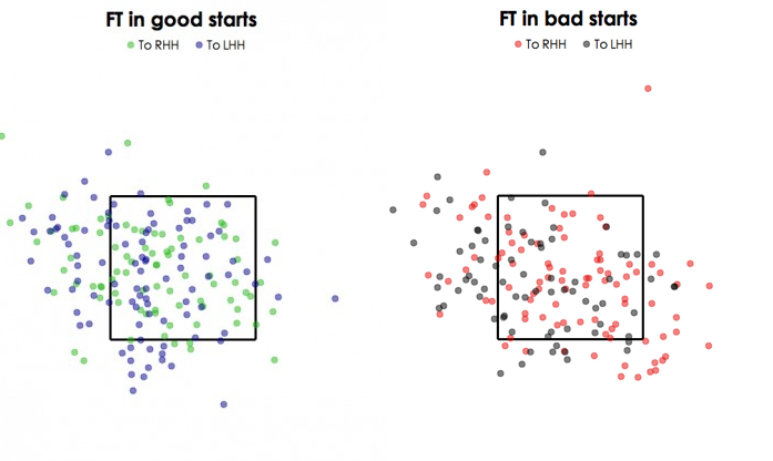
First, let’s check out his four-seam fastball location:


In both groups, he throws predominantly to the outer half of the plate to both righties and lefties. In his bad starts, the pitches appear to conform to a diagonal pattern, while they are a little bit more scattered in his good starts; however, there doesn’t appear to be much of a difference in his four-seam fastball location.
Let’s check out his curveballs now:
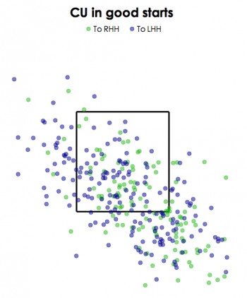
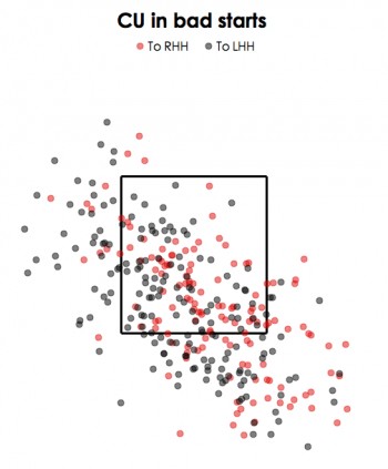
Again, the pitch distributions look almost identical. If you check out his two-seam fastball location, it’s no different. So it appears that any difference in location is going to be too subtle to pick up in a scatterplot. It looks like we need a better shovel.
So I divided the strike zone into 19 parts, like so, and measured the percentage of each pitch, out of total pitches, to righties and lefties separately that Burnett threw in each of those zones in his two groups of starts. That gave me 190 bins of pitches. I then queried my PITCHf/x database for all pitches that were similar to those of Burnett (you can read more about that in the References and Resources section belowe), and figured out the average run value per 100 pitches (rv100) to righties and lefties separately in each of the 19 zones, which gave me another 190 bins.
Then I multiplied the two bins together and summed the results. That gave me an expected rv100 based off of location for each of the two groupings of starts. In his good starts, the expected rv100 was -.19. In his bad starts, the expected rv100 was -.36. Remember that these are from the pitcher’s point of view, so negative is better. It turns out that his location was actually better in his bad starts!
Approach
By looking at both his stuff and location in those two groups of starts, we have found practically no difference between his best and worst starts of the season. In fact, there is some evidence to suggest that he was actually better in his bad starts. However, by using aggregate data like I did, you take all context out of the equation. The count, score, batter, and base/out situation all dictate how a pitcher goes about his business. And how successful a pitcher is at pitching to the situation obviously will have some determination on how effective he is.
Now, there is no one stat for measuring how well a pitcher pitches to context—that would pretty much solve baseball—so it makes comparing his approach in the two different groups of starts a tough proposition. However, we can look at some basic stats from which we could infer something about the quality of his approach.
First, I looked at his F-Zone, which is the percentage of pitches thrown in the strike zone on the first pitch to each batter. Given that getting ahead of batters is touted as a good approach, it makes sense to look at how Burnett was able to do that. In his good starts, his F-Zone was 56.4 percent. In his bad starts, it was 55.6 percent. Over the 1,000 or so pitches he threw in each the two groupings of starts, that’s a difference of about eight pitches. Significant? Probably. But it doesn’t nearly explain the difference in results in those two groupings of starts.
We also can look at his his pitch selection by count. To do this, I broke the counts into three categories—hitter, neutral and pitcher—based on the average linear weights found in this article by John Walsh. The count distinctions are wholly arbitrary, but it’s a lot more productive to try to compare three categories than 12. Here is what I got:
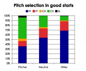
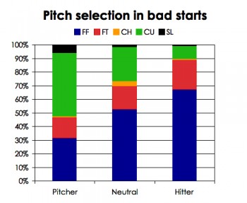
I’ve heard a picture is worth a thousand tables of data. In this case, that holds true. It’s really hard to tell his pitch selection apart. The only major difference is in pitcher’s counts, in which he threw slightly more four-seam fastballs and change-ups and fewer two-seamers. Overall, the average absolute difference was 1.9 percent, which seems very small.
There are more things I could look at with regard to approach, like pitch location by count, but the sample size will get too small to make any meaningful conclusions. Plus, I already looked at aggregate pitch location, and aggregate pitch selection by count, and found no noticeable differences, so I doubt we’ll see anything by breaking it down further.
Conclusion
So what did we learn today with this obnoxiously long article? Well I took a pitcher’s 10 best and worst starts of the year, in which you’ll remember there was an ERA difference of about 8, and found no meaningful differences in terms of what he threw, the velocity/movement of his pitches, where he threw them and when he threw them. I think I’ve established that there was practically no difference in how he pitched in his good starts compared to his bad starts.
Does this show that all peaks and valleys of performance over a long season are simply due to luck? Of course not. Burnett is only one pitcher. However, I believe that this is a strong piece of evidence to support that notion to some extent. I hope someone smarter than me will develop a way to quantify the expected production of a pitcher using PITCHf/x data. Then we could apply it to the population to see if the phenomenon I found today holds true for most pitchers.
References & Resources
PITCHf/x data provided by MLBAM and Gameday.
Regarding the location by run value I looked at in the “Location” selection, I feel I should offer some caveats. The zones I used are obviously not very precise, thus the final run value tally is subject to measurement error. I used those zones because breaking it down any smaller resulted in massive sample size issues for the run values, making the results practically unworkable. To figure out similar pitches to those thrown by Burnett, I used all pitches that were within 2 mph of velocity on either side, and three inches of movement. I used data from 2007-2009.
Another thing that’s very difficult to seperate out is what happens to the bad pitches. Say a pitcher consistently throws 10 really hittable pitches out of every 100. Does he throw them when he’s ahead 0 – 2 with nobody on base or down 3 – 1 with two guys on? Does he throw them to Pujols, or some stiff filling in for a star on his day off? Did he hang a curve when the hitter was looking fastball? Does he happen to groove one on the inner half to a guy who likes the ball away? Basically the scatter plots for pitch location can look exactly the same game to game with very different results.
I think part of Greg Maddux’s philosophy was to limit the bad pitches – to try not to lose concentration on any pitch which would limit this effect but also admitted that even he would throw some bad pitches.
Hey Nick, this is an excellent thought exercise. I think Brandon is onto something for the next level of analysis: perhaps the quality of the opponent accounts for a lot of the variability we witness.
The obvious conclusion is that while AJ pitched very consistently, it was the performances of the hitters he faced that varied dramatically as between his best and worst starts. We tend to attribute outcomes to how the pitcher performed, but maybe it’s how well or poorly the batters are recognizing (or guessing) pitches, and how well they are swinging the bat, that really varies from game to game.
Another factor I don’t think was mentioned is home-plate umpiring. How many of those inside border pitches were called balls and how many of those outside border pitches were called strikes?
Interestingly, pitchers who get shelled in a particular start often defend themselves by saying they thought they “pitched pretty well,” or only made “one bad pitch.” Fans deride these kinds of comments, but maybe the pitchers are right.
Quality of opponent may account for some of the difference, but it can’t account for the difference between and ERA of 1 (10 good starts) from and ERA of 9 (10 bad), can it? The difference between the best and worst teams is only about 1.5 runs / game.
bsball: When you talk about “quality of opponent,” you’re presumably basing that on some kind of average—either team OPS or an individual player’s OPS (or other metric). What I’m talking about is a given hitter’s or a given series of hitters (e.g., a particular opponent’s 2-5 hitters) superior or inferior level of hitting on that day. Maybe it’s not the pitchers who are good or bad in a given start as much as it is the hitters.
What is missing from this essay which would be helpful is a breakdown of how successful Burnett was in hitter’s counts, pitcher’s counts, and “neutral” counts. I assume Burnett is no different than any other pitcher in that he is far more successful when he gets ahead of hitters than when he falls behind hitters. Assuming this to be true, what stands out most from this collection of data is how often A.J. Burnett throws fastballs in a hitter’s count: approximately 90% of the time, with the overwhelming majority of those pitches being a four-seamer, a pitch that has less movement than his two-seamer. Hitters almost always sit on a fastball in a hitter’s count. This data shows that Burnett threw the very pitch that the hitter was sitting on nine out of ten pitches in counts that favor the hitter. The fact that he “got away” with throwing so many fastballs in fastball counts in his “good starts” can probably be attributed to two truths: Burnett throws very hard, and hitting a baseball is such a difficult task that even the very best hitters sometimes miss the anticipated fastball thrown down the middle of the plate.
In contrast, Burnett threw a high percentage of breaking balls in pitcher’s counts (almost 50% of the time). Burnett has a filthy spike curve ball: it’s probably his most effective pitch, especially when contrasted with his fastball. So it is no surprise that when Burnett is ahead of the count, he is more successful. The hitter can’t sit on one type of pitch: half the time a fastball is thrown, half the time a breaking ball is thrown.
In this way, Burnett is no different than any other pitcher. He is more successful when he gets ahead of hitters.
I believe that the data may support the following conclusion: When pitchers throw a predictable pitch (i.e. a fastball in a fastball count) in a hitter’s count, they lose the huge advantage they have over hitters, and in turn, they are more prone to the vagaries of chance.
Brandon and Dave
I agree that quality of opponents is probably a big factor. However, it would be hard to tell how much of an impact it had. You could use standard quality of opponent run adjustments, but that would only capture the average quality of opponent as BD said above – not what was necessarily the case when Burnett faced them.
I would also agree with DB, that umpires probably played a role as well. When I get a chance, I’ll revisit the data. If I find anything interesting, I’ll post something at Live.
Completely anecdotal observation here: As a Jays fan it seemed Burnett would look fine for about 5 innings, then would do something like walk, single, walk, double, etc. and before you know it that good start just turned bad, statistically.
I wonder if guys like Burnett tend to bunch their “bad” outcomes, such that two similar pitching lines produce different results, due to the other pitcher “scattering” those hits and walks. If true maybe we could add a Composure rating to pitchers!
Greg
That’s an interesting theory, and probably true (and even better, it should be easy to look at!). I’ll put it on my to do list.
Could pitch sequencing have an important part in this? Maybe there is a difference when he throws FT, FF, CU; in the same situation vs FF, CU, FT, etc. Probably severe sample size issues.
What about the hitter’s ability to pick up the ball? Is hiding the ball a skill that can be measured? Or can it vary from game to game? Could that be what’s going on here
Or is it possible that Burnett is a “dumb” pitcher, and throws balls that hitters expect in bad counts? That is, maybe this is an indication that Burnett does not overly scout an opponent, and may over-rely on his great stuff. Sometimes he gets away with it, and sometimes he doesn’t. Maybe a “smarter” pitcher will pitch more to an opponent’s weaknesses than Burnett.
It’s an interesting study, but I am not willing to say that because a pitcher has basically the same stuff for a good outing vs. a poor one it therefore proves that good results vs. bad ones are just a matter of luck. I think this field can be mined quite a bit more than that. Test these and other theories against the data available before concluding that luck plays so big a part of this.
Dan – Unfortunately, there is no way to tell how much deception a pitch has in a given start using Pitch f/x, or anything else that I know of. As to pitch selection by the count, I already looked at that in the “approach” section, and found nothing.
Please, where did I ever say that? In my conclusion, I expressly stated that this is only one example and doesn’t mean that this is case for all pitchers.
What if someone were to run a simulation of a pitcher in a season’s worth of starts. In the sim you would assume that all variation is random. What sort of distribution of outcomes (10 best vs 10 worst) would we expect in the sim (i.e. run the sim 10,000 times)?
It seems if we did that we would have some baseline to measure the variation in a pitcher’s outcomes.
Hey, not much substance here, but i just wanted to add that i thought this was really lovely. I’ve shared your suspicion in this matter and thought you provided some pretty strong evidence (though clearly not rock-solid as people point out, it is pretty suggestive) to that end.
We need to remember what Nick noted: that this is just one pitcher’s results. I think parsing what little data there is would not be productive.
I think that this is a strong piece of evidence for DIPS, that the variation in hits and runs allowed is due mainly to the defense, with some variation, obviously, due to the strength of the opponent.
Obviously, facing the best offensive teams should change how many runs you give up, but that would only account, as the other commenter noted, for at most 1.5 runs.
Yes, opponent quality would account for 1.5 runs on average. But, when you go and pick the results post-facto, as this study (for good reason) does, that’s going to get magnified. So, that’s not an apples-to-apples comparison. The right question to ask is bsball’s, what is the correct baseline for variation assuming a null hypothesis of “static quality of stuff.”
Also, I noticed fastball speed is higher in the poor starts, probably because bad starts end earlier, and fastball speed is known to decrease with pitch count beyond 20 or 30 pitches (I forget exactly). It might be better to limit the compatrisons to the first 60 pitches or 18 batters to account for the effects of varying appearance length.
Finally, the location comparisons are rather qualitative. Picking up visual differences of that sort is pretty hard, a quantitative approach would be better.
Fascinating article, I always wondered about this, and look forward to some follow up.
There’s another possibility that you didn’t consider that might affect AJ start quality: percentage of first pitch strikes and overall ability to stay in pitchers counts vs. hitters counts. Quality of opponent would also have something to do with it as well, I would think. His home park also seems to favor left-handed batters. But quickly looking at the starts where he gave up 4 or more runs, I see: @BOS, LAA, @TOR, PHI, @CHW, @BOS(again), and then two inexplicable bad start home and away vs. BAL, with his two worst starts being @BOS. He has another start @BOS: 5R, 3ER in 2.2. Seems like opponent quality had a much stronger affect on his performance than pitch quality/selection!
Nice article, Nick. Something you may want to look at besides location frequency is Burnett’s results by location. You’ll probably find that he was more difficult to hit when he kept the ball down (especially off-speed pitches) and that AJ allowed more extra-base hits up in the zone. The difference between the good and bad outings might may not be dramatic enough to be noticed in your location charts—it only takes a few bad pitches to get into trouble—but I bet it’s there. Also, as I recall, Burnett also had problems vs. RHB with runners on base in the second half of 2009, which spiked his ERA.
Nick, I believe the introduction was confusing to me. You stated “The point of this long-winded introduction is that even the best stats tell us the results of what happened, not the process. Over a large sample size, the results start to conform to how well a pitcher actually pitched. However, when you look at the highs and lows that all pitchers experience, it’s likely that the results of each start don’t actually tell you much about how a pitcher pitched that day. In fact, I believe that they tell you almost nothing at all!”
And you seemed to be presenting an argument that a pitcher can pitch almost exactly the same from one game to the next and have vastly different results. I think the implication is that luck plays a large part of Burnett’s success, you even state that “I believe that this is a strong piece of evidence to support that notion to some extent.” To what extent? The whole article makes the claim that it is to a large extent at least with regards to Burnett. If this is not your point, why write the article? Why make the strong statement at the front of the article, then back off it at the end?
I think you are on to something here, and I think studying the results of a pitcher who has good and bad results is a very fruitful area for mining. I assumed that your initial statement was your main point, and disagreed. I think a different approach might bear fruit. This may be a case where intestive study of one pitcher may be better than massive statistical analysis of many.
As a Yankees fan who watched almost all of Burnett’s starts, I can tell you that your long article shows the weakness of (at least your) statistical analysis. In his bad starts, Burnett pitched too often from behind in the count and did not have control over location. There were games he pitched in which he was brilliant – almost unhittable. And there were games he pitched where he obviously couldn’t do anything he tried to do.
Baseball is the greatest game; and the most difficult to learn and play well on a consistent basis. That’s why averages are such an important part of the record of the games.
Statistics are the RESULT of what happens on the field, not the other way around. The game starts again with every pitch.
If statistical analysis assists in teaching players the actions and decisions necessary to maximize their performance; and can inform management of ways to improve their teams’ chances of beating the competition, that’s all to the good. If it adds to the enjoyment of stat-heads, that’s good also. The rest of us can just relax and enjoy the game.
Newbie here and definitely early in the learning curve. Really enjoyed the article. A few suggestions on additional aspects to consider:
– offensive approach, measured by pitches per plate appearance … or perhaps pitches per out. My novice impression, as a Red Sox fan watching AJ pitch for the Yankees and Blue Jays in recent years, is that you could get to him even on nights when he has electric stuff, if you could grind out ABs and force him to pitch in the zone. If the measure of a truly perfect game is 27 outs on 27 pitches (is it?), is there a significant difference in the # pitches per out in the good starts vs. the bad?
– Or if a team is aggressive and swinging away and not forcing a pitcher to make quality pitches late in the count (as measured by lower pitches per PA) is this a more likely opponent for AJ to succeed against?
– Another variable that would be easy to check given the many great and detailed factors you’ve evaluated—any significant difference between day and night starts? Other possible variables included within the starts you analyze – are they all on the standard 4-day rest? Home/away (as others have mentioned)?
When you throw all of these factors in the hopper, it seems as though the end result of success or failure, quality start or early shower, could be the combination of a multitude of mini-variables—for the pitcher and defense, hitter and offense, umpiring, even managers/coaches (great call on that hit-and-run, can’t believe they sent him from third on that short fly ball … the quality of managerial/coaching decisions isn’t the same from game to game) that each in its own right doesn’t necessarily have the power to decide the overall outcome.
Again, I appreciate the effort and very much enjoyed your analysis.
Thinking about this further, I think this article has potentially revolutionary implications. As you point out, we tend to judge whether a player is good or bad based on empirical results. The present analysis challenges the assumption that a particular pitcher’s good or bad results are mostly a function of the way he pitches. That’s pretty stunning.
This in no way proves that good or bad starts aren’t attributable in some way to how the pitcher performs. However, it does suggest (at least in the caes of one well-known “up or down” pitcher) that the “usual suspects”—stuff, location, and approach—are not the culprits. So what in hell IS the culprit? Now that the question is raised, we really need to know the answer. Or, with all due respect, we need for someone to completely debunk your analysis.
I think it would greatly affect the way we think about pitchers to discover that there’s really no discernible difference in how they perform on their best and worst days. The whole idea of a “big game” pitcher or a guy who “can’t pitch in the playoffs” would be blown out of the water. Think about the effect it would have on the confidence of the pitchers themselves if they realized how little control they played in causing their team to lose a particular game.
I look forward to seeing more work in this area. My gut tells me that a lot more attention should be paid to the roles of hitters and umpires in helping a pitcher to toss a gem or a stinker, as the case may be. I would point out that, for the pitcher, the game doesn’t change that much from day to day. They’re always throwing the ball to the same place, they get to choose the pitch and the location, and, in regard to the confrontation with the batter, they’re the ones who are always initiating the action. Based on all that, we should EXPECT them to be able to perform fairly consistently. OTOH, batters can only REACT to what the pitcher is doing, which involves a lot of guesswork and uncertainty. Batters are also constantly facing different pitchers with different release points, etc. (Same for umpires, actually.) For those reasons, it seems reasonable to think that the quality of a hitter’s performance would be subject to more day-to-day variability than that of a pitcher. For some reason, however, we focus overwhelmingly on the pitching performance as the determining factor in a particular game’s outcome.
You mean its not Posada’s fault when AJ gets lit up?!?!?!
Whenever you watch a pitcher get lit up, the common theme is usually that the pitcher cannot locate a certain pitch. Looking at this from 10 game standpoint you’re almost certain to see pitch type percentage, movement, location regress to the norm.
I’d like to see an individual location breakdown for each pitch type for his 10 worst games. That might tell us if one game he’s unable to locate his fastball, and the next he’s unable to locate his curve, etc.
I enjoyed this a lot as well. Great way of looking at the data. I know there’s a lot of follow up that can be done, based on the suggestions, but this is a nice footprint into the sand.
Ted Williams used to claim that hitting a baseball was the toughest thing in sports, and who was I to argue. I’ve never believed the old saw that pitching was 75%, or 80%, or 90% of the game, but rather that pitching, hitting, defense, park effects including weather effects, umpiring, and luck all played a part. The value of good hitting has been shown by the various studies of lineup variability/viability which point out how much better teams score in the 1st inning. Basically, having the teams best hitters always involved = some decent production. Further reinforcement comes from the production difference evidenced by the 2 leagues since the adoption of the DH. I think this study needs to be parsed along a time axis to be genuinely eye-opening. Maybe his pitching stats from 5th inning on don’t look so damn similar, good starts vs bad ones, as they do in total, but…what if they do? Wouldn’t that suggest we ought to put more emphasis on the guy with the stick in his hands?
I have another thought. I don’t know if you are familiar with this methodology, but Ron Shandler’s Baseball Forecaster annual has been publishing a methodology that he calls Pure Quality Starts, which is a sabermetic oriented way of tackling issue of what a quality start is. This link explains PQS: http://www.baseballhq.com/free/free03.shtml?src=hqf
What that shows is that in dominating starts, their ERA is low, middling starts, up and down, and for what they term disaster starts, high ERA. Nothing surprising, I know.
What they have found, though, is that the number of disaster starts is what elevates a pitcher’s ERA. I have found that if a pitcher is able to avoid disaster starts, even if he doesn’t have many dominating starts, he can have a decent ERA.
So I did the PQS for the starts in question for AJ and found that you included 6 starts in his worse 10 that PQS would define as middling to dominating. Only starts 29 to 32 are defined as disaster starts (Game scores of 28, 22, 19, 18; yes the game score of 17 was rated a middling effort, that is because he suffered bad luck with hits and HRs but was able to keep his walks down and strike out a lot). One was actually rated a DOM start and five were middling starts (PQS of 2 or 3).
So perhaps the reason the pitch plots look similar is because there are only 4 disaster starts out of his ten worse starts, and there were 6 OK to good starts muddying the pitchplots, as it were.
I would suggest doing the same above analysis, but instead of Top 10 vs. Bottom 10, make it Top 5 vs. Bottom 5, so that OK to good games don’t muddy up the Bottom games. Ideally, though, I would suggest Top 4 vs. the four game scores I noted, since PQS was OK with the game score of 17.
IMO, PQS provides additional insight into how well a pitcher pitches by looking at his performances on a game by game basis, and on a luck-reduced basis. This is not promoted by PQS’ creaters, but I believe that pitchers who can keep their DOM% high are the ones a team should have if they want to get deeper into the playoffs, because they can perform more consistently at a high level and have less disaster starts that puts their teams out of the game.
There have been a lot of great comments and suggestion here. Thank you so much. I plan to do another case study next week utilizing some of the suggestions made here, and if that shows similar results, I’ll try to expand this to the population.
Does anybody have requests for pitchers I could look at? Preferably, they would have had to have made at least 20 starts and weren’t injured at any point during the season.
Statistics basically tell us what happened.
So there’s no difference between say a population mean and a sampling mean? Standard error is unnecessary? Inferential statistics are completely inconsequential?
The discussion and understanding of statistics in this “analysis” are puzzling.
If you want to split Burnett’s population of starts into the extremes of good and bad first you’d need to define the parameters for selecting each cohort.
You would particularly need to do this because this is observational data that is very prone to bias. The lack of sound methods opens up the conclusions to issues such as selection bias.
There are no key variables controlled for. In fact no attempt is even made to control for exogenous factors that might impact the hypothesis being evaluated.
And then you would need to, you know, actually do some statistical analyses to test some kind of null hypothesis.
This article is enlightening to everybody who can’t grasp the disconnect between processes and results. You have made it clear that there is almost definitely something utterly random at play to produce such drastically different performances. Having said that, I concur with those who suggested that you should have considered whether he tended to be in pitcher’s or hitter’s counts in these starts. As a Yankees fan, my impression is that when Burnett is throwing strike one the opposition can just pack it in. I know this is anecdotal, but this smacks you in the face when you watch him.
I am a Burnett fan – love to watch him, because of that electric motor he’s got. It can be frustrating, though, when he is missing.
You hit the nail on the head with your pick – please bore into Burnett again. The Yanks need the help!
The telling stat may be in the border-out category: he is not a “contact” pitcher (which may be the problem), and he aims for swings-and-misses with those border-out pitches. Analysis of called balls vs. swings there may bear the fruit you are looking for, Nick.
I see some possible explanations in Burnett’s pitch fx data that would need to be confirmed by looking at the individual games.
The higher fastball velocity in bad games could be overthrowing by Burnett…or the higher velocity could be just because most pitchers lose velocity the longer they go in a game and when a pitcher is out early they don’t have time to lose that velocity
The change-up also appears to be less effective with a larger velocity spread in the bad starts and different use in good games.
I suspect that part of the problem with Burnett is that he may battle his mechanics sometimes and be unable to place the ball where he wants and if that happens once every few at-bats in his bad starts in highly-leveraged situations that could easily be the cause.
Well just out of curiosity, I grabbed his 2007-2009 gamelogs and compared the top 10 to the bottom 10 with the basic stats considered skill based vs luck+skill based:
Top 10:
2.7 BB9, 10.2 SO9, 0.4 HR9, 0.70 ERA
0.144 BABIP, 2.34 FIP
Bottom 10:
5.1 BB9, 7.1 SO9, 2.4 HR, 13.31 ERA
0.424 BABIP, 6.83 FIP
So, by “traditional” measures he was very lucky in those top 10 and very unlucky in the bottom 10 [while also averaging nearly 9 more outs per start and being much better in the skill based rate stats in the top 10].
…Does using Game Score cause some issues?
I plotted GS against ER and (HR*13+BB*3-SO*2) [for the three year sample of AJ Burnett] and got .80 and 0.31 r2 respectively.
Maybe using a ranking metric that correlates better to what is perceived as skills rather than luck+skills would give different results?
The main difference between a good start and a bad start is the percent of pitches thrown when ahead/behind in the count. The simplest way to track this is by calculating the percentage of first pitch strikes thrown. Over the last 3 years Burnett’s OOPS is 640 when he starts the batter off with a strike and 798 when it’s a ball. That’s fairly typical. If you want to use just one statistic to indicate how well a pitcher was throwing in each game, that would be it.
If you want to use just one statistic to indicate how well a pitcher was throwing in each game, that would be it.
That may be true, James, but have you studied the question? Is this the single most important distinction between good starts and bad starts?
Intuitively, I’d guess that his splits when looking whether the second pitch was a ball or strike would tell you a very similar story.
Over a big sample, I’d guess that the %%% of PAs starting with a strike is pretty close to strikes divided by pitches.
Per FanGraphs, AJ had a first-strike percentage of 58.6, and an overall strike percentage of 61.0. So he was slightly worse than expected in terms of getting the first pitch over for a strike. However, that’s for the whole season. It says nothing as to whether, in his “good” starts, AJ’s first-strike percentage was much better than in his “bad” starts.
Interestingly, the (qualified) SP with the greatest success at throwing a first-pitch strike was Carl Pavano.
Regarding first pitch strike percentage, check out the “Approach” section. It’s not exactly answering your question, but…