A First Look at StatCast Baserunning Data

Unsurprisingly, StatCast says Mike Trout is one of baseball’s fastest runners. (via Keith Allison)
For most of the 2014 season, StatCast was more of a dream than reality. After the demonstrations when the system was announced, MLB Advanced Media kept quiet. There was an occasional tease with cool videos like this:
But that was about it.
However, during the two League Championship Series and the World Series, we started to get a hint of what the technology is capable of. StatCast was installed in the home ballparks of all four remaining teams, and MLBAM began posting videos of key plays from each game. A large number of videos with numbers in them means that the data can be collected in one place. It also makes it possible to look deeper into the numbers that make baseball happen.
While videos were posted for a variety of plays, the largest sample of data came from baserunning, particularly player speed and acceleration. Through the playoffs, I began scraping the data from the videos and posting them into this Google Doc. My statistical abilities are not as honed as those of some of you readers, so most of what follows is simpler than what others can do with the same data. The point of the document, and ultimately this article, is to think about what can be done with more information (if it becomes available). I’m not trying to provide anything definitive.
The biggest challenge in collecting and sorting the data was determining when a player was running with maximum effort. Since a player jogging from first to second on a single doesn’t tell us much about how fast he is, those data were excluded from the analysis wherever possible. This caused some issues, which I have tried to note where possible in the document. Making a more definitive determination would be easier with more information on an individual player, as well as a more established pattern of how players act.
On to the data.
Maximum Speed
Most of the videos posted show a maximum speed, like this one:
There were 94 videos with a baserunner’s maximum speed posted, the largest set of data possible with StatCast so far. The average maximum speed of the players sampled was 19.5 mph, with a standard deviation of 1.2 mph, a pretty tight cluster.
In the data document, you’ll also find the FanGraphs speed score included with each data point. The first purpose of this was to check for sampling bias in these data, since there are a lot of fast players in the sample (thanks, Royals!). The major league average speed score in 2014 was 4.4 (or 4.5 without pitchers). The average speed score for players featured in the StatCast videos is 5.0, so indeed we are dealing with a faster sample than average.
The other purpose of collecting each player’s speed score is that the value forms a reasonable proxy for “baserunning results” as a rate stat. It lets us see how much speed (and acceleration) can impact results. Other stats like UBR and wSB can be made into rate stats and check the impacts more discretely, but speed score is a nice shortcut for a quick correlation. The 2015 Steamer projected speed score for each player is also included, since some players like Terrance Gore didn’t have accurate major league numbers in 2014 due to limited playing time. This isn’t perfect either, since it adds the impacts of an aging curve (2014 RoS projections would have been better, but were not available when the data was pulled). Still, for an easy correlation, it gets us a basic picture of how top speed impacts results.
Here are the correlations for maximum speed and speed scores (click to enlarge):
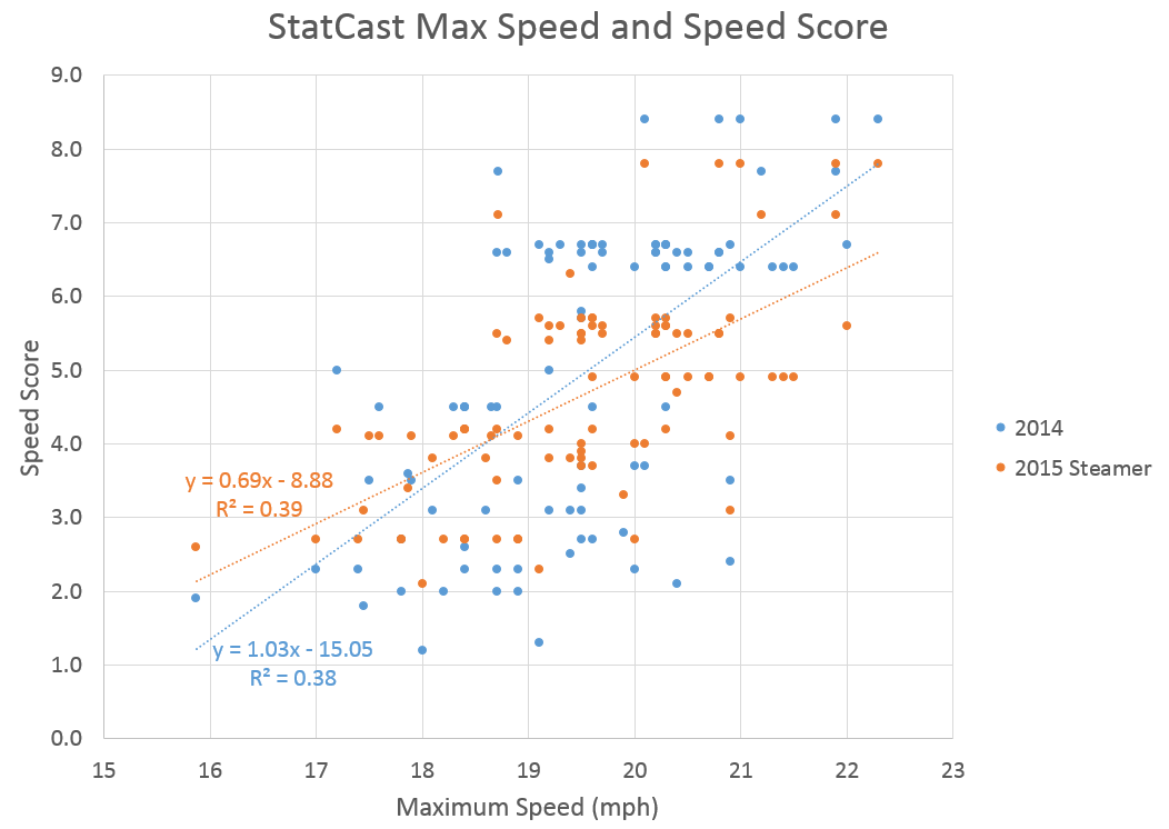
There is some correlation present, but maybe not as strong as one would think. Some of that can be explained by sample size, of course. Pooling together all plays as equivalent impacts results, too. For example, players tended to reach slower speeds when stealing a base than they did while running through first. Including the 2015 projections improved the correlation slightly.

Some of the outliers in the plot are fun. The slowest maximum speed reached was from Jhonny Peralta, running from first to second on a double play ball. His speed scores are pretty close to the trend lines, so maybe that play is a fairly accurate representation of how fast he can run. However, if Peralta followed the trends of the other players, he would be faster in other kinds of plays than the one sampled. It’s interesting that a shortstop would be so slow, but it hasn’t hurt his play on defense. The biggest departure below the trend line (or, the fastest “slow” player) is J.J. Hardy, hitting 19.1 mph while running out a ground ball to first base. Hardy’s career speed score is 2.4, but that speed is close to average. Hardy has attempted only three steals in the last four seasons, so his problem could be slow acceleration.
The correlation shows us that maximum speed is important, but not everything. Let’s move on, then, to the other potential piece of the puzzle.
Acceleration
Most of the StatCast baserunning videos had maximum speed and no other information, but some also included “acceleration.” Some of the earliest videos showed acceleration in units of ft/s2, which is the proper physics unit but does not account for the fact that players do not accelerate evenly. The videos produced later in the season and in the postseason displayed acceleration in “seconds” — presumably how long a player took to reach maximum speed. The latter had the biggest acceleration sample size: 34 points.
Intuitively, acceleration should be more important than maximum speed. A player doesn’t reach his maximum speed for a few seconds, and depending on the play, he doesn’t stay there for very long. More time at maximum speed can make a huge difference. So, how do the correlations look with acceleration?
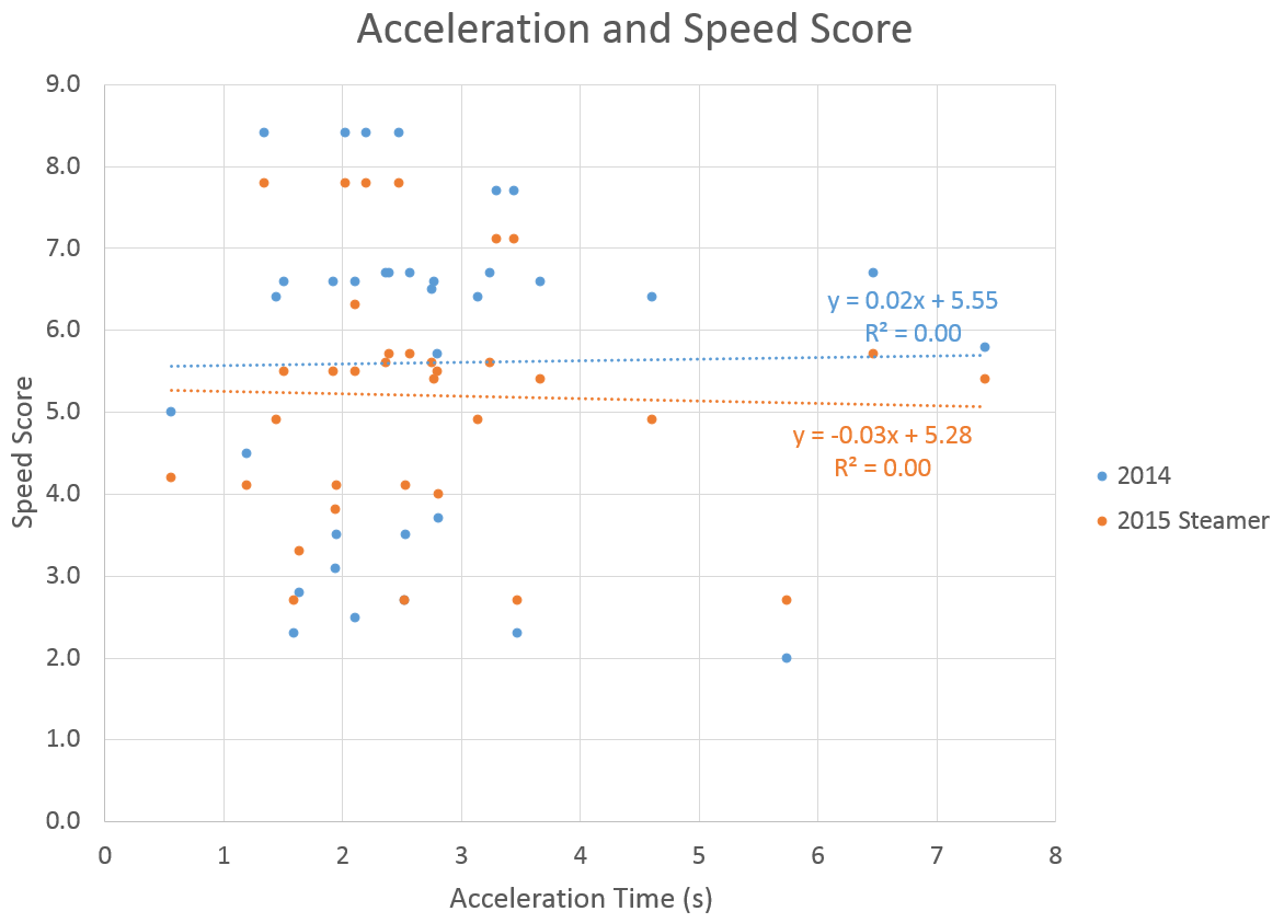
The plot shows that acceleration in seconds has no correlation to either the 2014 speed score or the future projections. Therefore, acceleration as shown is not useful for determining baserunning results, which is opposite of expectations.
Explaining this is pretty easy. The data aren’t useful because showing acceleration in seconds makes accelerating to a maximum speed of 15 mph in four seconds equivalent to accelerating to a maximum speed of 20 mph in four seconds, and so on. Tom Tango goes into further detail here, and suggests showing acceleration as a “0 to 15” time, or something similar. The main point of the article is backed up by the complete lack of a correlation in the data shown above.
While these videos aren’t great at showing player acceleration, there is another place to look. StatCast was also present at the All-Star Game and showed speed in a different way:
The data are shown as instantaneous speed in each frame of the video. This can be recorded in chart form with a little help from a frame capture tool (in this case, at 15 fps) and some manual data entry. Here are the data from the video in chart form (click to enlarge):
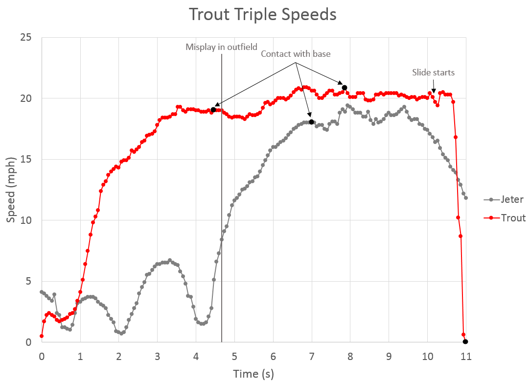
There’s a lot to note here. Mike Trout hits a deep fly ball to right field. It’s hard to see, but Yasiel Puig misplays the ball, allowing Derek Jeter to score and Trout to reach third. The timing of the misplay is shown with a vertical line on the chart.
Let’s start with Jeter. He was reading the fly ball, and knew there was a chance that it would be caught (and a good chance that he could score if it wasn’t). His speed oscillates for the about 4.5 seconds the ball was in the air, but he was able to time a burst in acceleration with the play in the outfield. This shortened the amount of time he needed to reach sprint speed. Between second and third, Jeter reached a maximum speed of 18 mph a few feet before the bag. Less than a second after rounding third, he reached a maximum speed of 19.4 mph, but appeared to struggle to maintain a speed over 19. The final downward taper began after he realized the play would be at third base and continued until he scored.
Trout contacted the ball, and it took him a bit less than a second to “recover” from the swing (before the main period of acceleration started). He didn’t run at full speed until after the misplay, maintaining a cruising speed of about 19 mph beforehand. Trout actually lost a bit of speed as the misplay occurred, and took about a second to accelerate again. He reached his top speed of 20.9 mph about a second later. His speed fluctuated a bit, but generally held steady over 20 mph (minus a speed dip as he rounded second) until his slide began.
This is just one play, and there isn’t a lot to conclude. Jeter and Trout were actually relatively close in maximum speed, but Trout was able to hold a much steadier and longer period near his peak. The StatCast videos in the playoffs didn’t show much about maintaining speed, and that could be a key part of why the data don’t correlate very well with results, especially on long plays like this one.
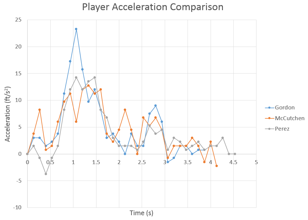
Three other plays from the All-Star Game might be useful in understanding how players run. Below is a chart of three players running to first base: Dee Gordon, Andrew McCutchen and Salvador Perez. All three were trying to beat out close plays at first, and these three players cover the full spectrum of game speed. McCutchen’s data got a bit weird as he crossed the bag, so the speed as he crossed the bag is extrapolated. Like the Trout/Jeter play, the interval is 15 samples per second, and the contact/end points are approximate.
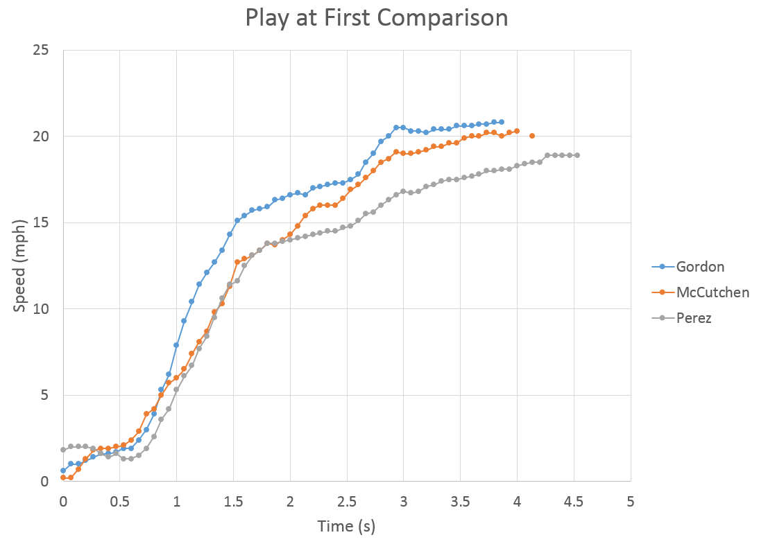
McCutchen and Gordon had about the same recovery time, but Gordon had much faster initial acceleration. Perez took a bit longer to recover, but accelerated at nearly the same rate as McCutchen for a surprising amount of time. If we were to use Tom Tango’s suggestion of “0 to 15 speed,” Gordon clocked in at about 1.5 seconds, McCutchen at about 2.1 seconds, and Perez at about 2.6 seconds. This chart also reflects the potential pitfalls of that kind of measurement. If we used “0 to 14” instead of “0 to 15,” McCutchen and Perez would have been almost identical.
One other thing apparent from these data is that players seem to accelerate in stages. On the infield single chart, all players had an initial burst of acceleration after their swing recovery time, then slowed somewhat. Between 2.5 and 3 seconds, the players have one last burst before starting to level off near their top speeds.
Since the All-Star Game data is in discrete points, it’s easy to calculate each player’s acceleration. Below is a chart of the same three plays at first, but displayed as acceleration (in ft/s2) rather than speed. The acceleration numbers are smoothed a bit (calculated every 2/15 of a second), but can better show the “stages” described previously.
All three players follow similar patterns. There’s an initial low acceleration during the swing recovery, then they reach their maximum acceleration between 1 and 1.5 seconds. All three players fall off in the same way between 1.5 and two seconds, then show a similar bump between 2.5 and three seconds. After that, players taper toward zero or maintain very slight positive accelerations through the bag. It’s possible that these stages are created more by the equipment than the players. It will be hard to know for sure until there is additional data to review.
From the chart, it’s pretty clear how Gordon got so far ahead of the other two players. His maximum acceleration was 23.25 ft/s2. It’s also clear why max acceleration isn’t the best measurement, since Perez’ maximum of 14.25 ft/s2 was actually higher than McCutchen’s maximum acceleration of 12.75 ft/s2. “Average acceleration over three seconds” might be a better way, even if it’s just a fancy way of presenting speed. Gordon averages 6.31 ft/s2 through the first three seconds of the play, McCutchen averages 5.98 ft/s2, and Perez averages 4.73 ft/s2. This method wouldn’t necessarily apply to the Trout/Jeter play shown above, but could work when players accelerate to full speed from a stop (stolen bases, etc).
The discrete points from the All-Star Game offer clues on how to make acceleration data more useful than what MLBAM presented in its playoff videos, but definitive and intuitive ways to present and use it to compare players won’t come until there’s a large-scale release of the data. More data will also better reveal how useful a player’s maximum speed is, and how different types of plays and field conditions impact the values.
Unfortunately, what we have so far is more trivia than solution. With more data, StatCast can be used to accurately determine how important speed, acceleration, and even reaction time (which was not presented with a big enough sample to be examined here) are for baserunning results. An accurate forecast for a player’s baserunning value can probably be made from these data, and that can branch off into other offensive categories like batting average on balls in play. The information presented during the playoffs isn’t enough to get there. But, at least it was enough to get people thinking, and that has value too.
…
A few miscellaneous items which don’t fit above:
StatCast tracked two plays in which a player slid head-first into first base. In Game Three of the World Series, Gregor Blanco slid into first, starting his slide at 22 mph and reaching the base at 20.4 mph. Eric Hosmer slid head-first into first during Game Seven of the World Series, slowing from 18.1 mph to 15.8 mph. Without knowing the start time of the slide and the extension length of the player’s hand beyond the point on his center of mass (which is what StatCast tracks), it cannot be determined how sliding into first base impacted the result of the play. It should be noted that Hosmer lost more speed and was out by less than Blanco, so a more efficient slide into first base may have changed the result. Words have been written at this very site on whether sliding head-first into first is a good idea.
Occasionally, MLBAM would post a video for a play, then replace it with a version with more detail the following day. Sometimes, this would lead to discrepancies in data (which were caught only because I had logged the data the night before). The photo below is one such play:
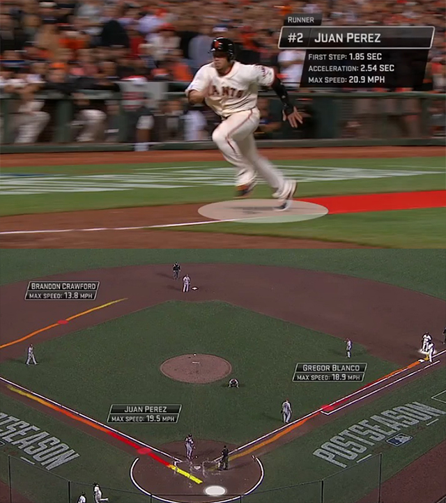
On top, in the produced version of the video, Perez had a max speed of 20.9 mph. In the video uploaded the night before (in the format of most playoff videos) his max speed was 19.5 mph. This happened a few times on other videos, but the difference was smaller (0.1-0.2 mph). I’m not entirely sure what this says about the accuracy of the data, but it’s worth noting.
References & Resources
- Daniel Brim, Statcast Baserunning Google Doc
- Tom Tango, Tangotiger, “Why @StatCast should stop calculating “acceleration” the way they do”
- David Kagan, The Hardball Times, “Taking a dive (into first base)”
It’s interesting, at least to me, how smooth Trout’s path around the bases was on his triple. He couldn’t have taken better angles if you drew a chalk line for him to follow. Jeter does the same thing – when he accelerates, it’s not towards third base, it’s in an arc that takes him around third without losing speed. Are there any examples in the data of runners who didn’t take such a smooth path around the bases, or is this pretty much universal?
Baserunning “route efficiency” would actually be pretty easy. Total distance would be the area under the velocity curve in the first plot (minus the fidelity issues that are caused by taking samples every 1/15 seconds as opposed to the normal sampling rate). However, a route efficiency of 100% would be taking right angles at the bases, which obviously wouldn’t actually be good since it would lead to a big speed loss at each base.
I wouldn’t be surprised if there’s an inverse correlation between “baserunning route efficiency” and “speed loss at base” which would result in an “ideal” rounding angle of a base, though we don’t have enough to measure what it is and it’s probably different for each player. This is all speculation, though, since we don’t have enough data to know for sure.
Mathematicians have looked at the best path for base running….Read a summary here. Soon we’ll have more data so we can see if they got it right…
Seems like they made a lot of assumptions about acceleration and cornering ability, possibly too many. Daniel is probably right to say that it differs for each player. It seems like it would be really easy to test, though. Since it’s just running, you might not even need baseball players for this (though imagining a team doing it in spring training is fun). Some grad student could probably round up a bunch of reasonably athletic undergrads, have them spend a few afternoons running around a diamond, and make a thesis out of it.
As for baseball as she is played, maybe when we have more data you could identify doubles or triples where batters were running all-out the whole way, then see how top speed correlates with time to second/third? Seems like outliers on that graph would be likely places to look for good/bad route selection. Or you could graph route efficiency against time to base and see whether that shows anything interesting.
I suspect that most players at the big-league level have near-optimal baserunning routes for their individual abilities, though. This just seems like the type of thing that an athlete can intuit over hundreds or thousands of repetitions.
Unfortunately, not that I can think of. Keep in mind that what we’ve seen so far is a very selective sampling of the StatCast data, which has tended to present highlights.
There was a similar comparison made for outfielders over the summer when Puig and McCutchen made spectacular plays on the same night. They discussed route efficiency, but even Puig’s “inefficient” route was over 90%.
A more thorough study would tell us what a standard deviation of “efficiency” looks like. Maybe there’s a big difference between the routes taken by, say, Bartolo Colon legging out a double and Trout, or maybe you don’t make it to the majors without those technical skills.
This is a phenomenal article. Not only is this sort of speed analysis cutting edge in baseball writing, I would assume that there is an extremely limited amount of analysis on speed and acceleration in general. Kudos to Mr. Brim for a well-written and extremely well-researched article.
Whoa, Daniel; these are pretty good words here. I’ll admit I was hoping for (further) evidence that sliding into first is silly but this is still great.
I suppose, maybe, slide data at other bases can be interesting. It *seems* like Trout’s slide into third is very quick, it may may be fun to see more of these in the future for comparison (hello Mr. Sandoval!).
Some recent work on sliding head first found it a bit faster as long as the player slides less than 2 feet on the ground (and hopefully doesn’t injure himself).
http://www.baseballheatmaps.com/is-sliding-head-first-faster-via-tweets/#more-1160
Thanks, Jeff. I’ll give it a read.
Brilliant stuff, by the way. Curious about the uptick in Trout’s speed right after he started sliding; just a reminder that whatever we get out of StatCast is still going to be subject to measurement error!
All depends where you are measuring him. Some parts of his body will move faster than the other, and if you are not linked to the same body part at all times, who knows what you are measuring.
As well, on a slide, you might be getting that “boost” from the jump. Is it possible that you can increase acceleration enough to counter the loss in planting your foot, at least in that tiny moment of transition?
Very interesting article! I’ll let Punto know to stop sliding headfirst into first.