Are High-Scoring Games Making a Comeback?
Higher-scoring baseball games could become more normal. (via Andrew Malone)
Early in September, Jon Roegele pointed out that scoring in August was way up, countering a longstanding downward trend. My first thought was, “Hooey! This is no more than the result of random variation.” This idea is supported by observing that the monthly scoring rates were roughly normally distributed and that the August value was two standard deviations above the mean, as you can see in Figure 1. The August scoring rate was high, but a normal distribution predicts there will be some extreme values like this.
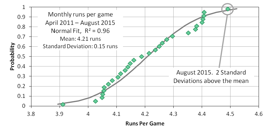
Stated another way, assuming that the run environment had changed in August appeared to me to be the base rate fallacy. The base rate fallacy can occur when an unlikely explanation (August scoring was high due to random sampling, P ≈ 0.02) is dismissed, even though the alternative (an increase in the run environment, P = unknown, presumed to be << 0.02) is even less likely.
But then scoring in September was just as high as it was in August. The likelihood of consecutive months sampling at extreme values is very low if due to randomness alone (P ≈ 0.02*0.02). This suggests a more causal variable was introduced into August and September. So, my second thought was that the August and September average scoring rate was elevated by a rash of high-scoring games. If this were the case, it would be observable in the distribution of game scores (i.e., the actual tally of runs).
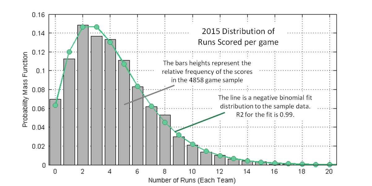
Figure 2 shows the distribution of 2015 game scores, all 4,858 of them (2,430 games, two scores each game, one Detroit-Cleveland game not played). The bars are the actual distribution; the line is a negative binomial fitted distribution (R2 = 0.99). A negative binomial fit distribution is derived from the mean and variance of the empirically sampled game scores. Sean Dolinar provided a really clear explanation of this math in a baseball context on his blog before joining FanGraphs. This distribution is about what you’d expect; the most probable scores are two or three runs (30 percent of all games), the existence of high-scoring games draws the mean game score up to 4.25 runs, and about five percent of games score 10 or more runs.
The probability mass function is defined so that the sum of probabilities is equal to 1: 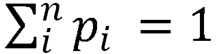 In practice, this is just pi/N, where i is the game score and N in the total number of games played. The mean game score (4.25 runs in 2015) is the product of the game score and probability of that score, summed across all possible scores:
 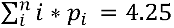 The mean score is really just a weighted average of the game scores (weighted by the probability of occurrence).
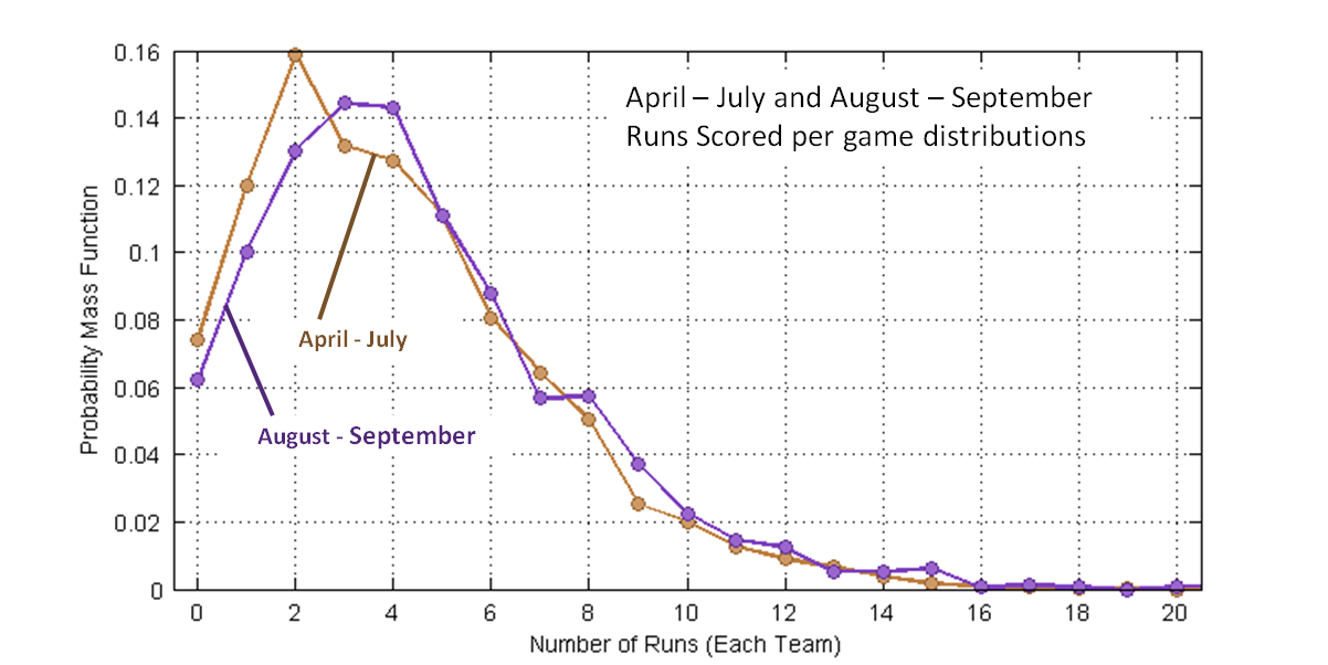
Figure 3 is a comparison of the April-July and Aug-Sept distributions, now shown as lines because they overlap. Observe that in the latter months low-scoring games (zero to two runs) occur with reduced frequency and that scoring three to nine runs occurs with an increased frequency.
Consider that the April-July mean score is: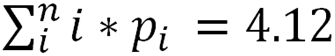 And the Aug-Sept mean score is:
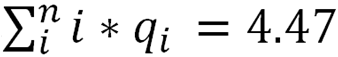 Then difference between these mean scores is:
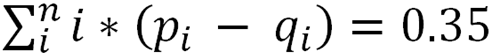 Where pi corresponds to the probability of i runs in the August-September period and qi to the probability of i runs in the April-July period.
There is a “problem” in this definition — p and q tend to be very similar in magnitude, so taking their difference tends to amplify sampling uncertainty. The sampling error can be mitigated, without change to the mean and variance, by substituting fit distributions for the sample distributions. This only “works” if the empirical data truly conforms to a negative binomial distribution. Fortunately, the quality of fit (R2) is very high (>0.99) for both sample periods. Figure 4 repeats the distributions shown in Figure 3 and adds negative binomial fit distributions ghosted behind the data curves. Also shown in a grey curve (plotted on the right axis) is the run-value-weighted difference between the two “half”-season fit distributions.
As expected, the integral of the grey curve is equal to the difference in mean scores between the April-July and Aug-Sept periods, 0.35 runs (4.47 – 4.12). The point of the grey curve is that is shows us which run totals most greatly contributed to the elevated run environment. The fat part of the grey curve is where teams made the “extra” runs: in 6-10 run games. We can tell the blowouts (say 15+ run games) weren’t major contributors to the change in run environment, because the area under the curve for big scores isn’t all that large.
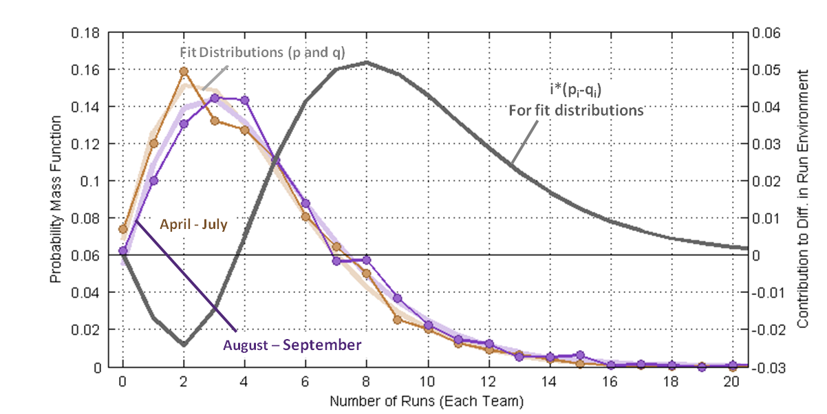
Figure 5 repeats the grey curve from Figure 4 and adds the run-value-weighted difference between the sample distributions as vertical bars. The comparison between the two data sets is a little rough (R2 = 0.11). Upon close inspection, the discrepancies between the two sets correspond to where the sampled data sets have the greatest deviation from expected values.
I thought the increased run production came in bunches (say a handful of 15+ run games), but it turns out the blowouts didn’t move the needle much. Had that been otherwise, it would have required looking for different phenomenon than Jon was searching for. Instead it looks like teams were pushing across an extra run across twice a week (two runs / six games ≈ 0.35 runs/game).
So where did these extra couple runs per week come from? That’s a great topic for a follow-up study. I’d suggest at least two areas to explore, focusing on context-specific metrics. Did teams get better at scoring runners on third? Did hitters get better with runners in scoring position? I could be talked into one of those two (probably), but obviously there are other potential explanations besides these two.
Who knows if this increased scoring will continue? More runs are good, right? (Well, to a point.) I seem to recall that was a theme in new commissioner Rob Manfred’s comments last offseason.

“Jonathan Luman is a systems engineer with a background in aerospace.” No kidding!!!!
The increase seemed to start after the ASB so caught a bit of July too. Might have been better to just do a 1st half/2nd half analysis
The ball is the obvious culprit IMO since the strike zone actually got bigger. Same thing happened in Buds first year as commissioner. Perhaps just a coincidence. Rawlings could have just produced a batch of balls at the high end of the COR spectrum. Manufacturers don’t produce balls with 0 tolerance, and sometimes tolerances are higher than normal due to change in suppliers/materials
Consider that from 2002 which was still at the height of the steroid era which really did not end until 2006, that 2015 had the highest HR/FB rate (tied with 2012). I can’t find any records before 2002. We have also seen similar seasonal outbursts like 1987 and 1977’s which were likely caused by the balls (eg Rawlings moved their production from Haiti to Costa Rica at the time of the 87 boom, and Rawlings became exclusive supplier around 1977). Unlike the boom from 1993/1994 these issues were soon corrected. MLB does regular testing of course but we don’t get to see the results except that one report that tested balls in 1999-2001 that was released in 2002
August’s R/G of 4.49 was the highest for a month since April 2010 when it was 4.55. So the last 35 months have all been under 4.50. In contrast, from April 1993 to August 2005, every month was 4.50 or above. That’s a stretch of 76 months.
I wanted to expand on what pft said about the increase since the All-Star break. The first half OPS was .710, the second half .735. That 25 point increase is tied with 2007 for the 3rd biggest since 1914. The most was 31 points in 1985, 2nd was 26 points in 1944. On average, OPS has dropped 7 points in the second half since 1914.
I wonder how much of this can be explained by the phenomenally good rookie class we had this year. Adding late season call ups like Sano, Schwarber, and others of the “high strikeout/high home run class” that we’ve been seeing so much of lately. Could it be, at least partially, that scoring increased this year because we just called up a phenomenally high group of player who could hit the crap out of the ball, and the difference between July and later months had to do with the fact that we were studying two different populations, and the late season had a few monster outliers affecting the data.
Whether high scoring games are making a comeback or not, does it really matter if, even with a second half surge, offenses are still depressed on the whole? Especially if three true outcomes is still to blame, do you really want to see MORE strikeouts, MORE walks, MORE home runs and doubles?
Compare 1980s vs. 2010s
Year Hits 2B 3B HR XBH 1B CO + E
1983v2013 37 -25 14 -28 -40 77 358
1984v2014 51 -32 10 -14 -37 88 359
1985v2015 11 -28 6 -25 -47 58 381
w/ 81-11 189 -20 4 57 -186 -333 522 2260
w/o 81-11 194 -157 48 -137 -246 440 1886
Whether high scoring games are making a comeback or not, does it really matter if, even with a second half surge, offenses are still depressed on the whole? Especially if three true outcomes is still to blame, do you really want to see MORE strikeouts, MORE walks, MORE home runs and doubles?
Compare 1980s vs. 2010s
Year Hits 2B 3B HR XBH 1B CO + E
1983v2013 37 -25 14 -28 -40 77 358
1984v2014 51 -32 10 -14 -37 88 359
1985v2015 11 -28 6 -25 -47 58 381
Average Team Runs and RBI Gained/Lost
Year Runs RBI
1983v2013 24 14
1984v2014 31 20
1985v2015 12 4
Because in 1983-85 the average team scored 67 more runs, and did it with MORE SINGLES and CONTACT OUTS and CONSISTENCY, and had less strikeouts than the 2010s. 2013-2015 had more HRs, and doubles, yet it didn’t matter because all those strikeouts and walks cost MLB teams runs and RBI compared to the 1980s.
The pendulum has swung too far. I, for one, am hopeful that the way the KC Royals have played the last 3 years, catches fire around the league. Welcome back the 1980s mentality at the plate!