The Padres’ Journey From Unique to Undistinguished (and Back Again?)

The Padres might be circling back to an old friend when it comes to their jerseys. (via Arturo Pardavila III)
If you take a quick look at the logos of major league teams, a trend stands out: A lot of red, and a lot of blue. Of the 30 teams, 24 have red, blue, or both colors in their color scheme. That includes the San Diego Padres, who have used navy blue as their main color since the early 1990s.
But the team on the extreme southern tip of California wasn’t always just another navy blue team in a sea of navy blue. There was a time when the Padres had the extremely unusual color scheme of brown-and-gold.
When San Diego entered the National League with this color scheme in time for the 1969 season, it marked the return of brown to the baseball world for the first time in 15 years. The aptly named St. Louis Browns were in the American League from the early 1900s until 1953. The Browns started out as a strictly brown-and-white team in 1902 and stayed that way for 32 years. By the 1934 season, the Browns had infused orange into their color scheme and orange would remain a major part of their identify until the team’s final two seasons of existence.
Then, orange was pushed to the wayside as a tertiary color in favor of white becoming the secondary color once again. This became a fact of life for the Browns for the 1952 and 1953 seasons. In 1954, orange returned to the franchise’s color scheme, but this time it was the primary color along with black — but this is because the St. Louis Browns were now in a new city with a new nickname. You know them now as the Baltimore Orioles.
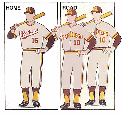
Fifteen years later, in ’69, along came the Padres with brown as their main color. It made sense, too. The team’s initial logo included the first appearance of the famous Swinging Friar mascot. Friars normally wear brown, after all. Plus, there was the added flourish of gold as a secondary and trim color. While the old Browns mostly stuck with a brown and white scheme, the Padres at least had this splash of color going for them, giving them one of the most unusual color schemes in American sports.

1972 uniforms (via Dressed to the Nines)
At this time, only one other professional sports team in North America had brown as a major color: The aptly named (again) Cleveland Browns. In a bit of a twist, the Browns weren’t actually named for the color back when they were formed back in the 1940s. Instead, they were named after Paul Brown, the team’s legendary coach. However, you aren’t going to give a team nicknamed the “Browns” a red-white-and-blue color scheme, so of course the Browns went with brown and orange as their two main colors. They’ve stuck with that color scheme ever since.
1974 uniforms (via Dressed to the Nines)
While the Browns and Padres may have been the only two teams holding down the color of brown in North America, another major sports team had the color scheme of brown-and-gold locked down for at least half a century by the time the Padres came around — Hawthorn Football Club, which played the Australian version of football down under. Hawthorn had been wearing the color scheme since at least 1914, and hasn’t wavered from it to this day.

1976 uniforms (via Dressed to the Nines)
The same can’t be said about the Padres, who’ve become so much more ordinary since 1972. After spending three years with relatively normal but unique uniforms, the Padres decided to go with eye-catching uniforms that hadn’t been seen outside of the Oakland/Kansas City Athletics franchise: Gold from head to toe. One of the hallmarks of baseball in the 1970s was bright, gaudy, and decidedly untraditional uniforms, and for two seasons, the Padres fit that bill. San Diego went to a more traditional look for the 1974 season, but kept a hat design that would become famous with Padres fans: The brown hats with the yellow front panel. San Diego would undergo a few more changes, but the basic design of brown hats with a yellow front panel would remain the same going into the 1980s.


1978 uniforms(via Dressed to the Nines)
In 1976, the Padres once again abandoned traditional gray away uniforms for brown jerseys, and wouldn’t wear gray on the road again until the mid-1980s. They even went with all-gold uniforms once again in 1978, but that lasted only one season. That would also be the last time that the Padres would wear the all-gold uniform set in the franchise’s history.

1980 uniforms(via Dressed to the Nines)
Once the calendar turned to the 1980s, the Padres went with a look that was arguably their best during their time as a brown-and-gold team. The new orange accent color really made this uniform flourish. And it stuck for five years. There were no tweaks to be found during those seasons, and this is what the Padres wore for two of the most important moments in the franchise’s history — the debut and rise of the legendary Tony Gwynn, and the team’s first postseason appearance and subsequent run to the 1984 National League pennant.
They eventually fell in five games in the ‘84 World Series to the Detroit Tigers, and one of the takeaways from that series (other than the obvious superiority of an excellent Detroit Tigers team led by the likes of Alan Trammell and Kirk Gibson) was the extreme contrast in uniform styles. The Tigers have worn their home uniforms with the old English stylized “D” logo on the chest with few interruptions since the 1900s, and they’re wearing that same home uniform to this day. Contrast that with the Padres and their incredibly unique color combo of brown, gold and orange, and it made for a very intriguing uniform matc-up.
The season after their run to the World Series, the Padres made a decision that marked the beginning of the end for brown in their color scheme — they replaced gold with orange and got a new logo. In an instant, gold was gone from their color scheme and so was the Padres’ unique look in the North American sports landscape. Granted, they were still the only brown team in baseball, but they were now in the same boat with the old St. Louis Browns. Brown-and-orange came in 1985, and it stayed until 1990.
The color orange ended up being a grim reaper of sorts for brown, because 1990 turned out to be their final season as a brown team. In 1991, the team kept orange as a secondary color, but replaced brown with navy blue. Just like that, the Padres went from being the one and only team wearing brown in baseball to one of 18 major league clubs at the time who wore blue on the field.
Since 1991, nary a trace of brown was to be found in the Padres’ visual identity. The only time that you could see the former flag-bearers of the color in the majors wear brown would be for the occasional Turn Back the Clock night. Indeed, from the blue-and-orange days of the 1990s to the blue-and-white period in the early 2000s to the experiment with sandy colors in the mid 2000s and finally to the present-day return to blue-and-white, one thing has remained constant: Navy blue.
In case you got lost along the way, let’s review the team’s logo progression through the years:

It’s been a long, strange trip to be sure. However, 2016 brought a glimmer of hope to fans of the Padres who still believe that brown is the team’s rightful and proper color. When the team unveiled new uniforms as part of their season-long celebration for hosting the 2016 All-Star Game, one of those new uniforms included a shocking blast from the past: A brown-and-gold alternate uniform! This wasn’t just a throwback, either. It was an actual new uniform with the team’s new logos in the familiar brown-and-gold color scheme. Even the hats stayed true to the old classic look of having a gold front panel with brown lettering on an otherwise all-brown hat. It was a beautiful look, and it’s received mostly positive reviews from the fans.
The fans could end up being the reason the Padres could decide to return to the brown-and-gold look. Sports franchises that have a good idea of the pulse of their fan base tend to go with what the fans want when it comes to logos and uniforms.
A prime example would be the Buffalo Sabres of the NHL and their time with the color scheme of blue-and-gold. Although the Sabres have never won the Stanley Cup, most of their fans associate the good times of the franchise with the colors of blue-and-gold. For nearly three full decades until the 1996-97 season, the Sabres wore blue-and-gold. Then they inexplicably changed to red-and-black. Although they made their first and only Stanley Cup Finals appearance in red-and-black, fans continuously clamored for the Sabres to return to blue-and-gold. When the franchise eventually caved in to fan demand, it came up with a poor idea that was panned and the Sabres had to scramble to make the fans happy. Eventually, the Sabres listened and came up with a blue-and-gold look that made everyone happy.
It’s possible that the Padres could stop “toying with the idea” of making brown-and-gold their primary colors again and actually do it. They are dropping the blue-and-gold home uniforms ahead of the 2017 season, but we probably won’t see them fully implement brown-and-gold next season.
A wise fictional television character once said that “time is a flat circle,” and what’s old will become new again. It appears that San Diego’s Friday alternates may have been a trial run that could lead to the color scheme returning to the Padres. It’s too early to tell whether this could result in a permanent shift, but this type of thing has precedent in sports. The Toronto Blue Jays and Houston Astros have gone back to popular color schemes and identities from the past and refreshed them with great success.
If the Padres do the same in the near future, it would surely please a large chunk of their fan base that remembers the old brown-and-gold days of the Padres. At the very least, the Gaslamp Ball crew would be very, very pleased with the return to traditional colors. For everyone else who enjoys sports logo and uniform aesthetics, the Padres returning to brown-and-gold would be a welcome sight.
There’s something for having a color scheme that you can call your very own, and it appears that the Padres are close to returning to being one of those teams that stands out from the crowd.
References & Resources
- SportsLogos.net
- “Dressed To The Nines” Uniform Database
- Footy Jumpers, Hawthorn uniform history
- Corey Brock, MLB.com, “Padres’ uniforms enter uncharted waters”
Extending the definition of Padres, in 1974 they were, at one point, scheduled to play in Washington, DC with a preference for Frank Robinson as manager. This link shows pitcher Dave Freisleben modeling a red, white and grey/blue prototype: https://www.washingtonpost.com/news/dc-sports-bog/wp/2016/06/16/the-time-the-san-diego-padres-were-this-close-to-moving-to-d-c/
Gold,Good on you.I have always wondered what the annual computer recycling collection does with the more vintage models. You’d like to think that they try find a good home for them if possible, as th128#&ye7;d be worth more to someone that way.
Between artificial turf, the collusion scandal, and cocaine the 1980s were not a good time for baseball. However the Padres uniforms were awesome.
Nice article! I would add that the Giants also dabbled in brown for a few years in the 1900s & ’10s. (Of course, they dabbled with every color in the palette at one time or another, incl. violet in the mid-’10s.) I would say, too, you have the name + color cause & effect backwards: St. Louis teams in the 19th cent. traditionally wore brown and were thus dubbed the “Brown Stockings”–shortened inevitably to “Browns”. When the Milwaukee Brewers moved to St. Louis after the AL’s inaugural season, just as inevitably they became the Browns to continue the tradition. (The Cardinals had abandoned brown at the turn of the century.) So, they had to abandon their navy-trimmed duds for brown! When the Padres went from brown & orange to navy & orange in the early ’90s, I remember Tony Gwynn being quoted as saying, in effect, Thank God! I was so sick of wearing brown! Everyone back then was making fun of the Padres’ uni’s, too. So it’s interesting how we’ve come full circle: everyone now wants SD to return to brown . . . Finally, the Buffalo Sabres made it to the Stanley Cup finals vs. the Flyers in the mid ’70s in their blue-and-gold.
Great job!
FYI there was orange on a couple of the early caps, maybe:
Authentic 1910?: https://twitter.com/StL_Browns/status/786328879505911808
at least the cap companies like to think so:
“1908 home” : http://thumbs.ebaystatic.com/images/g/y9wAAOSwYlJW4LTy/s-l225.jpg
“1908 road”: http://www.strictlyfitteds.com/sites/default/files/styles/featured_550_x_420/public/1908-st-louis-browns-fitted-baseball-cap-american-needle-mlb_1.jpg
ps the San Antonio Missions, the top farm club of the Browns for over a decade, were full-on brown and orange
Cannot really tell what the Padres colors were in the PCL .. But here is at least one brown and orange hat from the 50s
The PCL Padres did a blue and rust/orange livery. Google “pcl padres jersey” and “pcl padres ted williams” for some images.
In the college ranks, Brown University resisted brown for decades, but finally had to give in. Tufts uses brown and blue, dating back to a time when schools could still strive for a unique color/combination.
All time best uni for the padres was 1985-1990. White with brown pinstripes, brown hat with an orange SD.
http://exhibits.baseballhalloffame.org/dressed_to_the_nines/detail_page.asp?fileName=nl_1985_sandiego.gif&Entryid=1547
Couldn’t disagree more. 85-90 Padres jerseys were the worst of both worlds = uniting brown and pinstripes. I would like to see a return to the 1976 font. The Tuscon Padres unis before they moved were really sharp.
Bless my brother. Its a true blessing to see the struggle you went through to make things happen in your life. Cooking is my life I have been in the arts for 28 years I have learn a lot from a variety of chef in the Atlanta, an Jakvioncslle area. An I have watch you grow an I do enjoy your style of cooking. Im always hungry for more recipes . An I have learn an got a lot from you. Be bless my brother an keep up the good work. Shortrib BBQWARS
That’s an expert answer to an interesting question
Oh, Hi Amy – Shrimp and broccoli – what is not to like?? It is still the ONLY thing Dad will order when we venture out to King Wong Take-Out in our bubbling metropolis of Marlton, NJ. I, however, have branched out to General’s Chicken – without the heat, of course. Yes, We are fans of Chinese food – but we do have our boundaries!!! And don’t forget – Chinese restaurants are one of the few that include dessert with all meals!! Love those fortune cookies! XX Mom
What a huge step, and one that will surely bring relief and joy to both Riley and you. A big task, but who better to undertake it than Team O&7d#12;Neil?Ku8os to you, and I look forward to reading all about it!
Because none of the significant North American specialist
leagues have games scheduled for that day – the National
Basketball Association, National Football League, and National Hockey League are not in-season, MLB does not have games that day, and likewise university sports activities are on summertime
vacation – key sports figures are obtainable to attend.