The 2015 Strike Zone

The strike zone saw some interesting shifts in 2015. (via Minda Haas)
The strike zone is regularly the most contentious part of a baseball game. Batters complain. Managers complain. Pitchers and umpires have stare downs. On top of the pitch-by-pitch attention that the strike zone draws, it also receives scrutiny at the macro level. Last offseason, it was reported that given the downward scoring trend across the league, the MLB Playing Rules Committee would monitor the strike zone during the 2015 season with a potential to recommend a change in its definition by as early as 2016.
Throughout the season, I have been checking in on the state of the strike zone and related aspects of the game on a monthly basis. If you wish you can review the status for April, May, June, July, and August. With the regular season coming to a close, it’s time to take a final look at how the 2015 season stacks up against its recent predecessors.
Before the season began, a number of Hardball Times writers collaborated on a season preview in strikeouts. In it I attempted to frame a strike zone outlook for the 2015 season, and concluded with this paragraph:
If I were made to take a guess as to what will unfold in 2015, I would say this is the season the falling bottom of the strike zone finally levels off, given the increased attention. There are other aspects of the game affecting strikeout rate aside from the strike zone itself, but I will predict a strikeout rate that is flat with the 2014 numbers in the upcoming season.
Here are the final numbers for the 2015 regular season compared with recent seasons:

| Year | Strike Zone Size (sq. in) | Strike Zone Size Below 21” (sq. in) | K% | BB% | R/G |
| 2009 | 435 | 0 | 18.0% | 8.9% | 4.61 |
| 2010 | 436 | 6 | 18.5% | 8.5% | 4.38 |
| 2011 | 448 | 11 | 18.6% | 8.1% | 4.28 |
| 2012 | 456 | 19 | 19.8% | 8.0% | 4.32 |
| 2013 | 459 | 30 | 19.9% | 7.9% | 4.17 |
| 2014 | 475 | 47 | 20.4% | 7.6% | 4.07 |
| 2015 | 478 | 50 | 20.4% | 7.7% | 4.25 |
The strike zone did pretty well level off, both as far as the bottom not dropping perceptibly lower and the size holding steady. The strikeout rate was also flat with 2014, meaning my guesses from the preseason fared pretty well. Of course I also guessed the Tigers would represent the AL in the World Series, so not everything turned out the way I’d expected.
Here are images from the umpire’s perspective of the strike zones for left-handed and right-handed batters in 2015:

One of the quirks of the current strike zone that I’ve been following this season is the development over the past two seasons of a noticeable gap between the size of the right-handed hitter strike zone and the left-handed hitter strike zone.

| Year | Strike Zone Size (sq. in) | BB% | K% |
| 2009 | 6 | -1.8% | -0.4% |
| 2010 | 5 | -1.7% | -0.7% |
| 2011 | 5 | -1.0% | 0.0% |
| 2012 | 7 | -1.5% | -0.2% |
| 2013 | 5 | -1.2% | 0.1% |
| 2014 | 17 | -1.4% | 1.4% |
| 2015 | 23 | -1.4% | 1.3% |
In the PITCHf/x era, the left-handed hitter strike zone has generally been a similar width to the right-handed hitter zone, but shifted 2-3 inches toward the outer edge of the plate. This has meant pitches off the outside edge regularly being included in the strike zone, while those catching the inside edge have typically been called balls. The widening size difference appears to be partly due to the apt shaving off of the outside “lefty strike” without any compensating addition on the inside corner of the plate.
Speaking about 2015 in particular, the small growth to the strike zone as a whole came completely from changes to how umpires called pitches for right-handed hitters. Since the zone began to fall in 2010, left-handed hitters have seen their zone swell by 8 percent, while right-handed hitters have now been made to deal with a 12 percent expansion in the size of their zone. This widening gap in zone size has led to a fairly stark contrast in strikeout numbers between right-handed batters and left-handed batters in the past two seasons.
I would suggest that regardless of the appetite of MLB for making a rulebook change to the strike zone, the left vs. right imbalance is an area where improved direction could be given to umpires to call a more equitable zone for all hitters.
I’d now like to return your attention to just the last two years of strike zone-related data.

| Year | Strike Zone Size (sq. in) | Strike Zone Size Below 21” (sq. in) | K% | BB% | R/G |
| 2014 | 475 | 47 | 20.4% | 7.6% | 4.07 |
| 2015 | 478 | 50 | 20.4% | 7.7% | 4.25 |
Notice that all of the columns look very similar between the two seasons, save the last column: the average number of runs scored per game per team. In the past, I’ve estimated in my research the impact that the strike zone has on run scoring, and found that the expanding strike zone has clearly played a significant role in the reduction in scoring around the league in recent years. This very fact is what makes the final column in this table so puzzling: if the strike zone size finally stabilized, leading to virtually identical walk and strikeout rates, how is it that scoring increased so substantially in 2015?
In my update at the end of July, I pointed out that scoring in fact had been tracking along at the same rate as 2014 through that point in the season. The run scoring pace was only scarcely higher than the previous season, but the typically run-depressing month of September had still yet to be played. Everything appeared to be on course for a perfectly explainable repeat of 2014.
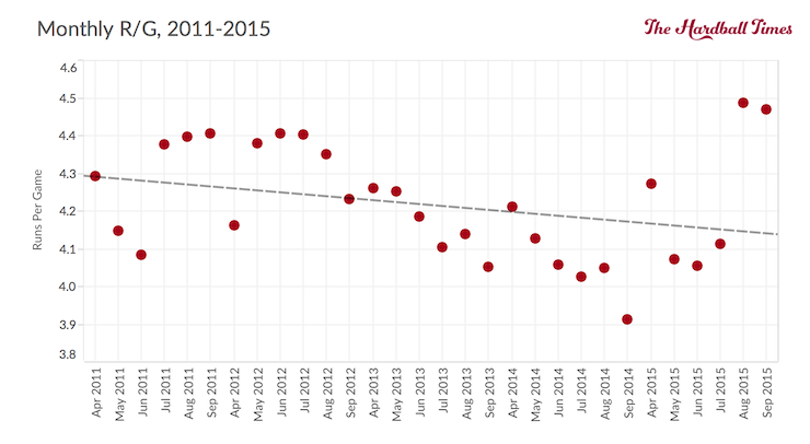
But then August happened. And then September/October one-upped August. Take a look at monthly splits for runs per game per team over the past five seasons.

The last time the league averaged as many runs per game as either August or September/October was six years ago in August 2009. If you scroll up to the top of this article, you’ll see that 2009 was the last year before the strike zone started to expand, when it was 9% smaller than it was in 2015.
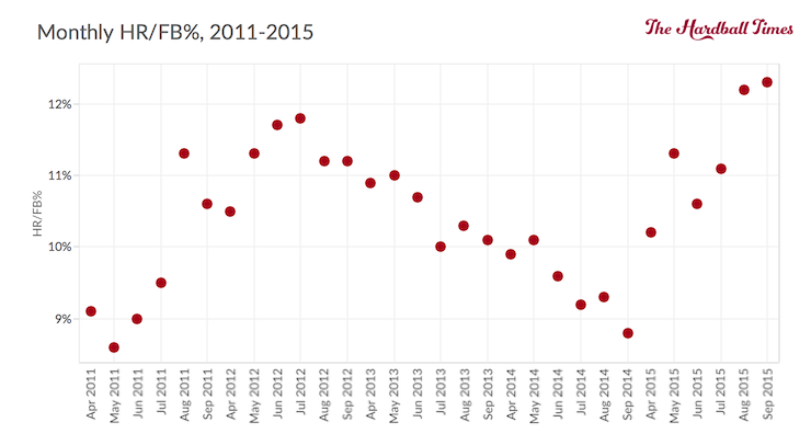
So what happened? Well, for one thing, home runs. Check out the monthly HR/FB% numbers over the same period.

At FanGraphs, HR/FB% numbers have only been calculated since 2002. The months with the highest HR/FB% percentages are September/October 2015 and August 2015 in first and second place, respectively. The two most recently played months surpassed the previously all-time recorded high set in July 2003.
I wanted to return to consider the potential impact of one variable that could explain part of the rise in scoring over the past two months – temperature. I glossed over this factor in my last update when looking for explanations for September depressions in scoring, but did not investigate it specifically with respect to the recent run scoring spike.
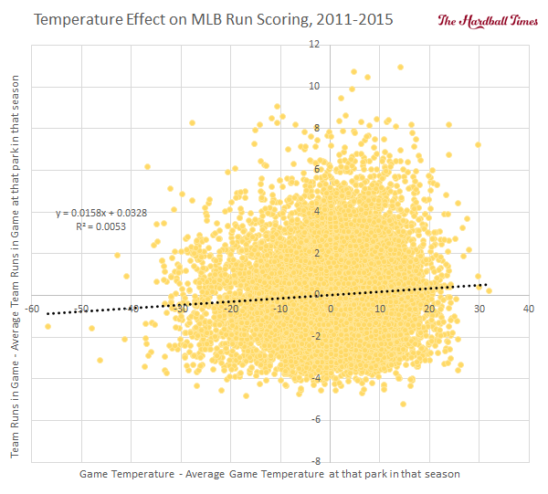
Based on the suggestion of sabermetric pioneer MGL, I looked at the effect of temperature on run scoring over the past five seasons while controlling for the home stadium.

While the r value is low, this is a statistically significant correlation, and suggests that on average expected runs scored in a given game around the league is roughly 0.016 runs per team higher for every degree warmer that the game is played under. To make this clear, this temperature effect is in relation to the numbers represented by R/G throughout in this article, which is the number of runs scored per game per team.
Considering this league average temperature effect, it is possible to estimate how much the warm weather in August and September/October of 2015 contributed to the sudden spike in run scoring. The average temperature for all games played in August was 78.7o F. In September/October, the average temperature was 75.1o F. These were 5.0o F and 1.4o F higher than the average temperature for all regular season games in 2015, respectively. At 0.016 additional runs scored per game per team per degree warmer than average, this suggests expected run scoring numbers to have been about 0.08 and 0.02 higher than the seasonal average based on temperature effects alone. The actual spike was 0.24 and 0.22 runs per game per team in these two months. So the warmer climate explains only a small part of the jump in runs scored at the tail end of the season, in particular for September/October.
While the above analysis paints a general picture across the entire league, temperature effects can vary quite substantially from diamond-to-diamond. In some parks, temperature affects run scoring in a noticeable, statistically significant manner. In others, temperature doesn’t appear to play any significant role in runs scored. Here is the breakdown of temperature impact on run scoring per team by home stadium over the same five year period:

| Home Team | Avg Temp (F) | Runs/Temp (F) | Significance |
| Houston | 74 | 0.049 | * |
| San Francisco | 63 | 0.044 | *** |
| Boston | 69 | 0.035 | *** |
| Texas | 87 | 0.034 | *** |
| Washington | 77 | 0.032 | *** |
| Philadelphia | 76 | 0.021 | *** |
| New York (NL) | 72 | 0.021 | ** |
| San Diego | 70 | 0.021 | |
| Pittsburgh | 74 | 0.020 | ** |
| St. Louis | 79 | 0.020 | ** |
| Chicago (NL) | 68 | 0.020 | ** |
| Chicago (AL) | 70 | 0.019 | ** |
| Colorado | 73 | 0.017 | * |
| MLB Average | 73 | 0.016 | *** |
| Kansas City | 78 | 0.015 | |
| Seattle | 65 | 0.014 | |
| Miami | 78 | 0.014 | |
| Detroit | 70 | 0.014 | |
| Oakland | 65 | 0.013 | |
| New York (AL) | 73 | 0.009 | |
| Baltimore | 76 | 0.006 | |
| Milwaukee | 74 | 0.006 | |
| Cleveland | 70 | 0.005 | |
| Los Angeles (AL) | 74 | 0.005 | |
| Minnesota | 71 | 0.005 | |
| Arizona | 82 | 0.004 | |
| Atlanta | 80 | 0.004 | |
| Cincinnati | 75 | 0.003 | |
| Toronto | 69 | 0.003 | |
| Los Angeles (NL) | 73 | 0.000 | |
| Tampa Bay | 72 | 0.0000 |
** – Statistically significant at 95% CI
*** – Statistically significant at 99% CI
i.e. Expected number of runs scored per team in a game in San Francisco is 1 higher when game played at 86 degrees vs. 63 degrees.
About 40 percent of the stadiums in Major League Baseball show a statistically significant relationship between game temperature and runs scored per team per game. For the most part there looks to be similar temperature effects on stadiums that are close geographically, but there are certainly some exceptions to that statement. There are obviously other environmental factors that affect run scoring (i.e. other contributors to air density, as well as wind) and these may move in a contradictory fashion as temperatures rise in some stadiums to counteract the beneficial effects of hotter weather on scoring.
Having more resolution for temperature effects, let’s revisit the games played from August through the end of the regular season in 2015 but now consider the additional context of the home parks where the games were played. This exercise doesn’t bear any more fruit; utilizing only statistically significant park effects, the estimated increase in run scoring above season average is 0.07 runs per game per team in August and just 0.01 in September/October. Even if we lump in effects from all parks, whether they are statistically significant or not, the values are 0.09 and 0.02 for August and September/October, respectively.
Clearly the warmer weather since the beginning of August has produced playing environments that are on the whole conducive to higher run scoring. This analysis suggests that this only explains a fairly small portion of the unexpected peak in offense. As far as the cause for the remainder of the jump, other than a potential change in the constitution of the baseballs themselves, the other suggestion that I have heard but have not pursued is a mid-season influx of batter talent from the nearly unprecedented quality of position player rookies this season.
Whatever the case, in particular with HR/FB% setting records the last two months, it is apparent that batters hit balls in the air further than earlier in the season:

| Month | Average FB + HR Distance (ft) |
| April | 276.4 |
| May | 277.9 |
| June | 278.8 |
| July | 279.4 |
| August | 281.8 |
| September/October | 281.0 |
If you find the late season offensive spike an interesting topic as I do, and wish to read further, please check out the upcoming Hardball Times Annual where Jeff Sullivan will be delving into the subject in greater detail.
References & Resources
- PITCHf/x data and batted ball distances from Baseball Heat Maps.
- Other statistical data from FanGraphs and Baseball-Reference.
Because of the expanded playoff structure, more teams were in the hunt and thus played their top position players more. Just from perusing the box scores, I would say that the number of secondary pitchers used in September was closer to average. Thus, more scoring.
Could be as simple as pitcher’s arms fatiguing over the course of a season. As they say in science, usually the simplest explanation is the right one.
So maybe Clint Hurdle is on to something. He skipped Gerrit Cole a start about 3 starts ago… not due to injury, but to rest him up a little. Maybe it will show up tonight in the wild card game.
Has anyone else noticed a lot of broken bats towards the end of the season? Maybe it’s just me. But you would think they’d have a regular replacement schedule. I’m sure that they do. Wood fatigues like anything else.
That would be an interesting stat to follow. The number of broken bats for individual players, and timing through the season. Do players with higher exit velocities have more broken bats. As we find out, the answer we hypothesize is not always the one that the data bears out.
People continue to avoid looking at the most obvious cause of a sudden jump in offensive numbers, or decline. Its balls with a higher or lower COR. Manufacturing tolerances are not 0, and changes in raw materials or suppliers can alter physical properties of the balls. MLB specifications are so broad that balls can travel 50 ft further in the 400 ft test at one end of the spec than at the lower end of the spec. Minor league balls travel 10 ft less than MLB balls per a test report MLB released in 2002 on balls used in 2000/2001
Perhaps this is a temporary blip like in 2011 and 1987, or a more permanent one like in 1993/1994. MLB can easily do this by adjusting the specs they give to Rawlings (which are narrower than the official spec which is way too broad) for more runs.
Obviously, we can’t know if its the ball or not w/o having the balls tested. Maybe somebody can get these balls from Hample
Great work
Great article. Glad to see someone tackle temperature the right way, by using individual parks. One other thing to note: some parks have a very strong wind direction to temp. correlation. E.g., a certain portion of Fenway’s apparent sensitivity to temp. is actually the fact that the wind is usually blowing out there on hotter days.
Are the LHH smacking their outside pitches to left field? Or aren’t the umps calling them strikes in the manner RHH seem to be called on the outside part of their plate?