The Declining Share of African-American Baseball Players, Part 1
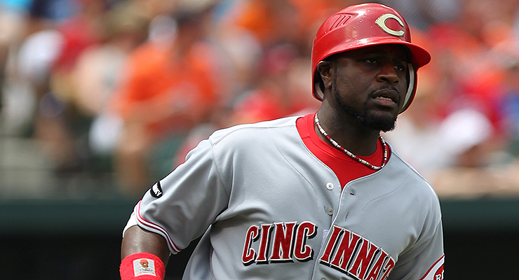
Fewer African-Americans born in the ’80s, like Brandon Phillips, reached the majors (via Keith Allison).
African-Americans make up a smaller share of major league players than they have at any time in the last 50 years. After black players rapidly became part of the major league landscape, 19 percent of players were black as recently as 1981, but today only seven percent are. Although the increasing share of Latino and other international players accounts for some of this decline, the share of U.S.-born players who are black has fallen very rapidly, as well.
In March, I published a Hardball Times article in which I showed the increasing importance of opportunity and income in making it to The Show. However, I did not have data on the actual race of players, so some of my claims relied on guesswork and inference. Fortunately, Mark Armour has been gracious enough to share a data set that he and Dan Levitt created for their fantastic study documenting the decline of black players, enabling me to look more closely at the link between opportunity and race. These data strengthen the case I made in March about opportunity while also calling into question several other theories about the source of racial trends in baseball.
In March, I produced this table showing the relative share of baseball players’ WAR to births in each region by decade:
| WAR/births by decade, region |
|---|
| Region | 1940s | 1950s | 1960s | 1970s | 1980s |
| Northeast | 0.61 | 0.50 | 0.73 | 0.52 | 0.23 |
| Midwest | 0.96 | 0.85 | 0.66 | 0.75 | 0.47 |
| South | 1.00 | 0.93 | 1.06 | 1.13 | 1.46 |
| West | 2.11 | 2.51 | 1.94 | 1.85 | 1.79 |
In this graph, the South Region in the 1940s had a WAR/birth ratio of 1.00. This means that the share of WAR produced by players born in this region among all U.S.-born players between 1940 and 1949 was equal to the share of births in these states during the same decade. Values above 1.00 indicate that the share of WAR from players born in this region was greater than the share of births, while the opposite is true for values below 1.00.
In this table, it is clear that a greater share of players came from the South over time. Since there are more African-Americans in the South than any other region, we may have expected there to be more African-American players over time, but instead the opposite is true.
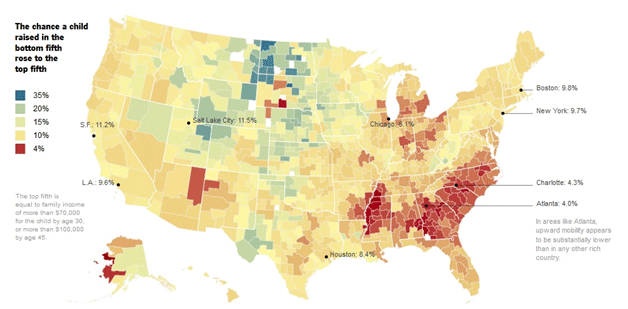
I pointed out that this may not be so surprising when you consider the following map produced by David Leonhardt at The New York Times, based on research by Raj Chetty, Nathaniel Hendren, Emmanuel Saez, and Nicholas Turner. This map shows economic mobility by region within the United States, where red areas represent the least upward mobility:
I further studied the data on WAR by county and determined which factors corresponded to producing more WAR per birth over time. These were the three main takeaways from this study:
- Higher income has become more important over time
- Warmer weather has become more important over time
- Warmer weather is more important in high-income counties (and vice versa)
Now that I have specific data on players’ races, I can look at these results a little more thoroughly.
Data
The primary source of data in this series of articles is the Armour and Levitt proprietary data set that classifies the race of all major league players who played from 1947 through 2012 into white, African-American, Latino and Asian. Since I used all data through 2013 and all players born from 1940 to 1989 in my study, I needed to classify a few 2013 rookies. This is surprisingly more difficult than you would expect, which has made me even more impressed with Armour and Levitt’s detailed work.
Of course, this provided only the numerator, and I needed the denominator, too. So I used state data on births by race (or people under the age of one) from a couple of different sources. The National Cancer Institute’s “Surveillance, Epidemiology, and End Results Program” has figures only since 1969, which it gathers from census data, as well as supplementary data where needed.
The National Center for Health Statistics provides data on births by state and race up until 1968. Unfortunately, the NCHS data use a somewhat different definition of black than the SEER data, which would have led to a bias. So I assumed that the share of black births in 1968 and 1969 was the same in each state and adjusted the 1940-68 data down (or up in some cases) by that constant. While this is not a perfect solution, the share of births in a given state wouldn’t change so much that it would have much of an effect. The changes in the share of black players are so large by decade that a slight error in the denominator would not have masked those changes.
One other limitation of this data was that I was unable to look at births by race and by county, so there is still some guesswork required at that level. However, I was convinced by the data that the issue of opportunity and income (especially the importance of weather in creating opportunity for wealthier families) is the dominating factor in the decline in African-Americans in baseball over the last few decades.
Variable Studied: Total Black Players, Population-based Expected Total Black Players
In March, the variable that I used was WAR per birth, with individual player WAR capped at 20. Some people were concerned that this might not capture the true trends, but fortunately, using the number of black players relative to all American players had the same results as looking at the share of black players’ WAR relative to all American players’ WAR.
However, this study will use a simpler variable, which is the number of African-American players that were born in a given state or region relative to the expected number of black players born in a given state or region. The “Expected blacks,” the number of black players we would expect to be born, is simply the number of players born in a state or region in a given decade multiplied by the share of black children born among all children born in that region at the same time.
For example, among the 218 players born in the South Atlantic Division between 1980 and 1989, we would have expected 59 players to be black because 27 percent of people born in the South Atlantic Division in 1980-89 were black. However, there were only 29 black players born in the South Atlantic Division during those years. A disproportionately small share of players from that region in that time period was black.
Census Divisions
There are nine Census Divisions, and the following table shows the expected number of black players in a Census Division each decade (based on the total number of players from that Division and the share of black children in that Division). The “E(B) 40s” column, for example, shows that we would have expected 39 players from the South Atlantic Division to be black among all players born in the 1940s, but the “B 40s” shows that only 25 were.
| Total Black Players Relative to Share of Regional Population |
|---|
| Census Division (States) | E(B) 40s | B 40s | E(B) 50s | B 50s | E(B) 60s | B 60s | E(B) 70s | B 70s | E(B) 80s | B 80s |
| New England (ME, NH, VT, MA,RI, CT) | 1 | 1 | 1 | 1 | 2 | 3 | 2 | 2 | 2 | 1 |
| Middle Atlantic (PA, NJ, NY) | 8 | 19 | 14 | 12 | 24 | 22 | 22 | 12 | 11 | 4 |
| East North Central (WI, MI, OH, IL, IN) | 10 | 15 | 18 | 24 | 25 | 30 | 27 | 18 | 15 | 5 |
| West North Central (ND, MN, SD, IA, NE, KS, MO) | 2 | 7 | 3 | 8 | 4 | 7 | 5 | 8 | 4 | 3 |
| South Atlantic (DE, MD, DC, WV, VA, NC, SC, GA, FL) | 39 | 25 | 43 | 38 | 58 | 75 | 62 | 47 | 59 | 29 |
| East South Central (KY, TN, AL, MS) | 18 | 26 | 22 | 34 | 21 | 24 | 27 | 28 | 18 | 15 |
| West South Central (TX, OK, AR, LA) | 20 | 39 | 27 | 41 | 32 | 33 | 30 | 19 | 27 | 12 |
| Mountain (ID, MT, WY, CO, UT, NV, AZ, NM) | 1 | 1 | 3 | 1 | 4 | 2 | 4 | 2 | ||
| Pacific (AK, HI, WA, OR, CA) | 7 | 31 | 21 | 69 | 26 | 64 | 28 | 45 | 20 | 25 |
| TOTAL | 106 | 164 | 150 | 230 | 193 | 262 | 204 | 183 | 157 | 94 |
The first thing that should jump out when you look at this graph is that the decline in black players has occurred everywhere. Overall, based on the share of the population born in each Census Division in the 1960s that made the major leagues, we would have expected 193 black players, but instead 262 black players born in the 1960s made The Show. In each Census Division, the share of black players relative to the population size was roughly equal to what we would have expected, except in the South Atlantic Division and the Pacific Division, where there were considerably more black players than we would expect base on the population.
By the 1980s, the opposite was true. We would have expected 157 black players based on the share of population in each Census Division, but there were only 94. Furthermore, there were fewer black players than we would expect in every region except the Pacific Division, but even in that Division, the share of black players was a far cry from where it had been in the 1960s. In the South Atlantic, there were less than half as many black players as you would expect based on the population.
Although the change basically occurred everywhere, the biggest impacts were in the Pacific and South Atlantic. However, in percentage terms, the decline in the East North Central and West South Central Census Divisions was more pronounced.
Although this table of Census Divisions provides a pretty good picture of nationwide decline in black players over the last couple decades, looking at things at the state and county level is illuminating, as well. Doing so will further strengthen the case that weather and income have become increasingly important in developing baseball players.
States
I created a similar table to the Census Divisions table but broken down by individual state, which you can view here. The results are difficult to analyze for some smaller states with few players or few black children born, but in states with more players/larger shares of black children born, you can see the effect take hold.
The decline in black players is largely composed of two coinciding trends. One is that some states with disproportionate shares of black children born saw declining shares of players overall. There are also states where players came from more over time, but that a large share of those players were white.
If the overall share of the major league U.S.-born population that was black was the same in the 1980s as it had been in the 1940s-1970s, there would have been 106 more black players born in the 1980s who played in the majors. The biggest drop in expected player turnout to actual player turnout was in California, which produced 24 fewer players in the 1980s than their production from the ’40s-’70s would have predicted. In addition, six other states–-Alabama, Florida, Ohio, Louisiana, Georgia and Texas–-all produced at least five fewer players in the 1980s than would have been expected.
Some of these states have interesting breakouts at the county level, as well. For instance, the share of players from California by decade has remained roughly constant, but players have come from Southern California more over time, and fewer players have come from the Bay Area, where the share of black children born was relatively higher.
Orange County produced only two players born in the 1940s but has had 68 players born in the 1970s and 1980s, and it is one of the wealthiest and most white areas in the country. Only one of the 103 players born in Orange County between 1940 and 1989 was black.
Historically, many California-born players have come from the Bay Area and Los Angeles County, where there are large shares of black residents, but these have given way to wealthier counties and (relative to the Bay Area) mostly warmer counties. The steadily rising share of players from Orange County over time is symbolic of the trend within California and in the nation overall, as many of the most talented and wealthiest youth players have had the opportunity to hone their skills year-round.
We see the same thing in Georgia, whose contribution to major league baseball has nearly quadrupled from just one percent of all players born in the 1940s to 3.8 percent born in the 1980s. The share of black players has fallen over the last couple decades, however. In the 1960s, 13 of 32 Georgia-born players were black, while in the 1980s, only four of 38 were. This was because of increases in wealthier counties, where disproportionate shares of residents were white.
The research from Chetty et al. on economic mobility showed that the very-sprawled Atlanta region had all the ingredients of declining opportunity for the poor. This seems to have manifested in baseball, as well. Forsyth, Walton, Douglas, Fulton and Gwinnett Counties have produced more players over time, contributing to the growing share of Georgia players in the league. However, this opportunity has not expanded to other regions. Clayton County is 66 percent black and is the fifth largest in population among all 39 counties in the Metro Atlanta region, but has not produced any black players.
It’s not just those two states. Hamilton County in Ohio–the county in which Cincinnati is located–produced only one player who was born in the 1980s after it had produced 15 in the four decades prior. The same is true in New York, where Queens and the Bronx have seen sharp drops in the number of black players produced despite being two of the counties with the highest share of black residents.
Wrapping Up
Across geographic regions in the country, these patterns are consistent with the broader findings that weather and income have become more important over time for the development of baseball players. However, there probably still are many people who are skeptical and believe that black interest in baseball has simply waned over time due to fewer black superstar players that younger children could root for. In tomorrow’s article, I will exploit some of the excellent geographical data to show why I do not believe this theory holds.
References & Resources
- Mark Armour and Dan Levitt dataset on player race used in their article
- J.C. Bradbury’s study on the decline of Black players, including evidence that the NBA and NFL have not seen coinciding increases in Black players
- NCI – SEER (National Cancer Institute – Surveillance, Epidemiology, and End Results Program) for 1969+ data on race
- National Center for Health Statistics (1940-1968)
- My article on income and weather
- Map from New York Times article
- Small Area Income and Poverty Estimates for county-level income data from 2011
- National Oceanic and Atmospheric Administration for average temperatures by state
- Team loyalty lists come from this map
- The article on ages of fans is here
Matt, great follow-up article.
I’m glad you looked at income as a proxy in the first study, since I believe that has become an entry barrier for getting onto the MLB “track”. Have you looked at population density as another proxy factor? I would tend to think that a growing % of major leaguers with a low-income background come from the rural poor vs. the urban poor simply because space for inner-city “sandlots” has vanished.
That’s a good idea if I can get that data, thanks. I’m guessing decreases rural exposure to travel leagues might have an opposite effect that could cancel this out, but it’s worth exploring.
I don’t know if you can find the data, but the rise in popularity of basketball and football likely has an affect. The ratios you are using may be increasing or steady if you analyze professional atheletes even though it is decreasing for professional baseball players.
Thanks– but if you look at the link to J.C. Bradbury’s study (which I discussed in the March article but not this one), the share of African-American players in the NBA and NFL has been the same over time, so it’s probably not about substituting sports.
Could you repeat that link, please? And really, it shows that the % of African-American NFL players was the same in the 60s as it is now??
It’s the 2nd link in references & resources. And I’m talking about players born in the 1960s, not the ones who played in the 1960s. Think changes during the last 25 years.
The link is at the bottom of the article in the resources section (and doesn’t analyze before the 90s).
MLB ratio is reducing while the ratio for other sports is steady. So the data correlates to the idea that competing sports could be reducing the MLB ratio. (i.e. A smaller proportion of African-American professional athletes are baseball players.)
The Bradbury study also mentions cultural issues (family, school, etc.) that could affect the overall ratio in mulitple ways. Looking at long term (~100 year) data for non-professional (HS, college, amateur) demographics would be the best way to answer this question.
That doesn’t quite make sense. If the decline in African-American MLB players is because African-American children have become increasingly interested in basketball and football relative to other races, then shouldn’t they make up a larger share of players in the NBA and NFL? Are they all just spending more time playing basketball and football than white children are, but the white children aren’t losing ground in those sports the way African-American children are in baseball?
I’d love data on participation by race by level. Getting data on the MLB players’ races required Mark Armour & Dan Levitt going through thousands upon thousands of photographs. I’m not terribly optimistic that data is available, but I’d be pretty excited if we could get it.
OK, Bradbury states the figure, cites the source, then gives a link to the source that doesn’t work, but I can’t imagine he’s faking that.
In his final paragraph, he also wonders why African-Americans ARE choosing basketball and football over baseball. So he nevertheless sees that factor as being at work.
“If the decline in African-American MLB players is because African-American children have become increasingly interested in basketball and football relative to other races, then shouldn’t they make up a larger share of players in the NBA and NFL?”
That conclusion is only valid under the assumtion that the African-American percentage of professional athletes is constant. If the percentage of African-Americans professional athletes is decreasing, NBA and NFL ratios being steady is an increase when comared to the decreasing overall ratio. The overall ratio can be affected by lots of issues. Saturation is one that may be overlooked (i.e. it is more difficult to increase the NBA ratio than the MLB ratio because the incoming athlete is more likely to replace an athelete from the same demographic category).
Also as you have done correctly in the article, it is important to compare compatible data (ex. USA vs MLB demographics is skewed because of the non-USA born players in MLB).
So at best the trend could be only partially explained by choosing basketball and football– it would require something like fewer opportunities to affect all sports while baseball was also chosen less frequently, causing the two effects (fewer opportunities, greater preference) to exactly counterbalance for NBA & NFL. Even still, that would mean that there was some other larger factor leading to fewer African-American athletes.
However, the fact that this seems to be income & weather makes it seem particularly unique to baseball. Weather is only going to affect baseball, because basketball and football can be played in the cold (indoors or out). And income to play in a travel league just isn’t an issue for basketball and football– athletes hone their craft playing for school teams in those sports.
Come back and read tomorrow’s article and tell me if you are more convinced that this is about something about than preference. I look at the geographic trends relative to the race of local team’s stars in that one.
Is the population of baseball players really the best window to examine how redlining and structural racism have marginalized and hurt black people in the US? I think the problem is the centuries of monstrous, systematic treatment, not that there are fewer black people performing for us on baseball fields.
This is not an article purporting to look into how “redlining and structural racism have marginalized and hurt black people in the U.S.” Worthy topic though it may be, this is a baseball website examining baseball-related issues.
Well that’s what I’m saying. This article is discovering an already well-known social phenomenon through the population of baseball players. There’s nothing to learn about baseball here, just the structure and distribution of wealth in the United States. As you say, that’s a worthy discussion, and an article to answer the question “How exactly is racial inequality in America manifesting in major league baseball players?” might belong here and use a lot of this data, but starting with baseball players and working towards a societal issue seems backwards to me.
I’m imaging the author stumbling into an enormous lecture hall full of people discussing racial inequality in the US and shouting “Hey everyone, guess what? It’s affected the population of baseball players too!”
Byron, do you think that we have a solution at the ready for structural racism in this country or not, and do you think that we have identified all the channels by which it exists? If you do not, then do you think that just maybe looking at the labor market with perhaps the best available data in the world has the possibility of being illuminating?
You can sit there feeling very self-righteous that you know a problem exists, or you can get your hands dirty with some data and chip away at a mountain of unknown information about what causes unfair outcomes in one labor market. I never claimed that this was the only way we should look at issues of race, just one labor market that is illuminating and where I found a counterintuitive explanation (i.e. the interactive effects of income and weather). And I certainly never claimed that the issue was that black people weren’t performing for me. Baseball players made about $3 billion collectively last year. If there is a structural process by which $400 million of that would have gone to black players given the institutional environment twenty years ago but not the institutional environment of today, that sounds like a small piece of the picture that’s worth examining.
Matt, what new channels are you discovering? Examining the racial makeup of baseball players has led you to what solutions for inequality? What has examining this labor market illuminated for you that wasn’t already illuminated?
No solutions yet per se, but the channel of the interactive effects of weather and income for baseball was new as far as I know. Again, until you’ve solved the problem, you look at more evidence in bits. I’m not saying I solved racial inequality but simply saying that everyone who discusses race is useless because they aren’t solving racial inequality altogether is somewhere between obtuse and asinine.
I’ve written about this more than once myself, on Internet blogs, and in my real career as a professional journalist.
The number of African-American players has been declining ever since the 1980s. Ever since a guy named Michael Jeffrey Jordan became THE standard-bearer for African-American sports heroes and role models. Everyone grew up with the Nike commercial that said “Be Like Mike.”
It wasn’t that way with the older generations. They wanted to be like Jackie, and then they wanted to be like Hank and Willie. But the generation that’s playing now wanted to be like Mike. It’s that simple.
If Bo Jackson hadn’t destroyed his hip, or if Barry Bonds wasn’t such an unlikeable person, or if a young Ken Griffey Jr. had played for the Yankees or Dodgers, it might have been different. But Bo broke, Barry got even more surly and (allegedly) became a cheater, and Junior never played in a big media market.
You want to see that change? Get someone to trade Andrew McCutchen to the Yankees, Dodgers, or Red Sox while he’s still in his prime, and let him be the World Series MVP for his new team. (Which will never happen; he’s Pittsburgh’s for a bargain and they will never deal him…)
Then why didn’t we see more black players in the NBA after Michael came into the league? And why did the decline in Black players start for people born in the 1970s who were already adults by the time Michael came into the league?
The answer isn’t as simple as preferences, which doesn’t explain either why poorer white communities have produced less players too, why southern states have produced more players over time, or why (as you’ll see tomorrow) why areas with superstar black players saw the same trend as areas without superstar black players.
1. “Be Like Mike” was from a Gatorade commercial (not Nike).
2. The idea of wanting to “be like Mike” appealed to pretty much everyone, not just the African-Americans (which explains why we didn’t see more of them in the NBA after Jordan arrived).
3. Back when people wanted to “be like Hank,” Hank never played in a big media market either. (I wasn’t around then, so I don’t know if that was any more/less important in his time… but Hank Aaron playing for Milwaukee and Atlanta seems about the same as Ken Griffey Jr. playing in Seattle and Cincinnati to me.)
Matt Kemp plays for the Dodgers, and C.C. Sabathia for Yanks. Even more specifically where are the black pitchers?
Do you think that globalization had an impact? I imagine there are a lot more international baseball and basketball players born in 1980 than in 1960.
Sure, some impact but not huge. There are more teams than there used to be too, which counteracts that effect of fewer ballplayers overall.
Look at the table on share of regional populations, because that only looks at the share of black players relative to black people in a given state, conditional on ballplayers from that state. So it strips out any effect of declining share of players from the US, by focusing just on racial trends among US-born players.
There must be more processing of the data going on behind the scenes here than is generally displayed in these types of studies.
You finally start to hit on something here by showing the ‘expected number of black players’ to be declining as well, but I think even that doesn’t go far enough.
Since the 70’s and 80’s, there has been an explosion in the number of Major-Leaguers from Latin America and Canada, and more recently from Asia and even Europe.
The implication of these studies is that baseball is becoming a white player’s game, but nobody is presenting all the data to back that up. There seem to be just fewer US-born players total, regardless of race. I would expect the same study done on white Americans to show a decline as well.
At least, I hope that’s a part of the answer. If not, it’s something MLB should be addressing in the marketing and funding ASAP. The sport is swimming in money, there’s no reason it shouldn’t be funding parks and equipment for schools across the country, but especially in the urban-blighted areas that could benefit from more sporting programs.
This study only looks at trends among US-born players. So while there may be some decline in white players (though there is a countervailing effect of expansion), the share of white players among US born players has increased from 78% to 84% among those born in the 1960s to those born in the 1980s, and the share of black players among US born players has declined from 18% to 9%. (It’s tough to get absolute numbers because plenty of people born in the 1980s haven’t made it to the major leagues yet so that data is incomplete).
Overall the share of non-US born players born in the 1960s was 16% and in the 1980s jumped to 45%. The declines came disproportionately from black players though. Their share fell from 15% to 5%, while white players share fell from 69% to 46%.
I’m guessing that the answer may have something to do with the decline in the number of minor league teams, and the extinction of the Negro Leagues. I’m pretty sure that’s made colleges a more important source of talent for baseball. (I don’t have any data on hand about the percentage of MLB players who have attended college, or where to easily find such information, but I’d be shocked if it doesn’t show the percentage going up over time.) And that would also explain why the NFL and NBA don’t show similar declines in the percentage of black players, since they never have really had any minor league systems and have relied on college programs to serve as essentially free minor league teams for them.
WHERE ARE ALL THE WOMEN IN BASEBALL???
WHERE ARE ALL THE BLACKS IN BASEBALL???
WAHHHHH THERE IS SOMETHING PREDOMINATELY DONE BY WHITE MEN AND THIS IS BAAAAADDDDD!!!
As someone who grew up playing basketball in an urban environment, while loving football, I can tell you guys with complete certainty that most of the reason for this decline is choice and influence: basketball and football are faster moving sports that draw a lot more attention from younger guys, and basketball and hiphop are marketed together and lived as a cultural piece…so this all just seems obvious to me.
The author says that preference for basketball and football can’t be the answer because the ratio of black pros in those sports didn’t spike.
This might be an incorrect conclusion.
The black kids might indeed have shifted towards basketball and football. Why didn’t the ratio of blacks in the NBA/NFL significantly increase? Well, just because a ton more black kids shifted away from baseball doesn’t necessarily mean that a matching increase will occur at the pro level.
A lot more black kids might have started playing basketball and football, but that simply left a much larger number that didn’t make the cut. It may have just increased the bar for what it takes to become a pro in the NBA/NFL.
Why didn’t the ratio of White NBA/NFL players shrink? Well there’s a lot more White people in America. And if the bar is being raised for blacks to go pro it’s being raise for Whites too. But whites and blacks are both basically eating the same food so the whites were also becoming bigger and faster.
My cousin lived and taught High School in Clayton County, Ga. I recall her saying that the 2000 census showed that Clayton Co. had flipped from 2/3 White to 2/3 Black from the 1990 census. As with most counties in the metro Atlanta area there has been extremely rapid demographic change. It is wrong to take today’s 2/3 Black population and say there should be more Black MLB players. The Black families who moved into Clayton Co. in the early 1990’s and had children would only now be heading to the show. The children born in 1999 would not yet be eligible for a driving license.
The map from the NY Times, and every map I have seen during my lifetime (born in 1950) shows the Confederate South lagging behind no matter what is being studied. Therefore you simply cannot judge the South the same way you judge the other sections of the “United” States!
Data jocks-
I have been looking hard and fast for some data, but I do believe that when examining where are the African American players and looking for a close substitute, you are ignoring all sports. Especially de facto professional sports. I am talking about big time college sports.
Look at this data that examines the percentage of African Americans in Division I college sports.
http://sports.espn.go.com/ncaa/news/story?id=5901855
Now, look at the largest “consumers” of African American athletes – the SEC, ACC, Big 12, Pac 12 and Big 12. (All of which have seen expansion from since 1980).
Simply put, I am too lazy to put together any type of data analysis because this is blatantly obvious. The ratings speak for themselves
http://www.bcsfootball.org/news/story?id=4819384
http://en.wikipedia.org/wiki/World_Series_television_ratings
If you want to blame anything, blame the spread offense and 7 on 7 spring offense that has made football a year round sport that demands speedy athletic players.
Take Vince Coleman – 6’0″ – 185. Put 10lbs on him and he is Derrelle Revis
or Chili Davis – 6’3″ 210 – put 25 lbs on him and he is Aqib Talib
or Kirby Puckett (RIP) – he is Darren Sproles
I do agree that income inequality, logistics, family structure and the costs of playing baseball factor heavily into the decision to play baseball. But the popularity of the NFL coupled with its inefficient minor leagues system (the NCAA) have created a talent pipeline straight to the football for the African American athlete.
If anyone is inclined to do so, if they expand the proxy and use college sports (D1 FB and MBB), I think you will find what you are looking for.
Regards,
TT
Matt, a few thoughts…
1. There are still a lot of African-American players in MLB. First, define American? North or South American? Seems to me that the majority of “latino” players are in fact from African ancestry….although some are whites or Native Americans/mix with Spanish names. So you have to put the latino players in the correct racial context. If you do this, in fact I would then conclude that probably the biggest racial representation of MLB players is in fact black…try this and lets see the statistics…would be interesting…
or…
Perhaps the study title should be about USA Born African Americans and Baseball…makes more sense to me…
Anyone care to speak on the people who do hiring in major league baseball? The GM’s and Owners have all the say as to who gets a uniform in the big leagues.
There are no black players because there are no black owners or gm’s short of magic Johnson. lets put the lack of black employees where it belongs, on the hiring managers.
To say blacks have turned away from the game is just naiive.
An all black little league team won the world series, but the title was taken away because the players were from different towns.
I would argue that if these black players played for their home towns, they wouldn’t have even gotten a chance to play.
The color barrier is back. Lets not ignore racism in baseball. Baseball and racism are as American as apple pie. Who put the color barrier in sports anyway?
A “Hall of Famer” named cap ansen who sat out games rather than play against blacks, and successfully turned the game’s sentiment, as well as the country’s sentiment against black people. I think it is interesting that soon after the color barrier was created in baseball, plessy vs ferguson declared that separate but equal was constitutional… shortly after the color barrier was broken, schools were integrated in America.
baseball, rather than being the reflection of American times, it has often defined American times as being one of the most successful businesses in the country.
America started going overseas to get it’s players, and shortly after, America follows suit with globalization and the massive shipping of jobs overseas.
Where is the sentiment in america now? Blacks are hated and called thugs all throughout america. We have a color barrier in society. Who puts this there? Blacks? No.
I would argue that everything blacks have done in America has been directed by whites. we don’t have free will to follow our dreams. we have to find a white person willing to support us. we are not free and independent. everything blacks do is preplanned and determined by whites who will deny any involvement in dictating our lives. if blacks make baseball money, we can start our own country which is why they got rid of the negro leagues in the first place… to keep blacks dependent on whites who will give us nothing in return, and cause our downfall.
This sentiment lies in the owners and gms.
Donald sterling would still be a racist nba owner that nobody would ever talk about if that brave woman didn’t break the rules to bring his racist sentiment to the light, and he’s an owner in the NBA… the “black league” as Charles barkley put it… do you really think he’s the only owner in sports with a racist sentiment?
it is well documented the racism of these owners… (marge schott, the florida marlins owner are just a couple examples).
just because nobody was brave enough to bring everyones racist sentiments to the light doesn’t mean it isn’t there and prevalent. if it can exist in a black sport such as basketball, then of course it exists in baseball, to a degree in football and for sure in runs rampant in hockey.
so lets blame the lack of black baseball players on those who are responsible… the people who hire baseball players.
you cant blame the blacks for noticing a pattern of racism and deciding not to spend 300$ to join a team, $80 on a glove, 50 for some spikes and $80 per bat. that’s just intelligence. That’s a big investment for a career path where nobody’s hiring… and for America to say racism has nothing to do with it… well do people still think like that? To live in total denial? That’s a luxury black people just don’t have.
the argument is made that blacks “don’t want to play”… as being the reason for the lack of black players. This is because the people keeping blacks out of the game are RICH, and you can’t publicly make an argument against the RICH RULING ELITE of America, so you have to blame it all on the poor voiceless black people… typical scapegoat seeking, sleuth skill lacking, solving nothing, failure to connect the dots reasoning done on a professional scale. Welcome to the MEDIA
If there was a hope of making the league, geography and income has nothing to do with it. Vladimir Gurrero used to hit bottlecaps with a broomstick. He came from no money and became a potential hall of famer. Blacks always played stickball when there actually was hope we would make the league, and a lot of stickball players made the league in the 80s and 90s. stickball doesn’t need a field, or cleats, or money. When baseball was hiring, black people found ways, but now there’s no hope to make the league and baseball is just like any other job in America.. if your name is Tariq, or Lamar, you’re just not getting hired.
Black people reading this… don’t waste your money on gloves and spikes. Don’t waste your time trying to bond with whites. The relationships don’t last, and it’s a waste of money. The umpires are all racist. You’re competing against the umps, your own coaches who don’t want to play you, your own teammates who call you the N-word, as well as the other team, which is the easy part.
Don’t do it. They’ll never give you a professional uniform. That money will never come back.