The Evolution of MLB Colors Since 1962
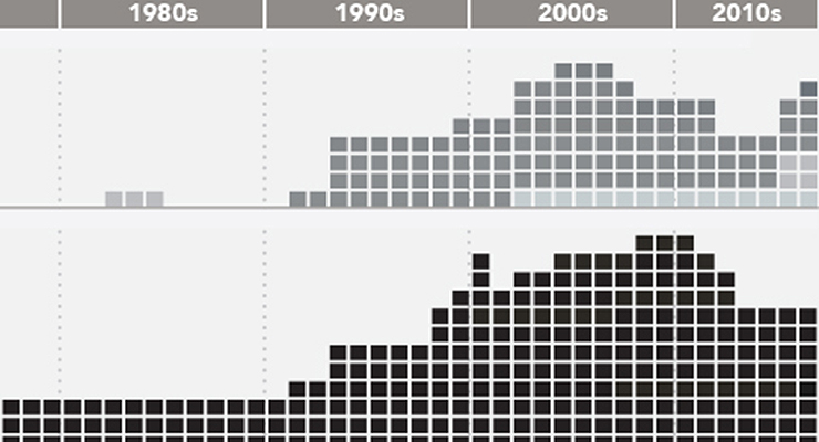
NWA had a profound effect on MLB uniform colors. (via John LaRue)
As far back as I can remember, I’ve always wanted to obsess over baseball jerseys. I say that with full apologies to Henry Hill, Ray Liotta, Martin Scorsese, Nicholas Pileggi, and anyone else who had anything to do with the opening line of Goodfellas. Nevertheless, it’s true. I remember rifling through the team pages of the 1982 Topps sticker album and wondering why teams chose certain combinations of colors and styles. Little did I know that it would become a lifelong obsession. I’m going to turn 40 in a few months, and that means I’ve witnessed a lot of data in the world of uniform colors. Let’s dive deeper into the evolution of MLB team colors since 1962.
I’ve selected 1962 as my starting point for two primary reasons. First, the 1960s saw the rise to prominence of the color television in American homes. This was a groundbreaking trend for businesses and the ad agencies that represented them. Baseball teams have as strong a brand as anyone, so they were sure to get in on the action. Second, 1962 was the second wave of MLB expansion, meaning the data set would start off with a robust 20 total teams– 10 per league. And expansion teams are a perfect view of the way a society and a market view colors at a specific snapshot in time (witness the teal and purple barrage from 1990s expansion teams).
What you see here is a year-by-year breakdown of every color that appeared in a major league team’s logo or uniform. The only exception is the exclusion of the white and gray cloth that serve as the base uniform color. Any other color of cloth (baby blue, cream, monochromatic jersey tops) is included. It also doesn’t include one-off throwback uniforms unless worn multiple times (for instance, the Padres’ use of brown and yellow this season). Now that we have ground rules established, let’s dig into some trends.
It’s All Over Now, Baby Blue
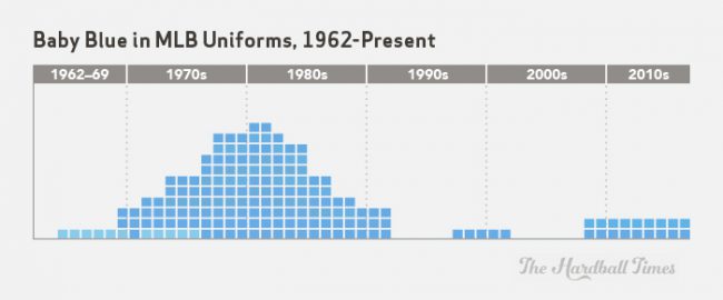
In 1964, the White Sox took the field on the road with baby blue uniforms. Their logic likely involved a combination of two factors. First and foremost, they wanted something less drab than a traditional road gray for color television broadcasts. Second, it was possibly an appeal to civic nostalgia as a callback to the Cubs wearing baby blue uniforms during World War II. Whatever the reason, baby blue uniforms started as a trickle with the White Sox, and then the floodgates opened by the middle of the 1970s. Baby blue hit its peak at 11 teams in 1980 and 1981. Because of the timing of the baby blue revolution, the color will spend the rest of history inexorably linked with polyester, AstroTurf, and sansabelt pants in the minds of fans.
Most fascinating about the baby blue uprising of the 1970s and ’80s is its enduring charm for fans. Baby blue survived the majority of the existence of the Expos and worked perfectly in Kansas City as a complement to the organization’s natural royal blue base. The color accented the only pennant to fly to date in Milwaukee and helped usher in championships in St. Louis and Philadelphia. Go to any game involving either the Cardinals or Phillies, home or away, and you are sure to see a baby blue Ozzie Smith, Willie McGee, or Mike Schmidt jersey. The brand is on the brain in those cities.
By the late 80s, the baby blue pipeline was drying up. Teams all over baseball were abandoning their polyester for button-downs, their AstroTurf for grass, their afros for sideburns, and their baby blues for the more traditional gray. Once the calendar turned to 1992, even the Royals and Expos had abandoned it. The Angels had a brief dalliance with baby blue in the late ’90s and early 2000s, but the color mostly died. Eventually, 21st century nostalgia brought it back in Kansas City, and the Rays adopted it in their brand overhaul.
I Am Curious (Yellow)

Every color has had a little bit of variance since the dawn of the color TV era, but none has had the variance of yellow. The Pirates got the ball rolling with a strong use of mustard yellow in the early 1970s. Around the same time, the expansion Royals were employing a richer yellow of their own. Both the Pirates’ mustard and the Royals’ deep yellow were in stark contrast to the traditional bright yellow of Charlie Finley’s Athletics and the Pirates of the ’60s. The Angels also entered the yellow realm in the ’70s with a more pale version.
Throughout the 1980s and early ’90s, the yellows employed by major league teams remained static. Then beginning in 1993, metallic gold and other tints staged a coup. The Royals, Brewers and Astros embraced metallic gold, a trend that survived–albeit in the form of different teams–all the way until today. Other teams chose to abandon yellow for even more unconventional hues into the 2000s. The Astros shifted from metallic gold to khaki, and the Diamondbacks added khaki to their mix in a 2007 rebranding. Most (in)famously, the Padres traded in orange for something in the realm of nicotine stains in 2005. The yellow trend overall seems to be brief bursts of brighter hues (the 1960s and 1980s), sandwiched around more classic, richer mustard and metallic (the 1970s, 1990s and most of the 2000s).
It’s Not Easy Staying Green (or Purple)
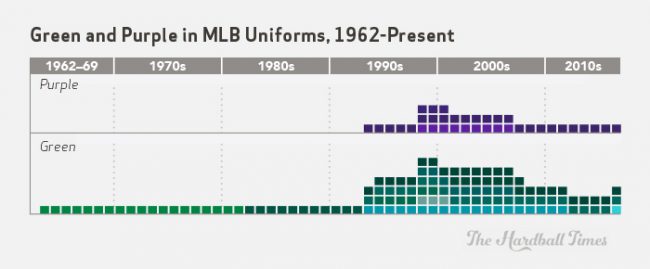
A strong sense of environmentalism in the 1990s gave green a prominent seat in color trends, both inside and outside of the game of baseball. Sure enough, MLB rebranding efforts in the ’90s involved the A’s shifting to a deeper hue of green, and both the Mariners and Brewers introducing green into their palette. Coupled with the birth of the Marlins and their teal in 1993, green had a stronger presence in the game than ever before, reaching its crescendo in 1998 when both the Diamondbacks and Rays joined the league and incorporated green accents in their color schemes.
Since then, green has had a slow descent back to earth. The Brewers were the first to abandon it in 2000 en route to their new digs at Miller Park. The 1998 expansion teams abandoned their respective greens in back to back years, first the Diamondbacks in 2007 and then the Rays in 2008. The Marlins ditched teal and every other green hue in 2012, leaving only the A’s and Mariners as the only two green franchises until Arizona reintroduced an electric teal accent this season. Even then, the 2016 M’s are dabbling in the blue and yellow throwback game, placing Mariners green on the endangered list.
Purple wasn’t nearly as prominent as green, but it enjoyed a similar trajectory, also propelled by 1990s expansion. All three teams to employ purple in major league history were born in the ’90s, with the Rockies standing as the lone holdout. The Diamondbacks held on to their purple until the 2007 brick red rebrand, and the Rays used purple for the first three years of their existence. But like green, it has faded out of major league existence except with the Rockies.
The NWA Effect
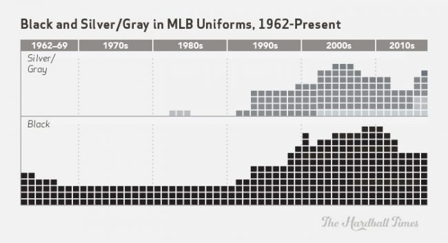
In the late 1980s and early 1990s, N.W.A. rose to prominence in the psyche of American youth. Their use of all black outfits and clothing featuring the NFL’s Los Angeles Raiders was a key part of who they were, and the black and silver look was becoming increasingly prominent. Combined with the fact that it gave them a more classic and nostalgic look, the Chicago White Sox embraced black and silver as they moved to new Comiskey Park. And the look was wildly popular. Just like with baby blue in the 1960s, the White Sox were patient zero for another uniform trend. Black had never been abundant other than a pairing with orange or yellow in San Francisco, Baltimore and Pittsburgh. The only prior appearance of gray (and metallic silver) was a brief splash on the Mets’ script logo in the early 1980s for a few years.
Next in line after the White Sox were the expansion Marlins and Rockies in 1993, who added both black and silver into their color schemes. The Mariners also adopted silver in their 1993 rebrand. In 1998 and 1999, the expansion Rays added black, the Reds gave black a front seat in their brand, and the Mets added it as an official accent. Even the storied Dodgers had added gray as an accent by the late 1990s.
Unlike green and purple–-the other 1990s trend–-black and gray/silver have mostly survived. Some stragglers have abandoned it–why exactly were the Royals and A’s dabbling with black to begin with in the 2000s?–but the new trend is charcoal, with the mid 2000s Blue Jays and current Diamondbacks latching on to it. Thanks to the expansion boom and White Sox ingenuity, black is here to stay with three franchises beyond the traditional O’s, Giants, Reds, and Pirates.
The Cream in the Clear

New ballpark trends in the 1990s inspired teams to abandon the bastions of the baby blue phase. AstroTurf returned to grass, polyester v-neck uniforms with sansabelts were tossed aside, and concrete donut facades returned to brick. This effect inspired many shifts to nostalgia in uniforms through the late ’80s and ’90s, but the biggest nod to nostalgia was yet to come.
In 2000, the Giants adopted a cream-colored uniform. San Francisco remained the only team to use cream until 2008. That’s when the Phillies and Indians, two other members of the original 16, jumped in the pool. The Mets and Twins joined in the fun in 2010, followed by the Braves in 2012, and finally the Cardinals in 2013. The Mets abandoned the cream beginning in 2015, but the Mariners picked it up as their own for Sunday home games. Add it all up, and cream is currently enjoying an alternate color peak that hasn’t been seen since baby blue’s 1977-1982 heyday.
The Rest: Blue, Red, Orange, and Brown
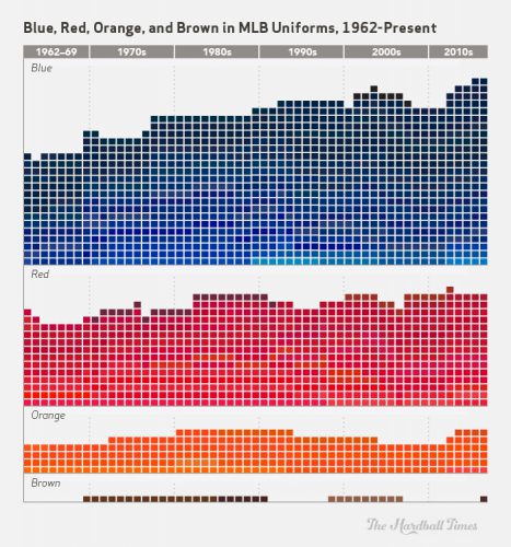
These four colors have been fairly static on uniforms since 1962. Teams like the Cardinals, Tigers, Giants, Dodgers, Orioles, Yankees, Red Sox, Indians and Cubs simply don’t change their color scheme other than a subtle shift lighter or darker from their base red, blue or orange. For brown, it simply means that it’s the most infrequently used color. Only the Padres have used brown, and intermittently.
The big trend for blue and red hasn’t been volume, but rather hue. The true impetus behind this project happened when I stumbled upon an old photo of an Expos-Braves game from the 1980s. Both franchises’ blues and reds have shifted darker since then, with the Braves shift occurring way back in 1987. The Brewers, Angels, Rangers, Mets, Braves, Mariners and Royals all took permanent steps to a darker blue from the late 80s through the early 2000s. The Expos’ royal blue disappeared in the move to D.C., shifting toward a more traditional navy blue.
On the red ledger, deeper shifts have happened to the Reds, Cardinals, Twins, Angels and Rangers, though these turns have been subtle. The Diamondbacks’ and Astros’ rebrands to brick red and the Expos’ D.C. transformation in the 2000s also shifted the red spectrum a bit darker. The only real victory for bright red over darker red hues came when the Phillies abandoned maroon for their more traditional red in 1993.
Meanwhile, fans can set their watch to the presence of orange. The O’s, Giants and Mets always have employed it on some level, and the Tigers have used orange on their road uniforms since the early 1970s. Throw in strong on-again/off-again relationships with orange for the Padres and Astros, plus the Marlins’ early 2010s rebranding, and orange has remained steady.
The Future
The biggest shifts in color schemes in recent memory have come about due to two factors. First, teams frequently will use new ballparks as an opportunity to rebrand themselves. This happened to the Padres, Marlins, White Sox, Astros (two rebranding efforts since Minute Maid opened), Brewers and Nationals. The Mariners also altered their color scheme in the lead-up to Safeco, though the two events weren’t directly related.
However, the stadium boom finally has dried up. The Rangers and Braves both have new ballparks on the horizon, but both franchises are locked into their blue-and-red palettes. It’s known that MLB would like new ballparks for the Rays and A’s, but the A’s surely will remain in some hue of green and gold. The Rays would be a ripe candidate for a rebrand, though their current navy blue/baby blue color scheme has served them well and is associated with the franchise’s most successful run.
The second major factor in a large color shift is expansion, as we last saw with the explosion of green and purple in the 1990s. And expansion is on MLB’s horizon, even if it is a bit further off. The 1990s colors were specific to overall (non-baseball specific) period color trends. The colors brought about by the next round of expansion will be determined in the same way, influenced by a larger color trend nationally and even globally. Additionally, location plays a factor, as it did with the Expos’ choice of French flag colors, the Marlins’ initial selection of teal, and the Padres’ 2005 rebrand featuring sand as a key color.
While cream has become more and more prominent, it appears to have reached peak capacity. It likely will begin a slow descent much in the same way baby blue did in the 1980s, non-essential accent colors eventually relegated to a very minor role.
On the other hand, the Diamondbacks’ bold 2016 rebrand foretells two potential big trends moving forward. Since the early ’90s, many teams have either added black or shifted their reds and blues to a darker tint. There’s a certain vibrancy from the ’60s and ’70s that has been lost. Major League color schemes are ripe for a bright jolt, and the Diamondbacks’ addition of electric teal this year–even as a simple accent–surely has made an impression.
Additionally, teams are seeking new accent colors beyond cream. The D-backs’ alternative this year is a dark gray bordering on charcoal. The Jays tried this not too long ago before returning their brand where it belongs in 2012 (that rebrand itself was a return to nostalgia). Brighter, more vibrant colors and very dark gray appear poised to gradually seep their way into major league color schemes.
Like the D-backs brightening their scheme with electric teal, the Brewers and Mariners have started to employ brighter blues and yellows. The Padres abandoned their muted sand for a more traditional process yellow. The Marlins certainly went brighter with their full-color-spectrum rebrand in 2012. The Astros’ 2013 shift stepped away from black, khaki and brick red, instead opting for orange. Every time a team has changed colors in recent years, it has pumped in more vibrancy, moving away from the dark, traditional hues.
In short, we’re witnessing a return to the same theory that guided ’70s major league teams’ color principles. Brighter is better, at least for now. And nostalgia is leading the way. The recent bright shifts by the Brewers, Astros, Blue Jays, Padres and the M’s weekend throwbacks all were preceded by nods to franchise nostalgia. Of course, all those franchises also had sunk toward extended mediocrity and wanted to change their image. Moving forward, that would seem to make the Rockies ripe for a refresh.
Interesting take on togs; this article prompted me to look up the RGC/HSV hues of MLB. Here is what I found:
1. The White Sox are the blackest-clad team in MLB (255-that is the max); that is NFL Raider-black territory.
2. The Tigers (86) and Yankees (135) are blue on the HEX palette—their appearances look black on my LCD TV.
3. The Reds are not the most-red club in MLB or even in Ohio. The Indians are the most-red team (227) beating out the Reds (198), Cardinals (196) and the Red Sox (189). For comparison, the NHL’s Red Wings are the reddest team in the Big 4 (236; 255 is max).
4. The Cubs are the most-blue team in MLB (227) over the Dodgers (156) Blue Jays (142) and the Royals (135). The NHL’s Blues appropriately max-out at 255 blue.
http://teamcolors.arc90.com/
http://html-color-codes.info/
I just pray future unis won’t look like those monstrosities from the Turn Ahead The Clock fiasco of 1999.
Read the post title, knew I’d love this post. Read it. Did not disappoint. Really nice clear presentation and I love when discussion isn’t overly long. OP and Paul Lukas of UniWatch should seriously get together and do a uniform podcast!
Could you please add the use of monochromatic uniforms (jerseys and pants have the same color) to your analysis?
I’d posit that the growth of hi-def / 3d / 4k screens helps the brighter hues pop from a distance on camera. Seeing many games in Phoenix, I can say that most of the new uni designs don’t read very well from a distance, particularly the darker ones, but on Tv they look okay. Great article!
It’s really interesting how uniforms have evolved. I remember when Charlie Finley put the Kansas City A’s in their colorful unis back in the sixties. That was really unique at the time. In fact, he did the same with the A’s minor league teams and I remember people going to see the Birmingham team when they came to Chattanooga just to see the uniforms.
Perhaps because I came of age in the sixties/seventies, I tend to prefer the more traditional uniforms. The Braves went through a variety of uniform colors and designs, especially when they were losing. In the late 80s, they went back to their more traditional uniforms, which I think most people prefer. Of course, most teams have multiple uniform colors and so on, probably so they have more merchandise to sell.
And, please, don’t go back to the White Sox short pants; that was not one of Bill Veeck’s better ideas, along with Disco Demolition Night.
Tradition gives way to innovation, innovation falls back to nostalgia when the long seasons of losing take its toll. Teams that win don’t change their look. Teams that lack a history that harkens to championships, will flip a uuniform as soon as the bloom is off the rose-(attendance drops). Yankees, Red Sox, Dodgers, Tigers, Giants, Royals, Cardinals and Orioles have kept traditional look and it adds up-a whole lot of winning World Series rings in the past 20 years