More WAR graphing fun!
Fearless Leader’s entry today on how to improve graphs has inspired some conversation at BtB and Tango’s blog.
For the most part I agree with everything Dave says – I do think that having the WAR values on the y-axis is helpful, which is about my only reservation with his advice.
But.
His graphs were aliased, and it drove me insane.
Now – and please indulge me a personal aside here – but I really am geekier than I think even most of my readers know. In fact, I’m pretty sure I’m geekier than even the two or three readers who catch the “Babylon 5” references that the editors don’t cut realize. (At least, I think one has survived.) And at varying points in my life, I’ve done things like, oh, four-color separation for printing presses.
And at the point today when I learned that Adobe Illustrator has graphing functionality, my doom was sealed.
So here’s my effort at making a similar sort of graph, but using Illustrator (and some post-processing in Photoshop):
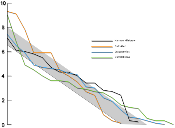
I don’t think it’s too bad for a first effort. I do know that I only used Illustrator’s graphing capabilities about a quarter as well as I think they could be. So, somebody throw out some ideas for me here. I think I need some practice.
I really like the way this looks, and you just convinced me to try visualizations in Illustrator.
Maybe the individual plot lines and text could be a tad bigger?
Dave,
Aliasing artifacts are the jagged pixels that are remnants of scaling an image (usually a raster image). If you look at Colin’s graph next to yours, you’ll notice that your diagonal lines have lots of jagged edges instead of a smooth plot. By using vector image software like Illustrator, Colin has avoided those aliasing artifacts.
Thanks, Tommy. Makes sense. It really is hard to please everyone.
“For the most part I agree with everything Dave says”
Suck-up.
It doesn’t hurt to butter up the boss a bit before you tell him his graphs are aliased!
Nick, I didn’t say I didn’t like the x-axis. I do find it mostly useless, but it doesn’t bother me. If you want to show the first and last point on the x-axis, that’s ok. That’s all you need. For the y-axis, I like see the scale. So far, Jeff at BtB has the graph I like the most, though I like the “non-aliasing” of Colin’s graph.
And the reason I like the WAR totals to the left, not right of the name, is taht this way both the WAR and the names will be aligned.
I like the X Axis. It provides useful information and doesn’t clutter the graph. I don’t know why Dave and Tango don’t like it.
As for this graph, it looks fine. I still think it has too little information. Given that BtB and THT get read by a lot of non regulars, it might be smart to allude to people what the axises and the numbers mean.
I would make the labels and lines bigger, so they are easier to read, and add some subtle horizontal gridlines so you can compare data points further from the Y Axis better. Then I would put the total WAR in parenthesis next to the legend. I posted one at BtB like that with some made up numbers:
http://img.imgcake.com/snapshot_2009-08-12_17-21-16×0.jpg
Tell me what you think.
What the heck is “aliased?”
Whether it’s a designer collaboration from Raf Simons — approved by dad Kanye West himself — or a retro version of a timeless look, these are the best sneakers to shop for Father’s Day this year.