What’s past is prologue
Roll up your sleeves; there’s going to be some math in this one. Let’s talk about regression to the mean.
True score theory
The concept of regression to the mean is rooted in what’s called true score theory. The theory states that a measurement consists of two factors: an individual’s “true score,” and measurement error, sometimes called random error. (I’ll take this opportunity to note that not all measurement error is random; some is biased.) In sabermetrics, we have taken to calling a player’s underlying talent (if it could be observed without measurement error) as “true talent.”
We can express this using a mathematical equation:
Observed Performance = True Talent + Random Error + Bias
(From here on out, we’ll be ignoring bias, for the sake of clarity.)
Obviously a baseball player’s innate ability isn’t constant: He can be nursing a minor injury or learn better plate discipline. A lot of things can happen to change a player’s true talent level. Of course, the same can be said of taking a test, the typical use case of true score theory. A student can be well-rested one day, tired another day, for instance. When we refer to something as “true” we simply mean that it is repeatable under the same conditions.
So what we notice is that when we observe something repeatedly, whether it’s baseball players or students, is those who did better or worse than the mean (or average) tend to perform closer to the mean as we add more observations.
What it looks like in practice
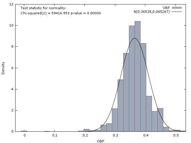
Let’s take a look at all batters who had over 100 plate appearances in a season between 1993-2008. The league average OBP in this period was .356. What we are looking at here is how well their OBP in their first 100 plate appearances in a season predicts their OBP the rest of the season. So with that in mind, here’s a look at how players who started differently fared over the rest of the season:
|
OBP_Start
|
PA
|
OBP_Rest
|
|
0.300
|
101992
|
0.341
|
|
0.320
|
145662
|
0.350
|
|
0.330
|
150128
|
0.350
|
|
0.340
|
165794
|
0.353
|
|
0.350
|
189717
|
0.357
|
|
0.360
|
188231
|
0.357
|
|
0.370
|
189845
|
0.360
|
|
0.380
|
169848
|
0.368
|
|
0.390
|
173844
|
0.365
|
|
0.400
|
164177
|
0.367
|
|
0.410
|
127379
|
0.374
|
|
0.420
|
123294
|
0.379
|
The first column is OBP in the first 100 PAs, the second column the number of PAs that group of players had after that, and the third column is the average OBP of that group of players after the first 100 PAs. (On average, each player had 393 PAs after their first 100, or 493 PAs in the season.
What this table shows us is that the concept of regression to the mean seems to do very well in predicting how groups of players will perform in the future.
Breaking it down
But do all individuals in the group regress to the mean? Let’s take a look at all players in our sample who put up a .320 OBP in their first 100 PAs. As a group, they put up a .350 OBP in the rest of the season. Pretty well regressed, right? But here’s a look at how the individual players in that group did:

While the group mean does move toward the overall mean, some players end up doing far worse than the mean, and some end up doing far better. We can look at this again, this time using a group that was above-average to begin with, say a .390 OBP:
Again, the group regresses to the mean: They put up a .365 OBP for the rest of the season. But again, some improved, and some did even worse than the mean.
Frankly, 100 PAs isn’t enough to tell us much of anything about a baseball player. The R-squared (in other words, the square of the correlation between OBP in the first 100 PAs and OBP rest-of-season) is only .105. We can look at a scatterplot with a regression line on it:
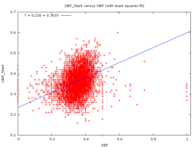
100 PAs of OBP simply doesn’t do a very good job of predicting future OBP. The answer is simply to use more PAs – if Pujols puts up a .320 OBP in his first 100 PAs, the question of how much he will regress to the mean will be almost entirely overshadowed by the fact that he’s Albert Pujols and he is the best hitter on the face of God’s green earth.
Do we regress Pujols’ OBP?
And since he’s Albert Pujols, and we have over 5,800 PAs of .426 OBP from him, we don’t expect him to regress toward the mean anymore, right?
Wrong!
Let’s rework our formula from the beginning. The variance (or spread) of OBP among baseball players in a given time can be broken down into:
Observed Variance = True Variance + Random Error
As the number of observations (in this case, plate appearances) goes up, random error goes down. In 10 PAs, one extra walk (or any other on-base event) is worth .100 points of OBP. In 1,000 PAs, it takes 100 extra walks to be worth .100 points of OBP. Errors become harder as the amount of observations go up.
But so does everything else: both kinds of variance decrease as our number of observations goes up. When we say that Pujols regresses to the mean, we don’t mean that he’s getting worse. We simply mean that due to the limited number of observations we have a certain amount of random variance that we have to account for. Typically for a very large number of PAs it’s a small amount of regression (probably not noticable if you’re rounding to three significant digits), and since his peers are typically expected to regress by the same amount it doesn’t change our relative opinion of him.
A side note about selective sampling
A funny thing happened on the way to the 101st plate appearance: Players who did very poorly tended not to make it that far, while players who did very well tended to get more PAs. There is a selective sampling bias here, in that teams allocate playing time based upon 100 PAs (as unpredictive as we assert that they are). Those players who tend to do poorly and still recieve playing time are generally either those who have done well in the past or who teams think are better players for reasons unrelated to performance to date, like scouting.
References & Resources
The information used here was obtained free of charge from and is copyrighted by Retrosheet. Interested parties may contact Retrosheet at “www.retrosheet.org”.
Here’s a great article about regression to the mean that goes into the history of the phrase. Another great resource on the topic is here (even though it focuses on basketball, not baseball.) And of course I’ve written previously on the topic.
The Sage Encyclopedia entry on reliability was a great help in preparing this article.
Graphs were created using gretl. All results were weighted by the number of plate appearances in the second sample – in other words, a player with 300 PAs was counted twice as many times as a player with 150 PAs.
Just taking a wild guess, I would say you would weight his 100 PA at “1”, his career 5800 PA at “0.40” (total of 2320 PA), and add in 200 PA of .356.
That gives me a weighted average of .417.
Now, if that’s all we knew, then that’s our best estimate.
Peter, RTTM doesn’t give us a “projection,” necessarily, simply an estimate of a player’s true score if we were to repeat the exact same conditions. So the answer I am giving here is not strictly speaking a projection, because it is not doing a lot of the things that I would do if I was building a projection system.
So to estimate uncertainty in Pujols’ OBP, we take:
(.320*100 + .426*5800)/5900 = .424
to find his OBP for the entire sample. (This is the part where I would have done things significantly differently if I was building a projection.)
Then we take .47/SQRT(5900) = 0.006 for our estimate of uncertainty in Pujols’ OBP. (As for where these numbers are coming from, check the appendix to The Book.)
We also need to estimate the uncertainty in our league average number – for right now, we’ll say .025. (Again, that’s coming out of the appendix to The Book.)
So then we take:
(.424/.006^2 + .356/.025^2) / (1/.006^2 + 1/.025^2) = .420
We can get more precise with that, but in this case I don’t know that it’s worth the fuss.
And again, that’s our estimate of true score assuming we repeated all of those PAs over again in the exact same conditions, not necessarily a projection (although our true score estimate and our projection for most players should be pretty close).
Or, we can do this slightly differently, and regress the year-to-date stats and the career stats seperately, as well as regressing to the population mean:
(.320/.044^2+.426/.006^2+.356/.025^2)/(1/.044^2+1/.006^2+1/.025^2)
The result? .420. I’m not sure if everything works out the same as the PAs go down, but at least in the case of someone like Pujols either approach should give the same results.
Re: Peter’s question. Given Pujols’ 0.426 in 5800 PA combined with his 0.320 in most recent 100 PA:
Best estimate of OBP = (0.426*5800+0.320*100)/5900 = 0.424.
Therefore, the best estimate of his OBP for the next N PA is 0.424, regardless of the size of N. I thought this was Colin’s answer before he took off on a tangent that I didn’t understand.
Ok, guys, where am I going wrong?
Colin – So Pujols has a .320 OBP in his first 100 plate appearances of a season. And you know that the league average OBP has been .356 and that Pujols previous OBP in 5800 PAs has been .426. Show how you would predict what Albert’s OBP would be in his next 500 plate appearances (essentially the rest of the season).
Colin, thanks for the link to The Book. It looks like a must read. Of course you’re right that the .49 would also just be an estimate of the SD since we don’t know the true OBP.
Ah, I wasn’t sure what you were doing with the formula involving the .025 – now I see you’re just weighting the estimates with the inverses of the variances. Keep up the good work, Colin! I’ll definitely read again…
Colin – it’s my first time posting (and reading) and I don’t know what “The Book” is, but where does .47 come from? Assuming you’re finding the standard deviation (SD) there, it should be sqrt(.424(1-.424))=.49, right?
Also, why does the .356 estimate have a higher SD associated with it than the .424 based on only 5900 PAs?
I’m looking forward to reading a lot more!
David:
The Book is a great resource for anyone who cares about baseball strategy; all the strategy stuff is sandwiched between the Toolshed and the Appendix, which are great reads for anyone who cares about baseball stats, whether they relate to strategy or not.
You’re right about the calculation for standard deviation, of course, except for the fact that what we really want (assuming I’m reading this all correctly) isn’t a player’s observed OBP but his true-talent OBP to calculate the SD. I’m using a shortcut here (there is a more in-depth method listed in the appendix) mostly because I don’t enjoy recursion, although I don’t think it matters much for the example listed here.
But yes, I could certainly do it the way you did it and it would be more accurate.
The .356 estimate has a higher SD because we aren’t using the uncertainty of our estimation of the population mean (which is essentially negligable) but the average uncertainty of any given player. In other words, we go through and calculate the SD of each player’s OBP and take the weighted average of that. Again, I haven’t done that here, and simply relied upon the work that Andy Dolphin did in preparing the Appendix to The Book.
Eli at Count the Basket gives a lot of good info on how to make the sausage, even if he does focus on basketball.
Alan:
Essentially, it’s for the same reason that a guy like Chipper last year or Mauer this year can start off batting .400, but nobody has actually done it for a whole season since Ted Williams. The more PAs you get, the harder it is to sustain an abnormally high (or low, it should be noted) level of performance. So just like our example .390 OBP players put up a .365 OBP rest-of-season, if we took a look at all the guys who put up a .424 OBP in 5,900 PAs, we would expect them to put up a (say) .420 OBP in their next X amount of PAs. (In reality, there aren’t a lot of .424 OBP in 5,900 PAs, so that probably doesn’t work as well as the .390 in 100 PA example.)
Please let me know if I’m making sense here.
Colin…sorry, I just can’t follow your argument. I agree that with lots of PA, it is hard to sustain an abnormally high or low OBP. It seems to me that the best estimate of future OBP is past OBP, based on all the available data. So, in my little calculation, I simply recalculated OBP, initially based on the first 5800 and updated to include the next 100 PA. It seems to me that the resulting OBP, 0.424, is the best estimate we have of OBP going forward. That is, in the next N PA, our best estimate is the the batter will get on base 0.424N times.
So I ask again, where have I gone wrong?
Alan, to word Colin’s explanation a bit differently: if you had no prior knowledge at all of the distribution of OBPs across all hitters, then you’re right – .424 would be the best estimate. But even though 5900 is a pretty big sample, the knowledge we gained from those 5900 PAs still doesn’t completely wash out the fact that most hitters have OBP far less than .424, and so we have to adjust the .424 back towards the mean – the exact equation for doing so would be complicated, but Colin is using a (probably quite accurate) shortcut to decide the weighting between (i) all this player’s PAs, and (ii) the known average of OBP
Alan, it is a pure Bayes problem.
Say that you know that the distribution that Pujols is drawn from is a league average of .700 OBP, with 1 SD = .010.
And you have Pujols with 1000 PA with a .400 OBP. What’s your best estimate at his true talent level?
Now, imagine he put up that kind of performance, but the league average was .300, with 1 SD = .010. What’s your estimate?
This is similar to flipping a coin, and you know that there is a couple of weighted coins, and the rest are not weighted. The question comes down to: what is the chance that the coin you have is weighted, knowing the results of your flip?
In other words, even after 5900 PA’s of OBP performance 68 points above the mean there is still a small (but non-zero) probability that Pujols is no better than an average major league hitter. That is true. And it will still be true after 10,000 PA’s, although by then the chance will be very small indeed. To use Tom’s analogy, just because a coin comes up heads 6,000 times in 10,000 flips doesn’t prove it’s a biased coin.
Ballplayers aren’t coins, though. The null hypothesis with a coin is that it is unbiased (or at least that, if there is a bias, it is so small as to be undetectable by anything as crude as repeated flipping). The null hypothesis with ballplayers is (or at least ought to be) that they are biased. The very fact that they are in the major leagues at all tells us that they are in the extreme tail of the distribution of all baseball players. The fact that a player has already racked up over 5,000 MLB PA’s by age 29 places him in the extreme tail of the extreme tail. If we want to regress Pujols’ OPS toward the mean it should be toward the mean of that very small subset of the population.