Why does Pujols regress to the mean?
This is a followup both to my article on regression to the mean and David’s article on true talent.
I want to highlight two comments. First, a comment on my article from Alan Nathan:
It seems to me that the best estimate of future OBP is past OBP, based on all the available data. So, in my little calculation, I simply recalculated OBP, initially based on the first 5800 and updated to include the next 100 PA. It seems to me that the resulting OBP, 0.424, is the best estimate we have of OBP going forward. That is, in the next N PA, our best estimate is the the batter will get on base 0.424N times.
So I ask again, where have I gone wrong?
(For those who missed out, we were discussing a hypothetical Albert Pujols who in his next 100 plate appearances were to have an OBP of .320, as an illustration of how that affects a forecast. All of the numbers presented here are based upon this hypothetical Albert Pujols.)
And from Moe on David’s article:
The way you approach the problem seems to be with Bayesian statistics. You draw a player from the distribution of all major league players and start with the “belief” that he is average (which of course is totally reasonable). Then you use the information you gather over time to update your belief about the player.
However, if your initial belief were different (for example, that Ichiro is not like anything that has every played in the majors and hence you have no initial prior or that he is the second coming of Ted Williams) you would get a different conclusion. The importance of the initial belief decreases over time, as you nicely describe above, but it never goes away.
Neither of them are wrong. But it does bring up something worth noting.
Some assumptions
Okay, first off, a disclaimer that needs to go in great big bold letters blinking in green and red neon: All of what proceeds is based upon the assumption of a normal, or Gaussian, distribution. This is a model we are using in order to describe reality. To the extent that the normal distribution misses something important, so will this model. (I will return to this caveat after the illustration is done.)
I am, in fact, using a “shortcut” proposed by Andy Dolphin in the appendix to The Book. I cannot explain these things as well as Andy can, so please, if you are interested in the subject, I would highly advise reading the appendix. I am also ignoring the fact that more recent plate appearances are more predictive than less recent plate appearances, as that’s a seperate topic and that would make the calculations much more confusing: the point here isn’t so much to project Pujols as it is to illustrate a point about how we would project Pujols.
Measuring uncertainty
To go back to the original comment, yes, our best estimate of a player’s future performance is his past performance (while taking into account other factors such as aging that we are again ignoring for simplicities sake). There are two components to our estimate: what we think he will do going forward and our uncertainty about our forecast.
In the case of Pujols, we would estimate his OBP going forward as .424, with an uncertainty (expressed in standard deviation) of .006. In other words, about 68 percent of the time, Pujols’ OBP should be between .418 and .430.
But we also know that it’s harder to put up an OBP of .430 than it is to put up an OBP of .418—the further we go from the league average, the more unlikely it is. In the case of a league average hitter, we would predict an OBP of .356 with an uncertainty of .025; in other words, 68 percent of the time we’d see an OBP between .331 and .381. (As I mentioned in the comments, this is really the weighted mean of the uncertainty of every hitter in the league, rather than the uncertainty of our measurement of the mean.)
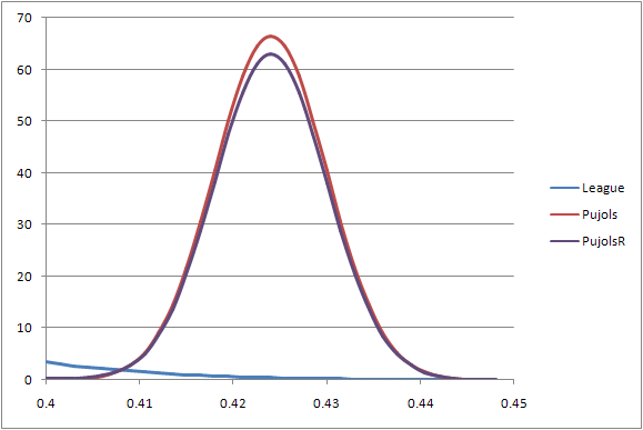
Let’s compare these two curves:

As you can see, the curve for the league average hitter is much shorter and squatter; the curve for Pujols is much tighter and much taller. Let’s focus in on only the part of the curve occupied by our estimate of Pujol’s performance:


Pujols is such an extremely good hitter that we’re extremely unlikely to see an ordinary MLB hitter put up those kinds of numbers; he’s about 2.75 standard deviations away from the league mean. The odds are somewhat less than two percent for a typical hitter to put up that high of an OBP in about 310 plate appearances.
But again, we see more probable outcomes at the left tail of the curve than the right tail. Yes, Pujols is an extremely good hitter, but he is more likely to underperform his average OBP than he is to overproduce it. We can see that reflected in the little sliver of the average curve that intersects with Pujols’. What we want to do is bend the curve a bit to reflect that:
(What I did there, for those curious, was take the weighted average of the two probability curves, using the inverse of the square of the uncertainty as the weight.)
It bears noting that the peak of the curve did not move toward the left, simply down. Our initial estimate of Pujols’ OBP is still the most frequently occuring value, what statisticians would call the “mode.” But the peak does shrink. To really get an idea of what’s going on here, let’s focus in on the lower left corner of the graph:
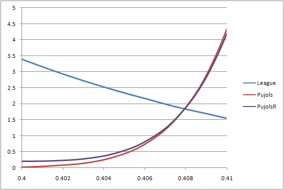
The regressed probability curve doesn’t quite hit zero the way the unregressed curve does. It’s a very slight effect, to be sure, but the tail continues on further to the left than the unregressed curve. And so while the mode doesn’t change, the mean certainly does shift very slightly to the left, by about four points.
And that’s all that we mean when we say hitters like Pujols (or Chipper Jones, or whoever you want to use) regresses to the mean. While his performance to date is our best estimate of what he will do, if we are being asked to pick the single most likely outcome, we need to regress to the mean to find the outcome that best reflects the probability of all of the potential outcomes.
Now this is the point where Pujols passes out of our tale, and we move on to considering the applications towards the other end of the scale.
The gray area
Remember at the start, when we said that we were assuming a normal distribution?
We don’t have one. Or rather, we have two:
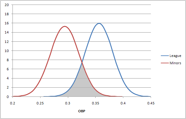
This is what’s referred to as a bimodal distribution, or a distribution with two distinct modes. Typically this happens when two normal distributions end up mixing together. The red distribution is based upon the spread of OBP talent in Triple-A, using the regular Davenport Translations for 2008, in other words an estimate of what those players would have done had they been playing in the major leagues.
The average translated OBP for Triple-A players last year was .294, or 62 points of OBP away from the major league mean of .356. The standard deviation for each distribution is pretty close to the same, given the same number of plate appearances: .026 for the minors and .025 for the majors in 310 plate appearances. That means that players halfway between the two are just a shade over one standard deviation from both means.
The gray-shaded area represents the area that can be easily represented by either mean. (As plate appearances decrease, the overlap goes up; as plate appearances increase, the overlap goes down.) And here’s the crux of the matter: over 310 plate appearances, there’s a slight but not unreasonable chance for an average minor-league hitter to put up a major-league average OBP (less than 2.5 SDs, or less than two percent of the time) and vice versa.
That doesn’t sound like a whole lot, until you realize that t any given time there’s about 390 position players on major league rosters and a similar number of players on Triple-A rosters. And players frequently move between the leagues all the time, thus the mixing. So in a small enough sample of performance, we have to decide which mean we want to regress some players’ performance to the major league or minor league mean.
What projection systems do
So what do most projection systems do to determine what mean to regress to for players they are projecting? For the most part, projection systems will regress everyone to the major league mean, even guys who haven’t played a day above Double-A.
Why? Because if that player does end up with any significant amount of playing time in the majors, they likely do belong to the population of major league players. In other words, you end up with more accurate projections that way.
But what that doesn’t mean is that if, say, an older veteran player and a younger farmhand with no MLB experience have the same projection, that they have the same odds of reaching that projection. It’s the difference between having a dollar and having a chance at a dollar on a scratch-and-win card. But when projection systems are tested for accuracy, all the cards that don’t win are simply thrown out and ignored.
References & Resources
The use of the DTs was because I already had scraped them for another article, which longtime readers may recall. I used the older DTs, not the updated ones for the PECOTA cards, which should be alright. If I used different MLEs, I would probably have come up with different results. For the purposes of illustrating the concept, that doesn’t matter. (As for which set of MLEs is more correct than another – I really don’t know. Perhaps a study for another time?)
Also, many thanks to Joe Arthur for turning me onto the idea of a bimodal distribution.
Where did the .356 average OBA come from? It’s more like .330.
I’m a bit confused: you say that 1. in mixing the distributions (or actually mixing the PDFs of the distributions) the mode stays the same but the mean shifts, and 2. talking about the phenomena of regression to the mean, you say “if we are being asked to pick the single most likely outcome, we need to regress to the mean to find the outcome that best reflects the probability of all of the potential outcomes.” But the “most likely outcome” is actually the mode, not the mean, right? Which you say doesn’t change? I might be missing something here.
Also, the mode does shift, right? The peak will actually shift very slightly to the left, though it might not actually be noticeable on the graph.
Colin,
here’s a link to an article on “non-parametric regression to the mean” with some nice pictures:
http://www.pnas.org/content/100/17/9715.full#sec-4
The authors illustrate their technique by simulating a bi-modal distribution [upper left picture], simulating random (measurement) errors on that sample [upper right], applying their non-parametric regression technique [middle left] to the sample with measurement errors and contrasting a classical regression which assumed the population had a Gaussian distribution [lower left picture]. Classical regression appears to give a far worse approximation of the uncontaminated original population.
In the case of a Pujols, the techniques might disagree about the exact amount of the regression, but at least they would agree on direction. The really interesting cases involve the “marginal” major leaguers – do they really regress in the direction of the major league mean? You’ve given a nice illustration of why they may not.
Before commenting on the main issue of this thread, let me ask a simple question. How did you arrive at 0.006 as the 1-sigma uncertainty for Pujols? I always thought that for Gaussian statistics, the uncertainty is the square root of the mean value. My estimate is more like 0.0085. I get this by taking sqrt(OB)/PA. With PA=5900 and OBP=0.424, then OB=2502, from which I get my result.
dave – I should have been more clear about that. Everything presented here was in the context of last week’s article, where I was using the first 100 PAs to predict performance in PAs past 100. That’s where the .356 figure comes in; I used the average OBP of players who had over 100 PAs. (The article started off as a comment and just grew way past its own size.)
carl – Yes, that was phrased incorrectly. Very incorrectly. As soon as I figure out a clean way to rephrase that, I’ll submit a clarification to the editor (Tango pointed out another point of clarification in his blog that I need to address as well.)
As for the mode shifting, I’ll have to examine that closer. I took the spreadsheet I used to generate the graphs and decreased the space between points on the graph from .25 SD to .01 SD and the peak still shows up a .424. You may still be right – just because an effect doesn’t materialize itself in one test case doesn’t mean it doesn’t exist.
joe – Thanks for that link. It’s a lot of stuff to unpack (I’m very, very bad at reading that sort of mathematical notation, so it takes me way too long to digest that sort of stuff), but I look forward to tackling it.
Alan – You could well be right. What I’m using is the formual for the standard deviation of a binomial distribution, which is:
SD = sqrt(n*p*q)
Where n is the number of trials (PAs), p is the chance of sucess (OBP) and q is the chance of failure. That gives us the standard deviation in terms of times on base. What we really want is standard deviation in terms of OBP, which can simplify down to:
SD = sqrt(p*q/n)
Or:
SD = sqrt(OBP*(1-OBP)/PA)
I use that SD to then create a normal approximation of the binomial distribution. (For large values of n using the binomial distribution itself becomes prohibitive, because factorials are involved.)
So, again, the formula you state could be correct for the normal distribution itself. (I went looking through my stats text book that I have and couldn’t find anything to say either way; it looks similar to the formual for the standard error of the mean.) I went through and tested the two formulas against each other to see if they tracked each other reasonably well, and they did.
unfortunately, the data is incomplete as the recently DFA’d Tony Pena, Jr. was unable to be represented on the curve since his OBP was soooo many standard deviations to the left. In fact, Dayton Moore has focused his efforts on overpaying for anyone on the left side of that curve, a new idea in the typically conservative midwest
Colin: actually, now that I think about it, you
are probably right. I was (incorrectly) extrapolating from my own experiences where the underlying distribution is binomial, but with p<<1, in which case the (1-q) term can be safely ignored. Thanks for correcting me.
Oops…I meant the (1-p) term can be ignored (since it is essentially 1).