Rethinking the Strike Zone: It’s Not a Grid

Let’s reimagine the strike zone, but not as a grid.
For many years, you’ve been led to believe that the strike zone should be divided into boxes, little boxes made of ticky-tacky arbitrary zones, little boxes in the strike zone, little boxes all the same.
If you browse any modern baseball website, such as FanGraphs, Baseball Prospectus, MLB.com, and ESPN, you’ll find that they all depict the strike zone as subdivided into some form of a grid. Some have larger “hearts” where the inner square is larger; others are symmetrical grids. You might find some with slightly more complex shapes, with “L” shaped corners. This author wrote an entire article, wherein the basis of the research was where a pitch was located in an arbitrary square or rectangular zone.
The very talented Bill Petti employs this standard approach on his excellent Edge % web app; today’s article is in many ways an evolution of Bill’s Edge % work. Other important strike zone research includes (but is certainly not limited to) Rob Arthur’s initial assessment of StatCast’s accuracy, as well as the Baseball Prospectus team’s detailed proposal for a universal strike zone, and its elucidation of the measurement challenges attendant with and the implications of a robotic strike zone.
Today, we’re addressing a different concept, specifically our tendency to divide the zone into boxes.
The core flaw in the current models is that squares are an inaccurate shape to classify how far away a pitch is from the center of the strike zone. The four corners of a square are much farther away from the the center of the square than the midpoints of the vertices. We can of course draw a lot of boxes and increase our resolution, as we do with modern television. However, this is not practical with the strike zone.
The main purpose of drawing a grid is to give you a sense of how far away the pitch is from the middle of the zone. Squares and rectangles have been silently misleading you for years.
It’s time to rethink the strike zone. It’s time to stop thinking in terms of grids of squares and rectangles. It’s time to start thinking in terms of concentric circles.
Let’s draw a picture:
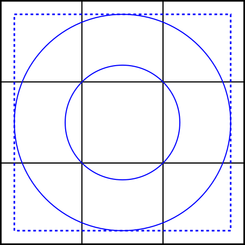
In part one of this series, “It’s not a Square,” we redefined the strike zone as a superellipse, rather than a rectangle. For visual clarity, we’ve drawn this as a square for the initial discussion.
We see a basic three-by-three grid, with a couple of circles. The inner circle surrounds the central square, which we’ll nominally refer to as the “heart” of the zone. The area between the outer square and the inner blue dotted line we’ll call the “edge” of the zone.
Let’s talk about the heart of the plate first. If we constrain ourselves to using the square heart, we’re leaving out a lot of surface area that is equally as far away from the center of the zone. The point on the far left of the inner circle, at the center of the vertical axis, is just as close to the center-center of the plate as any of the four corners in the square heart. Why are we using a pixelated methodology, when we can draw circles?
If we look at the edge, we’re leaving out a large amount of surface area that is outside of the larger circle, but within the dotted square. Those pitches are just as difficult to hit as the ones that are on the square edge. Further, as we discussed in part one, the corners are actually bad spots to throw to if you’re looking for a called strike, so they operate differently than the horizontal or vertical edge would, at the middle of the zone.
Which arbitrary rectangle of the strike zone a pitch was thrown to isn’t what’s important. What’s important is this:
- How far away from the center-center of the strike zone was the pitch?
- Was the pitch in the probabilistic strike zone?
Now, we could make that a little more complex and separate the vertical and horizontal components of distance. We could also incorporate directionality into our model (inside vs. outside, or up vs. down). This author is a big fan of simplicity, so we’ll be taking all the pitch locations and summarizing them to the above metrics (distance from the center, zone yes/no), before we propose a slightly more nuanced version.

What the Data Say
Pitchers, when they choose the location of the pitch are optimizing for three outcomes:
- Limiting quality of contact (we’ll measure this with wOBAContact)
- Maximizing called strikes (we’ll measure this with Called Strike % on pitches taken)
- Maximizing swings and misses (we’ll measure this with Swing & Miss %)
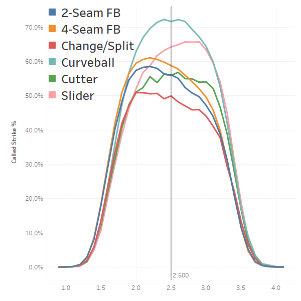
Let’s look at a chart from the perspective of the three metrics listed above. We’ll ignore foul balls in this analysis, as well as bunts and bunt attempts. Each metric is charted based on the distance from the center-center of the strike zone, adjusted for batter handedness, and assuming a vertical center of 2.5 feet.
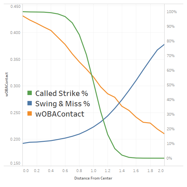
The value of contact is very nearly a linear function based on the distance. This implies that if we want to model wOBAContact, the most accurate way to represent it would be to draw a straight line from the center of the strike zone and create a series of concentric circles. If we were to dig into this a little more, we may want to skew the circles a bit, based on inside vs. outside and up vs. down. This author, as stated above, strongly prefers simple models. Simple models are easier to communicate, and sacrifice some accuracy for a huge gain in clarity. We’ve glossed over the differences between various pitch types and how they interact with these three metrics. We’ll touch on those later.
How many circles? Looking at wOBAContact, we could draw any number of arbitrary circles. However, if we look at the Called Strike % curve, we see that from 0.0 feet to 0.5 feet, we get near 100 percent probability of a called strike, followed by a rapid descent as the pitch gets farther away, followed by a near zero probability of getting a called strike. We could make the case the 0 to 0.5 is clearly the heart of the plate, an area with a very low probability of getting swings and misses, offset by a near-certain called strike if the pitch is not swung at.
Called strike groups are a natural way to splitting up the zone, since that is the core functionality of the zone, an area that will either get a called strike or not. Based on this, we split the zone into “Certain Called Strike,” “Extremely Likely Called Strike,” “Rapidly Declining Probability of Called Strike.”
This author settled on splitting the strike zone into three equal parts, based on quantity not volume. In other words, instead of creating three equal groups of surface area, we created three groups wherein roughly a third of pitches would fall into each of these zones. These were named “Heart,” “Control” and “Command.” The names as well as the number of groups were largely arbitrary. There could be much better ways to split up the strike zone, as long as you’re doing it with circles, or at the very least ellipses, within a superellipse. There was no strong rationale behind three equal parts; this decision was largely arbitrary.
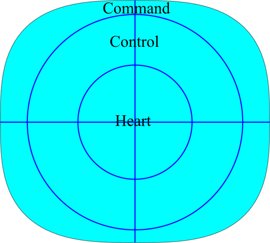
Keeping in mind that the strike zone isn’t a square (it’s a superellipse!), I’d like to propose the following framework for looking at the strike zone. Note that the drawing may not be a perfect mathematical representation of the formula outlined in part one. The outer zone was created using Procato’s Super-Ellipse Calculator.
Proposed Strike Zone Model
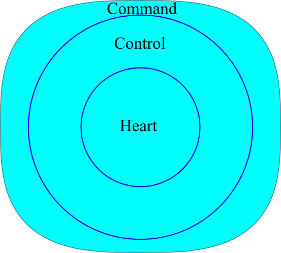
We start with a superellipse, with a height that is 90 percent of its width. This is the probabilistic strike zone we explored in part one.
The innermost circle, which can be larger or smaller depending on your own analysis, should be considered the “heart” of the plate. The size of the circle is entirely arbitrary and depends on what you want to convey with the word “heart.” Today’s definition simply implies the one third of pitches that end up in the superellipse strike zone that are closest to the center-center. It also conveys a near certain called strike.
The control zone is the next third of pitches within the zone. The word “control” conveys the skill of being able to get called strikes, while avoiding the heart of the plate. This implies a 90 to 100 percent chance of getting a called strike, and borders the area where called strikes start to rapidly decline.
The command zone implies the hardest part of the zone to hit. If a pitcher can consistently throw to the command zone, then it follows that he can command his pitches. One could easily make this zone considerably smaller; it depends on what you’re trying to convey. Today’s focus is more on the conceptual model, rather than digging into optimal classifications.
This author’s hope is that once you start thinking of the strike zone in this manner, every grid-like/rectangular representation will annoy you as much as it does the author. We can debate how big the “heart” circle should be, how many circles we should be drawing, or even if we should use ellipses instead of circles. However, there is no question, in this author’s opinion, that this framework is the best way to represent the strike zone. Later on we’ll dig into some pitch-specific tweaks we may want to make, in order to increase accuracy at the expense of increased complexity.
Metrics for Heart/Control/Command
Let’s look at some high level metrics for our three zones, for all pitches thrown within the probabilistic strike zone outlined in the first article of this series, excluding bunts and bunt attempts.
| Heart | Control | Command | |
|---|---|---|---|
| Number of Records | 1,225,241 | 1,222,749 | 1,220,902 |
| Location % | 33.4% | 33.3% | 33.3% |
| wOBAContact | 0.406 | 0.370 | 0.335 |
| Called Strike % | 99.2% | 93.9% | 73.3% |
| Swing % | 71.2% | 65.2% | 56.7% |
| SwStr% | 8.5% | 9.4% | 9.8% |
| Swing & Miss % | 11.9% | 14.4% | 17.3% |
Pitches to the heart of the zone have a greater than 99 percent chance of being called a strike. The control zone sacrifices a little called strike certainty for increased swing and miss and reduced quality of contact. The command zone sacrifices a lot of called strikes, but minimizes quality of contact and maximizes swing and miss.
Adding in Some Nuance
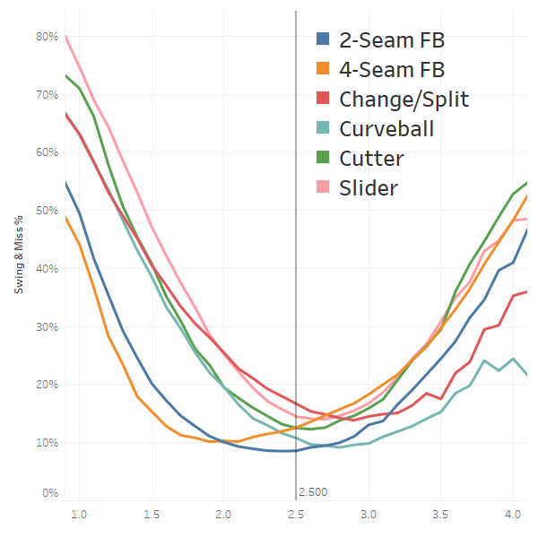
Let’s sprinkle in a little nuance that doesn’t conform perfectly to our model. Let’s begin by looking at swing and miss percentage by horizontal location. Negative values are always inside; positive values farther away from the hitter.
Swing & Miss Location by Horizontal Location
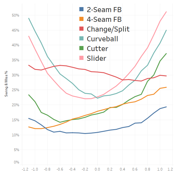
Four-seam fastballs get more swings and misses the farther they are from the batter. Two-seam fastballs follow a more parabolic curve. However, they also benefit more from being thrown away, rather than in. Change-ups don’t really get any benefit, in terms of swing and miss, from horizontal location. Cutters should definitely be thrown away from batters. Curveballs and sliders behave as we would expect.
Swing & Miss Location by Vertical Location
Other than curveballs, which max out when thrown high, vertical location is fairly consistent across pitch types. Generally speaking, much lower, out of the zone, will get more whiffs than higher, out of the strike zone. The centers of each curve will differ, but within the probabilistic strike zone, our simple distance model fits nicely.
wOBAContact by Horizontal Location
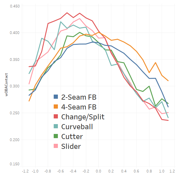
This graph is basically all about pulling the ball. All pitch types give up more damage on the inner half of the plate, suggesting that pitchers should pitch to the outer half of the plate, when optimizing for damage control, for all pitch types.
wOBAContact by Vertical Location
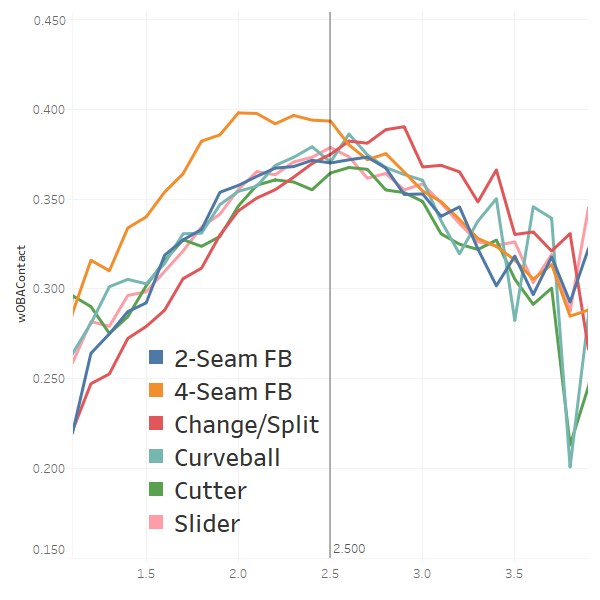
Unlike horizontal location, where throwing to the outer half was better for both swings and misses as well as contact management, vertical location has the opposite dynamic for four-seam fastballs. The data are far noisier for off-speed pitches, but they do conform quite nicely to our model.
Called Strike % by Horizontal Location
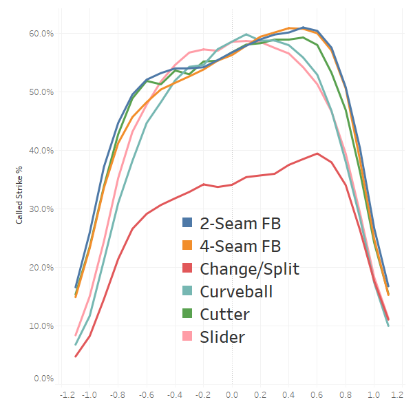
Don’t focus on the change/split being much lower than the other pitch types. This is likely due to the influence of vertical location. All pitch types exhibit very similar curves, with slightly higher called strike rates on pitches to the outer half of the plate. So essentially, the inside-versus outside benefit accrued for swings and misses and wOBAContact are offset here by fewer called strikes. I don’t have a great explanation for why the outer half gets called more than the inner half, other than a theory that it’s easier for umps to see pitches on the outer half.
Called Strike % by Vertical Location
Change-ups have a really weird called strike percentage profile. This is due to a much larger portion of change-ups being thrown way out of the zone, as compared to other pitch types. Change-ups thrown middle-middle are crushed, leading pitchers to focus on maximizing the distance from the center.
Summing up Horizontal and Vertical Nuance
Generally speaking, as we move away from the true center of strike zone, we experience predictable changes in outcomes. The large exception relates to swings and misses with respect to horizontal location. If a pitcher is optimizing for a specific outcome (such as a swing and miss), horizontal and vertical location become much bigger factors as opposed to distance in general. This author is of the opinion that the simple model does a good enough job at expressing the core trade-offs and is well worth the sacrifice in greater model fidelity.
Pizza Slice Model
If you believe the model above is overly simplistic, a simple modification would be to convert each zone into pizza slices. This would look something like this:
One could then capture the distance (Heart/Control/Command) as well as nuance (up and in/up and away/down and in/down and away). This would give us 12 distinct zones to classify pitches that would have more accurate distance profiles than boxes. Alternatively, we could produce a nine-zone version that didn’t split up the heart of the plate:
This model has the same number of zones as a simple three-by-three grid, but each zone will be clearer as to what it represents. If we’re discussing a pitcher trying to throw his slider down and in, a pitch to the heart doesn’t really matter if it is in the bottom-left part of the heart. However, knowing whether the down and in slider was in the “control” or “command” zone is critical information. The great part of this model is that we keep the same number of zones as a simple grid, but will be able to model them much more accurately.
Concluding Thoughts
The strike zone is a beautiful, constantly shifting puzzle; the pitcher has to decide, based on a host of variables, where he should aim his pitch. In part one, “It’s Not a Square,” we argued that the strike zone is better represented as a superellipse, rather than a rectangle. Today, we pushed the envelope one step farther, suggesting that we shouldn’t be chopping up the strike zone into squares. We should be slicing the zone into a series of concentric circles, with perhaps a pizza slice layer on top of these circles. Hopefully, once you see the strike zone this way, you won’t be able to see it as a grid of squares and rectangles anymore.
References and Resources
- Super-ellipse Calculator & Plotter
- Rob Arthur, FiveThirtyEight, “Baseball’s New Pitch-Tracking System Is Just A Bit Outside”
- Wayne Boyle, Baseball Prospectus, “Prospectus Feature: The Universal Strike Zone“
- Wayne Boyle, Sean O’Rourke, Jeff Long, and Harry Pavlidis, Baseball Prospectus, “Robo Strike Zone: It’s Not as Simple as You Think“
- David Kagan, The Hardball Times, “The Physics of the RoboUmp”
- Bill Petti, Edge %
- Bill Petti, The Hardball Times, “Expanding the Edges of the Strike Zone”
- Jon Roegele, The Hardball Times, “The 2017 Strike Zone“
Eli – this was fun. Good job.
The concept is interesting, but the strike zone is defined by straight lines, so an ellipse with concentric circles doesn’t seem like an apt depiction. It also seems as if hitters react differently to the vertical and horizontal location of a pitch. It would be interesting to see how the different vertical and horizontal distances compare to each other when keeping the other constant. The relationship between those two could either validate or nullify the notion of the strike zone as an ellipse.
If you like superellipses, why not draw concentric superellipses?
Really though I don’t get the point of setting up any large chunks of the zone. What’s the point of quantizing to one side or the other of an artificial line? Whatever your metric of interest, why not have a continuous-valued map of it across the space?
Although the strike zone may be defined by straight lines, the PRACTICAL strike zone – the strike zone as called – is somewhere in between a true elliptical one and the rectangular one. I’d say roughly half way in between, but that’s really little more than a wild ass-guess.
You are correct, it’s a superellipse. Take a look at part 1 of this series: https://tht.fangraphs.com/rethinking-the-strike-zone-its-not-a-square/
“I don’t have a great explanation for why the outer half gets called more than the inner half”
Gets taken by batters more often than the inner half, I think you may be seeing.
The graph reaches no higher than 60%, which is too low to be strikes / called pitch, so I’m guessing you plotted strikes / thrown pitch.
I didn’t slice the opposite axis into a narrow range, so it’s polluted by the % of pitches thrown outside of the vertical zone.
I understand you ignored foul balls for this analysis, but I would be interested in seeing the horizontal/vertical location graphs for those as well. The outcome of a swing being a swing & miss (bad for hitter), foul ball (slightly net negative), or ball in play (net positive) – are there areas where pitches generate similar wOBAContact but different Foul%?
A really interesting take, thanks Eli!
Thanks for this interesting read! There is definitely more work to be done in the final section about dividing up the model…thinking about where the dividing lines are. I feel like there’s a case to be made that the lines in the Control circle should be rotated 45 degrees, so you have control up, control down, control in, control out. This way you don’t end up with the weird situations where a pitch at the top of the Control circle is categorized identically to one at the inner edge of the Control circle, even though pitching someone up is a totally different behavior than pitching someone in. Then either keep Command divided as is, or divide it into 8 zones (four corners, up, down, in, out) to reflect the fact that points within each subdivision of the command zone can be much farther from one another.